Graciosa Viação

Note: This rebranding case was built autonomously with the intention of studying and applying visual communication techniques developed by the authors of the project, having no direct or indirect commercial connection with the company in question, which was used simply for doing part of our culture and our life. We hope you enjoy!
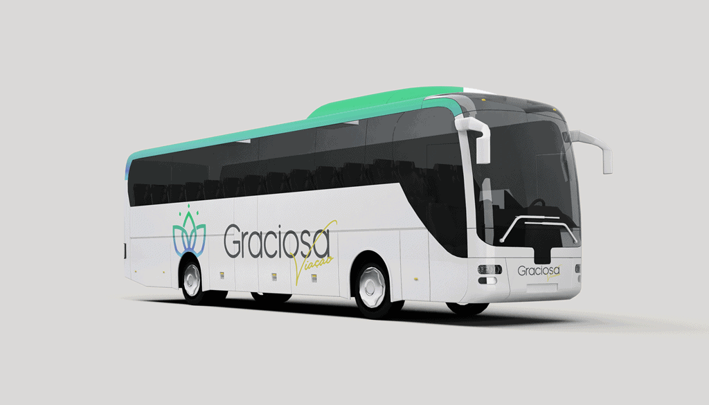
Viação Graciosa has been operating since the 1970s, creating connections between the coast of Paraná (Brazil) and the capital, and currently extending its routes to the metropolitan region and also to cities in Santa Catarina. The company not only applies in the transportation of passengers but also offers services for the transportation of cargo and parcels, carried out by buses and trucks, as well as serving as exclusive transportation of collective actions as events.
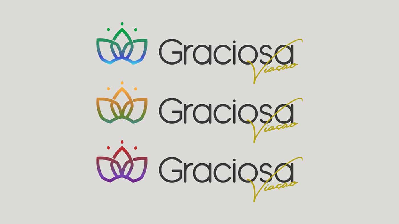
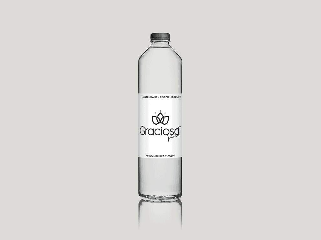
The logo, finally, totally inspired by the history of the company, represents the hydrangea, a flower present in abundance in the Estrada da Graciosa, where it originates the name of the brand, during periods it fills the eyes of tourists and passers-by with strong and vibrant colors as they flourish all along the roadside. Although the edges of the flower are slightly rounder, the idea of the icon was not only the same but also represent the mountain range, with elevations and depressions, also creating a connection with the three main areas and important points of the culture of Paraná, the cities of Morretes, Antonina and Paranaguá.
The colors reflect the visual experience, in short, are the result of perceived nuances along 3 periods traveling by road, the first composing morning tones, the second with vibrant tones of the afternoons and the third with the cold tones of the night. The color palette also seeks to give more life and visual appeal to the symbol and presentation of the brand.
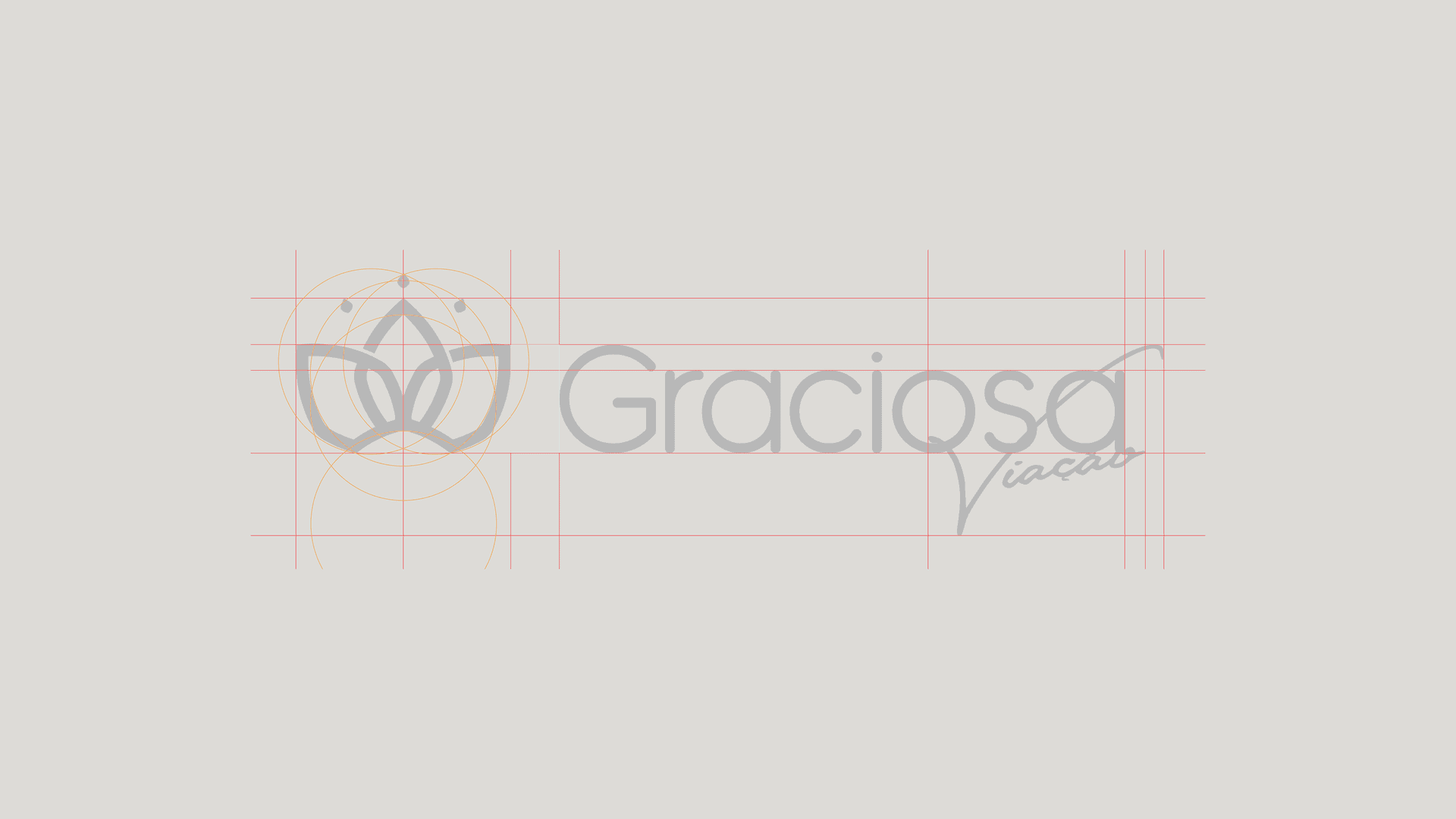
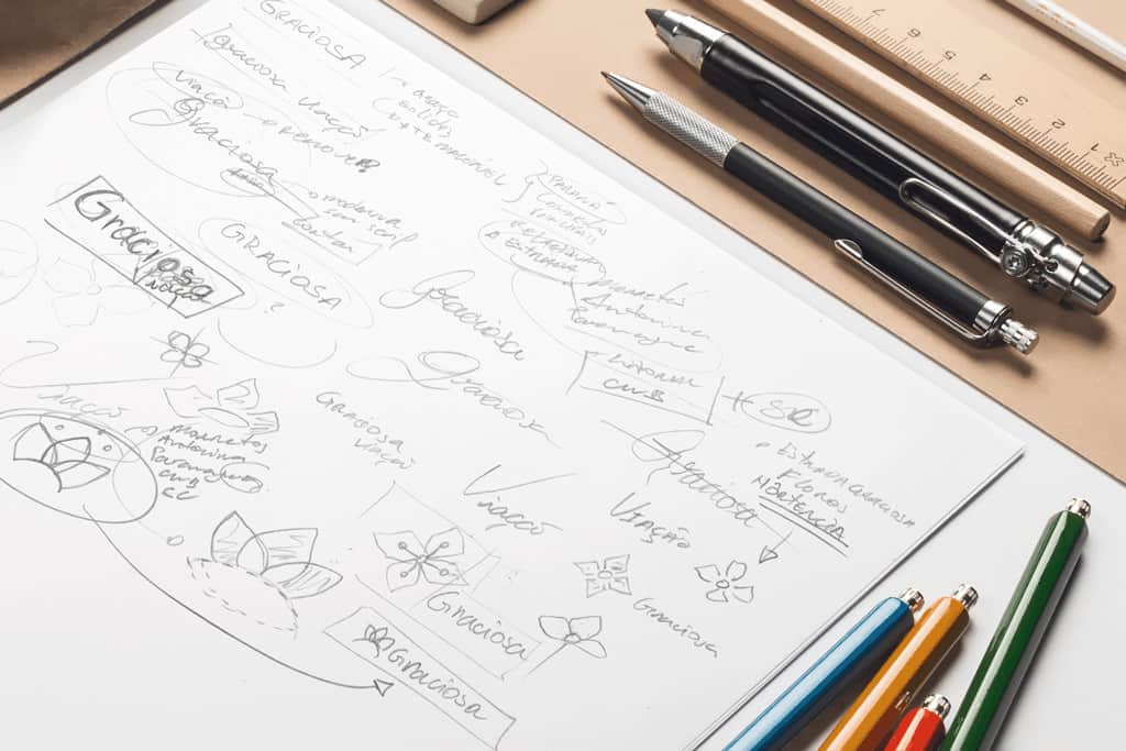
To create this material we used Adobe softwares, Photoshop and Illustrator. Starting with a sketch, the structure of the logo was designed with the aim of giving modern aspects to the brand, focusing mainly on highlighting a symbol to create a new reading and recognition aspects. We use San Serif typography, leaving the word Graciosa more solid, clear reading, in counterpoint the word Viação is marked by more human characteristics, with a handwritten typography.
![]()
We are still receiving answers regarding the project, but so far the update has provoked good reactions and we are optimistic, because despite a simple study, was developed with attention and care. A major challenge was to recreate a modern reading for a brand with a long tradition, not only marked by its shapes but also by its colors. The result pleased us personally for being able to convey so many meanings not using many elements, with objectivity and clarity.
Art Direction and Graphic Design by ALBQRQ and Lucas Santos.