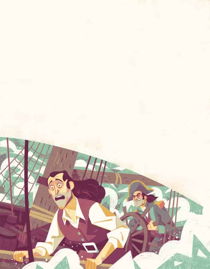
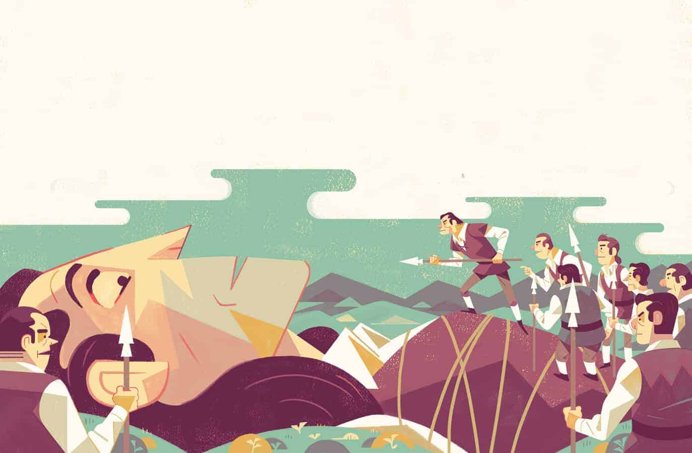
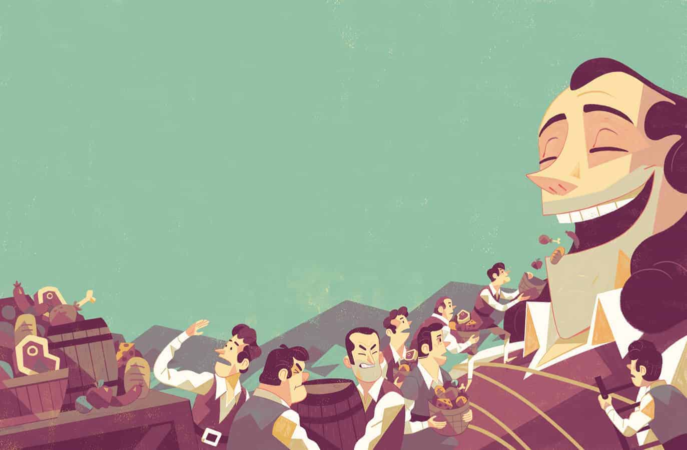
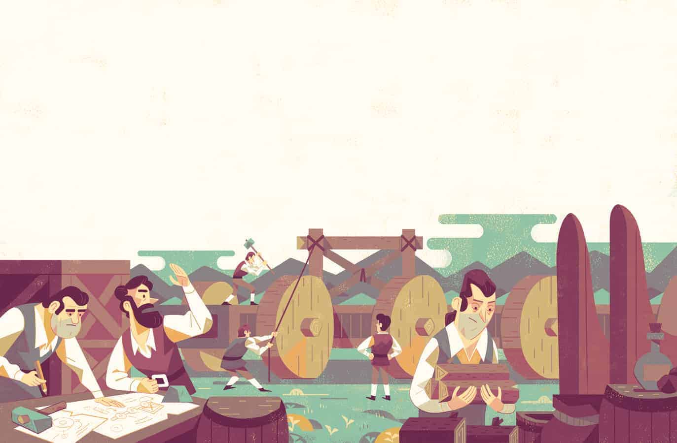
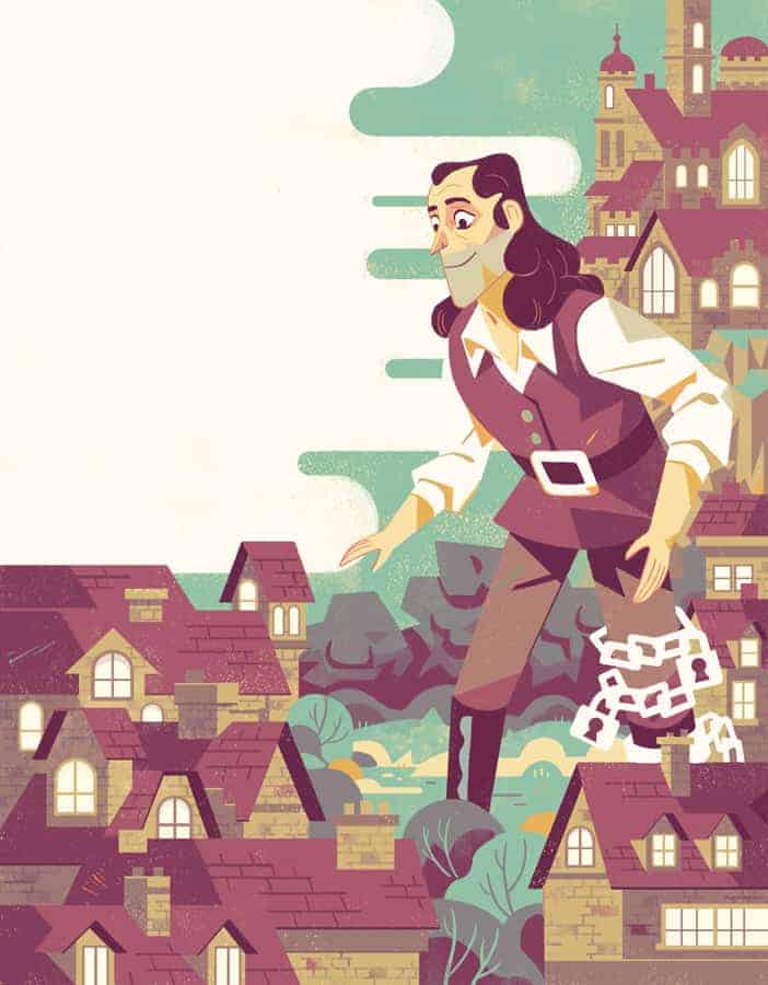
Gulliver's Travels

I was contacted by Storytime Magazine to do five illustrations for and excerpt from the classic book Gulliver's Travels. Storytime is a UK magazine aimed at bringing classic stories to children on a monthly basis. The project description was pretty straight forward and I was given five rough layouts with image callouts to work with, mainly trying to leave enough room for the type to fit.
Brief descriptions for each image had been provided so I knew exactly what I had to illustrate and was mainly concerned with the compositions. A few of the images had very similar overlapping themes so I put a lot of effort into trying to make sure that the compositions were unique enough to make them all interesting. In my own personal work I have been playing with finding a balance between graphic shapes and characterization, this was really helpful with this project as many of the images required many figures displayed at once, and there was a vast size difference in the subjects. Colour is extremely important to me in the image making process and I try to break it down into as few colours as possible then add more where needed. using colour palettes that evoke a mood rather than represent what something actually looks like is one of my favourite parts of art.
I almost always start any project by researching the subject and gathering a bunch of reference. For this project that meant looking at classic illustrations of the story and trying to find out what characters may have worn etc. I then begin to just sketch on a large pad of paper, drawing out characters and general image thumbnails, trying to get a feel for the subject matter. After I have some ideas down on paper I will scan them into photoshop and size the thumbnails to the correct format so that I can start planning the compositions better. Once all the compositions are working I clean up the drawings and then it is just a matter of getting down flat colours and playing with the images until they feel done. Because this was a series of images I figured out a colour scheme on one of them and carried it through to all the others. I always find the most difficult and exciting part of the image making process to be the beginning, figuring out an interesting composition can make or break and image for me.
The response form others on this project has been very positive and I am very proud of how it turned out. Parts of these images were a new direction for me and I was excited to apply this thought process to other images.