Harim | Accademia Euromediterranea

Euromediterranea Harim Academy specializes, such as the Universities of design, in the fields of fashion, jewellery, photography, interior design, product design and communication. This institution is located in Catania.
The aim of the project was to give a more modern look and a strong identity to the academy so as to make it look younger and more contemporary to its students.

Despite its innovative program and its avant-garde methods, the academy appeared outside without a definite, outdated, and old personality. He could not convey the sense of creativity and dynamism that incarnate and represent everyday life within the academy, and did not translate outside an environment of creativity in which to experiment and learn innovatively new professions. The academy therefore needed to evolve its visual identity to appear modern, current, and entice new students to become part of it. There was also a problem with the representation of the naming, "Harim" and "Euro-Mediterranean Academy" possessed the same visual hierarchy and this caused confusion for users who could not give a precise identification to the primary name of the academy, "Harim".
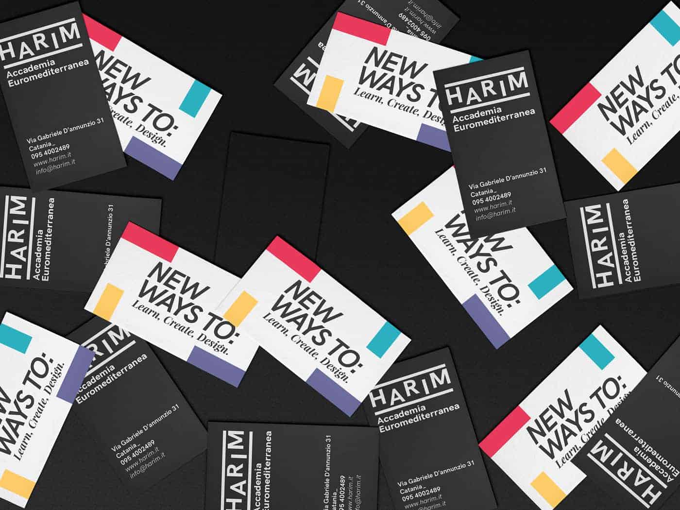
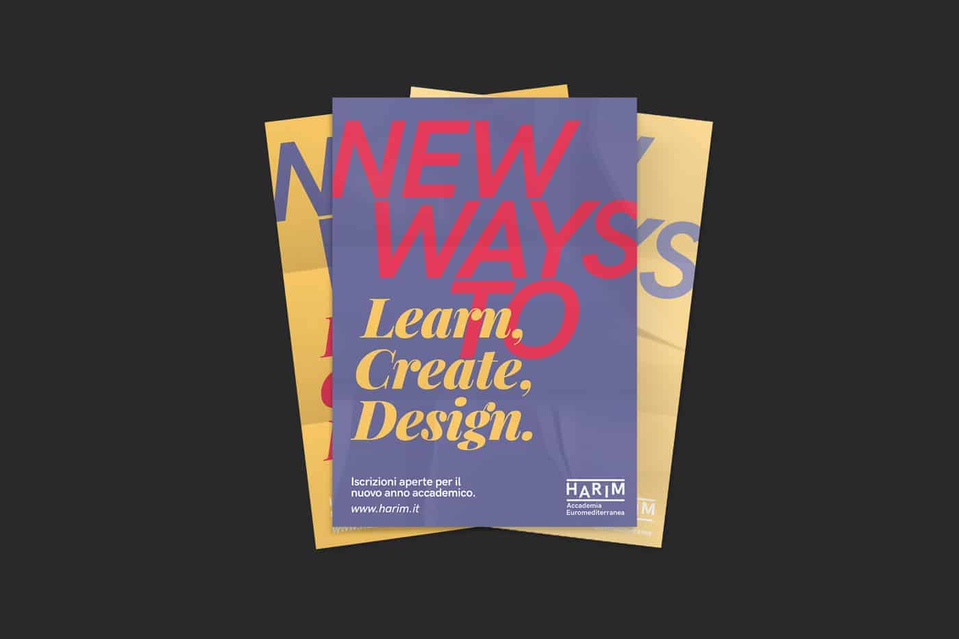
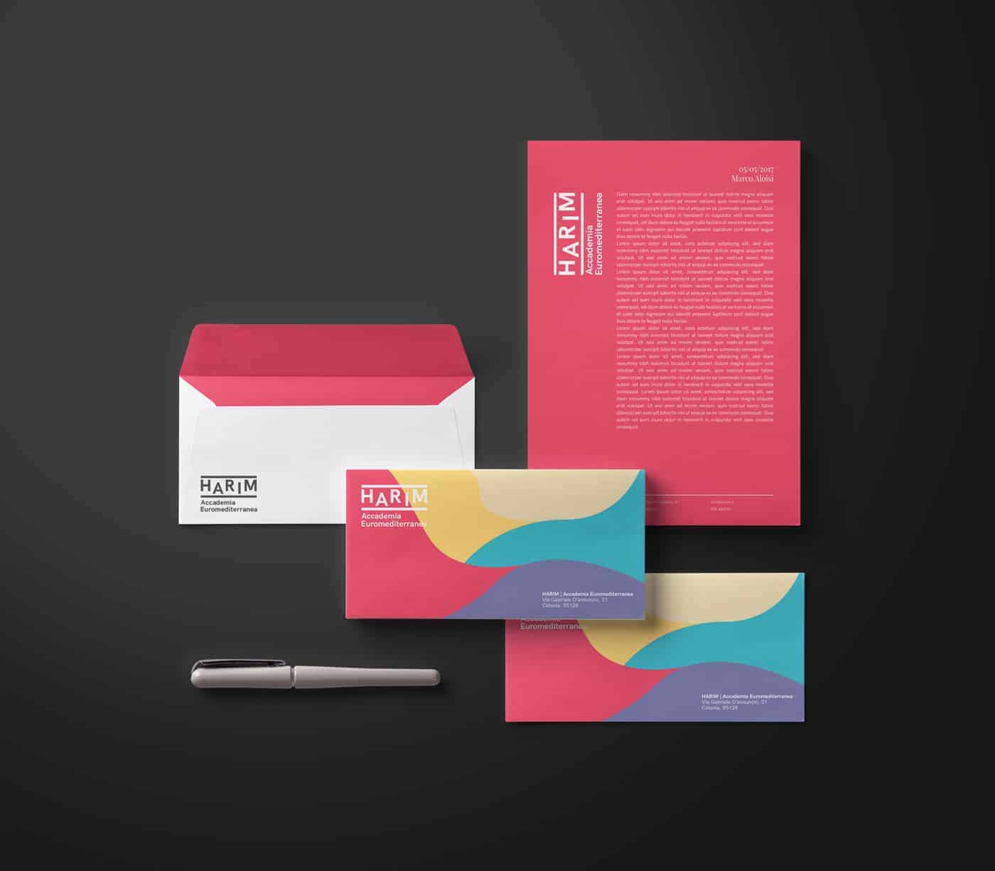
We designed a trademark consisting of a simple but distinctive lettering that emphasized the name of the academy to make it the absolute star, memorable and of immediate impact to its users. Through the lettering we have tried to convey a dynamic identity, lively but at the same time serious in order to acquire a more institutional aspect to the academy. A trademark that could be simple, but at the same time impressive and could highlight the primary name of the academy.
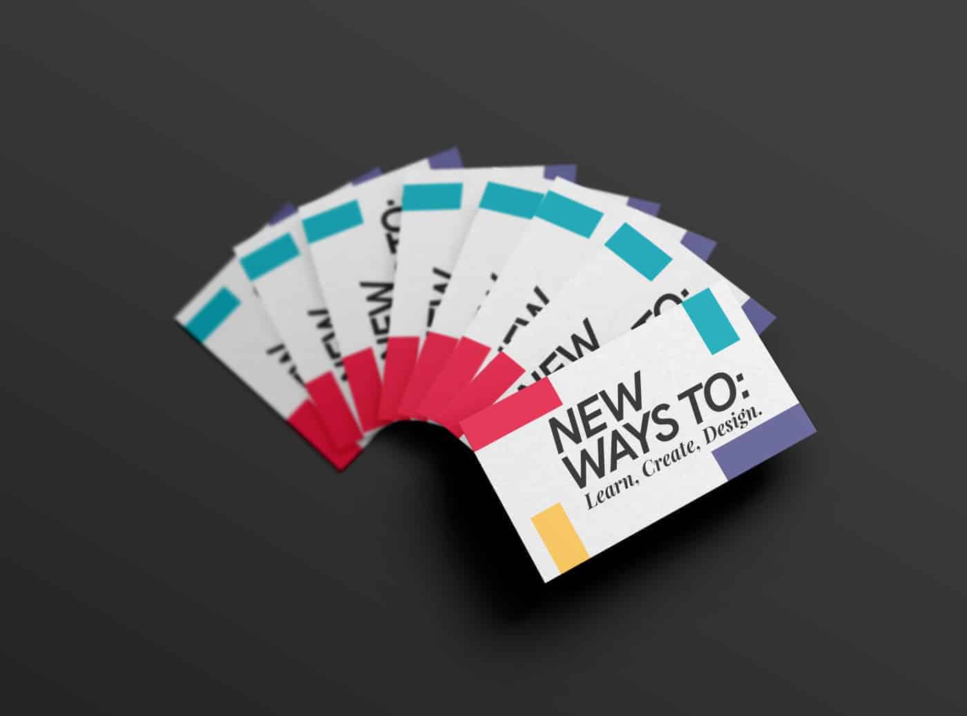
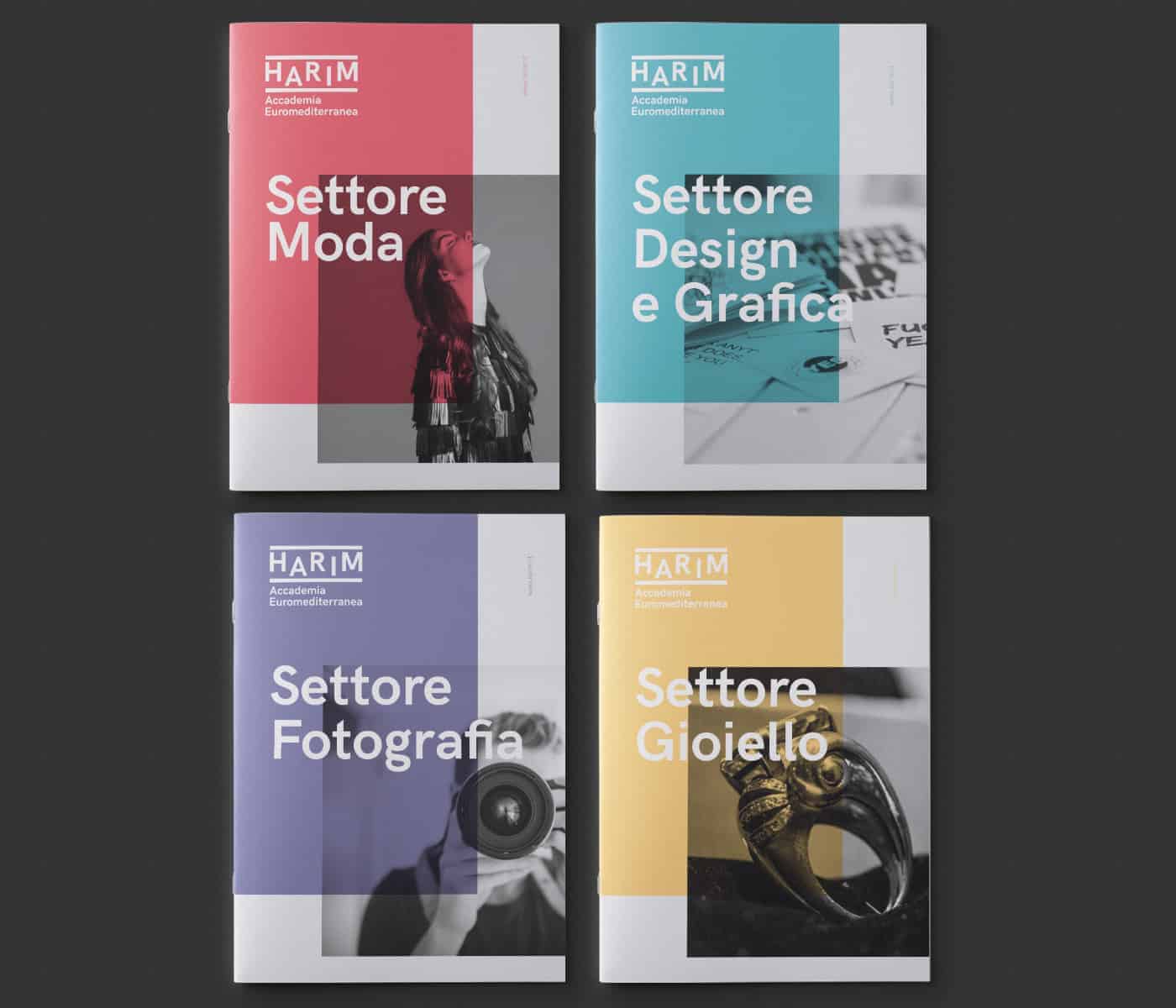
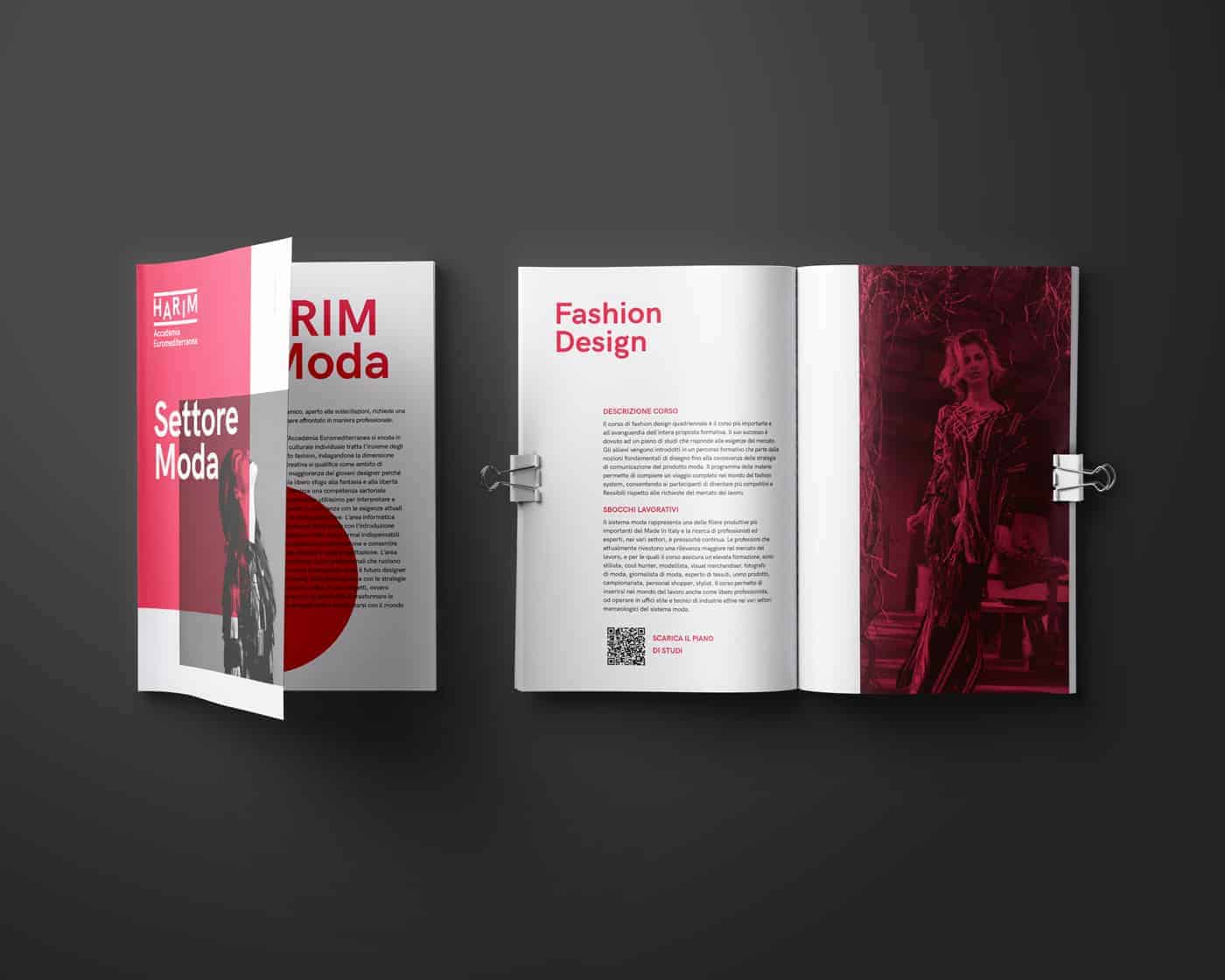
The structure of the academy courses is very wide and articulate and therefore needed greater order and clarity. We therefore decided to give a single color to each sector by extracting the color palette from the old brand to also create a link with the academy past. Each communicative artifact produced for the four sectors will therefore have a unique color and thus create true sub-brands.
In the rebranding process we also took care of web site restyling. The previous site was cold and did not have a definite personality outlining a serious problem within the visual system.
We have designed a portal to keep up with the new trends, but above all to reflect and integrate with the new brand identity. By integrating the new color system, we redefined the whole graphic aspect, but above all a clear hierarchy that has allowed us to implement a clearer and more practical UX.
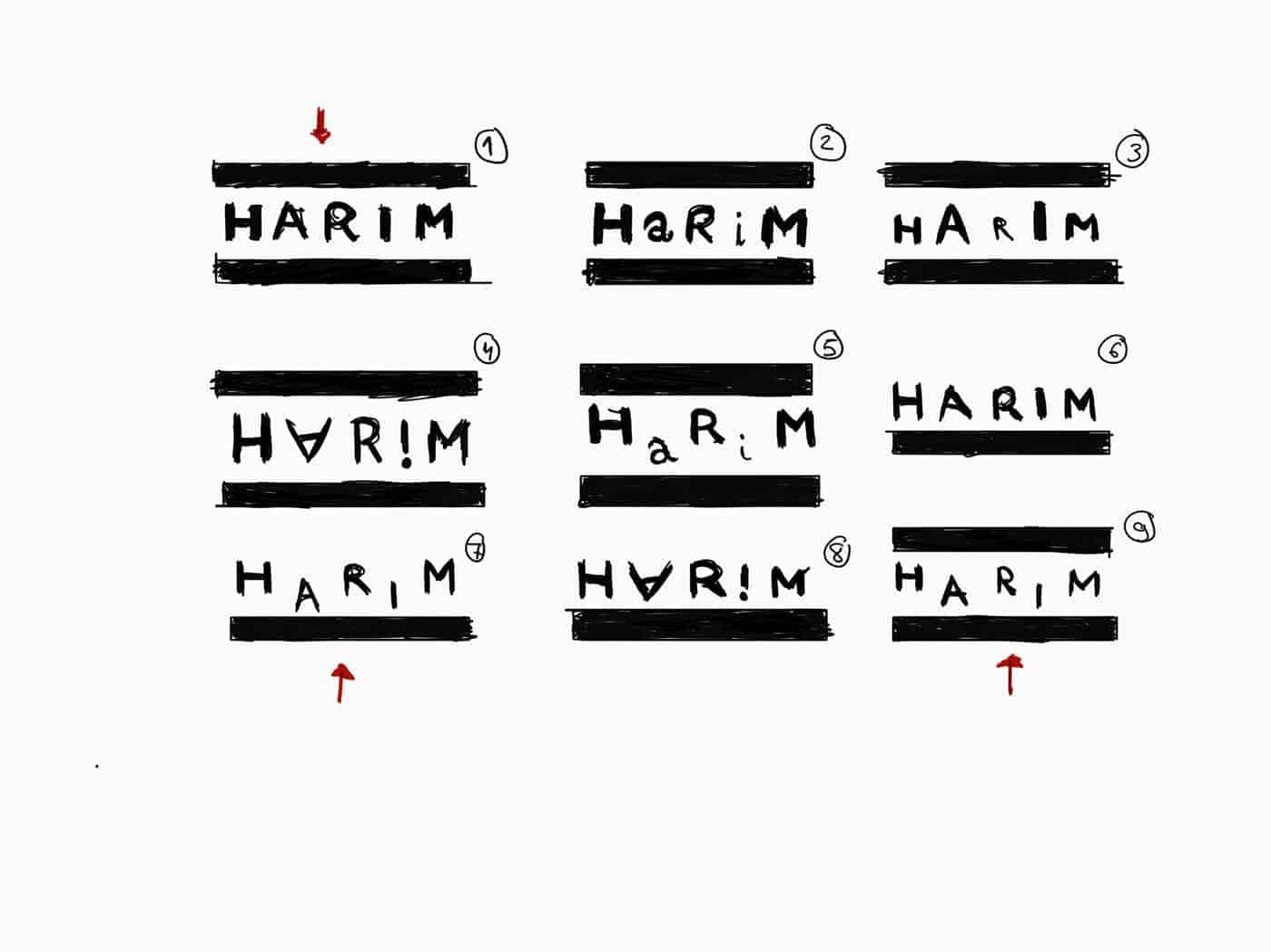
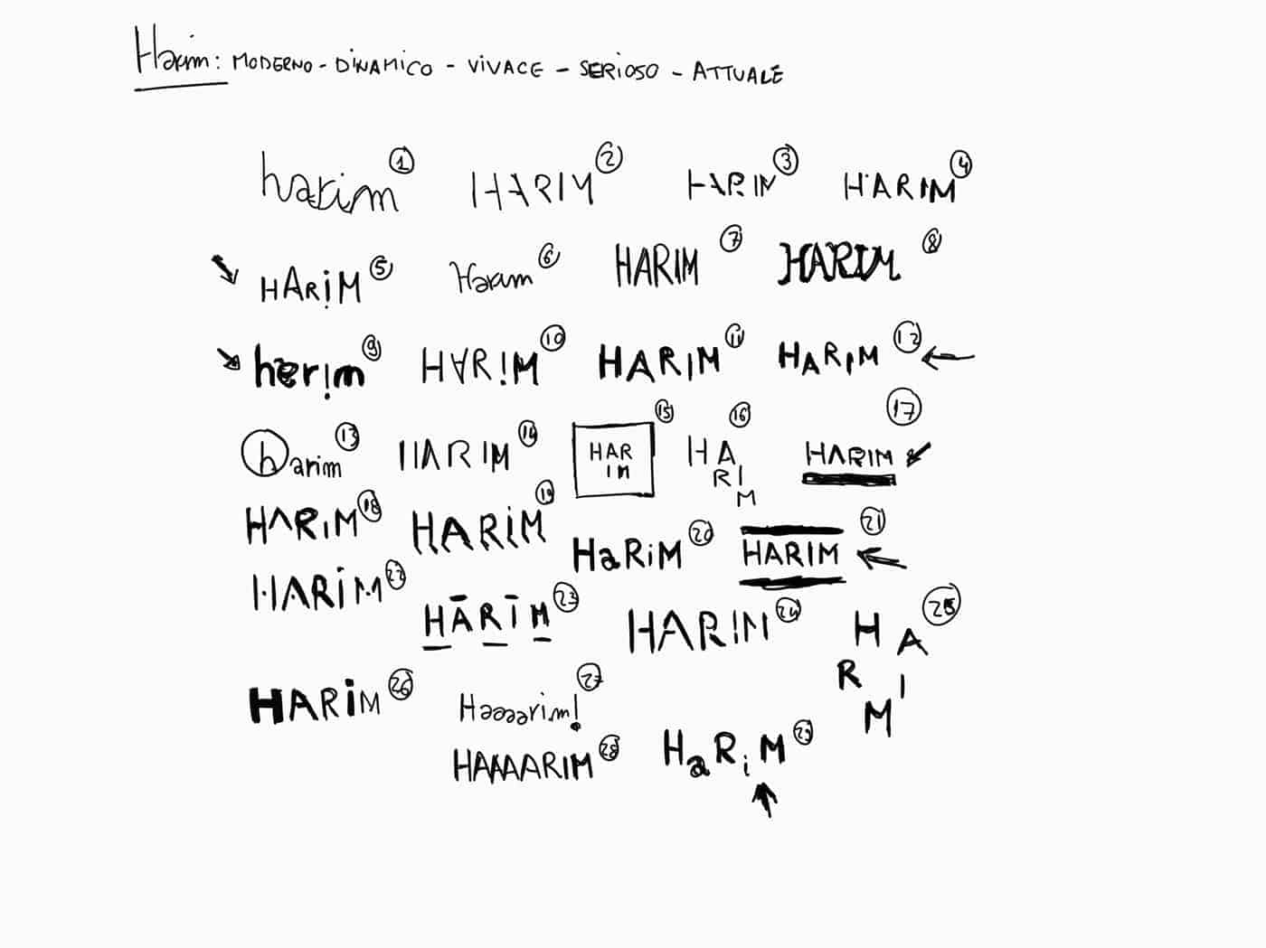
For the creation of the brand and all the identity we have first faced a long phase of sketching on paper. Once the right direction was found, the artifacts were made using the entire suite of Adobe and SketchApp for the creation of the website
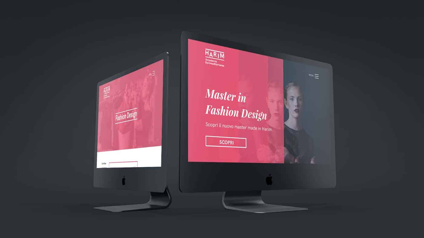
The public and especially the students responded well to the new identity we have built. Now they have a clearer idea of what the academy is up to and they immediately perceived the freshness and modernity of the new design. Thanks to the new website and the color system dedicated to each sector, new students are able to have greater ease of use and direction within the structure of the academy