Hawk - Visual Brand

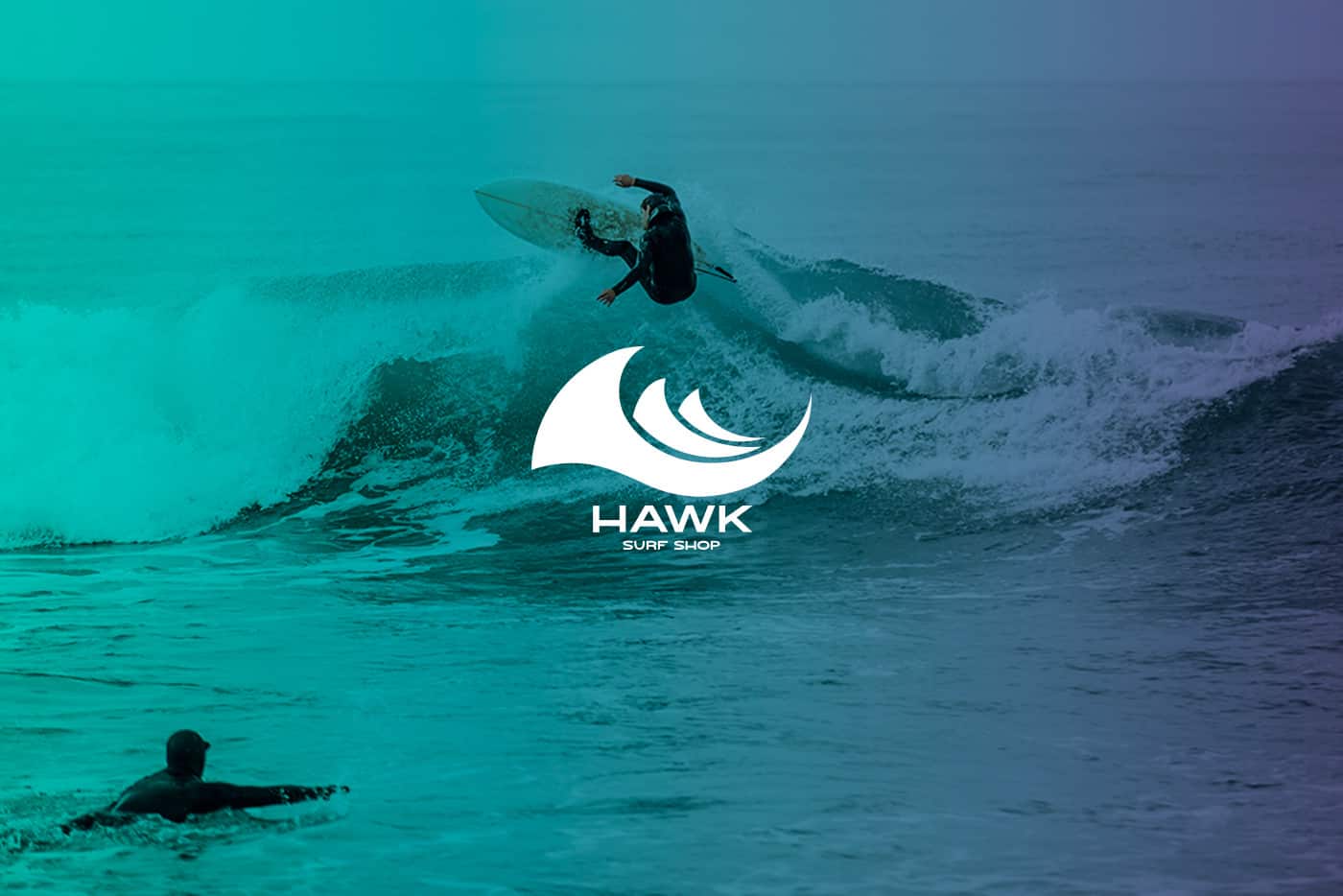
Hawk is a store specializing in the marketing of beach, surf and skateboard items for men and women.
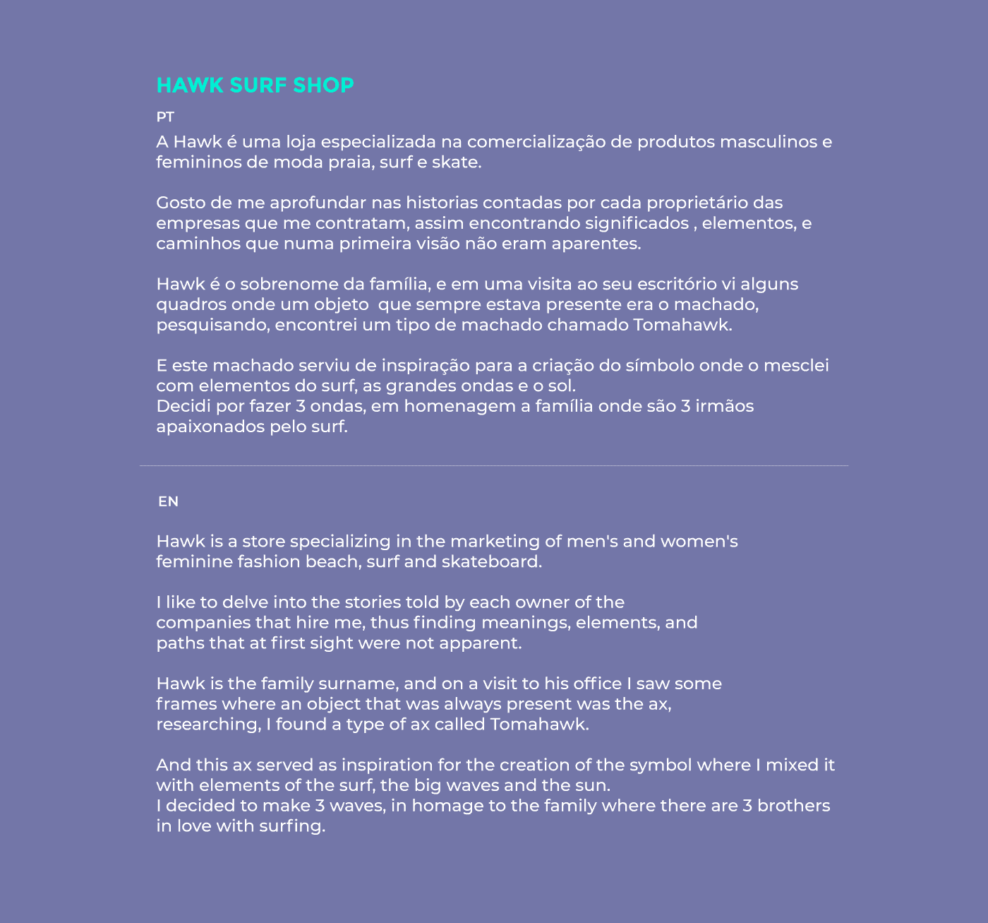
They are three brothers in love with the surf, who had the dream of materializing this in a store, where they could continue to be linked to surfing.
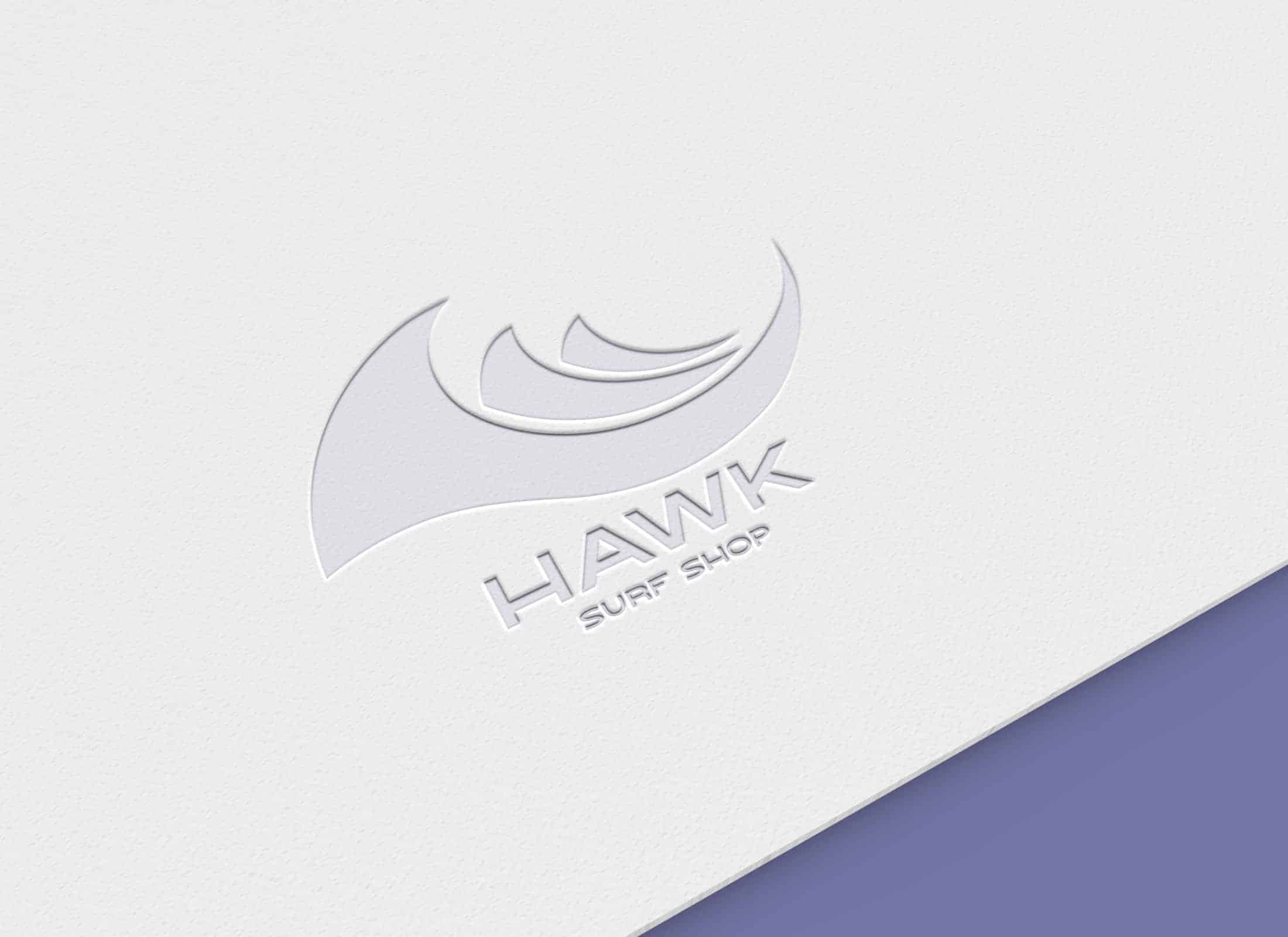
Thus was born the Hawk Surf Shop.
On a visit to the Hawk family office, I noticed that they had a taste for vibrant, striking colors and also some pictures of woodcutters.
I was inspired by this palette of colors and especially by the ax (Tomahawk).
Without leaving out the waves, and the sun, and all this was possible to materialize thanks to my trip to the family's desk, where I could notice these things

specially adobe illustrator and paper, I always start my projects with scribbles on paper, until I find something that solves the problem of the client and only then I go to the illustrator where I give life to the project. And finally I look for references of colors and typography that represent the mark well.
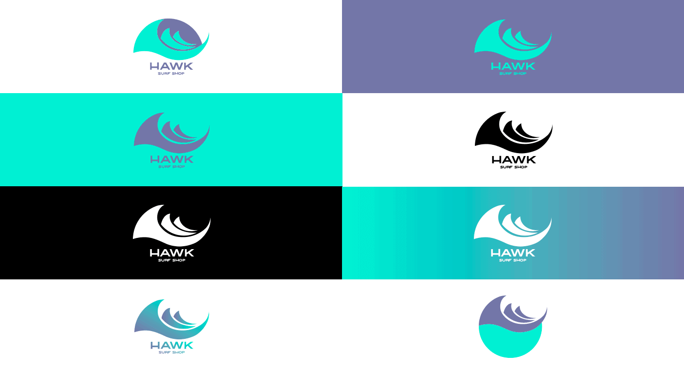
the family loved it, the idea of the ax and the waves was perceived in the first sight. And some applications with the sun, have attracted a lot of attention.
I have learned many things mainly that if you can be in person in the environment where your client works, deepen in their stories and tastes, you can make an incredibly deep project.