Hazel Branding Identity
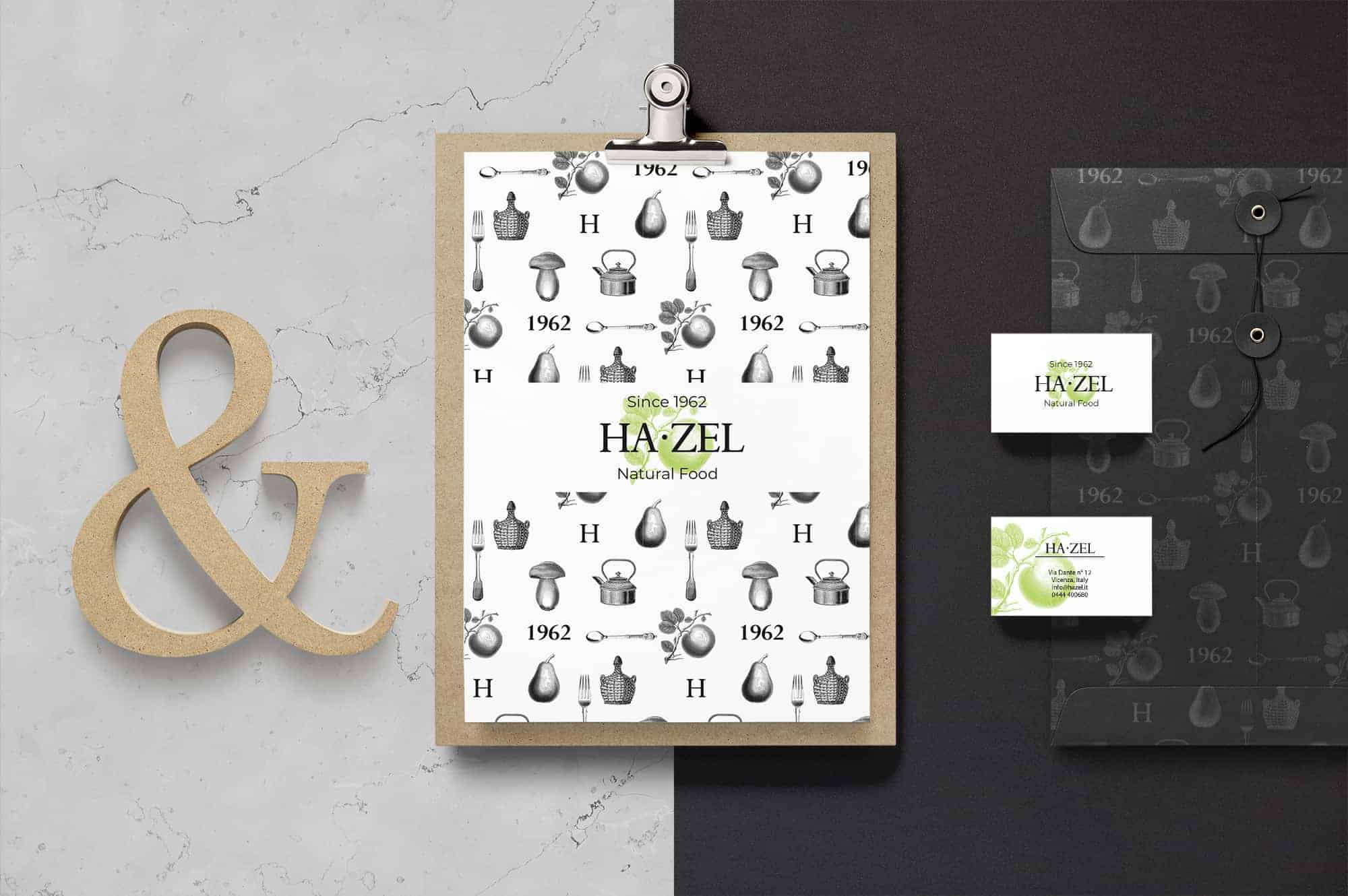
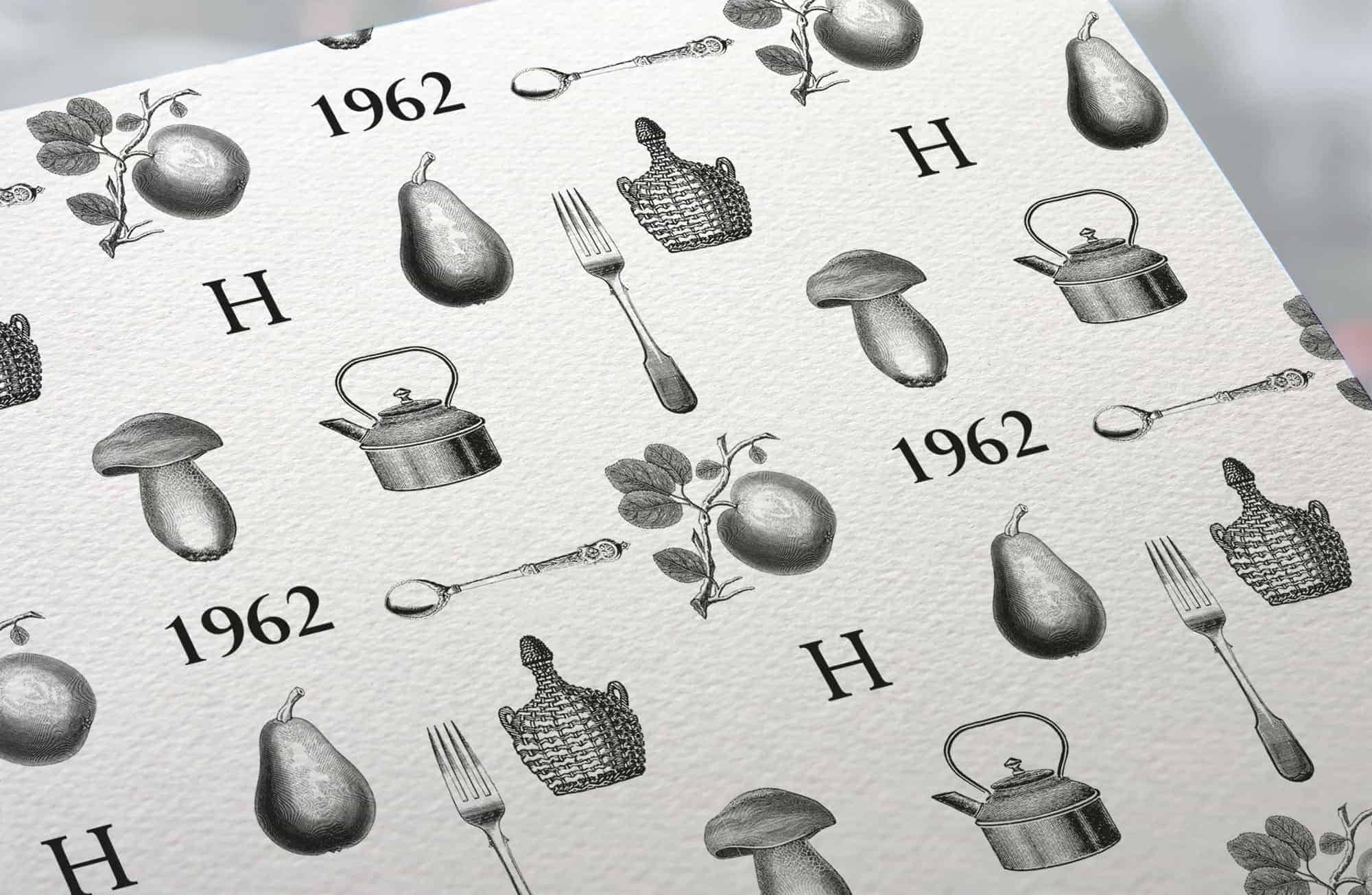
Hazel is a store of organic products that needed a new coordinated image. They were looking for a modern style but at the same time recalling the tradition of their products, so I decided to use engraved illustrations and materials from food waste.
![]()
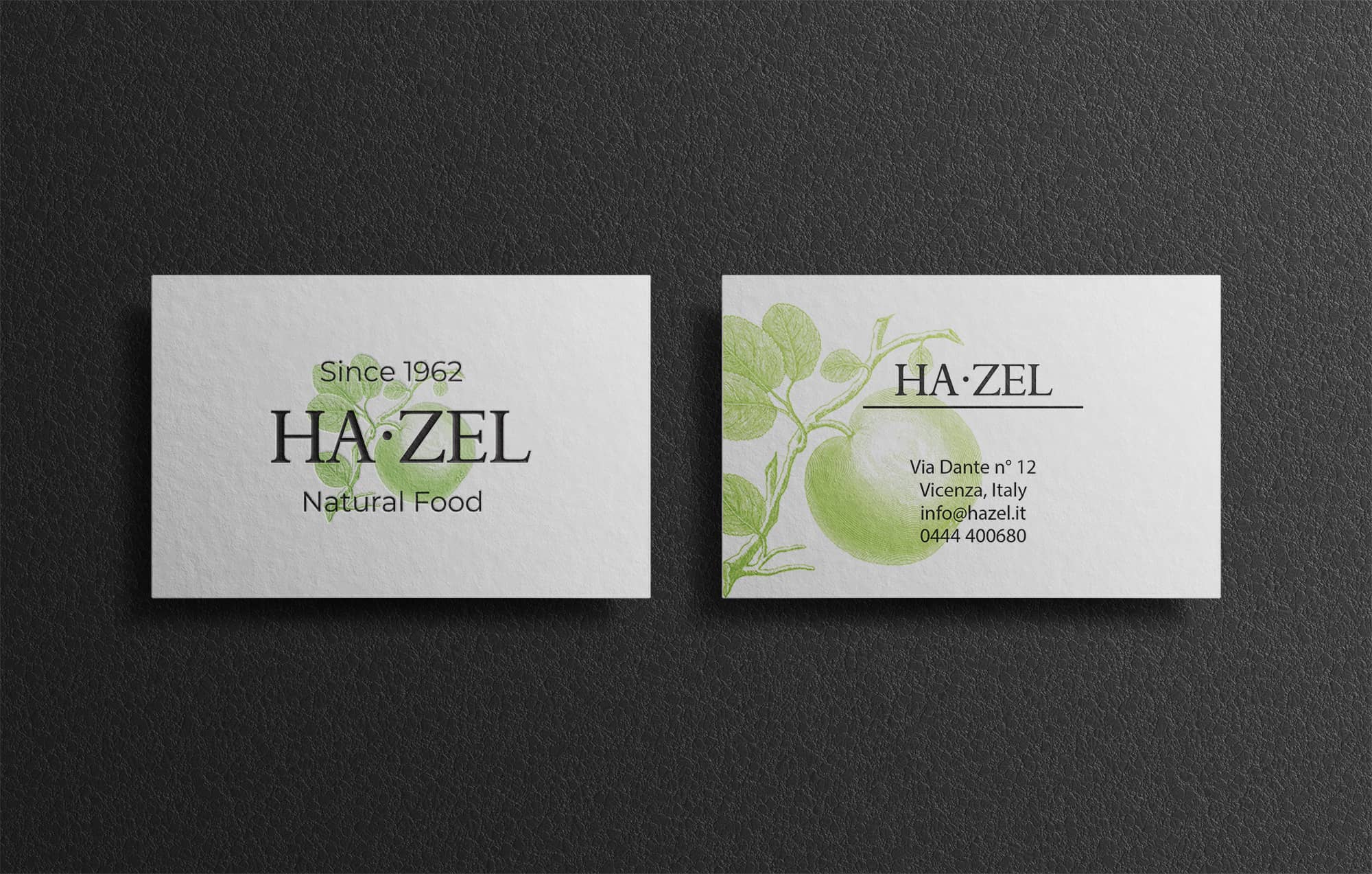
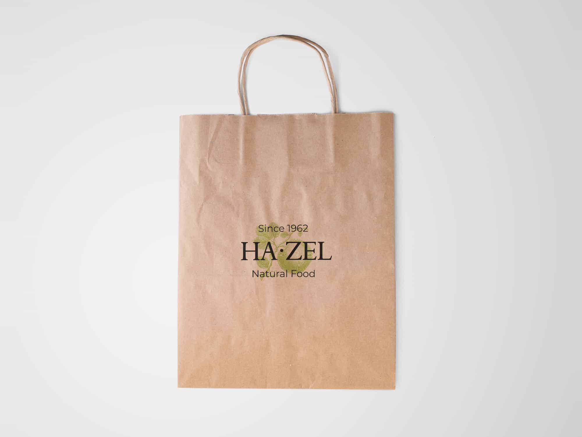
I wanted to create something simple, that had a crafted, but well-groomed appearance. The colors are inspired by nature, but very modern: an acid green background in contrast with the black of the name. The paper on which the whole coordinated image was printed derives from a special paper, produced by food waste from farms.
Usually when I realize a graphic project I do a series of brainstorming and research. After this, everything turned into vectors using the Adobe Ilustrator to create each line and define a clean logo.
Later I created a business card and all that was needed for the client's corporate identity. The important thing is that everything is connected and has a logical thread.
When you work on creating an identity, you must understand the client's psychology and the target audience. In this case I was lucky, the client was perfectly connected with my style and it was not difficult for me to propose a project that would satisfy him.
Very nice branding. The colors and designs are all modern and that is really what a brand should appear to be like today. Photoshop is powerful if you know how to use all the tools!
Gorgeous! I love the project
I love the simplicity and chicness of this branding