Helmsman Rum

"Since the beginning of seafaring the Helmsman has guided ships through Neptune's open seas with dexterity and dedication. It is with this inspiration that we have taken the essence of the Helmsman and capsulated it into our spiced rum, crafting its flavours from spices that then have been blended with the finest Caribbean rums to produce a well rounded drop."
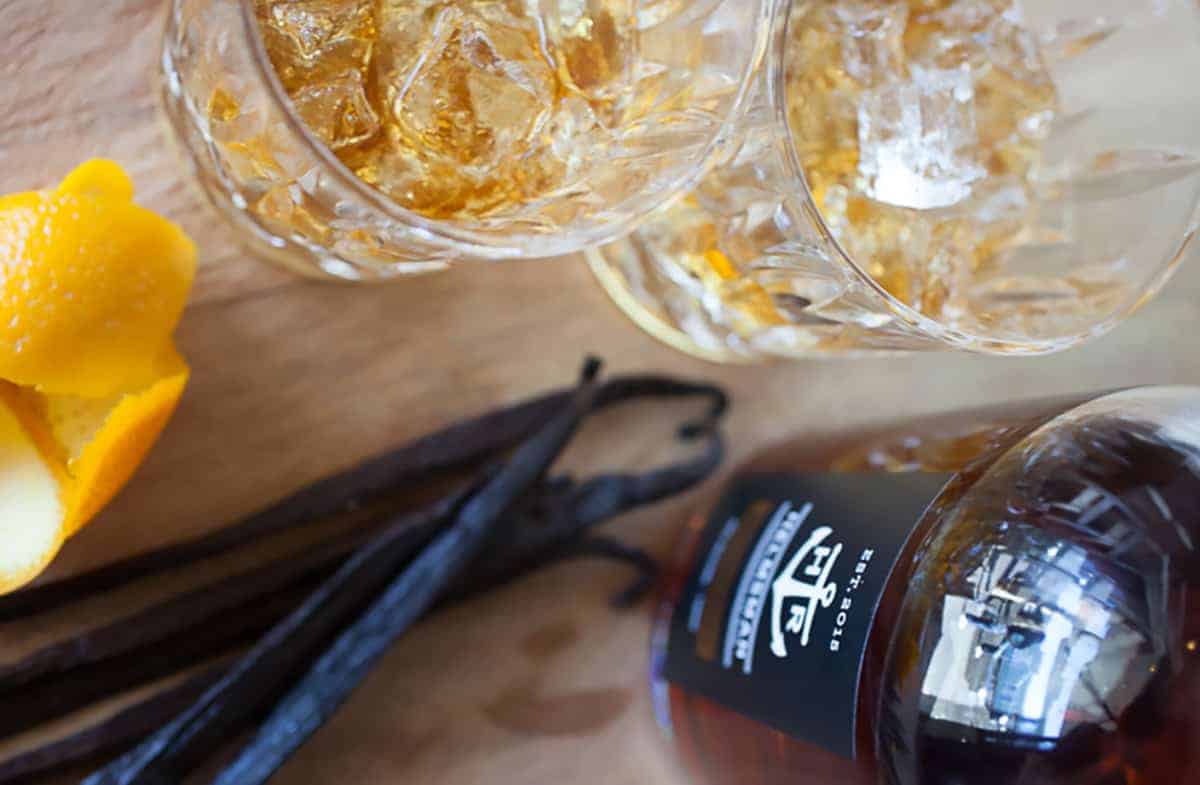

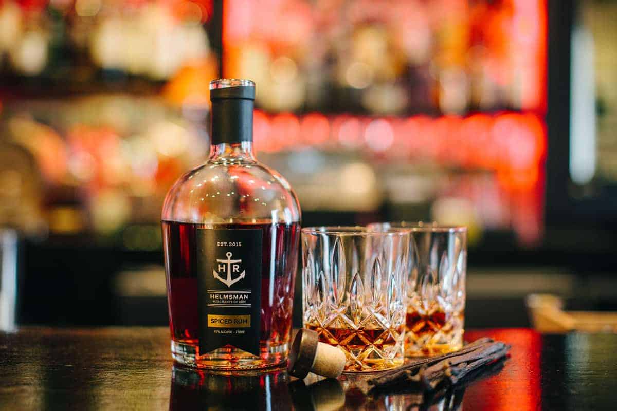
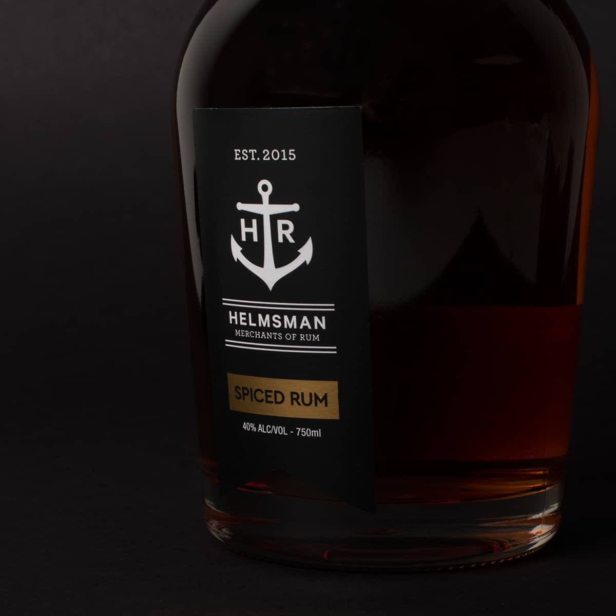
An identity was created for Helmsman, with an anchor and the watermarks being used as identifiers to a life on the seas. The directors wanted the identity to remain classy but still be strong, and hold a hint of the past. Currently we've only created the first bottle of Spiced Rum so the colours are in line with that – Black, White and Gold to offset the golden brown of the rum.
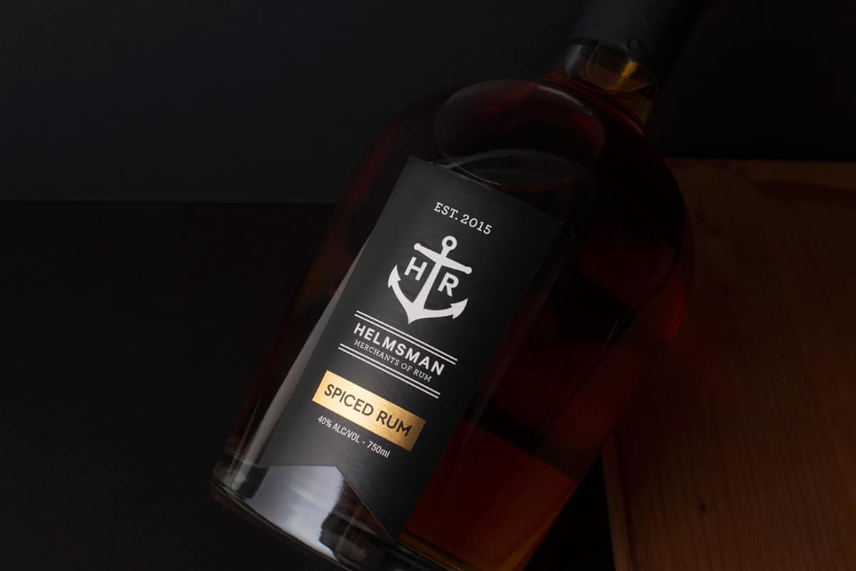
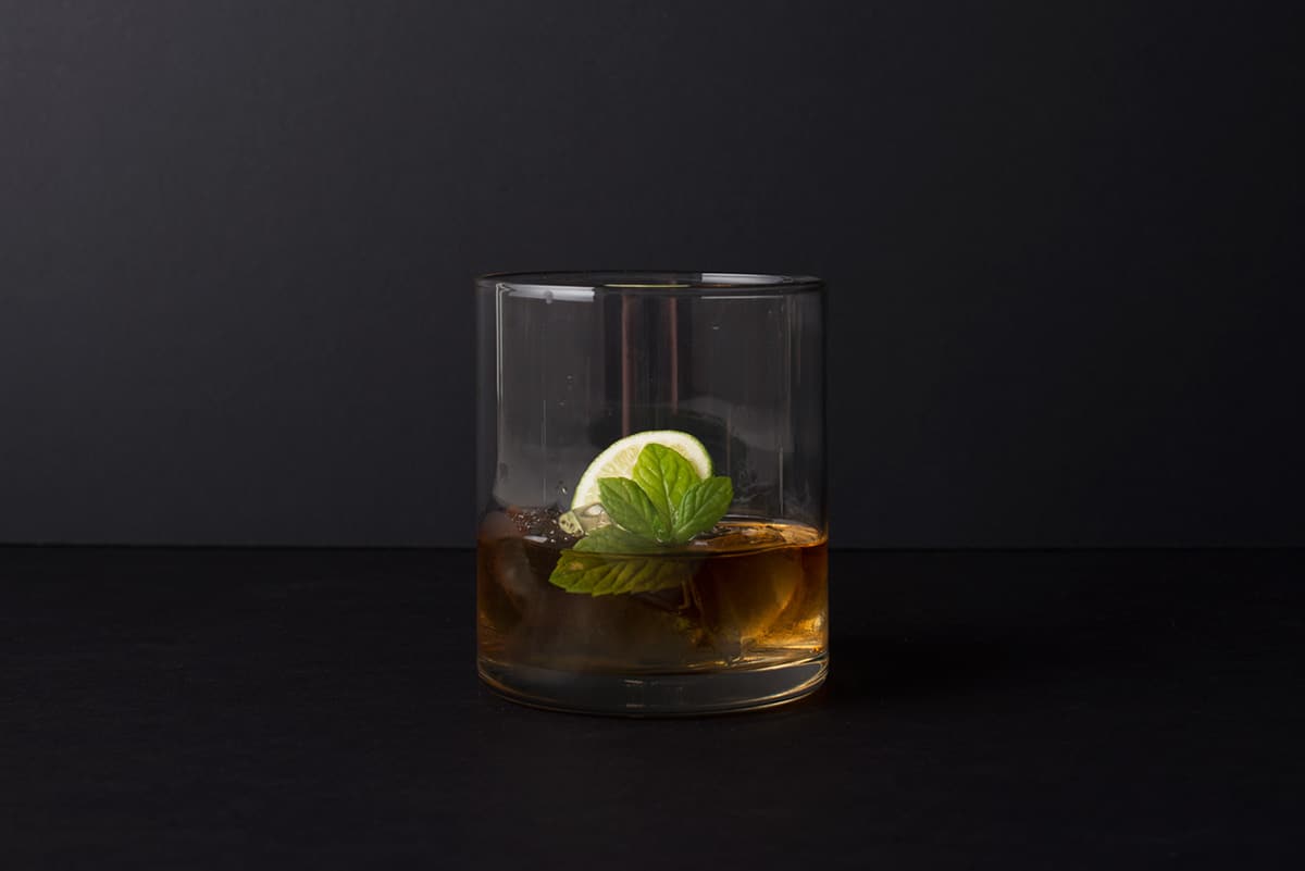
The label was created primarily in Illustrator, purely for the ease of being able to tweak vectors once started. Using all elements of the brand and after going through rounds of research, a black ribbon was to be the main shape, with gold foiling to reinforce the premium status of the rum. Add this to the careful consideration of the rounded glass bottle and the wooden cork in the top and you've got a new spiced rum itching to take on the classics like Sailor Jerry's.
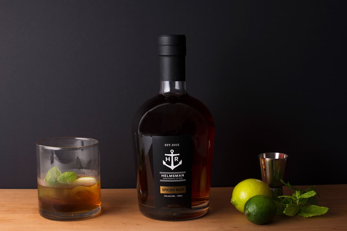
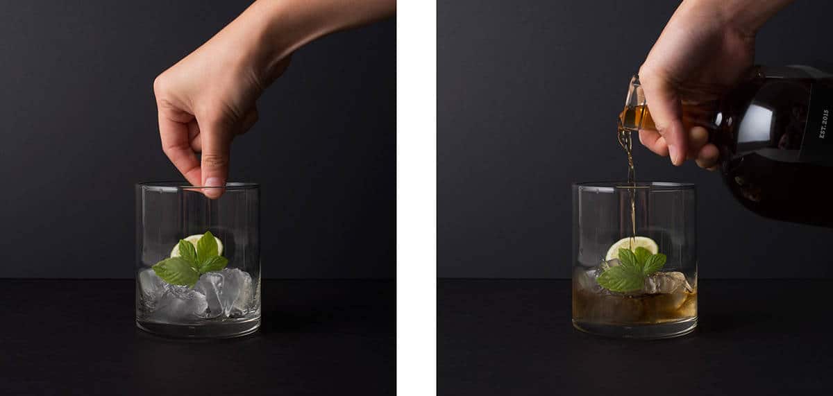
Currently testing around New Zealand, the boys are hoping to take on the market with gusto, with Helmsman sitting on shelves in select Liquor Stores in July 2016. The general consensus on the design thus far has been really positive and I look forward to seeing what happens next.