Hubbled - A community for space enthusiasts

Hubbled is a close-knit community of space enthusiasts and physics nerds who are interested in exploring space and our universal mysteries. I was in charge of their branding, from the logo design to social media aesthetic design. I was also given the opportunity to design their website and blog section. I approached this gig with a very modern, bold feel, making sure everything was cohesive yet unique.
I've always been drawn towards bold and colorful branding projects on behance. I wanted to use this style from a long time but couldn't find a project that suited this design style. Hubbled was the perfect project.
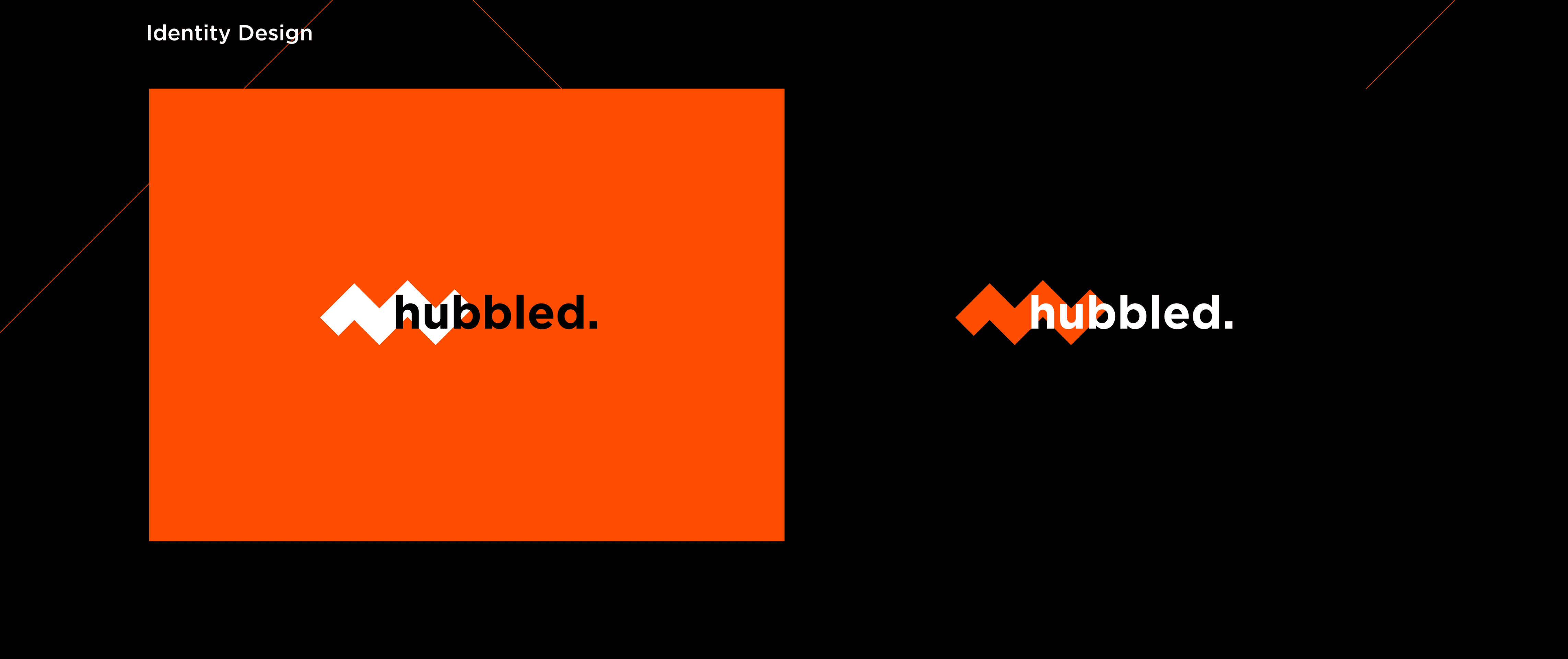
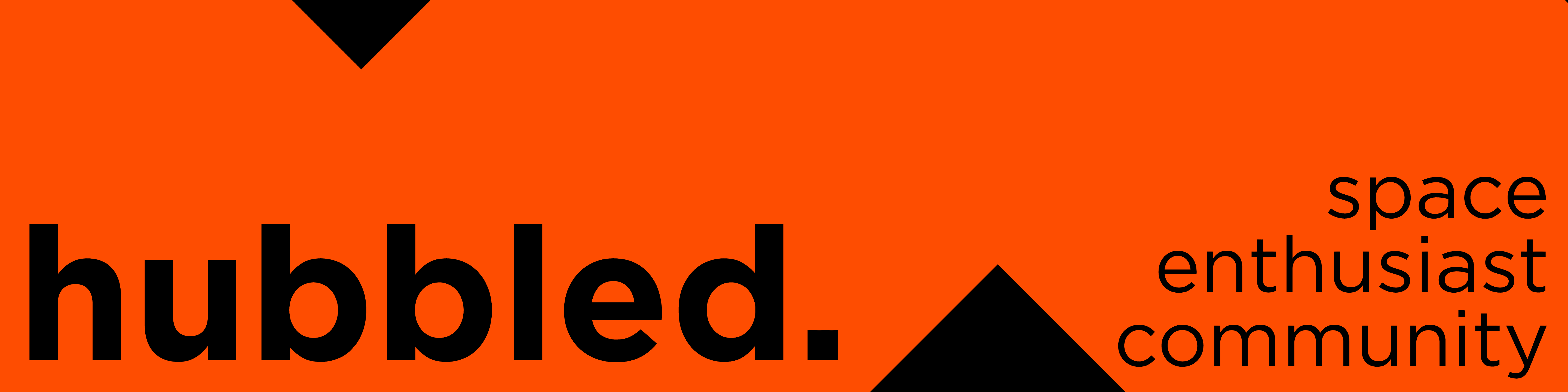
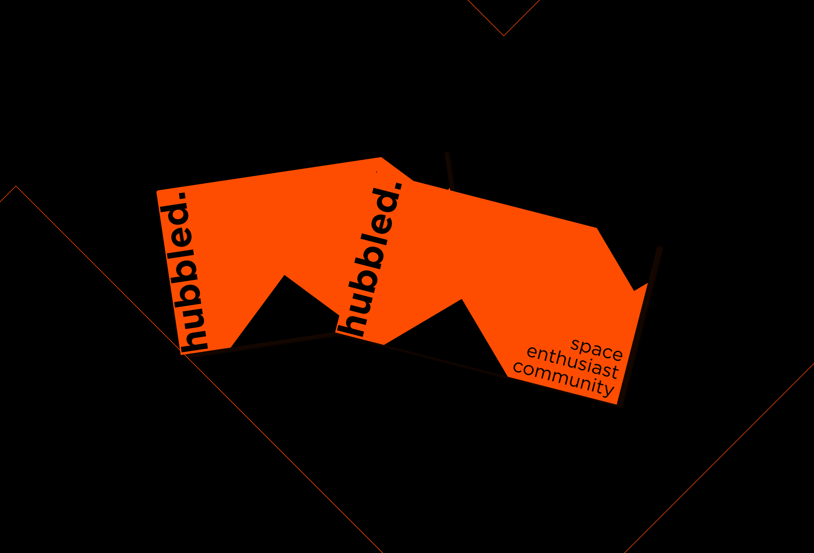
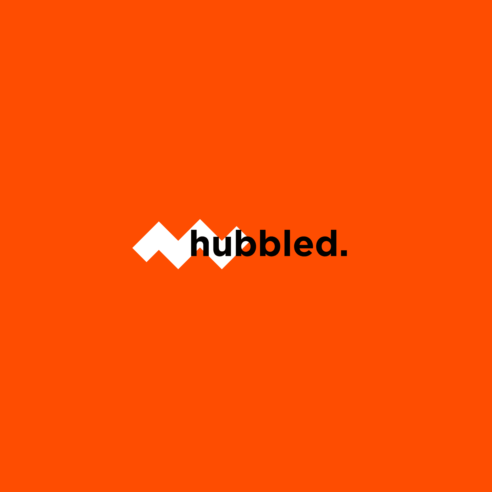
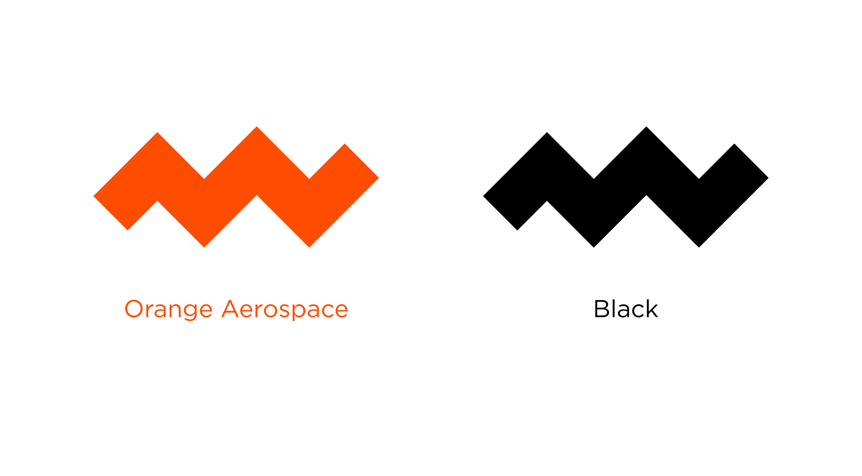
The concept was outer space so it was pretty obvious that I had to brand in the darker direction, hence the black. The orange was chosen for two reasons: one, to represent community warmth, and two, as a design choice because I liked how the orange stood out on black and gave my project a bold look.
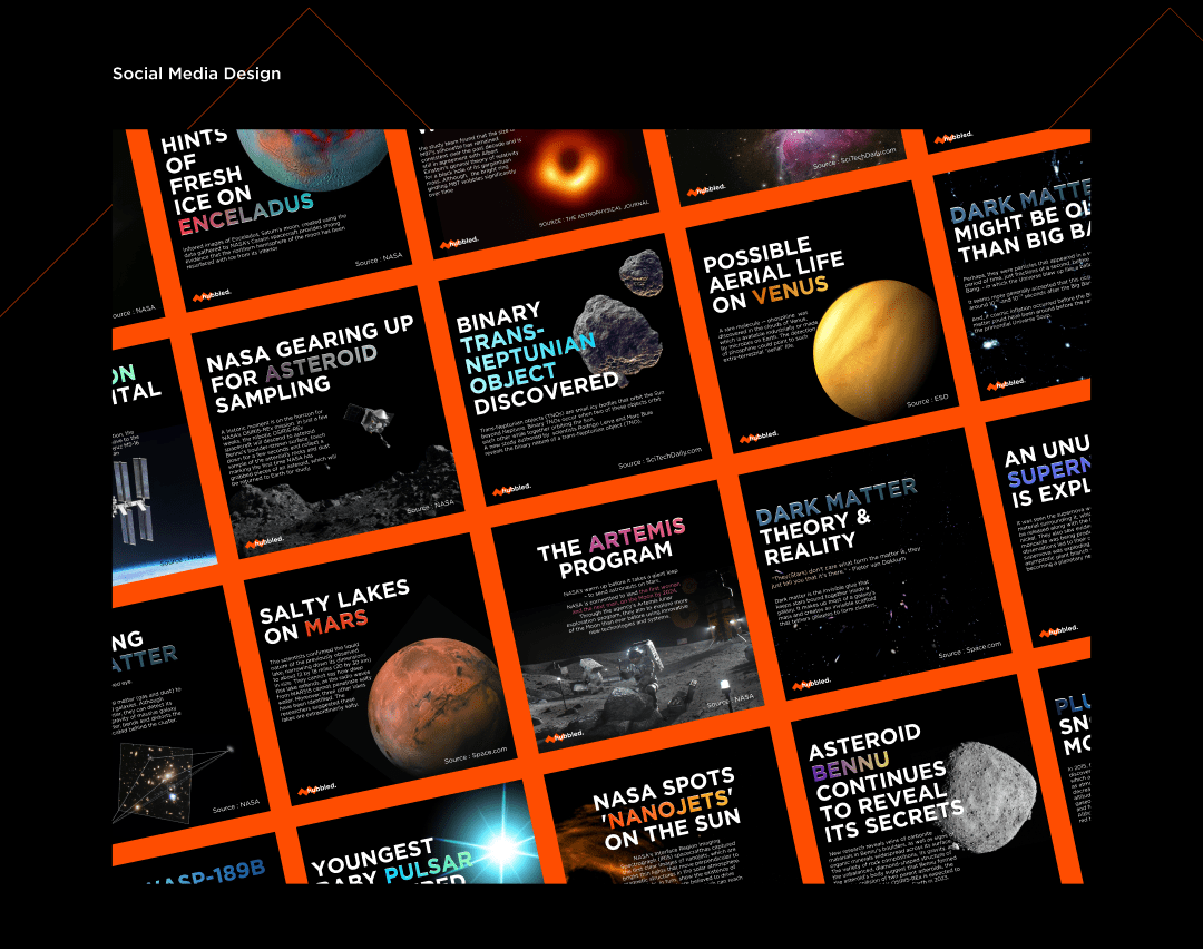
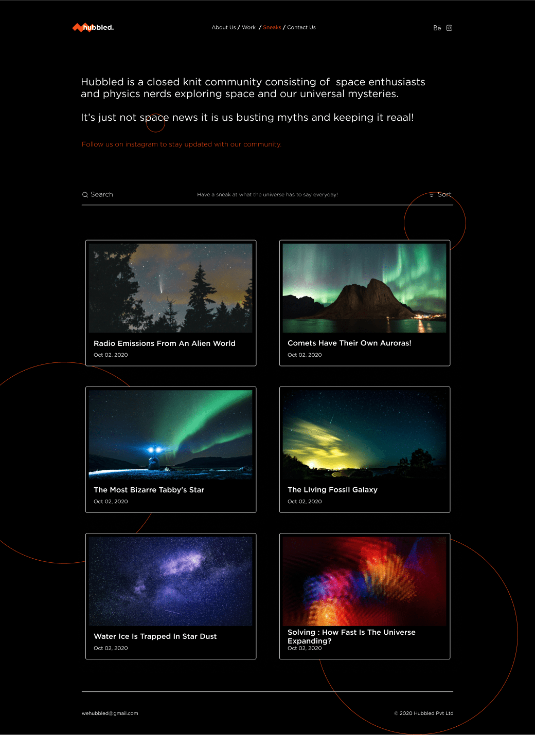
The clients wanted the social media to be all about space mysteries, such as news about discoveries, findings, research papers, and so on. The post design had to be content-heavy while also being interesting to read. As a result, my social media post design emphasized the headlines.
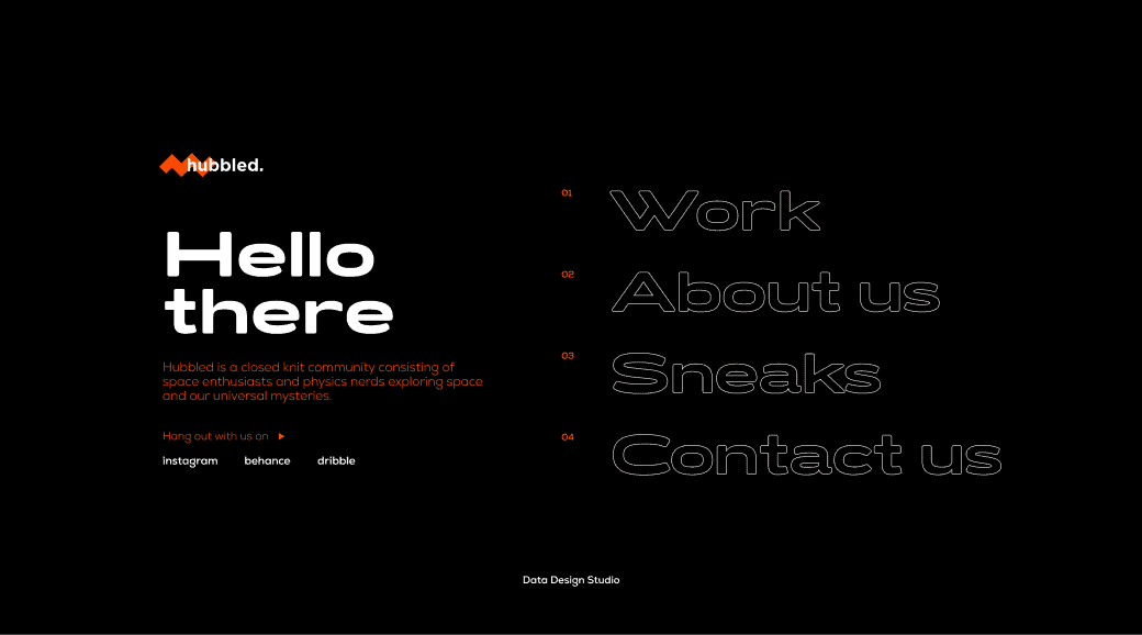
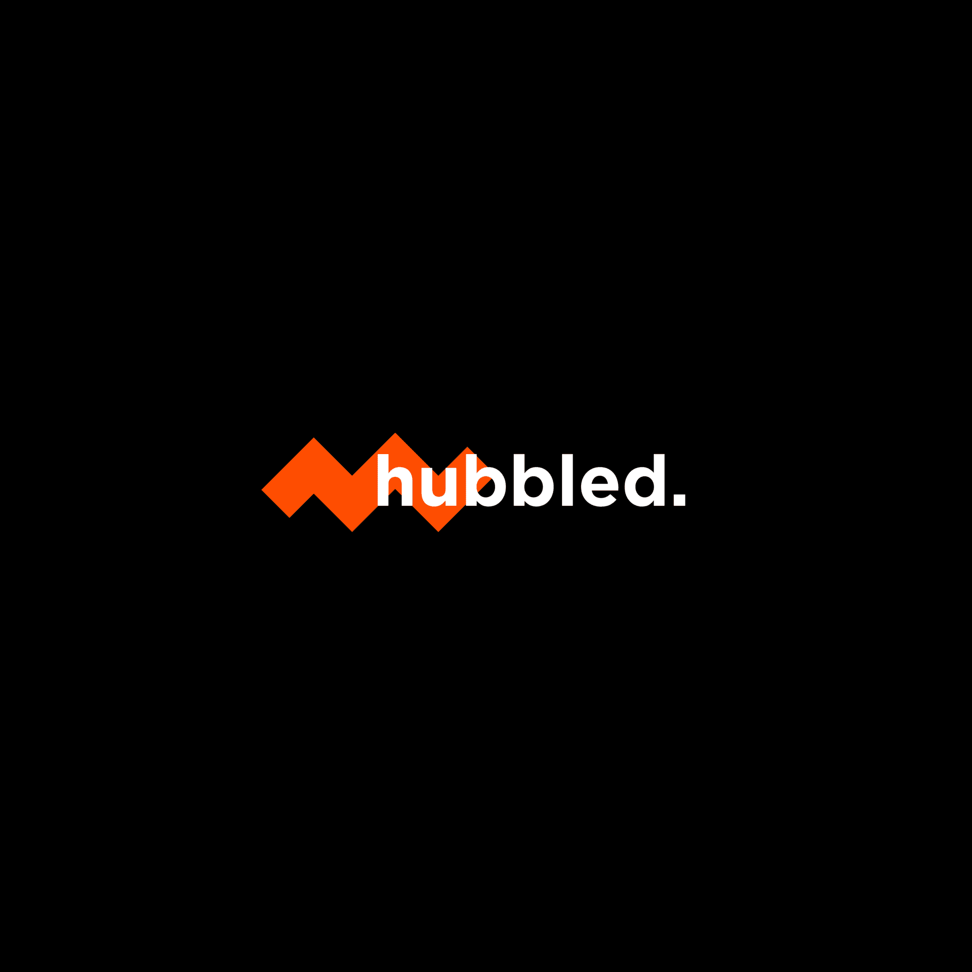
For the typography fan that I am, the logo, website, and social media designs are type heavy. To round out the logo, a vector inspired by the concept of wavelengths and sharp edges was added.
This project was completed entirely in Figma. This is one of my very first projects. So, like everyone else, I began this project with extensive research and the creation of a moodboard using Pinterest and Behance. I couldn't settle on a logo that I designed. So I asked my colleague Ashley Alexsius, who is an amazing at typography, for advice. Keeping that in mind, and after a few more iterations, we had the logo!
I was a Gotham font fanatic during the course of this project, so the social media design came together quickly. The design challenge was to strike a balance between bold typography and massive imagery. So I carefully selected images with pitch black backgrounds (which are quite easily available, after all, it is outer space!). The posts were text-heavy, which may or may not have intrigued the users' interest enough for them to stop by and read. To address this, I wanted to highlight the words that were the focus of the post, which I accomplished by curating gradients using the colors of the post's image. And it looked fantastic!
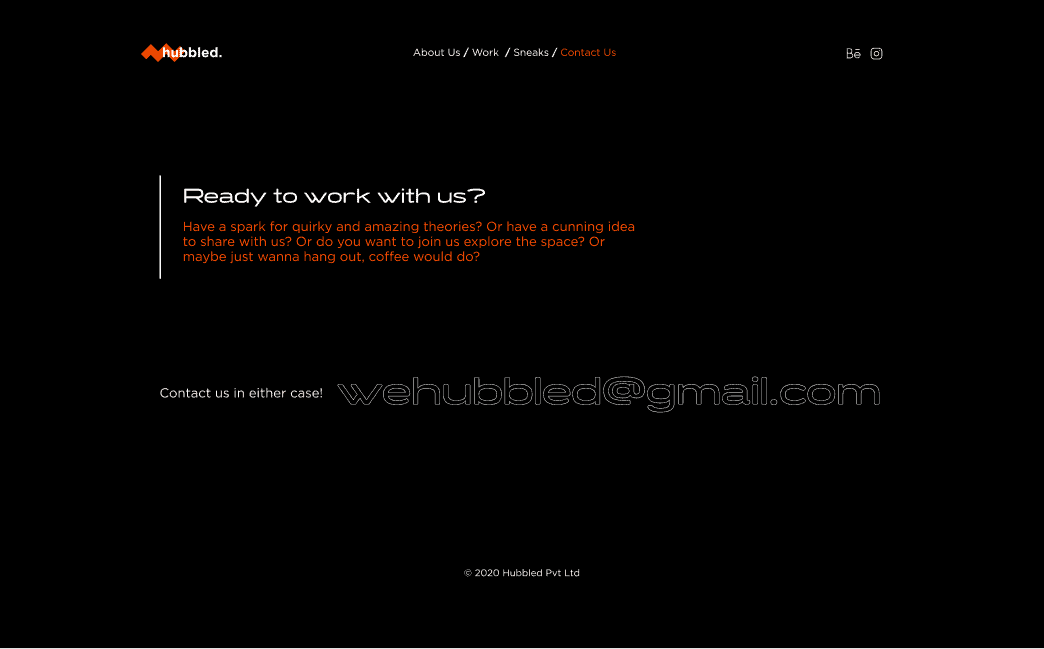
I attempted to design the website in the same aesthetic as the bold futuristic desktop sized websites on lapa.ninja. The use of turismo, a futuristic font, and the use of bright orange over black gave the website a very nice finish. I made certain that the website was easy to navigate and that the design elements were not hindering that in any way.
For this project, I received a lot of positive feedback, especially on the social media posts and websites. The clients were extremely pleased and praised the designs highly.
While working on these projects, I learned a lot about typography and gradients. Gradients were something I'd never done before. However, after some trial and error, they worked perfectly here. I discovered that using too many fonts is a bad idea. Minimal designs are not as simple as they appear. Putting everything together is a huge pain that requires a lot of practice.
Less is more, and the devil lurks in the details!
I love this, very simple and striking!