Hydrangea

Hydrangea cosmetics is a conceptual brand for a beauty company. This project was created because I really, really love the elegance and the fragrance of this beautiful flower called hydrangea.
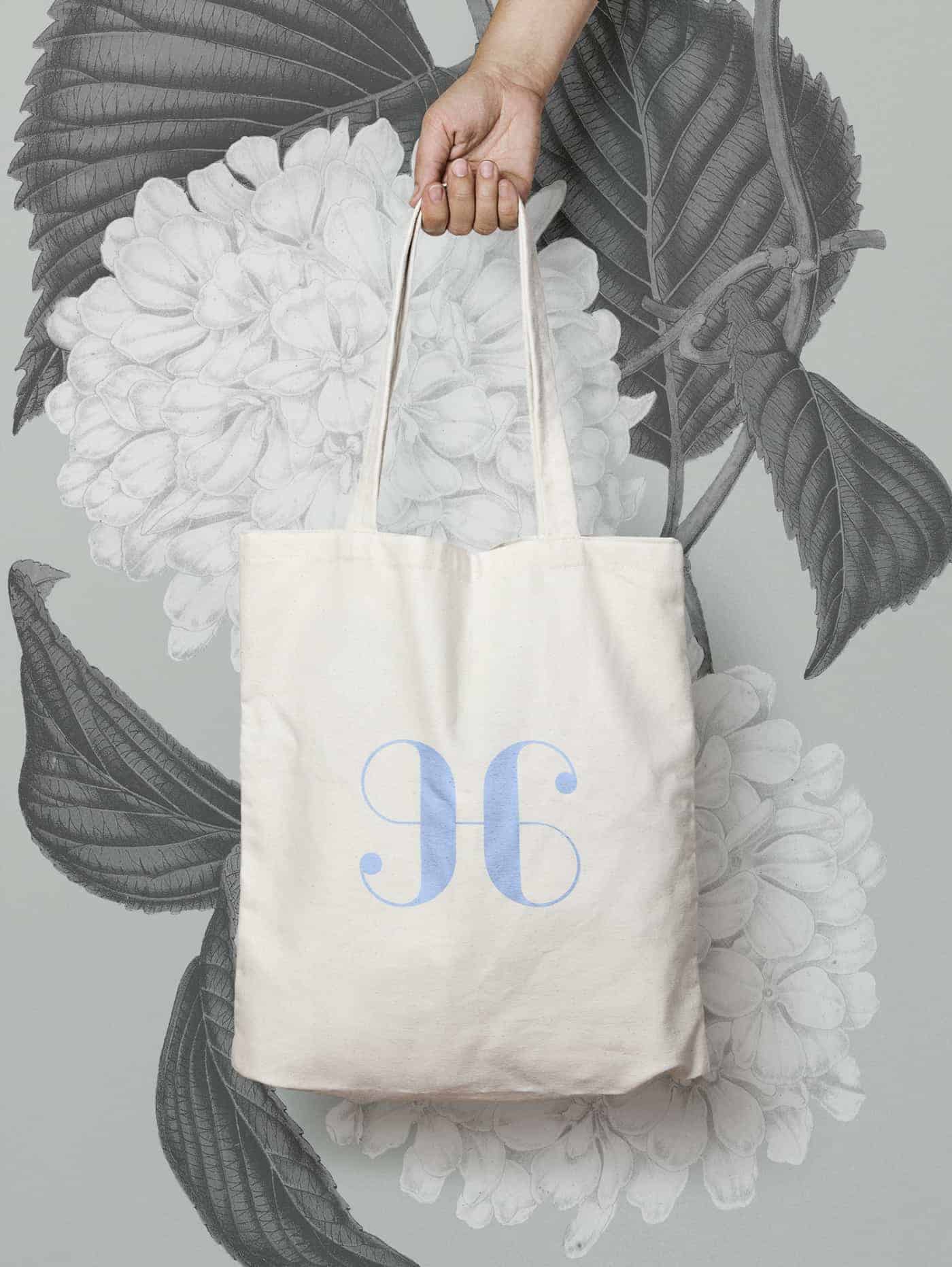
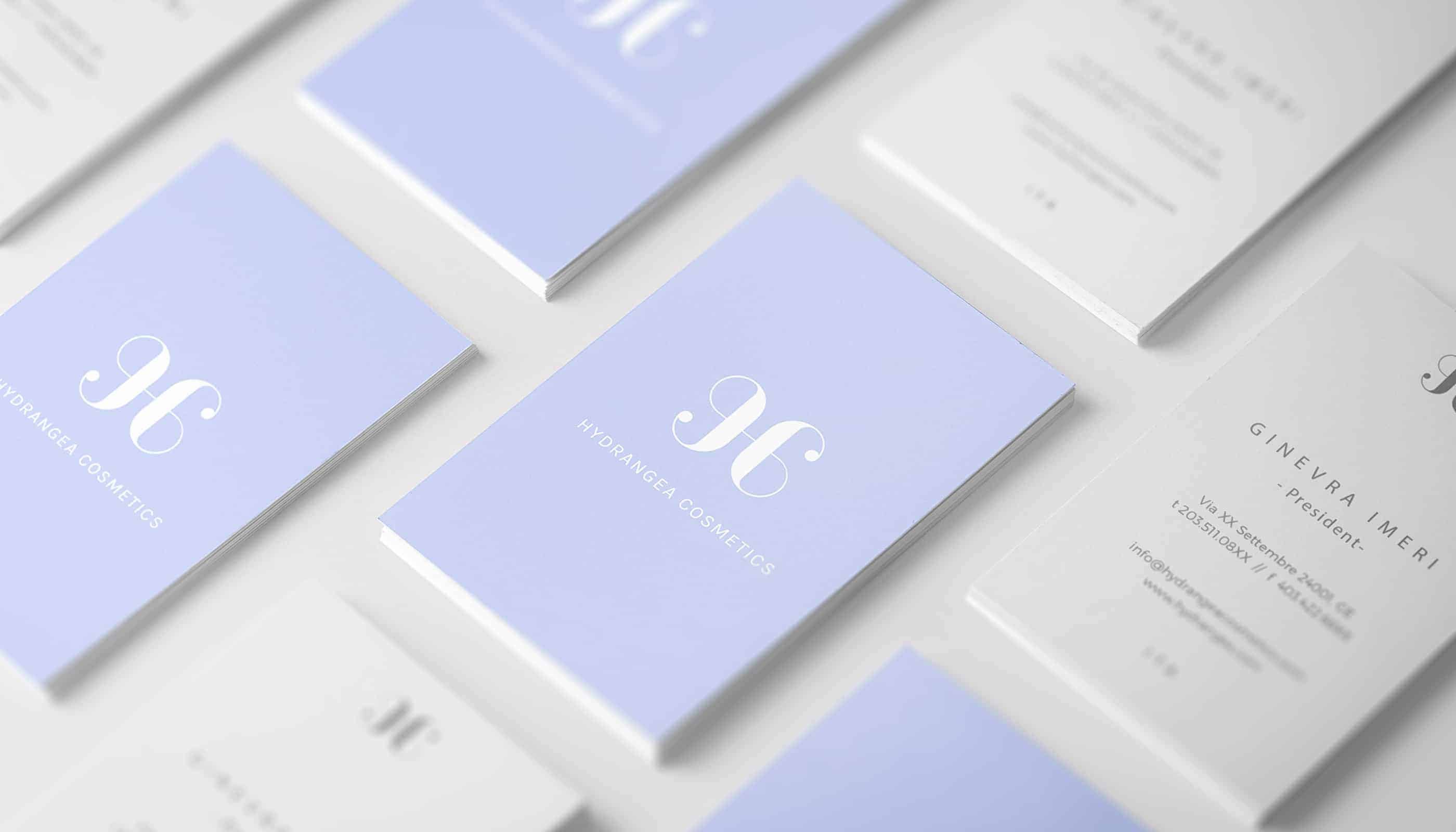
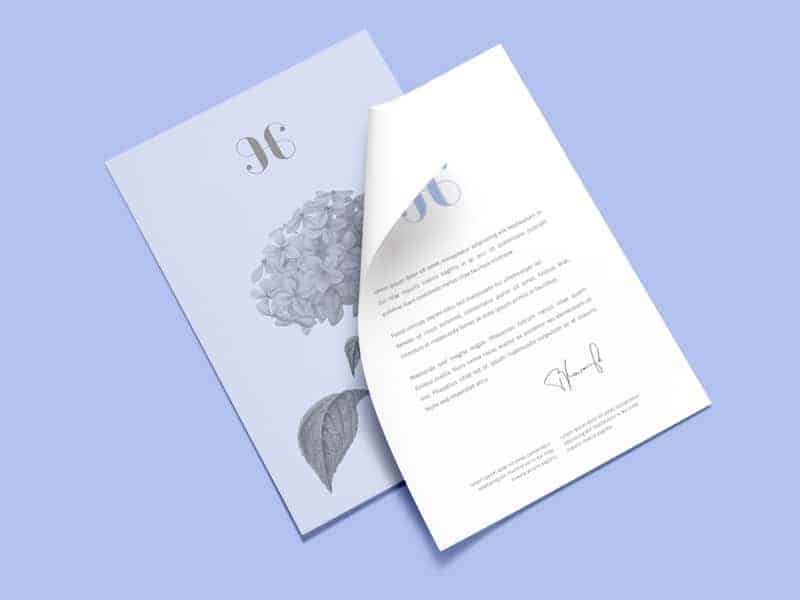
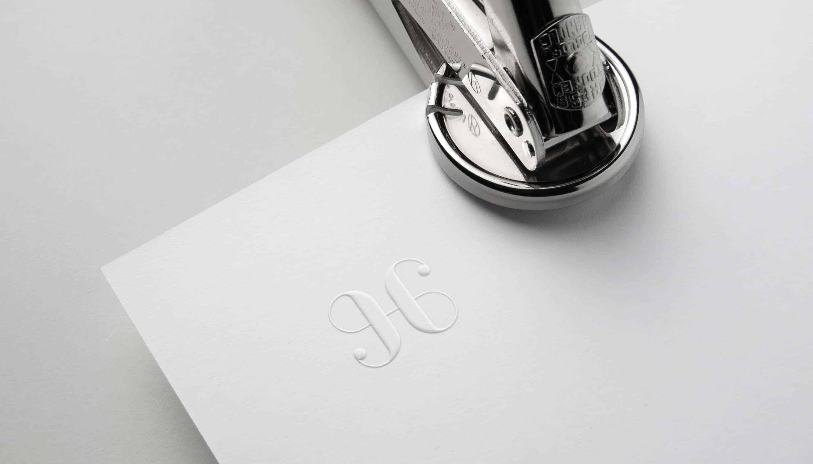
Inspirated by my personal monogram I decided to create a monogram that rapresent the armony and the geometry of this flower and I choose three different color: light blue, grey and white.
![]()
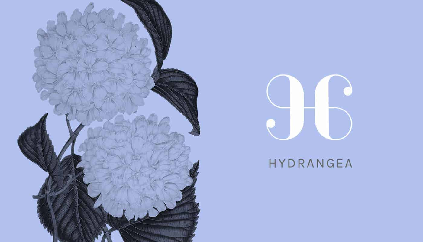
I recently came across a wonderful book of flowers and fruits so I decided: why don't use those illustrations for a new personal project? I decided to create a monogram of the first letter of hydrangea that was similar in style to my personal monogram.
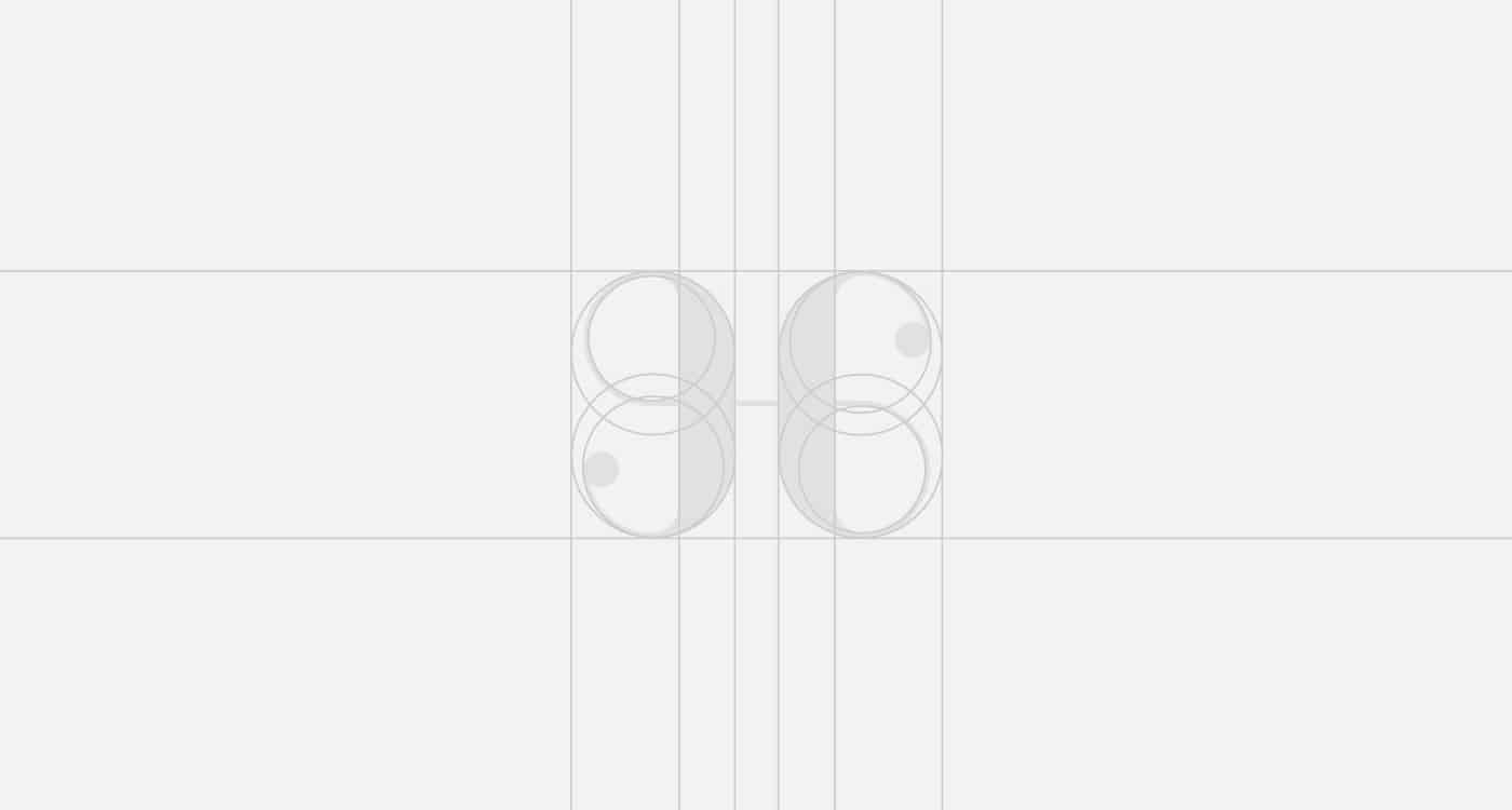
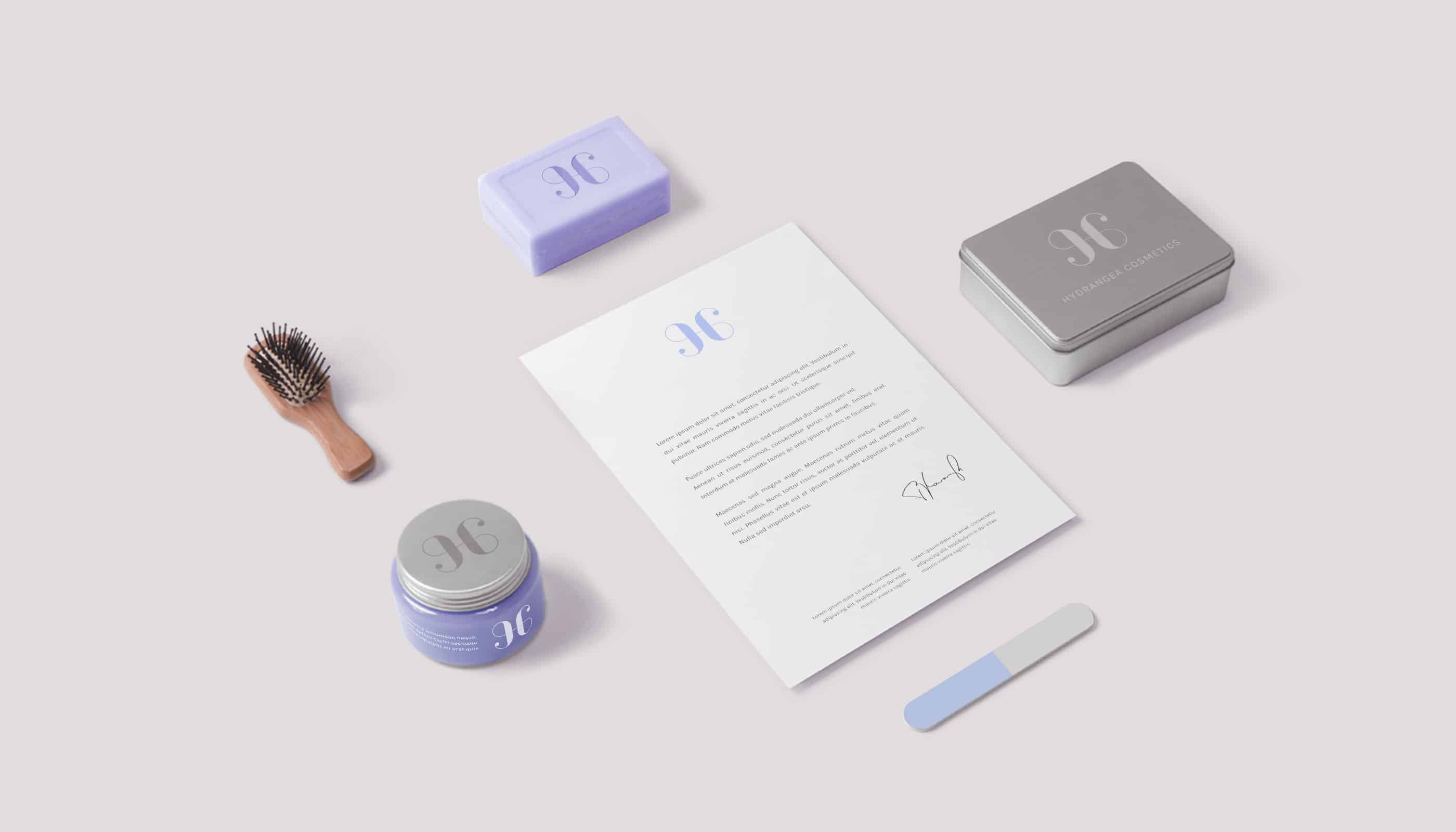
I used illustration to make this artwork but before, as usual, I started with some sketches. The illustrations of the packaging came from a collection of vintage flowers images I found some time ago.
After that I used Photoshop to make most of the mock-ups.
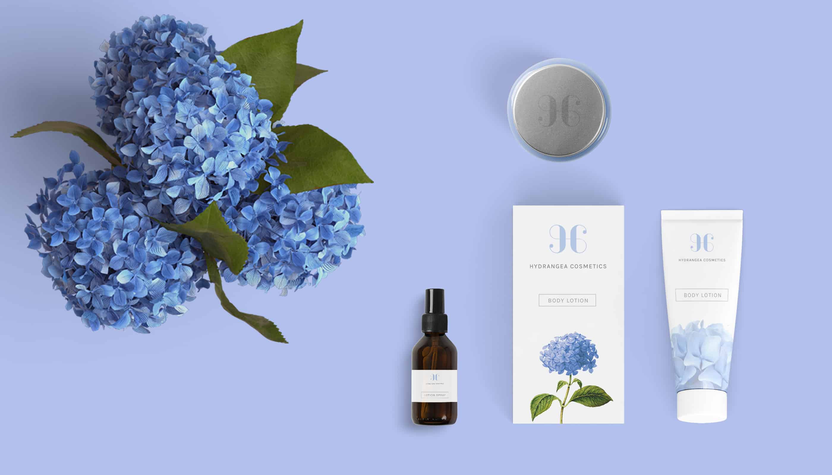
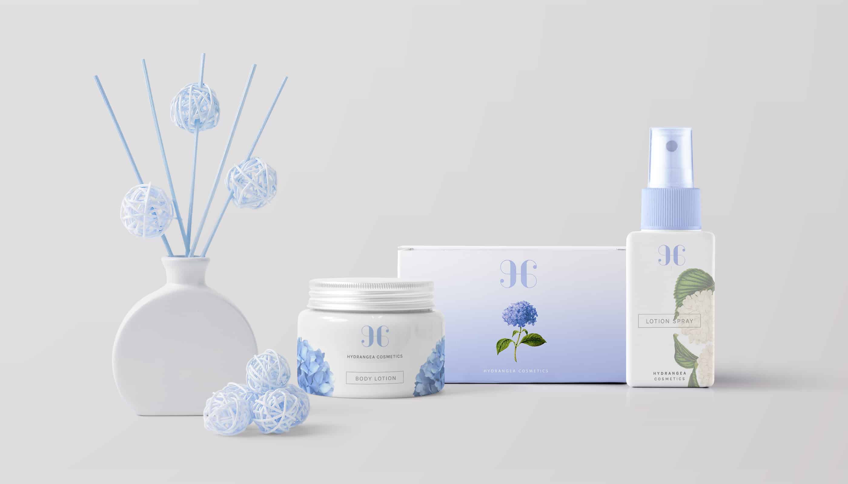
It's amazing how you can impress people just with colours. Using the right colour combination it's very important in making a catchy project and I think it's not very simple too. In fact I spent a lot of hours trying to find it but in the end I think I've found the right one. So, don't be afraid to spend some time mixing colours, try and explore until to discover the right combination :)
nice