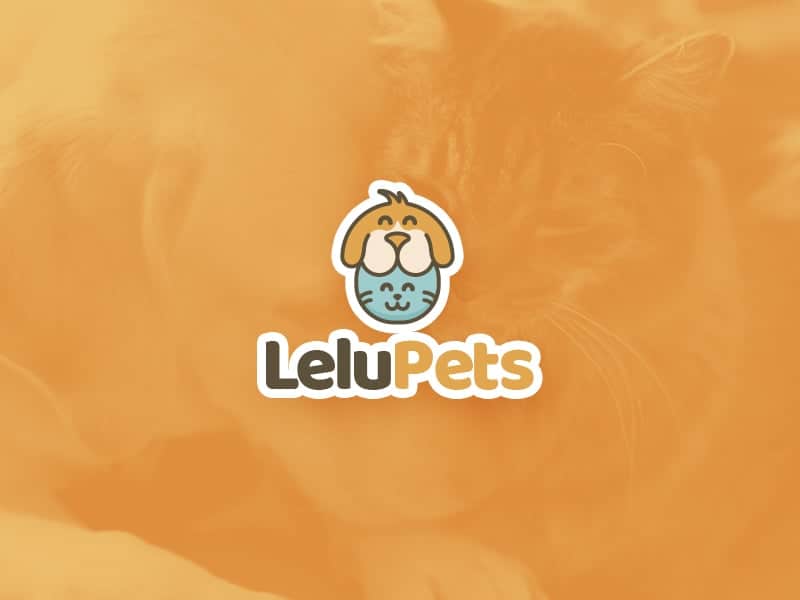
Identidade Visual Lelu Pets

The Lelu Pets brand is a company that works with the distribution of veterinary products for dogs and cats. These products range from medicines, accessories and toys. After a market expansion the company felt the need to reinforce its positioning, one of the strategy was the redesign of its entire visual identity. The main idea was to show the company's values, to give credibility to the new market and to interact better with the final public.
I always try to go through 4 steps in my projects, research, sketching, interaction (testing) and production. I am very sympathetic to agile methodologies and the concept of design thinking, so I like the customer to participate in the creation and I like to experiment or go through the buying process to understand how that product or service will be consumed. In the end this avoids long changes and increases assertiveness.
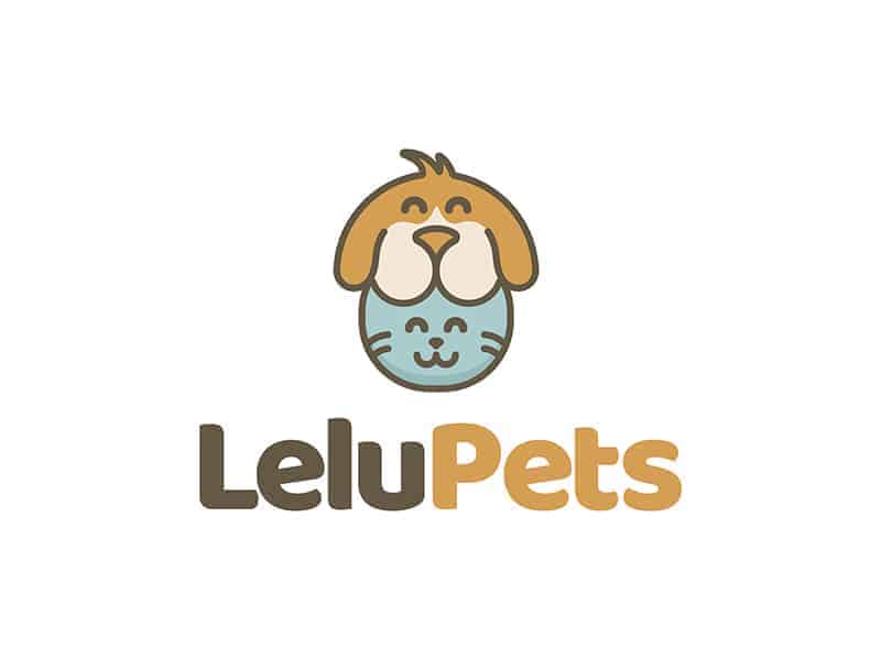
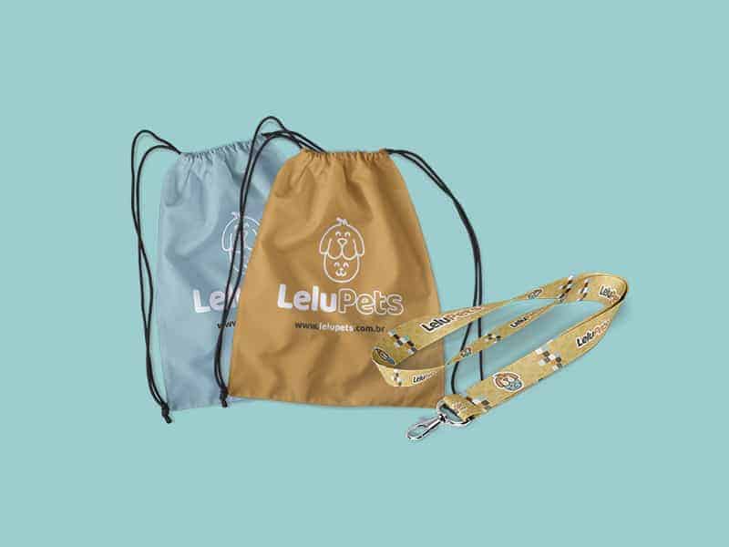
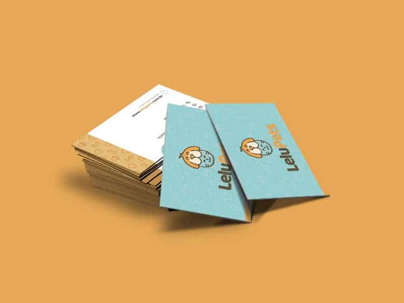
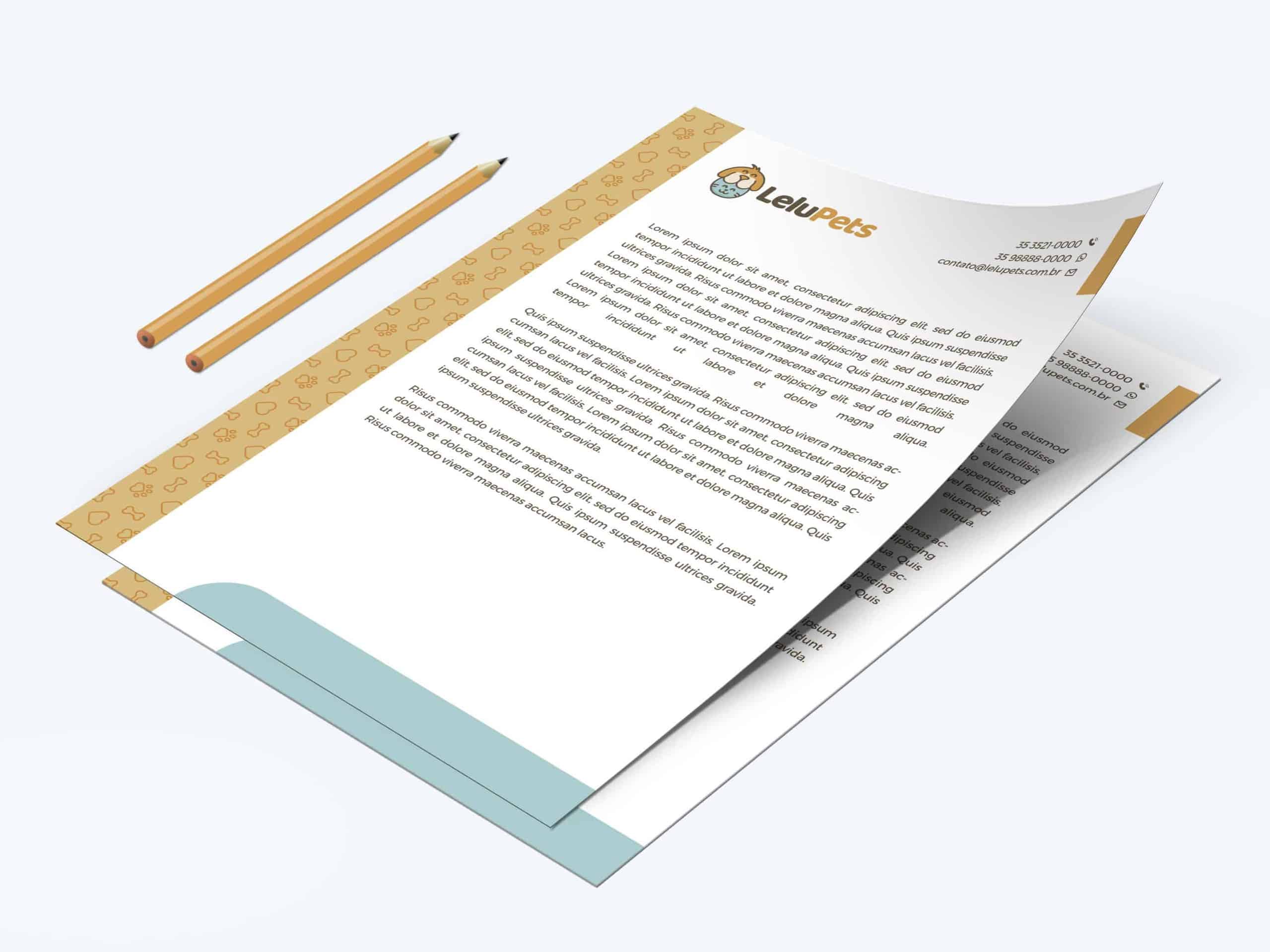
For the Lelupets project, my idea came not from the end customer, but from the final "consumer", the pets! With the brand working only with dogs and cats, I decided to illustrate them so that their shapes intertwined. The proposed color palette was developed from the color psychology so that the brand achieves its persuasive goal. For Lelu Pets' new visual identity, we work on the following key words: Warmth, joy, serenity, softness, confidence and tranquility. The colors were: Indian Yellow, Umber and Pastel Blue; In short, this tonal combination features harmonic samples in pastel variations, Indian Yellow conveys warmth and joy, Umber incites confidence and serenity, while Pastel Blue ensures softness and tranquility. And for contrast: Sonic Silver, Platinum and White Smoke Weight and Tint; The adjacent samples provide refinement while combined with the above shades. The result of this palette has an interesting contrast and ensures better readability and visibility for the public.
The typography I used was Baloo Bhai for the main logo because it has a heavy design with a subtle touch of fun. Its round and oval shape suggests carefree, warmth and fun and in contrast its weight gives the feeling of confidence and credibility. And for complementary texts, I used the typeface family Montserrat has a complete set of weights that aims to regulate the reading leaving light.
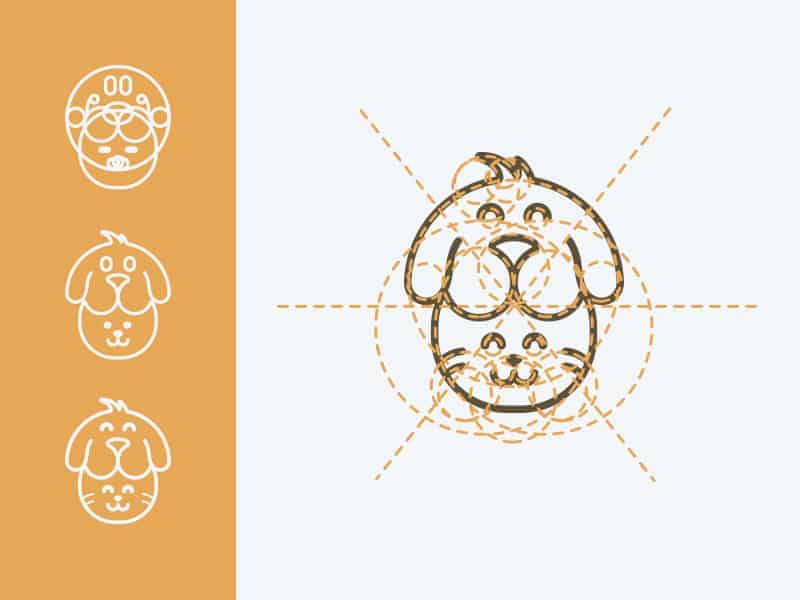
For production, I used: paper, pencil, rubber, Adobe Illustrator and Photoshop, strictly in that order. First I made several sketches, trying to produce something that respected the briefing, was readable to the public and carried my identity. Still in the sketch the idea was presented to the client and after their feedback I moved to the illustration (vector) process in Illustrator. There I used simple shapes such as circles and cylinders to compose the illustration and then I polished its shape until I reached the expected result. After the illustration was completed, I took the art to Photoshop where I applied effects and finished the applications.
Everyone reacted very well, I had an excellent approval, so much so that I was invited to publish here at designideas.pics, reinforcement here my thanks to the whole team for the invitation! I believe that every project, however simple it will always bring a value to be added to our career and even in our life. With this project I had the opportunity to work for the first time with pet segment, so it was all new and amazing.
I would like to conclude this project by saying that I believe that a good design is not only a beautiful design, it must also be functional and interactive! Understanding the needs and habits of customers is essential to plan and develop projects that, besides communicating simply, can influence the human development process. Hug to everyone!
This is an insightful piece!