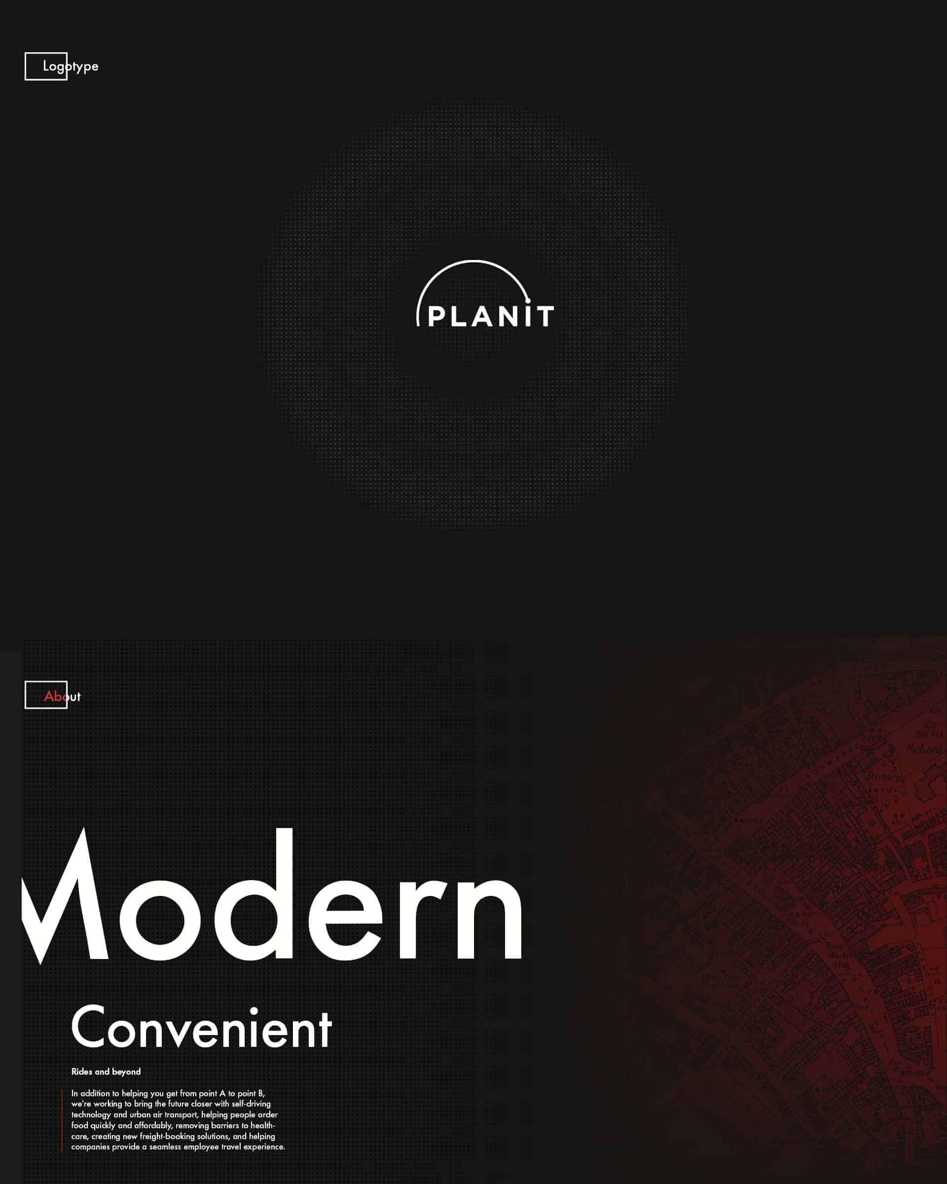
Identity Design For "Plan It"

A project made for the company named "Plan It". It is a company that sells the service to people that want to get from point "A" to point "B" in a quick and safe manner, with its revamped easy to use app. The logo itself is simple and represents people getting from one point to another.
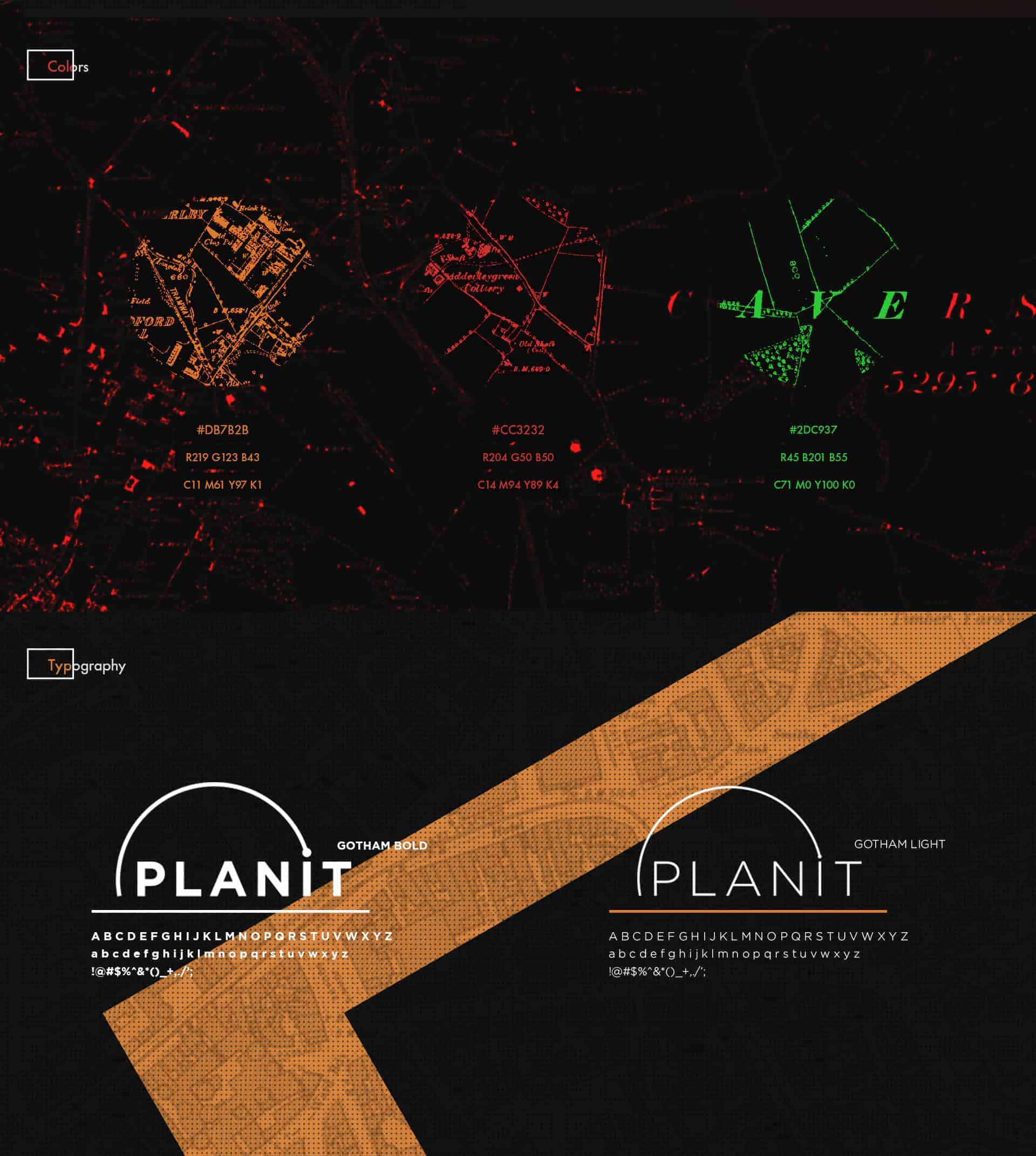
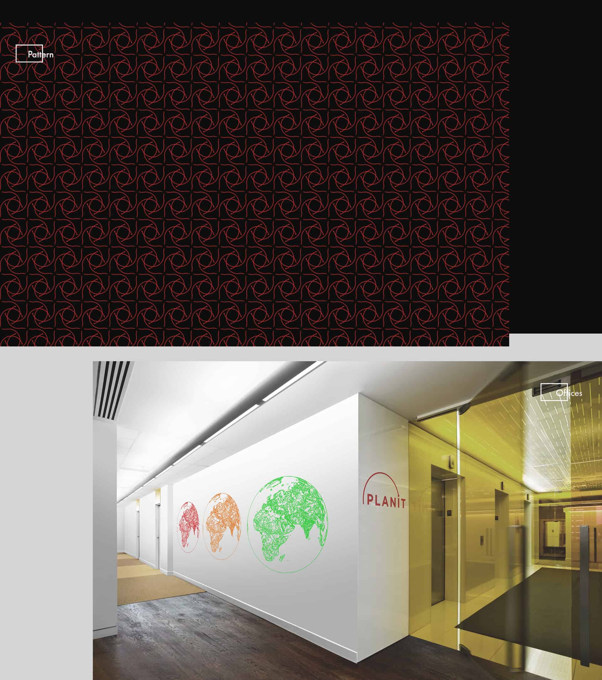
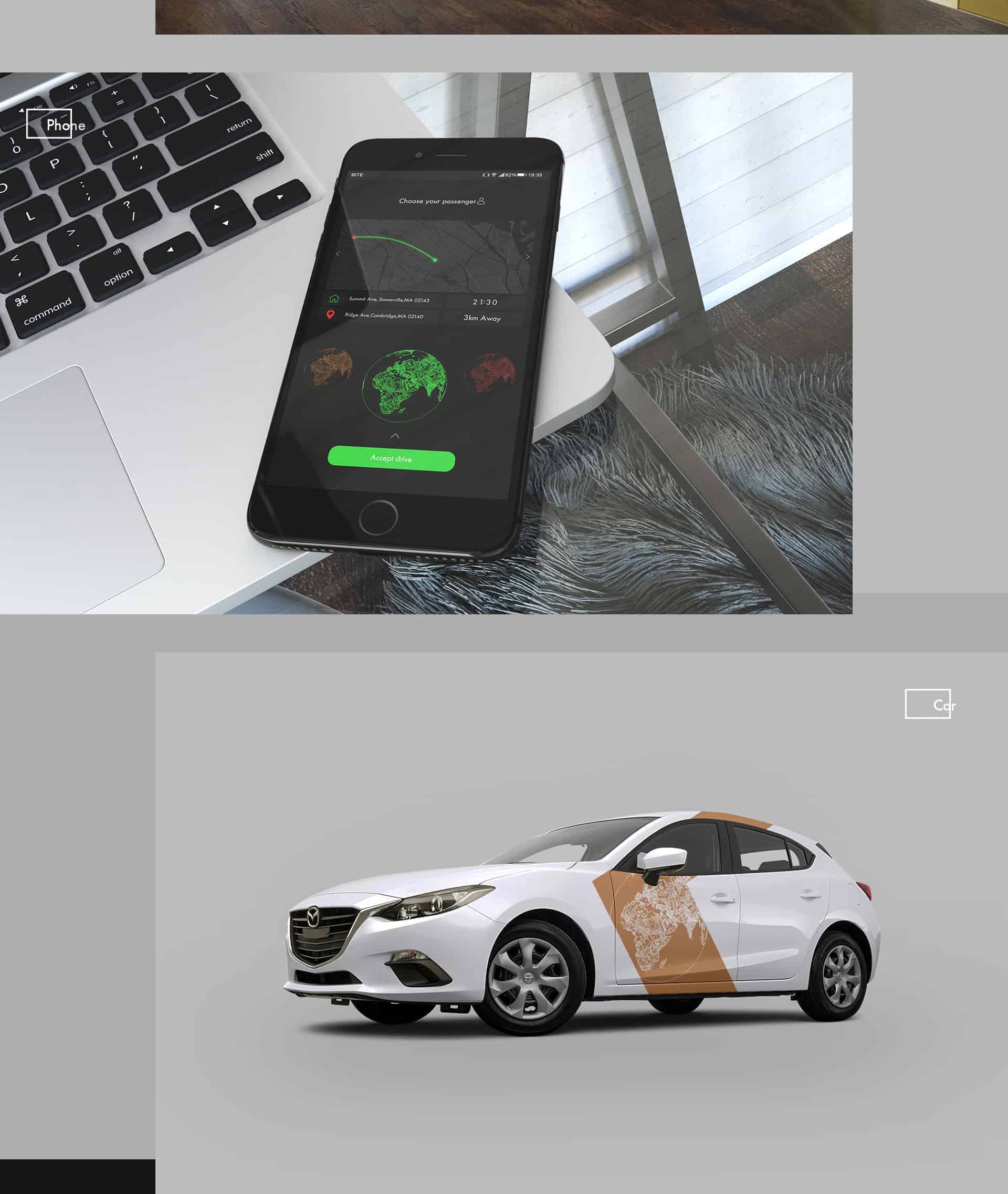
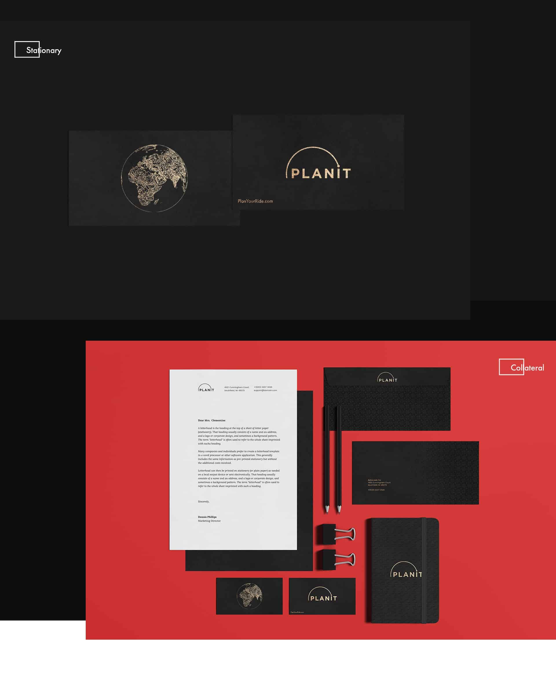
The background in the second slide shows old roads from 1800s.I chose the old roads to represent durability and timeless design.In the third slide i decided to also show the old roads and make something interesting to present the color palette. The element that represents the roads and the whole planet will be used in the app. The app is used both by the driver and the passenger. The three colors representing the stop light will be used to represent three options. Red color is used to cancel your ride. Orange is used to delay your ride. And green is used to confirm your ride.

I usually don't even start designing anything without generating some ideas.After coming up with some ideas I'll sketch the logos and layouts and then bring them to Illustrator,Photoshop and InDesign. I used Photoshop to modify the photos and to create the pattern.Illustrator was used to create the planet element and the logo. Lastly i used InDesign to layout everything else.
People responded positively to the whole project. They really enjoyed the logo and the color palette that was created to represent a stop light.I also realized that creating the right pattern can be the difference between bad and good design.