Identity for Granvik Shipping SA
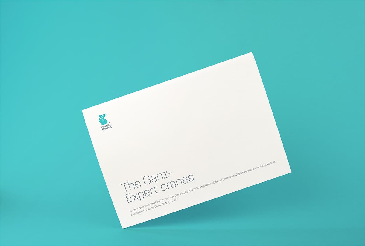
We have created the new brand identity for Granvik Shipping SA which is a large player in transportation and transshipment of cargoes on the high seas. We found a clean and alive image that reflects the brand activity and philosophy.

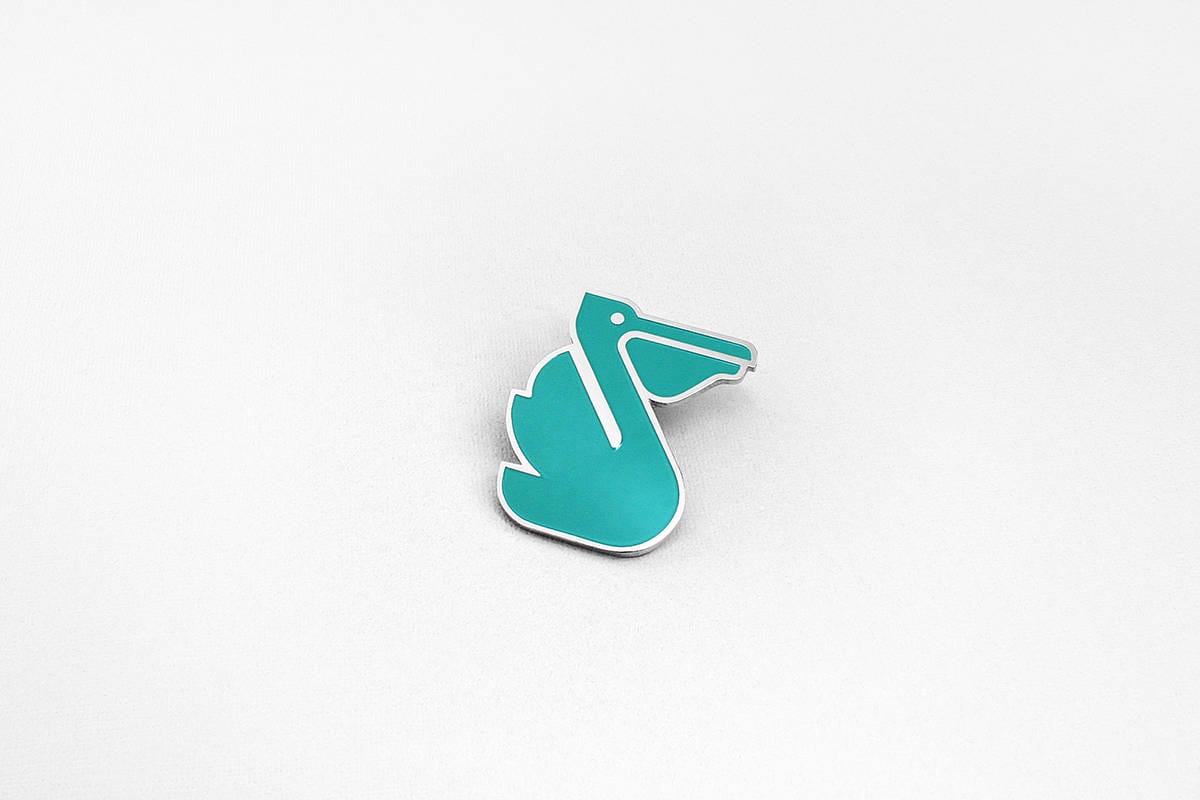
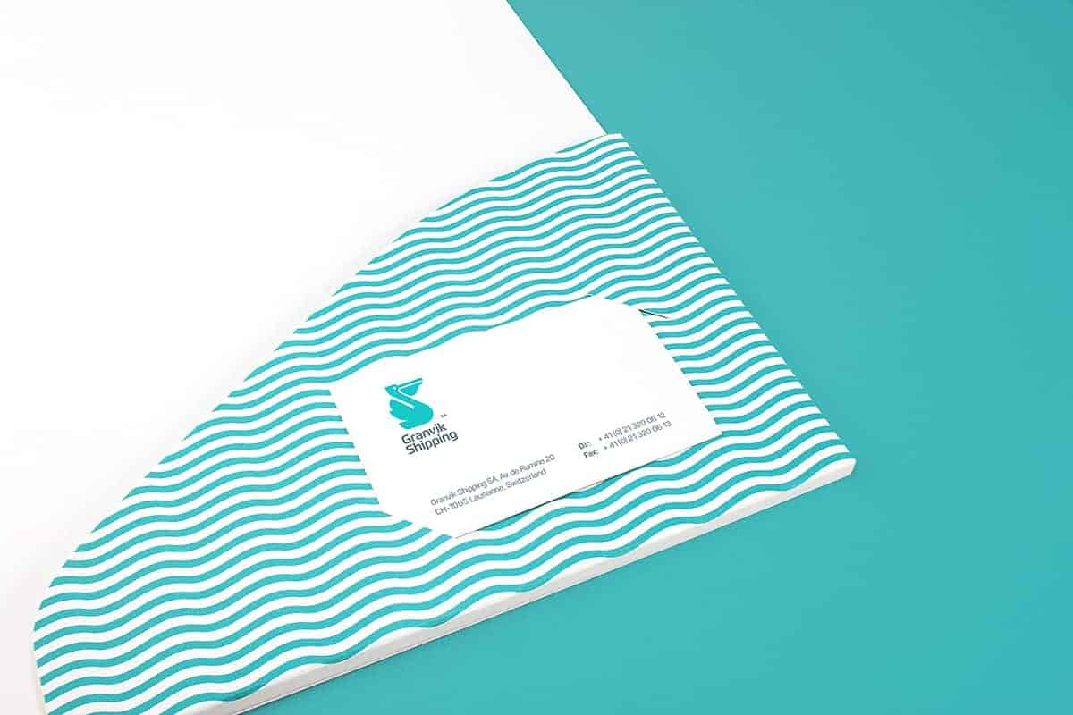
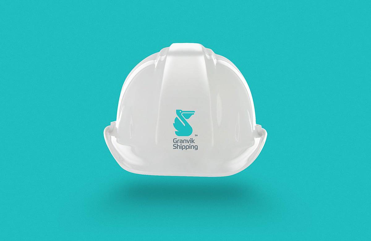
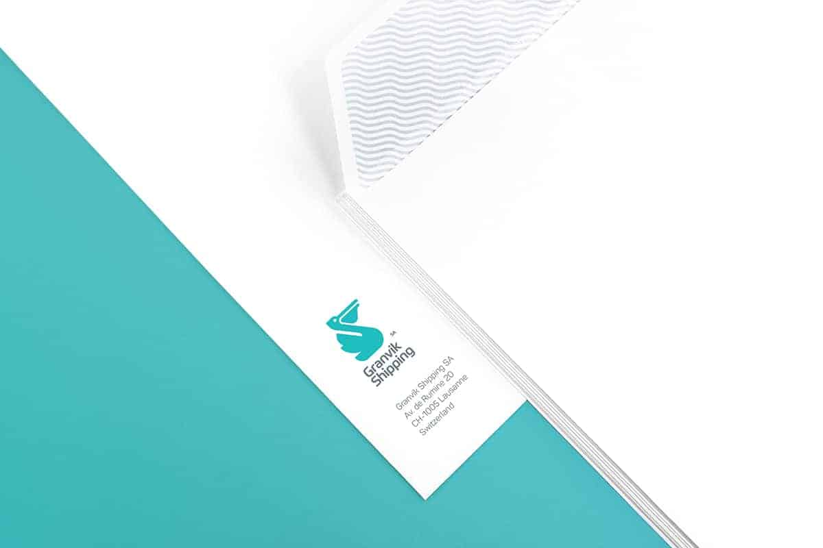
Pelicans are characterised by a long beak and a large throat pouch used for catching and transportation prey. Identity had also complemented by the wave as an auxiliary element that provides an association with the specifics of the company.
The choice of color was dictated by the brand's specific. We selected the color of sea waves. And it's a color of crane's deck and grab.
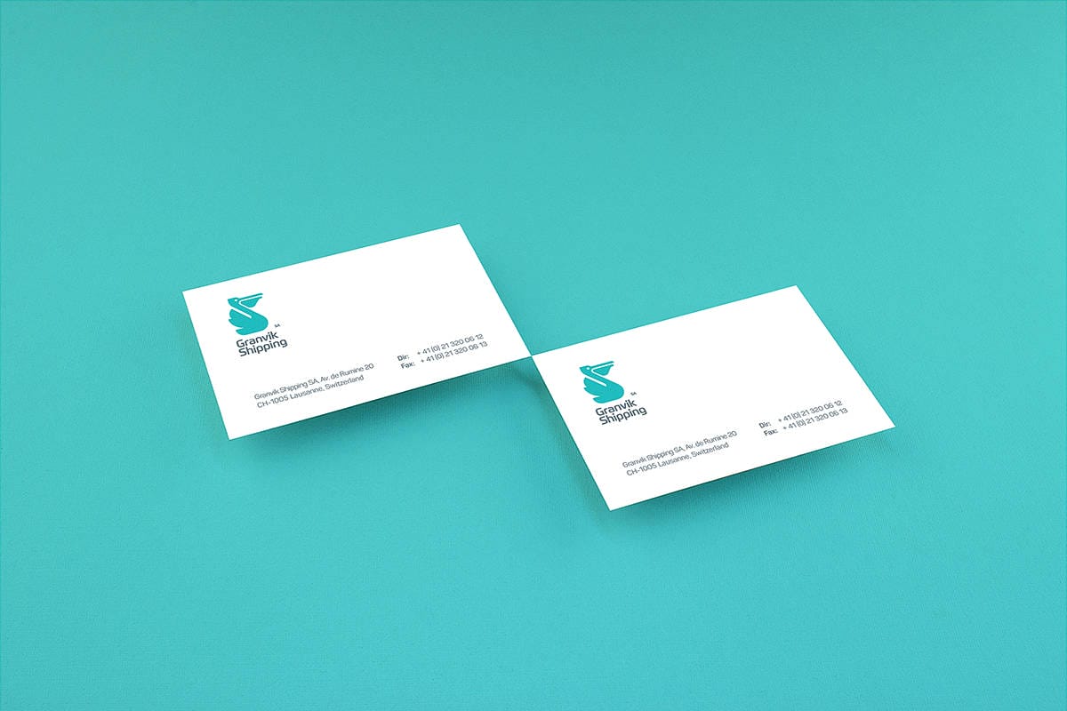
We started with pencil and paper for brainstorming with a team.
After finding this image we drew a lot of sketches.
After that we created vector logo in Adobe Illustrator and tested a new logo on a different products and corporate materials.
For design process we used Adobe Illustrator, Adobe Photoshop and Canon EOS.

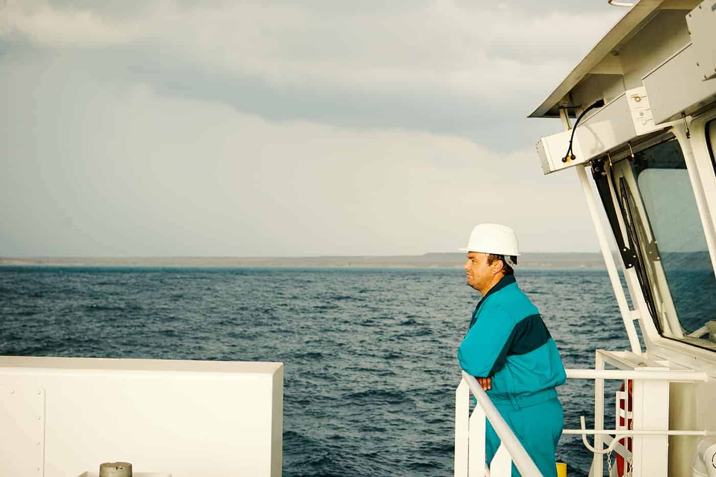
This project gave us a lot of new experiences. During a week we were at high sea, watching the transshipment of cargo and communicating with the team.
We take photos and video for corporate materials.
And of course now we know a lot about pelicans :)
some people need your contact details to offer cargos for your vessels. like me