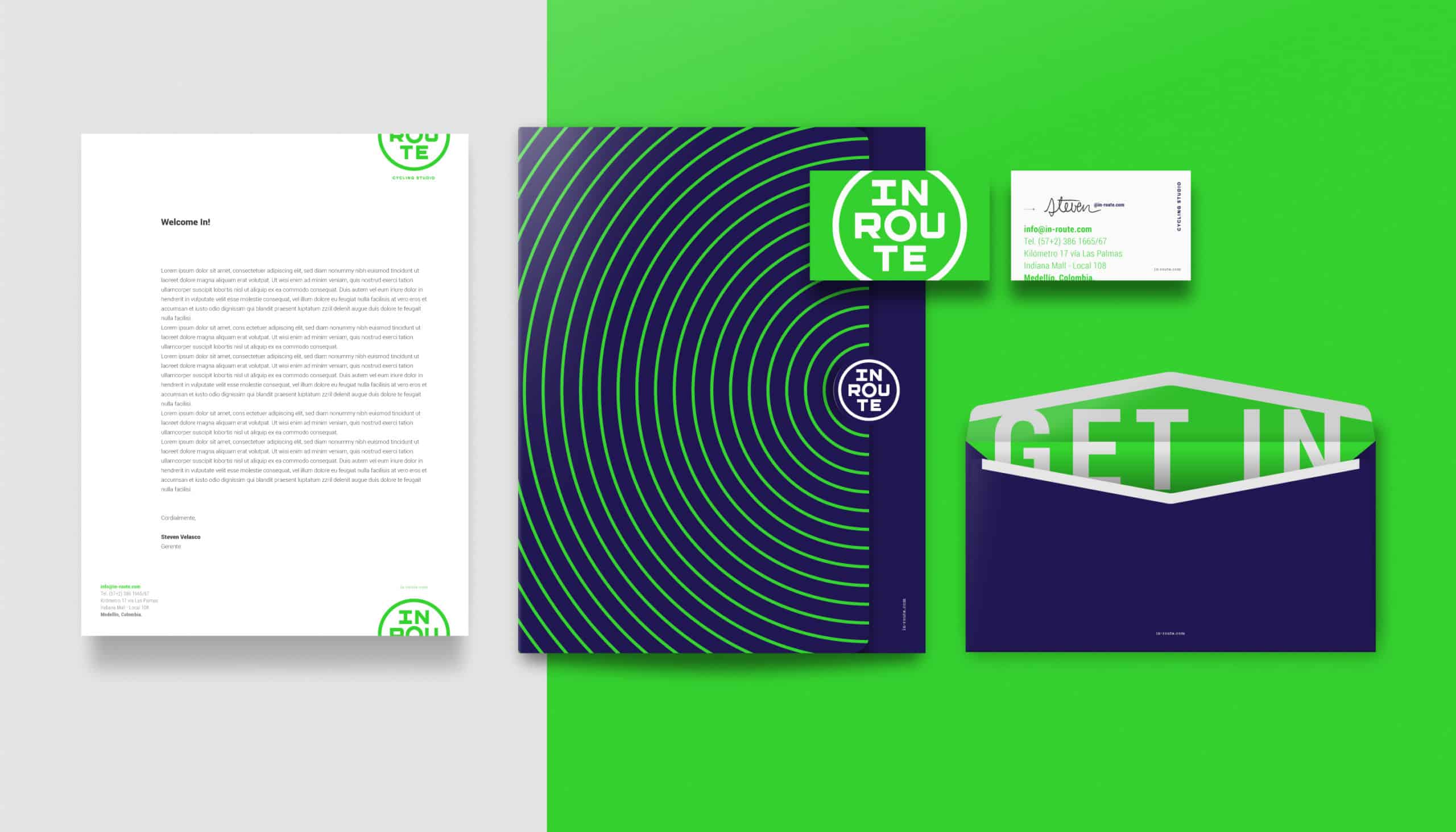
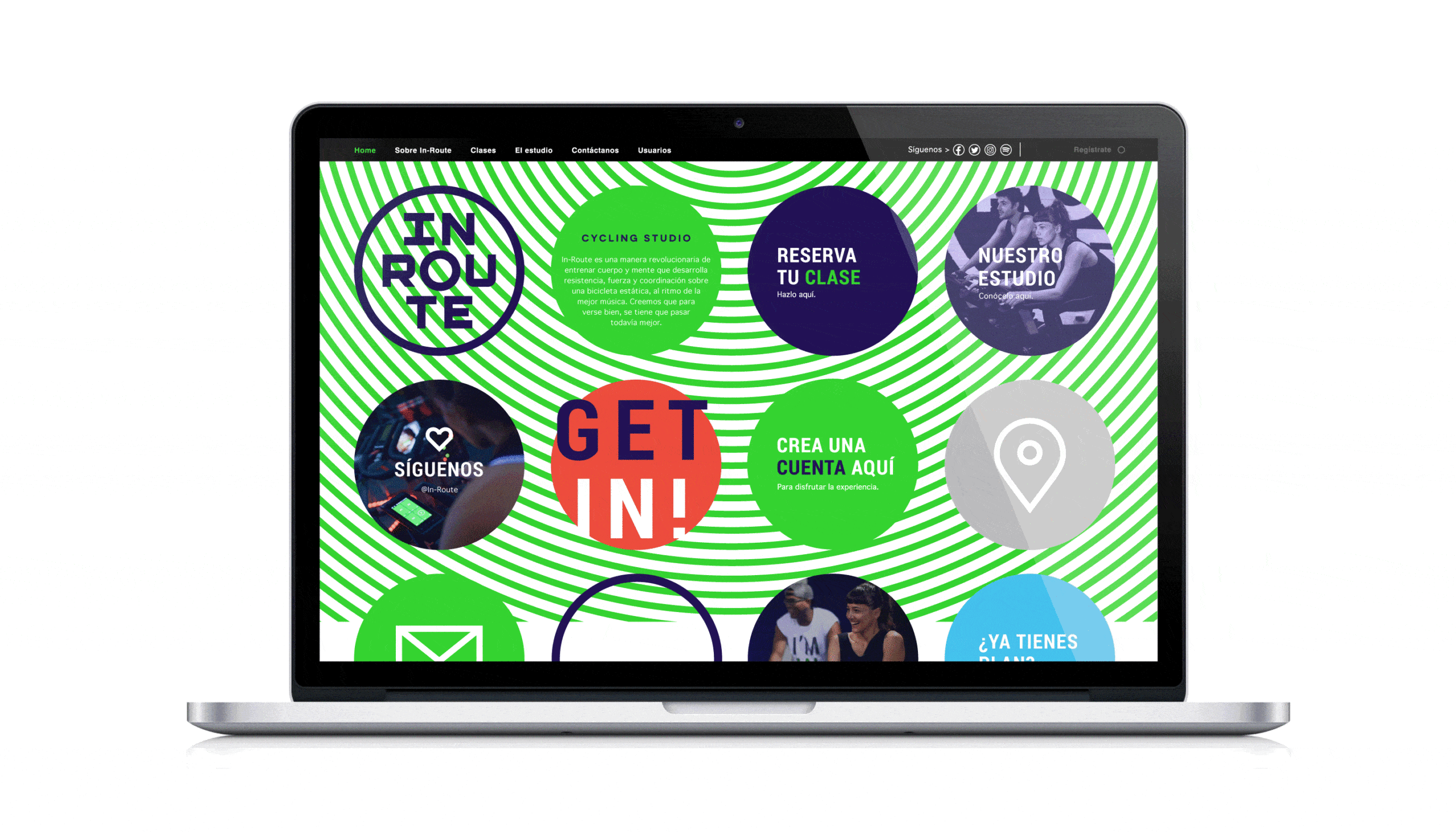
In-Route, cycling studio

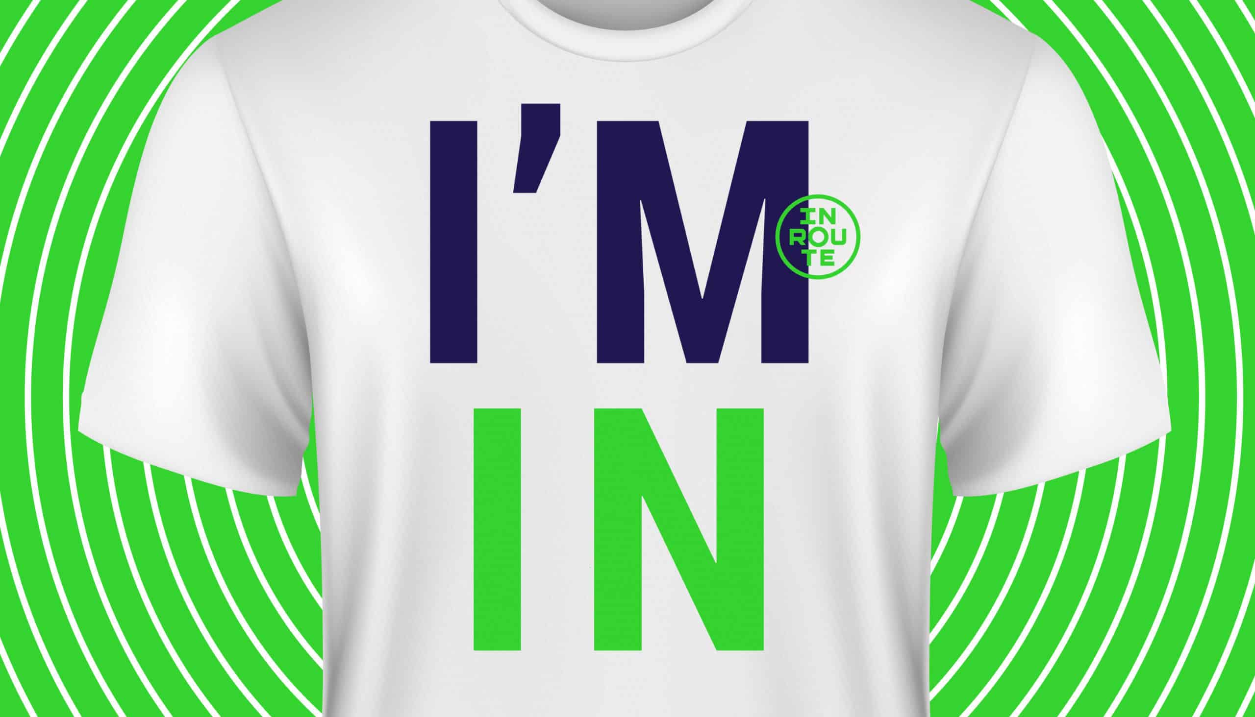
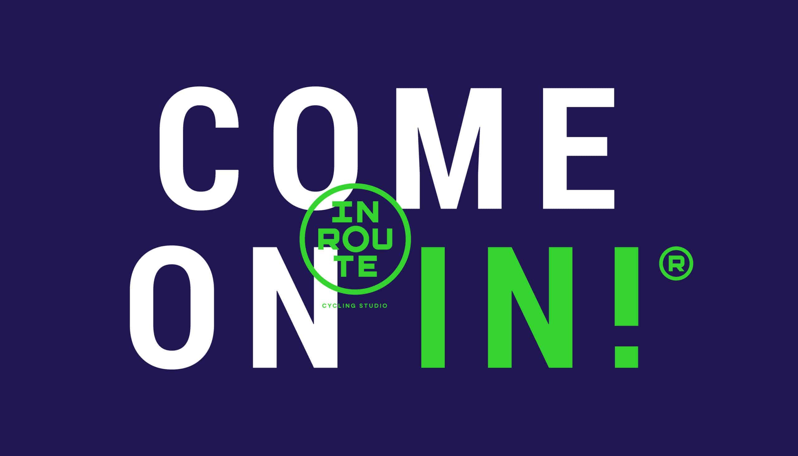
A vibrant, dynamic and attractive visual identity for a new fitness concept in Medellín (Colombia), inspired by its own clients. In-Route Cycling Studio combines music, technology, good attitude and exercise bikes to offer a new experience to the public, designed for the development of body and mind.

![]()
The colors, typography and visual style of the brand are inspired by the same experience that is lived within this cycling studio. Neon lights and electronic music add amazing energy to your daily spin class.
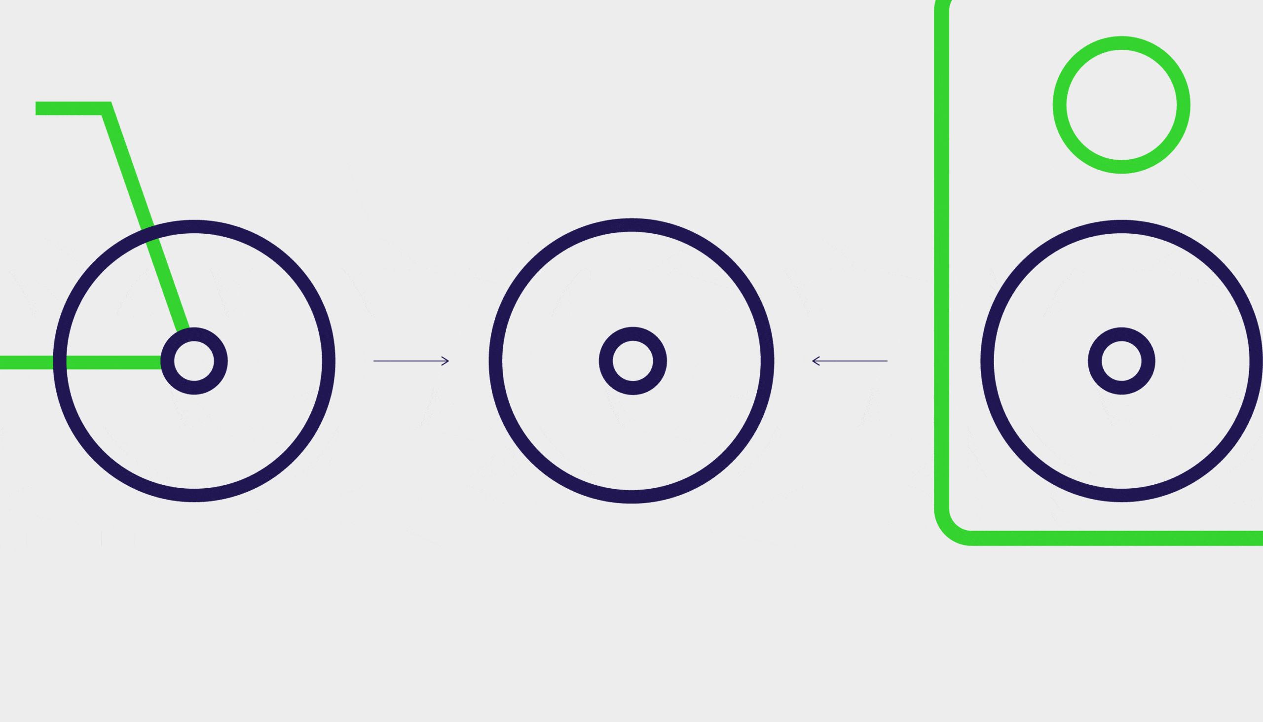
Regarding the logo, it was necessary that it could "spin", in the end it is a cycling study. In addition, the circle turns out to be the common shape between two of the important elements of the experience, exercise bikes and a speaker that represents the music.
Every project I do starts on a sheet of paper. Then those sketches are taken to Adobe Illustrator, where the details are refined. But without drawing first, it would take much longer to figure out the ideas.

You always learn from each project, you find new ways to come up with ideas, different ways of approaching the creative process, etc. In this case, the positive response of consumers to the brand, taught me the importance of finding visual resources that connect the visual identity of a brand with the experience it represents.
Amazing
I love the patterns!