INTECH. Marine electriс. Identity

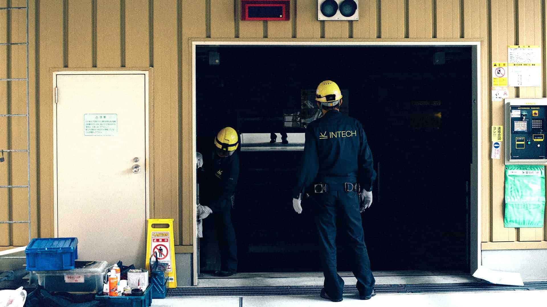
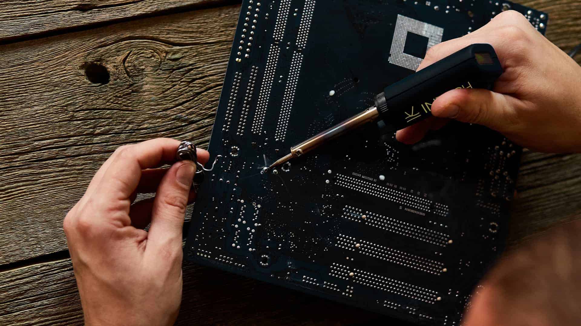
We created a logotype and brand identity for Intech marine electric company which based in the USA, Fort Lauderdale, Florida.
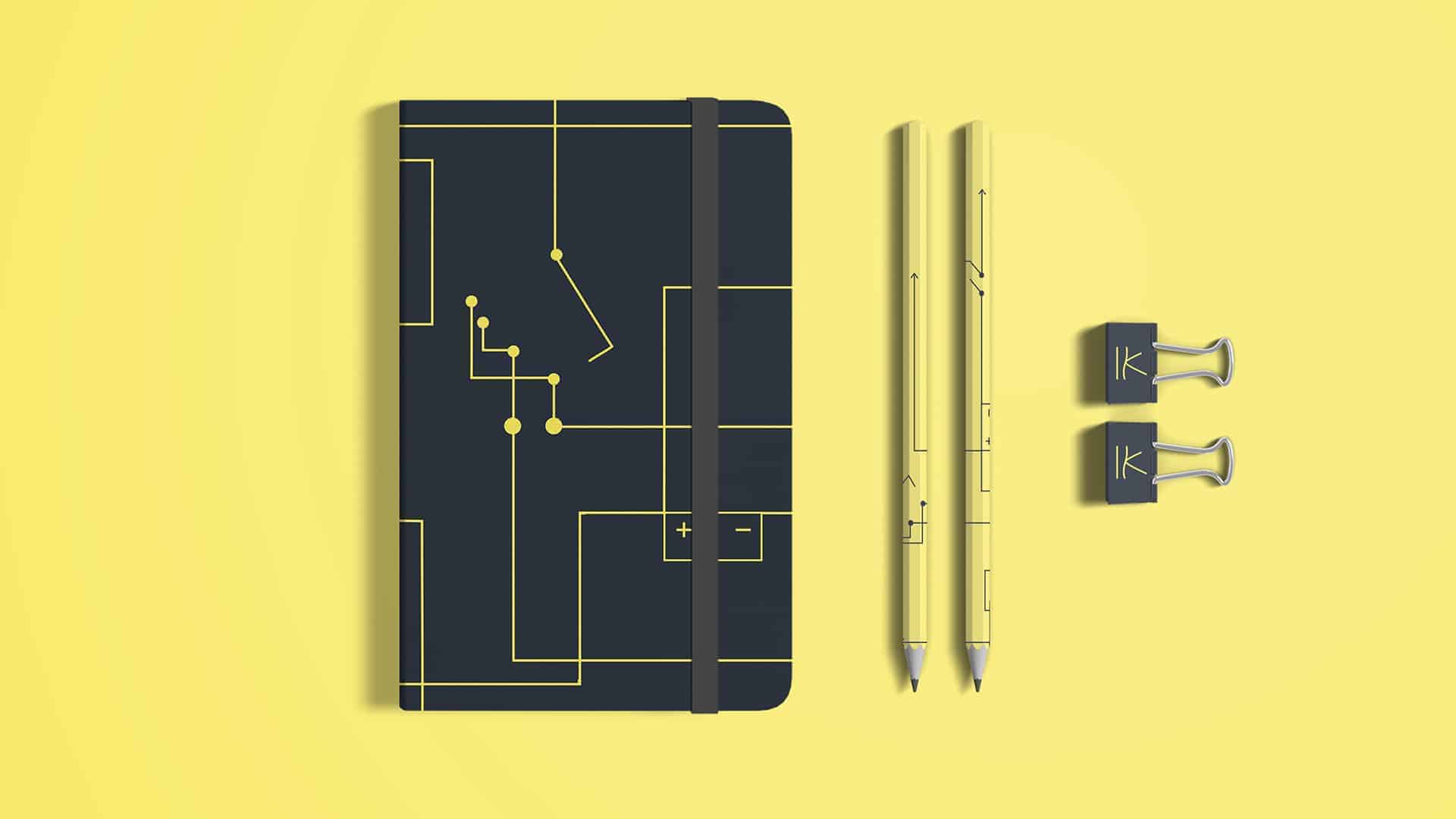
The logo is based on the fact that the company is specialists in electrics and electronics. We took direct and alternating current graphic designations as a basis. It is equally important to secure an image of expertise. Therefore, the done sign is introduced. And, in addition, it will be easy to find in the mix of graphic elements the bow of the yacht, plowing the waves.
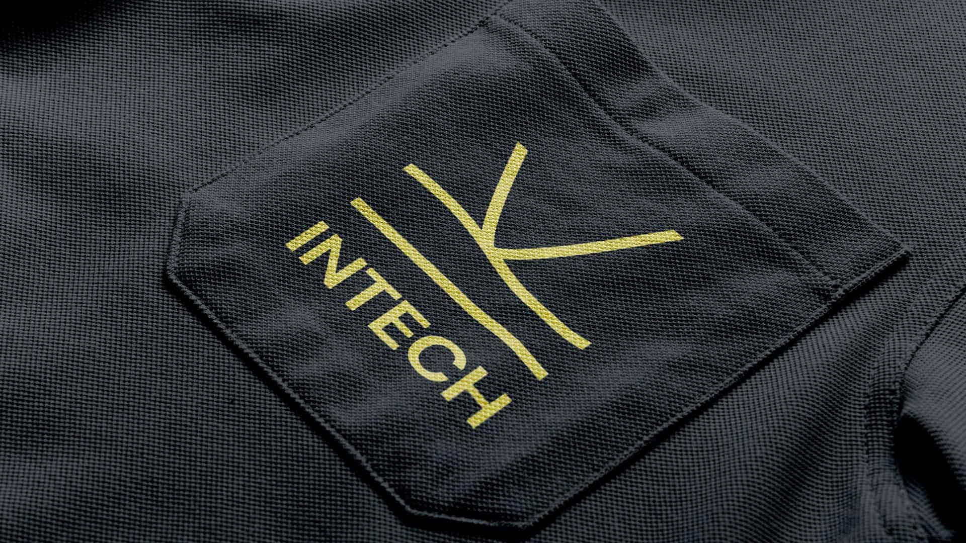
The logo is based on the fact that we are, first of all, specialists in electrics and electronics, which means we are dealing with direct and alternating current. We took its graphic designations as a basis.
In addition, the current is the directed movement of the carriers of the electric charge. This means that the logo should be dynamic, as well as convey the image of a company that moves in step with the times and uses up-to-date approaches to solving problems.
It is equally important to secure an image of expertise. And already in visual identity to show that we bring everything we started to the end. That any challenge is within our reach. Therefore, the done sign is introduced.
And for people who understand absolutely nothing in physics, it will be easy to find in the mix of graphic elements the bow of the yacht, plowing the waves.
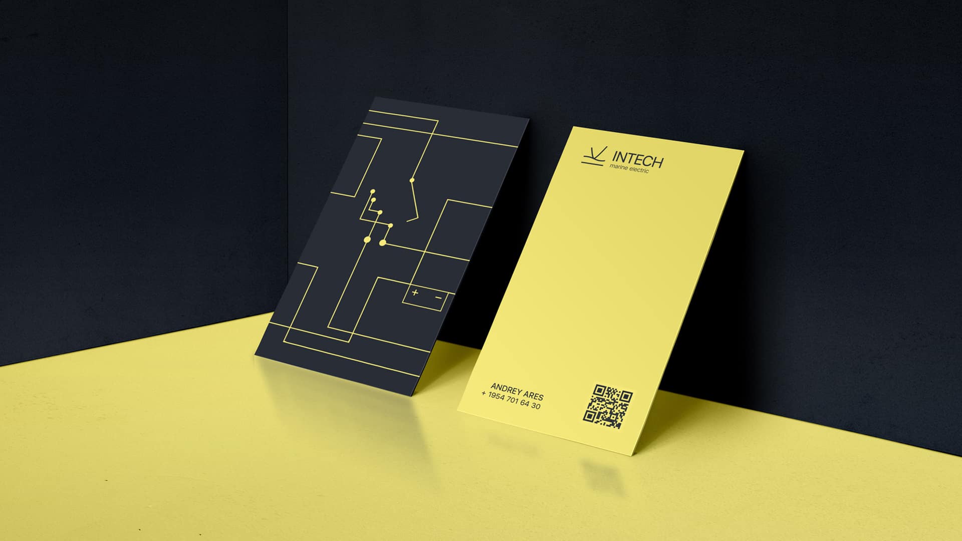
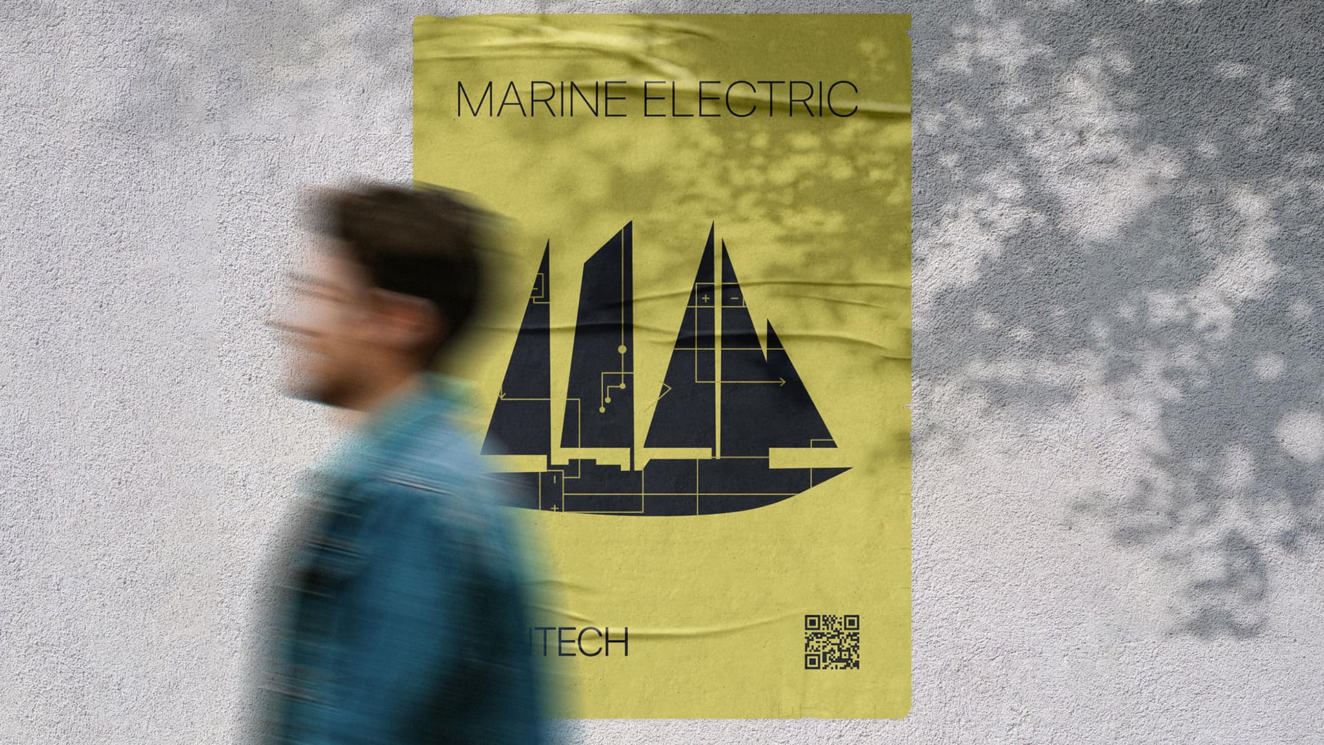
The yellow color is characteristic of electricity and clearly distinguishes the brand from the competition.
The pattern is a working electronic diagram of a yacht.
In our work, we used programs such as Adobe Illustrator for drawing the logo and pattern, Adobe Photoshop for rendering corporate identity media, Adobe After Effects for demonstrating the dynamics of elements.
We delved deeper into the field of physics to better understand the company's activities.
Used drawing skills to create logo ideas.
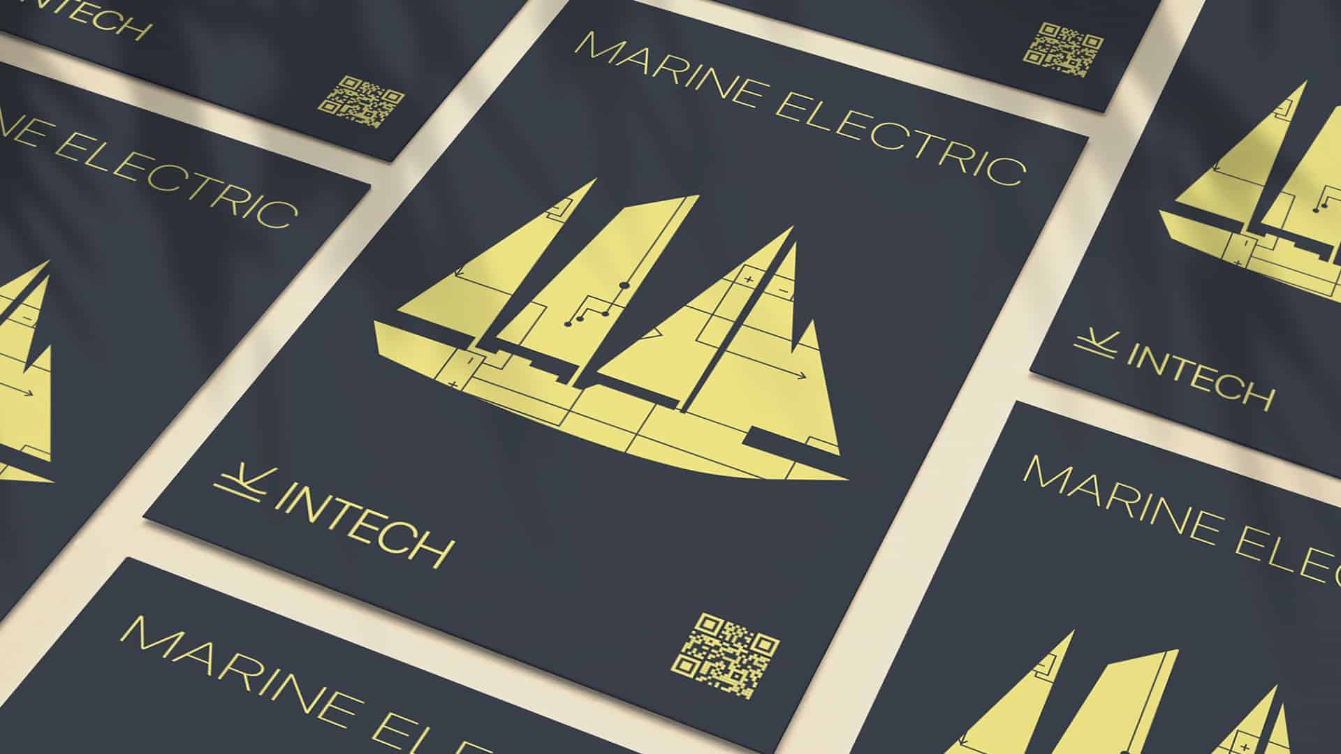
We conducted a deep analysis of the target audience and the processes of the direct work of the company. We delved into the physical properties of direct and alternating current, with which the company's team works, as they are specialists in the field of electrical and electronics. We have identified the key features, similarities, and differences between these two physical terms and laid them at the heart of the brand's corporate identity. In addition, two more associations were put into the logo's symbolism, which directly correlates with the character of the brand and the sphere of its activity - the bow of the yacht, which plows the waves, and the sign "done" which helps to maintain the image of expertise. A real electronic circuit of a megayacht was used as a pattern.
As a result of the work done, we strengthened our skills of qualitative analysis, plunged even more into the topic of the brand we work with, and remembered the laws of physics :)
Designer: Yelyzaveta Zhyrenkova
Wow, cool decision 👍🏻
Pretty nice design!