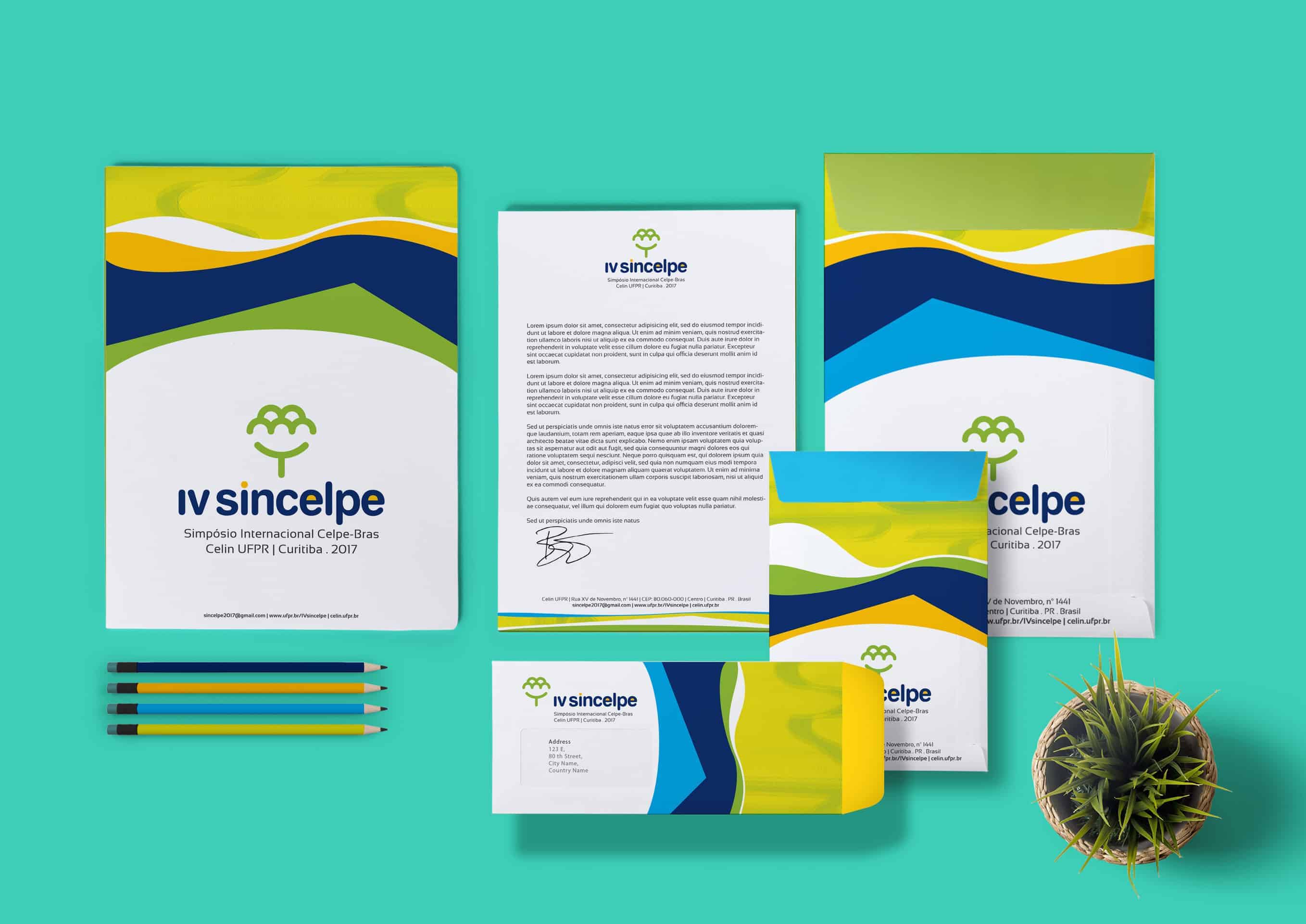
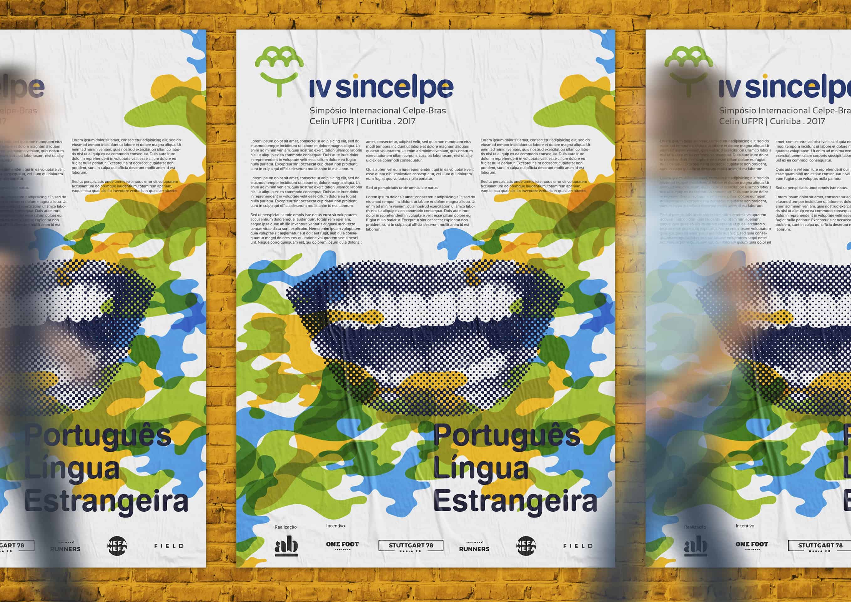
IV Sincelpe
Branding for IV Sincelpe, symposium of Celpe-Bras, exam that enables the certification of Portuguese language proficiency for foreigners.
The concept is a tree (because of the linguistic tree), and it also refers to Botanical Garden of Curitiba, a landmark ot the city that will receive the symposium in 2017.
![]()
![]()
Once it is a symposium to people interested in teaching foreign languages (specially portuguese for foreigners) , the client commented that a tree could be part of the brand, making reference to the linguistic tree and also because Curitiba, the city that will host the event, is quite wooded.
I started thinking about the idea of the tree, but I wanted something more. Thus observing the Botanical Garden, which is one of Curitiba symbols, I managed to bring the idea of the tree and also related the design of a striking landmark of the city that will host the event.
The brand can also be seen as a group of students reading a book.
![]()
Photoshop and Illustrator were used to create the concept. First I began to draw the elements that could be included in the brand (a tree, the botanical garden of Curitiba, people and students). With these pictograms, I gather the concepts in the brand in the most objective and simple way, without losing sight of the original request from the client, that the symbol could be a tree.
I used the colors green, yellow and blue in the graphic materials to relate to the Brazilian flag.

People became extremely surprised that such a simple, clean and minimalist brand could hold so many concepts.
I´ve learned that sometimes, in the creation of the graphic items, even if we have a lot of concepts involved, “less is more”. I mean, the less elements we have, the cleaner and more attractive the final design for the public's eyes will be. In short: KEEP IT SIMPLE!
The main idea I had during a break, after hours thinking, and thinking, and thinking again to solve the problem. So I perceived how important it is to give yourself a break during creative processes.