Jazz Street by Alejandro Gavancho

Jazz Street is a group dedicated to spread Jazz all across Peru through live events. They want to showcase Jazz in a fresh, exciting and innovative way. Established in 2008, the group aims to redesign the visual language of the brand in order to captivate a younger audience, such as music students and amateurs who have just started to play. Read on and enjoy!
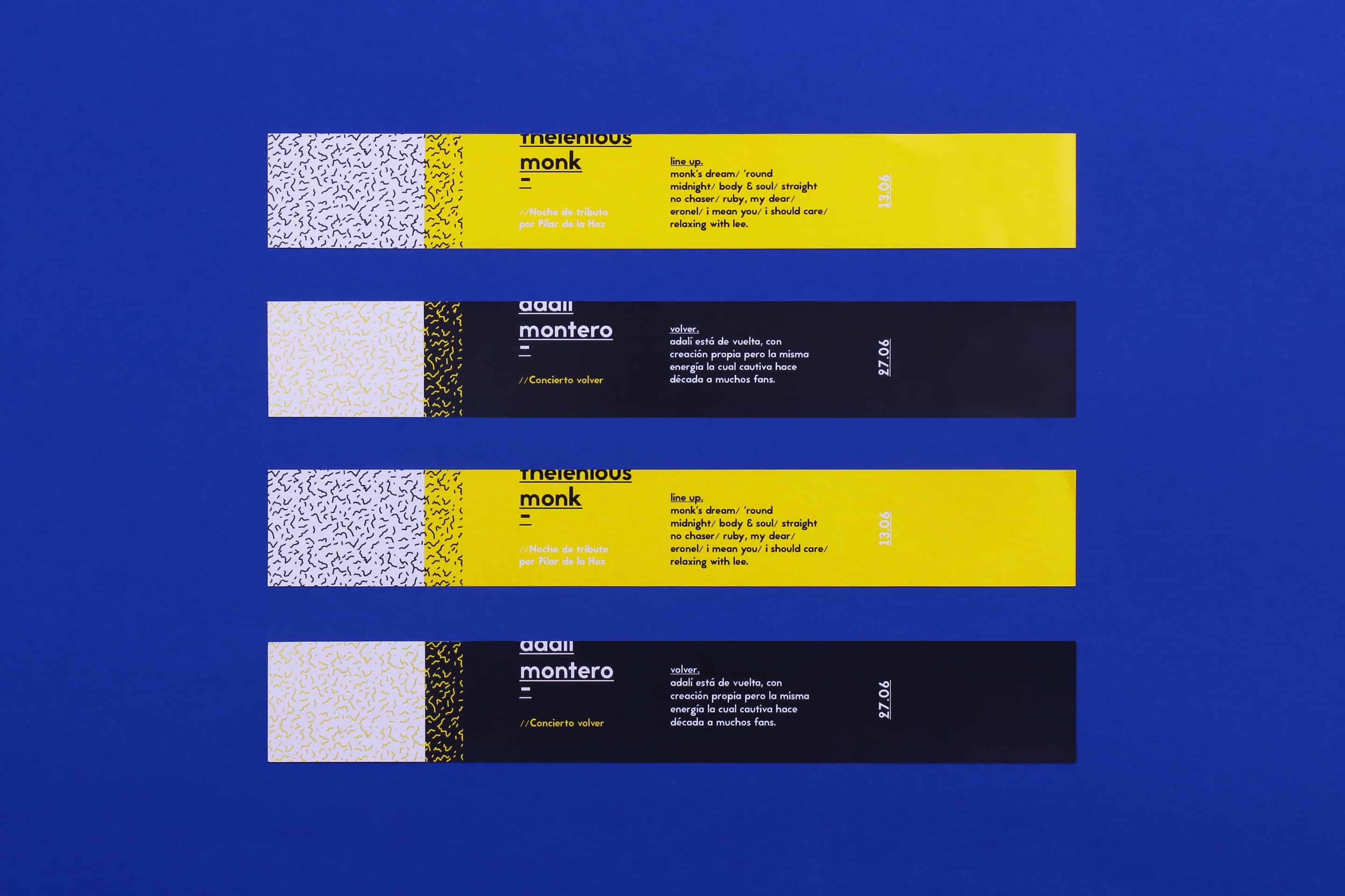
Jazz Street’s proposal is to hold live concerts showcasing Peruvian musicians, music with a jazz feel but also with modern influences, covers of modern tracks, and mixes that in the end are still jazz pieces but that can also be perceived as having a more eclectic style but does not stray from its jazz roots.
- Alejandro Gavancho
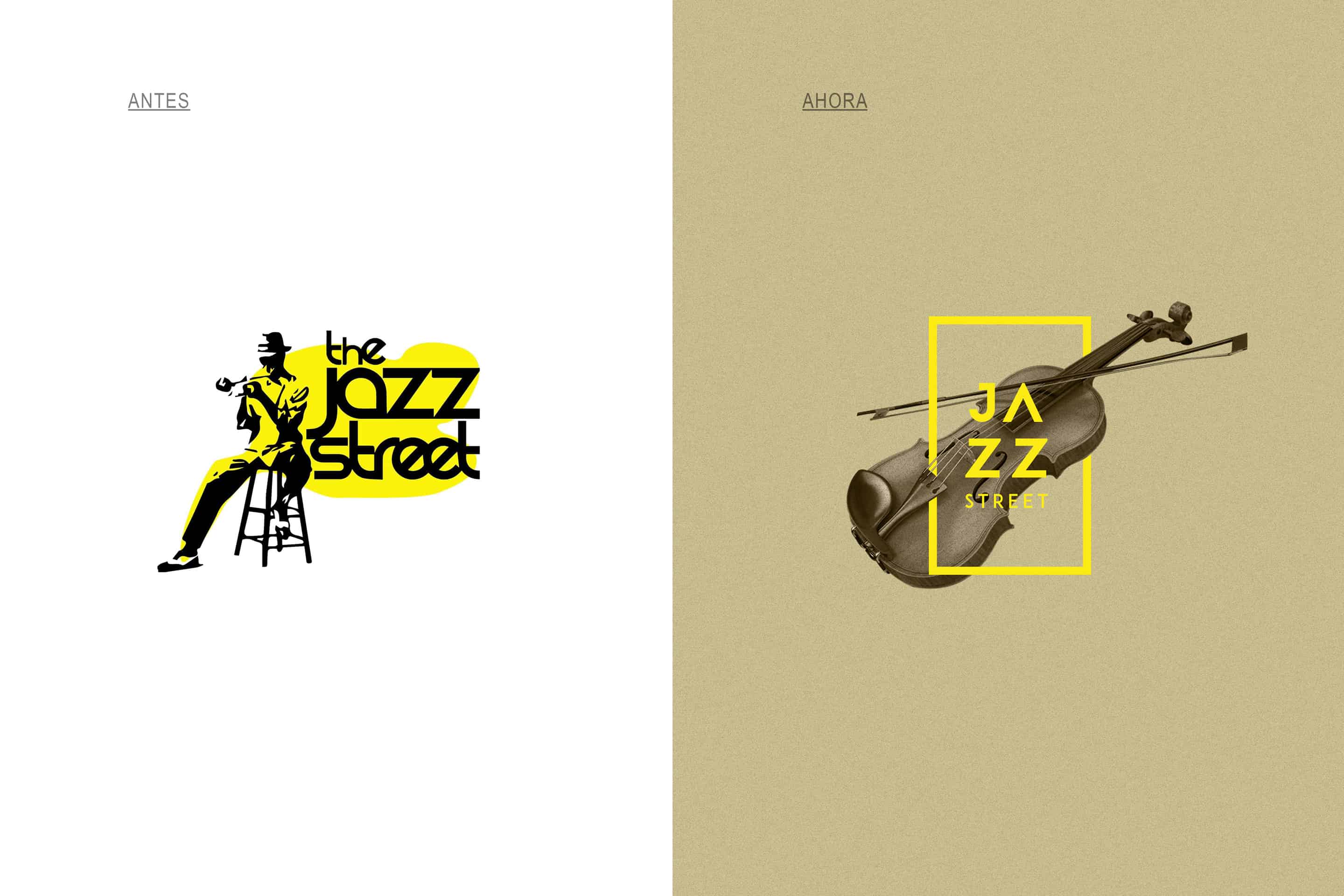
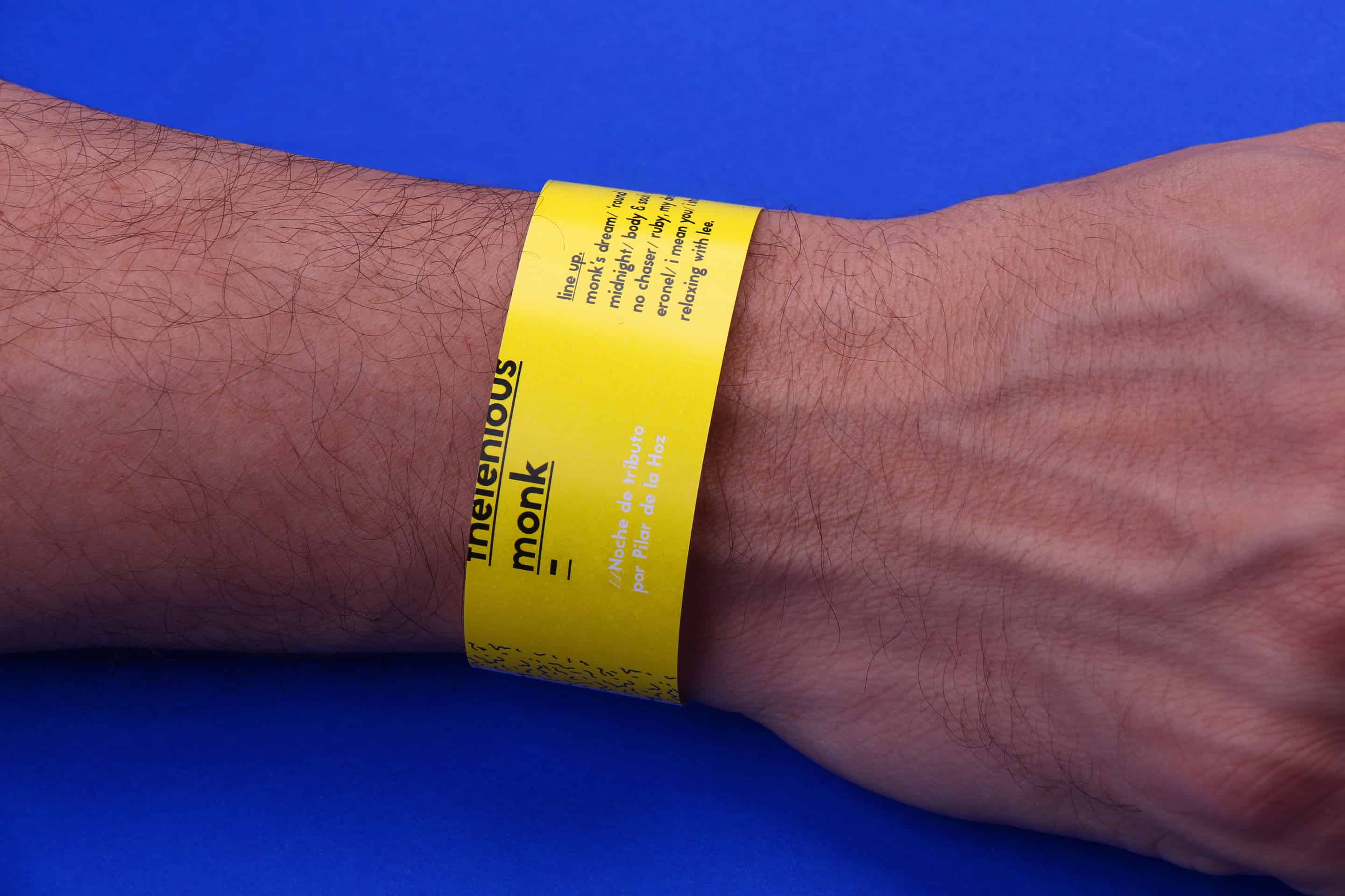
For the redesign, the first thing that was thought of was to instill new life into some aspects of the visual language for example using rounded typography in a range of yellow and blacks, colours that are generally associated with Jazz. Once these elements had been applied, I started to work on the new image of the brand.
- Alejandro Gavancho
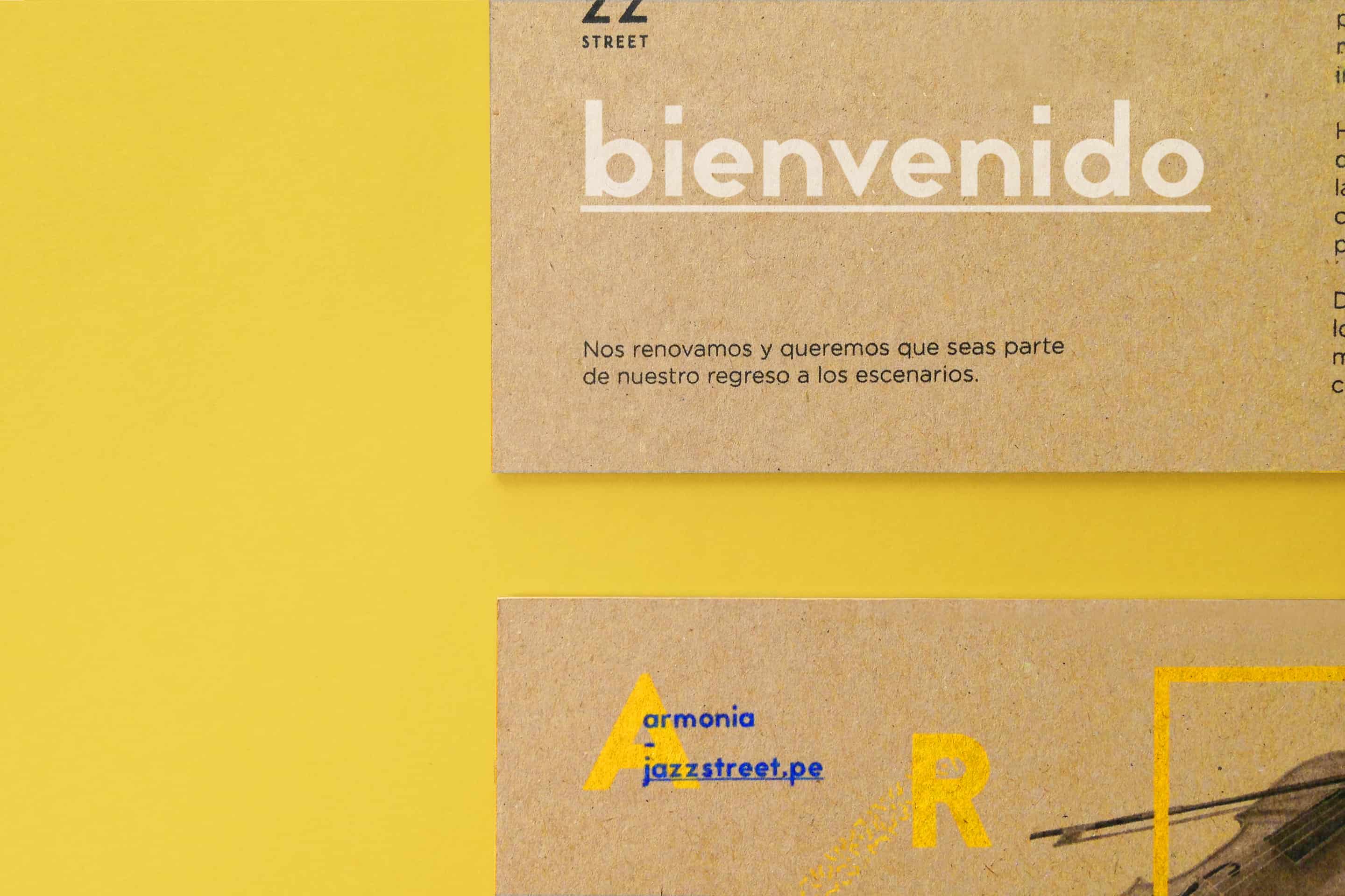
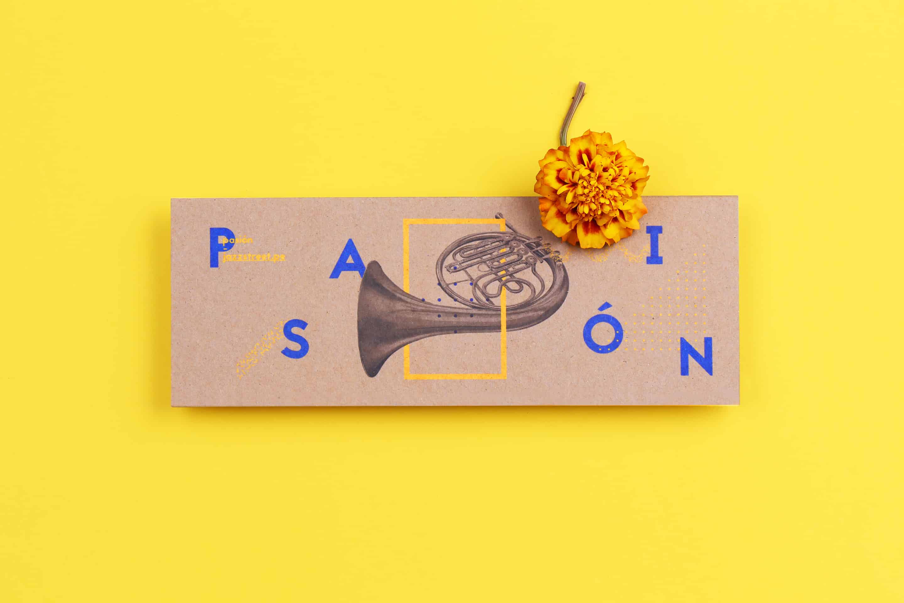
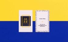
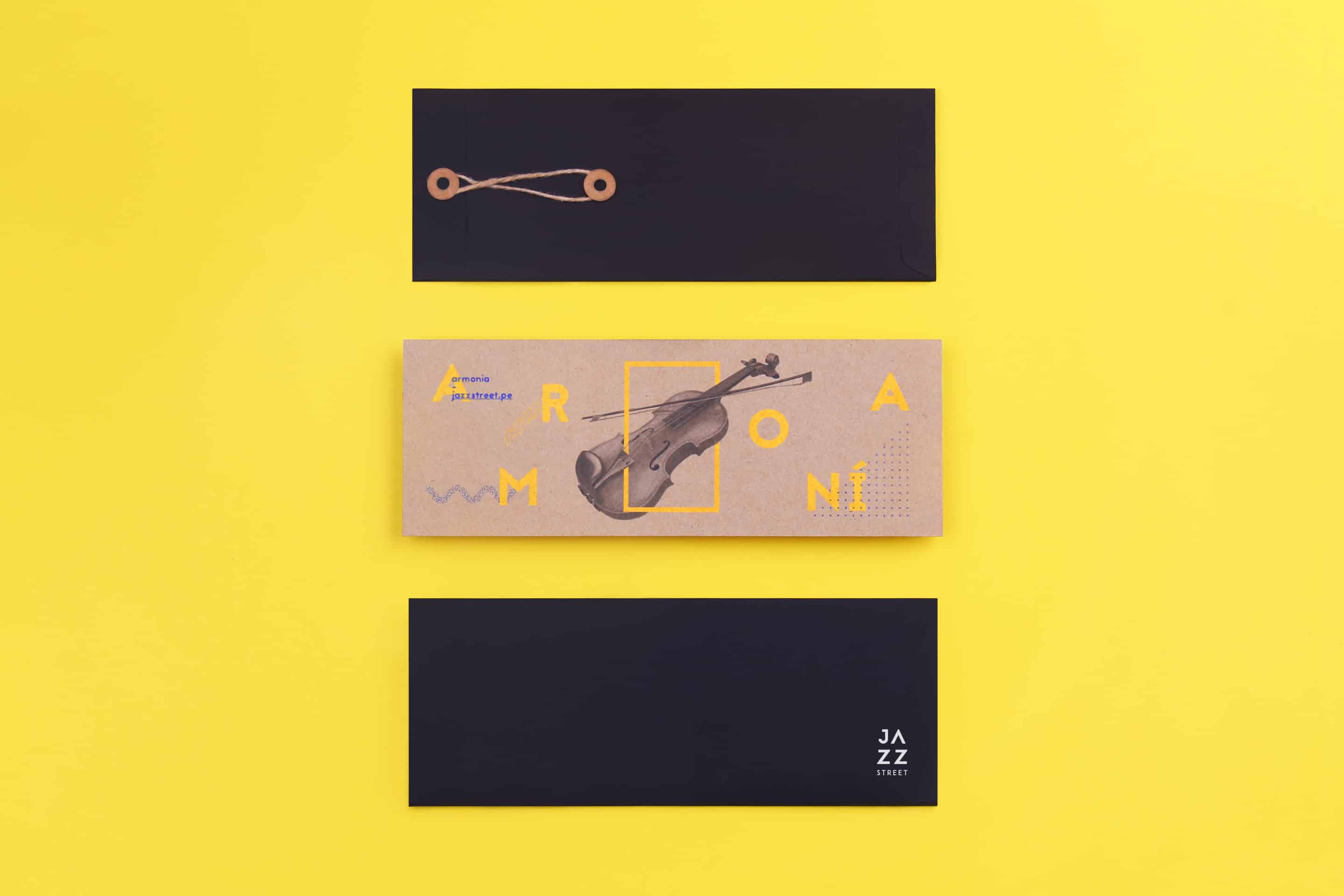
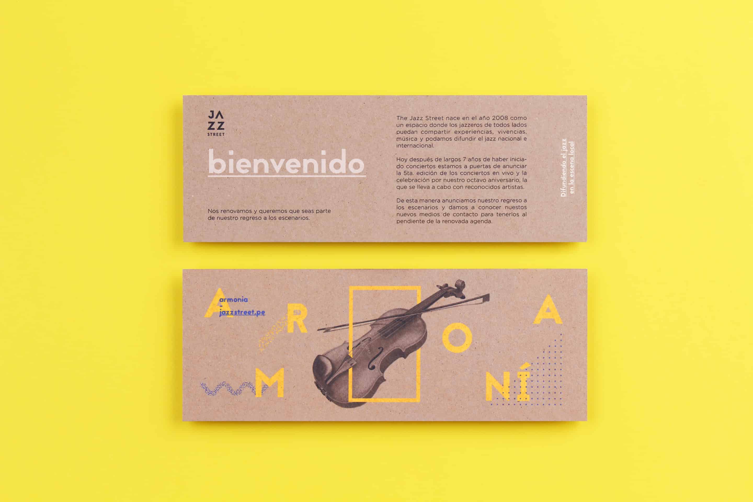
Following the yellow theme from before, I also implemented the colour blue along with using Kraft paper as the underlay, a natural and eco-friendly product that humanizes the product and contrasts well with the yellow and blue tones as well as the black and white typography that was used.
- Alejandro Gavancho
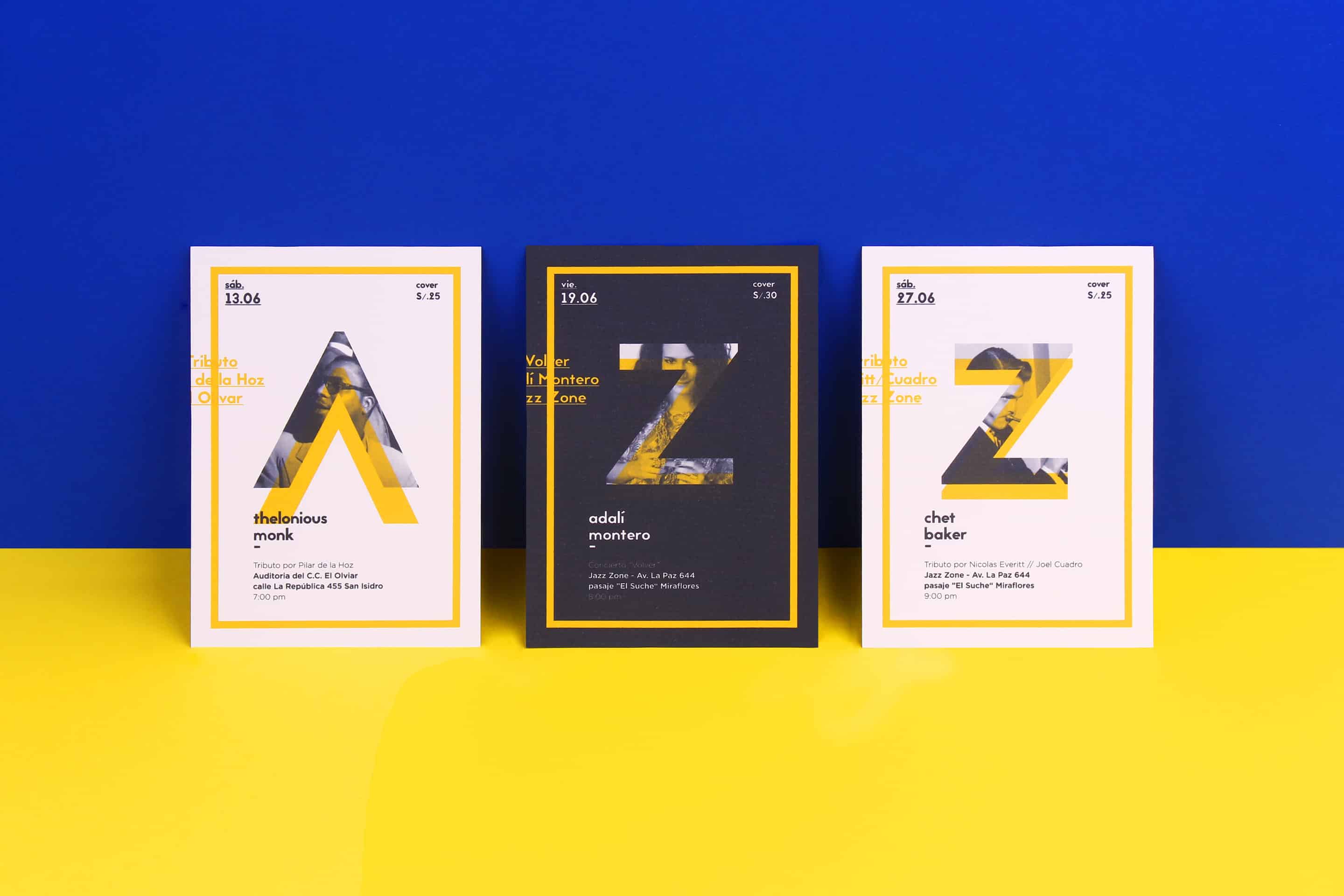
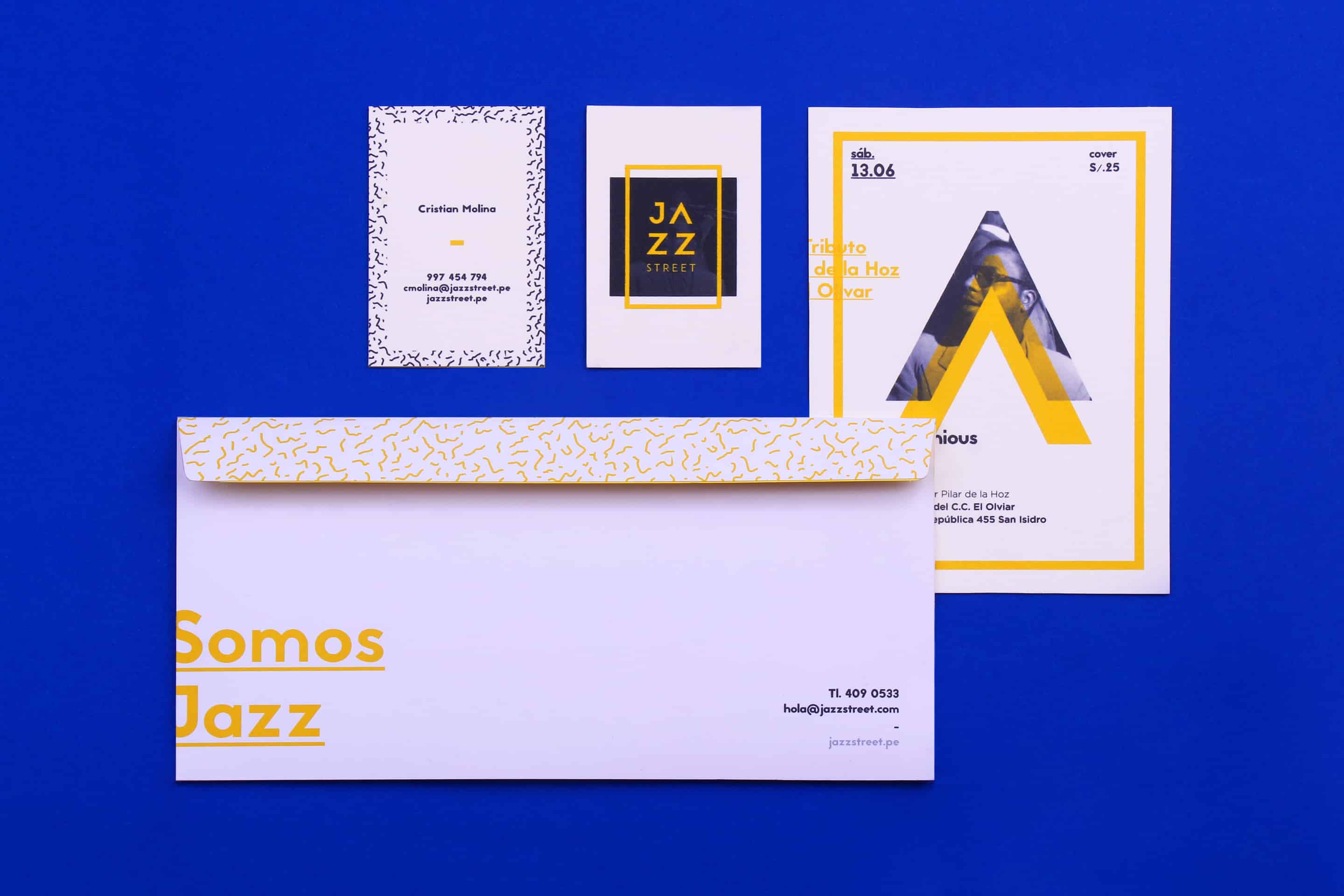
For the typography, I only used one type of letter, but one with many variants that facilitates a visual hierarchy between the title and body of text. The letters were also subtly edged in many of the pieces with the aim of giving them a more modern and edgy look, following the styling of the principal change: the logo.
- Alejandro Gavancho
ABOUT ALEJANDRO GAVANCHO
Alejandro Gavancho is a Graphic Designer based in Lima, Peru. At 21 years old, he has worked at the graphic studio FIBRA for the past year and specializes in branding, editorial design, art direction in photography and interior design. He considers the use of shapes and colours alongside paper, card, and wood textures to all be important features of his work and believes they portray a certain je-ne-sais-quoi in his final pieces and achieve a high-impact effect, adding also, a feeling of uniqueness. See more of his amazing artwork in Behance.