JNS Coffee

Specialty coffees have made their way to the Polish market, and are here to stay. Jawa Nie Sen is a new brand offering farmers coffee for those who care about quality.
Inspired by the founder’s background as a health specialist for the government, JNS (Jawa Nie Sen / Reality, not the dream) is a new coffee brand structured around a model based on subscription plans. The brand’s message is focused on the health and nutritional benefits of premium farmer’s / specialty coffee as opposed to industrial ones. The early goal was to create a polarizing yet premium experience for the audience. Being based on an alternative model, packaging the brand and creating a consistent visual language was the main priority so we could then set to develop an online presence. The online aspects of the brand are directed towards leads generation through different funnels in order to increase the numbers of subscribers.
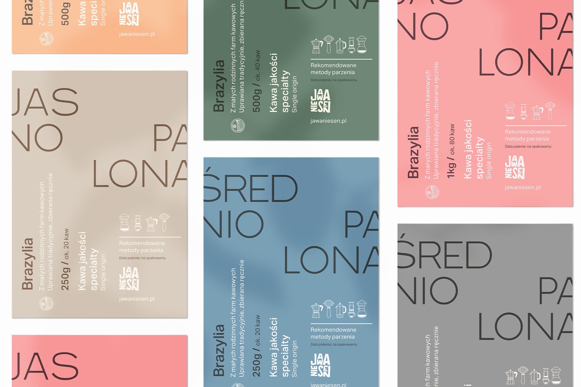
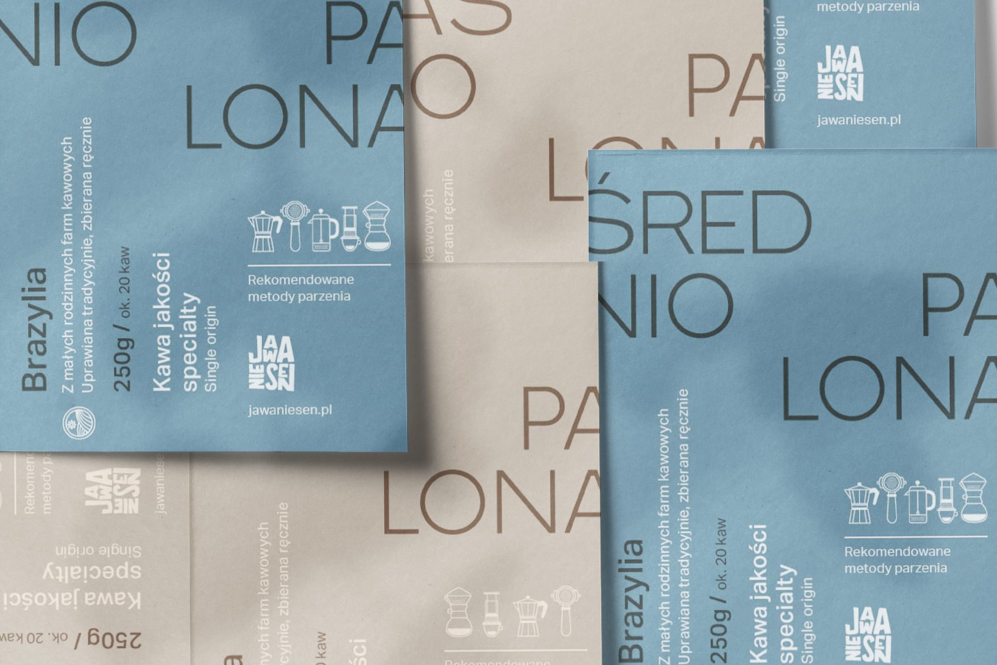
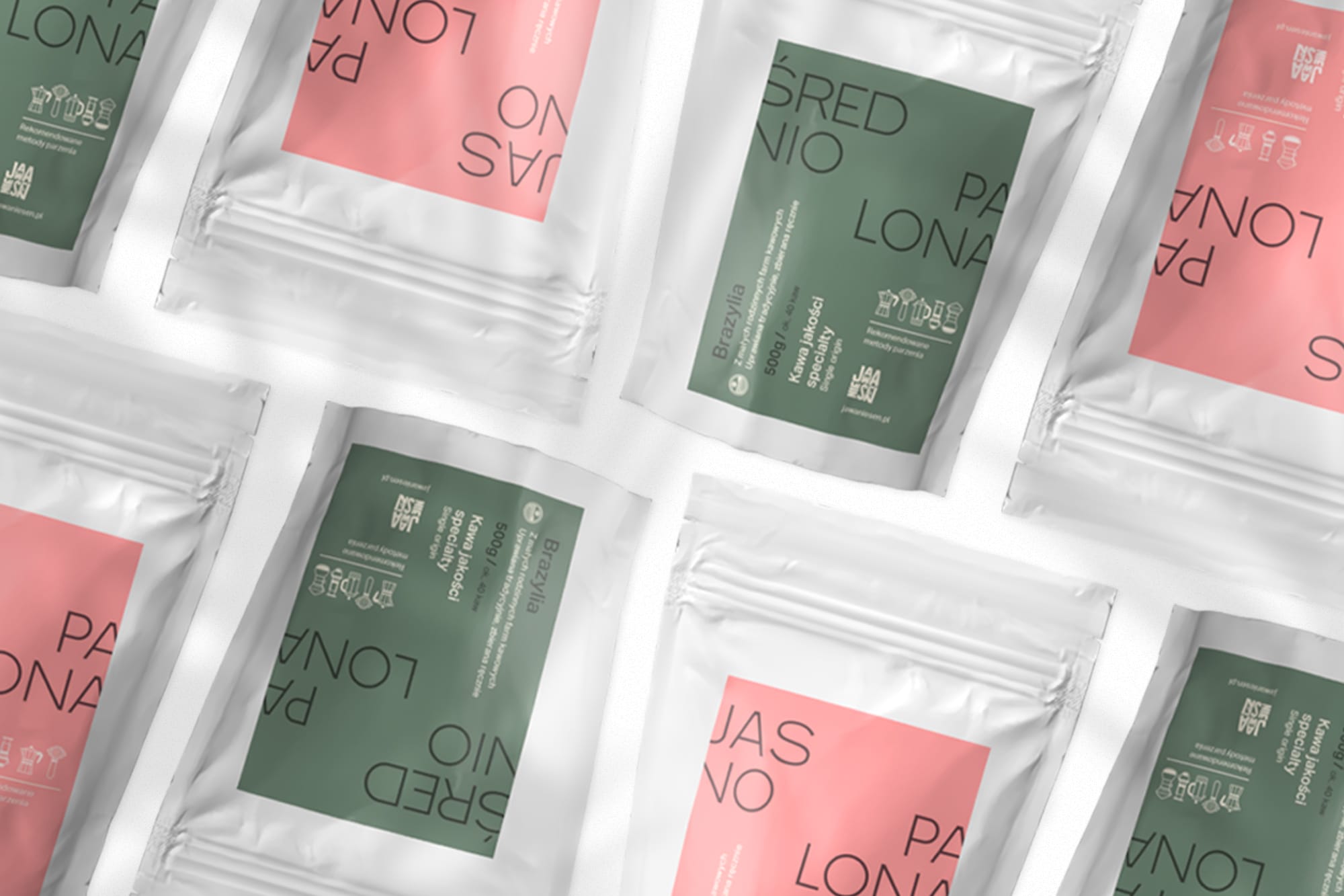
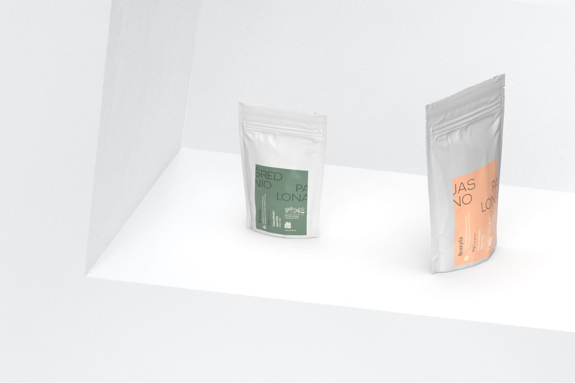
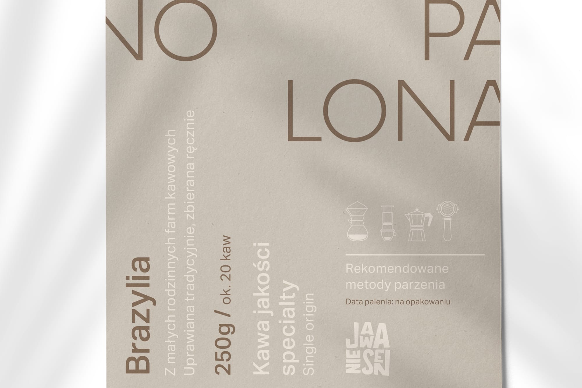
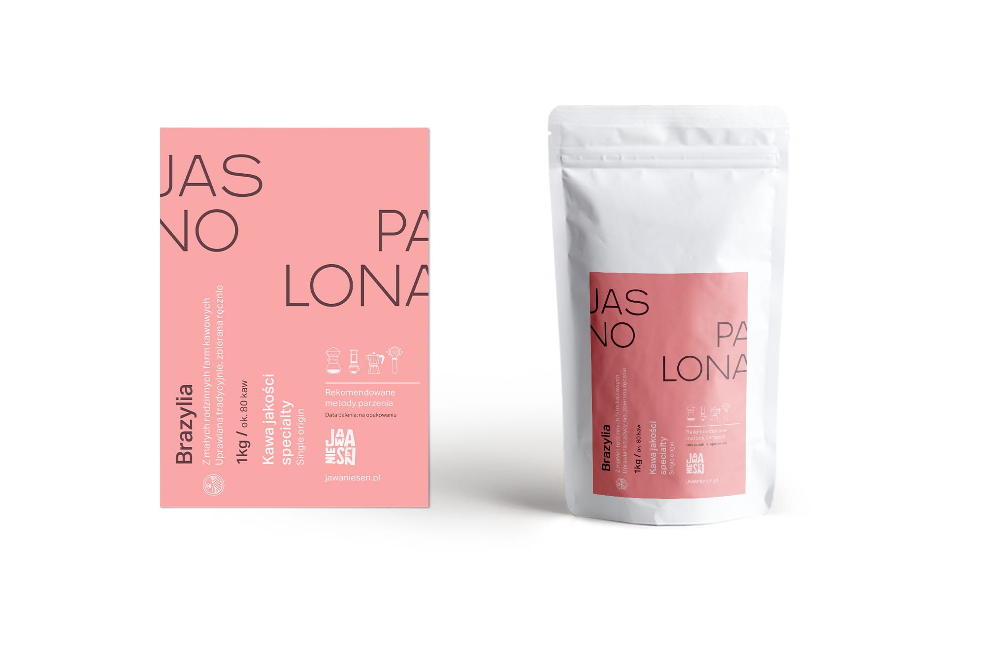
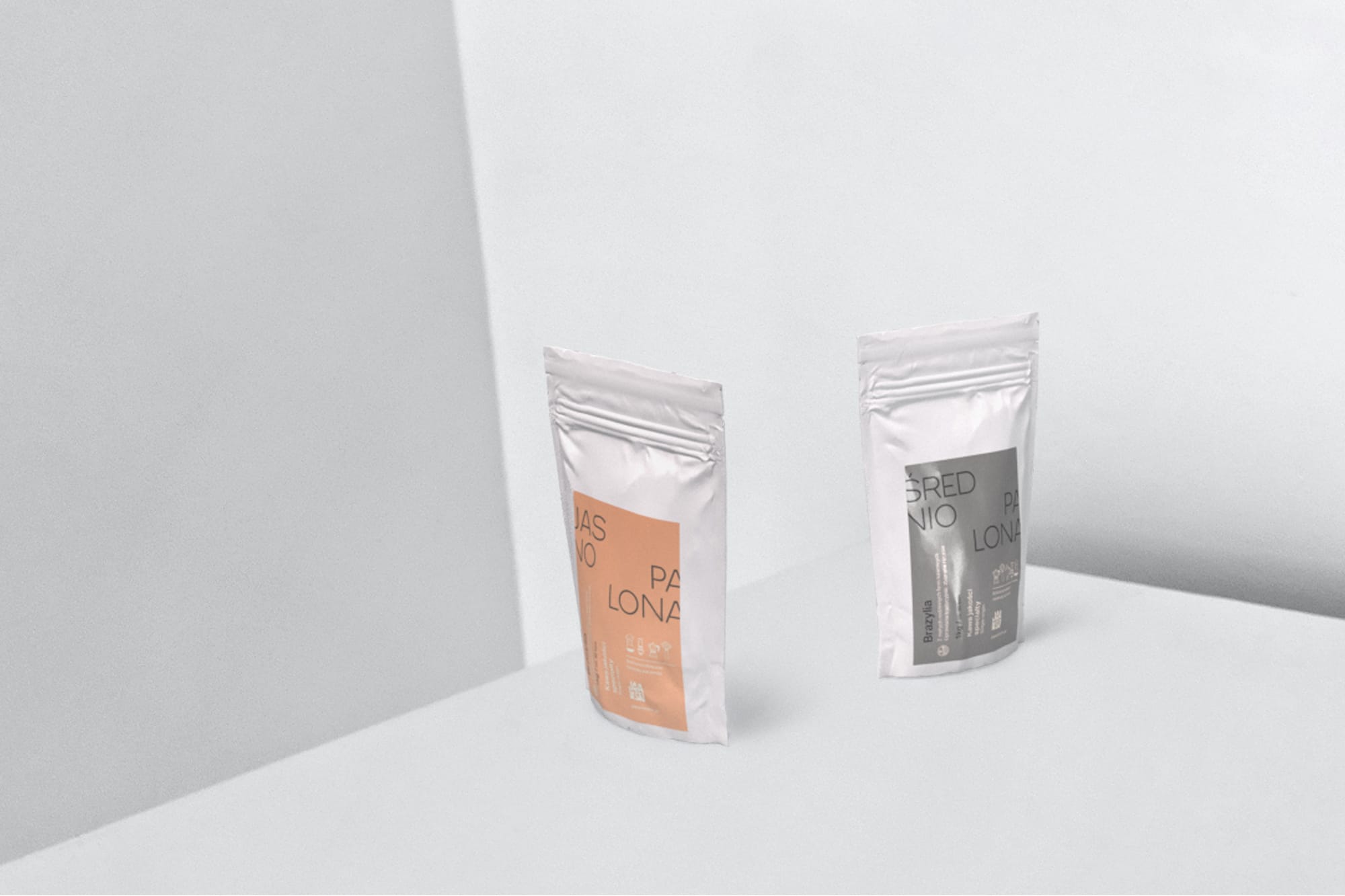
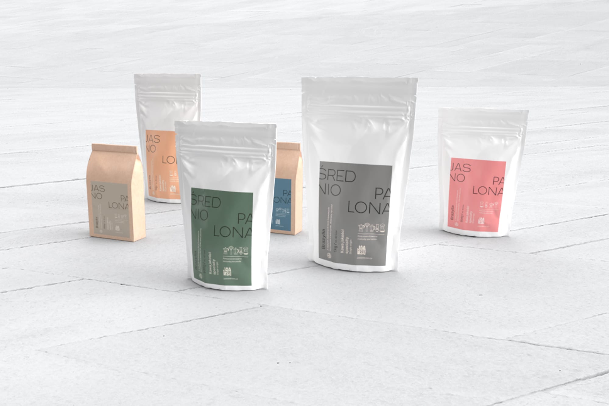
The offer is composed of two products (medium and light roasted coffee) selected in small independent farms in the Brazilian mountains, as opposed to large chains such as Starbucks. The tonal palette was established in order to differentiate each pack per quantity. Design-wise, inspiration was taken from the pharmaceutical industry as a reference to the founder’s history but was also a way to emphasize the health and nutritional benefits of high-quality coffee.
The refined design aims at positioning the roasting process and the origins in the first place rather than the flavour notes or the variety of the beans. Traditionally, coffee brands tend to hide the roasting level while it is the primary factor responsible for the flavour when it comes to coffee.
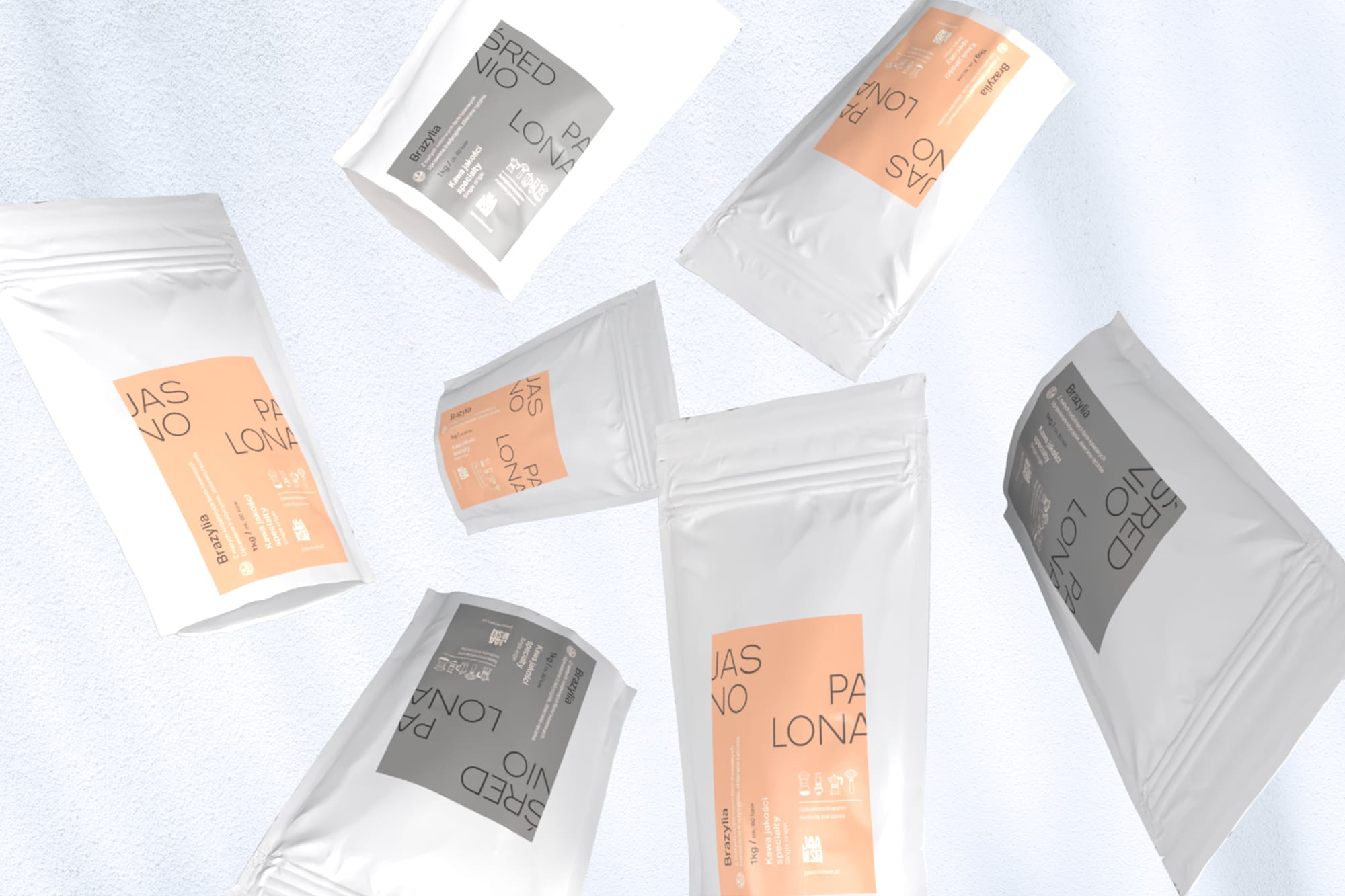
The usual adobe softwares where used for the artworks. Prior to that we run a series of meetings with our client to really get to the bottom of his brand and genuinely understant his product and its specificity. The production is still a work in progress as the packaging itself is evolving at each new batches thanks to the consumer's feedback. Different printers and paper stocks are tried by our client in order to provide the best experience.
To this day the feedback are very positive thanks to the uniqueness of the design in comparison to the other coffee brands on the market generally featuring strong illustrations. People have found this design refreshing and soothing to look at in some case which is a big success for us. The sales are rapidly growing since we launched this new packaging to the point that our client's producer is almost running out of it's current batch and had to source beans from other symilar farms in Brazil.