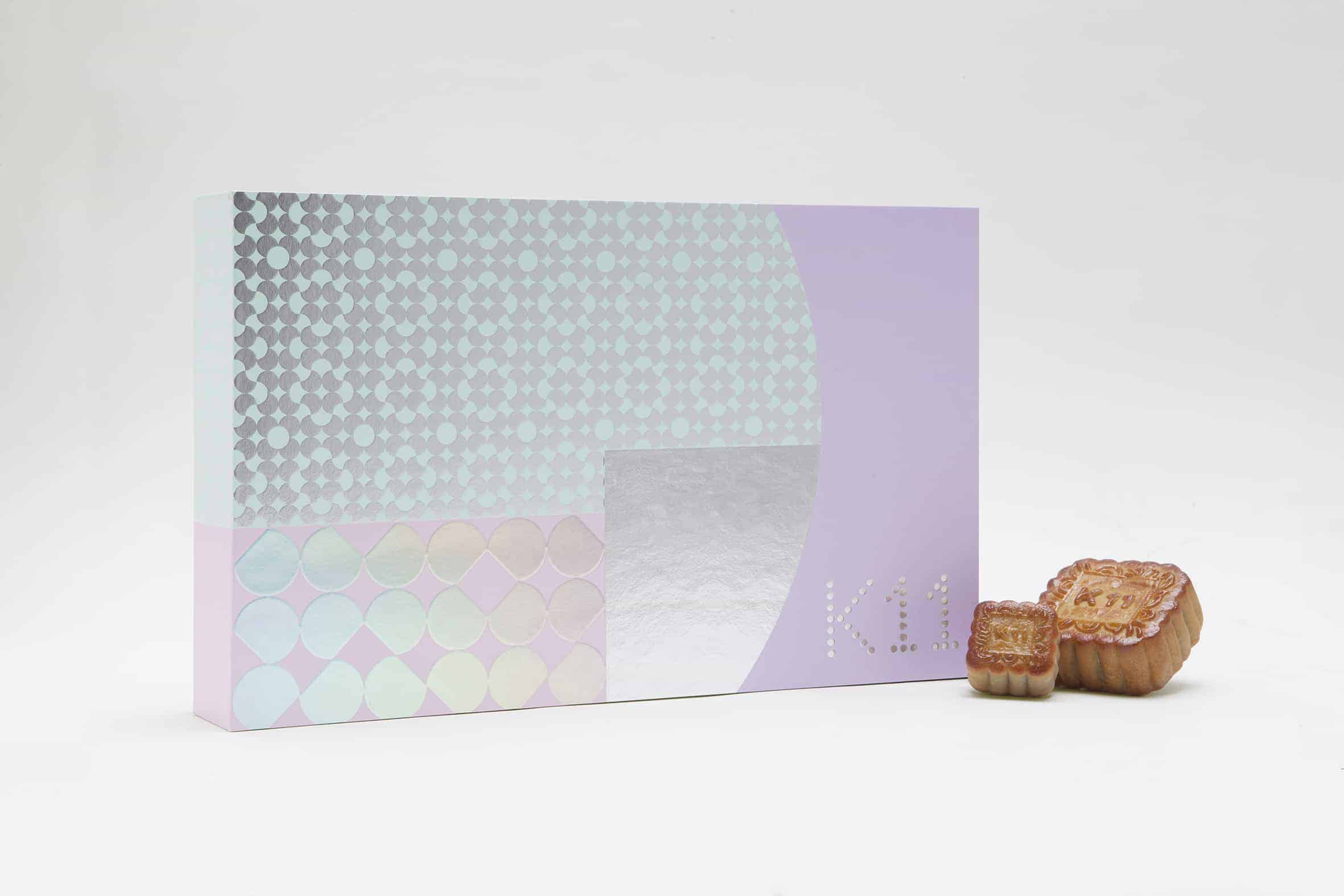
K11 Taste From The Moon
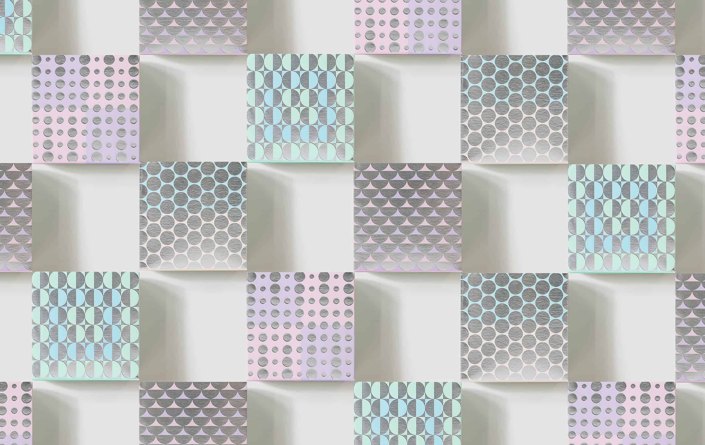
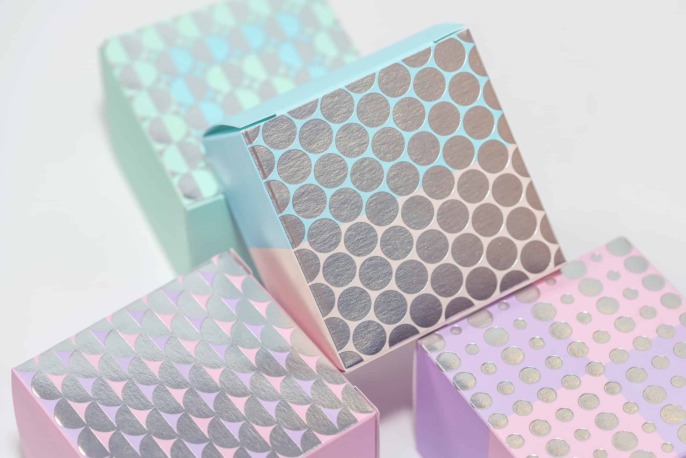
To celebrate the mid-Autumn festival, Not Available design (NA) developed the packaging for K11 Mooncakes. These pretty sweet cakes are made from a bean past and a crisp crust, and are often enjoyed with a bit of tea. Not Available design used abstract graphics and prevailing colors to represent the lunar cycle on the boxes and bags.
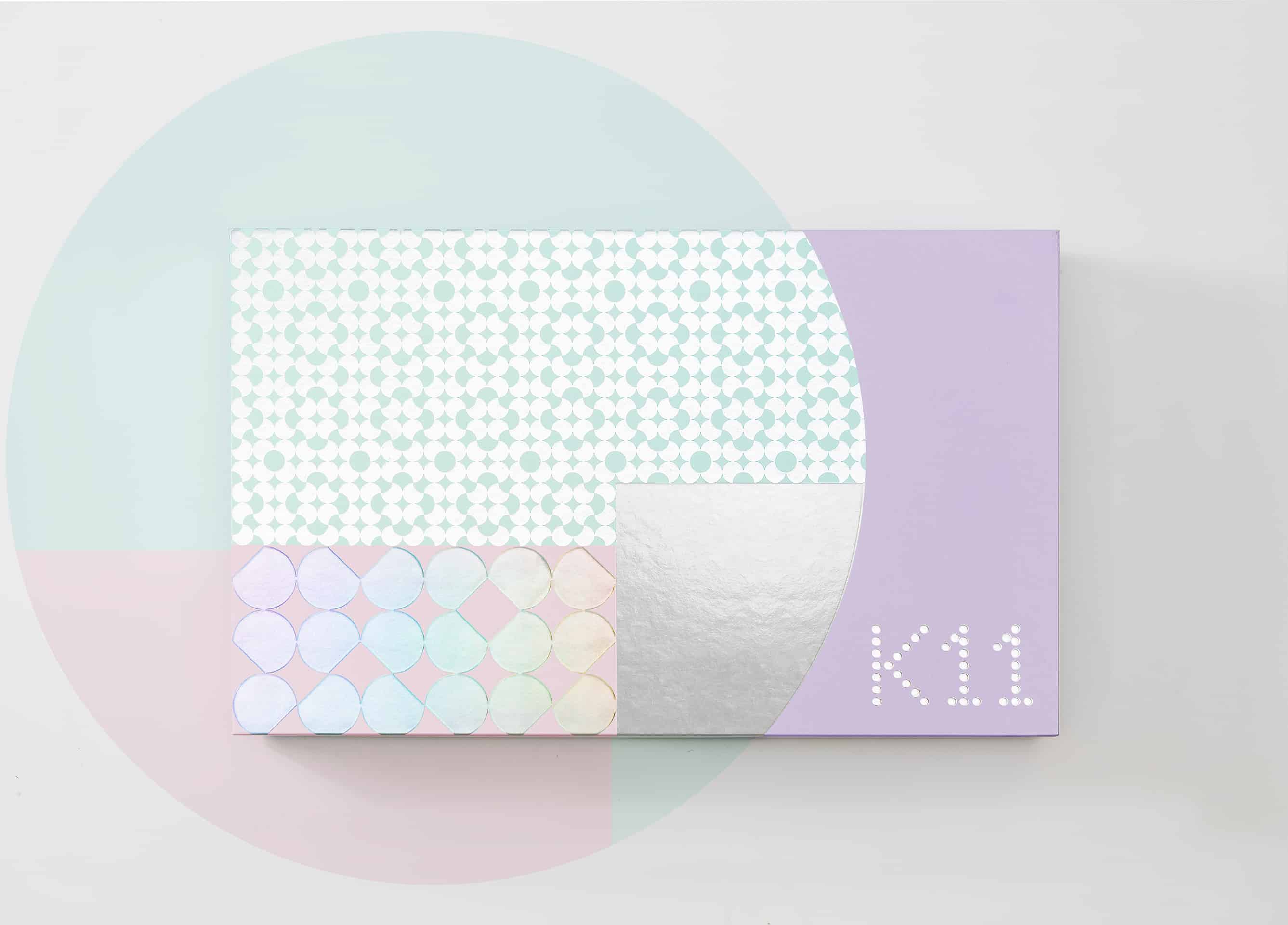
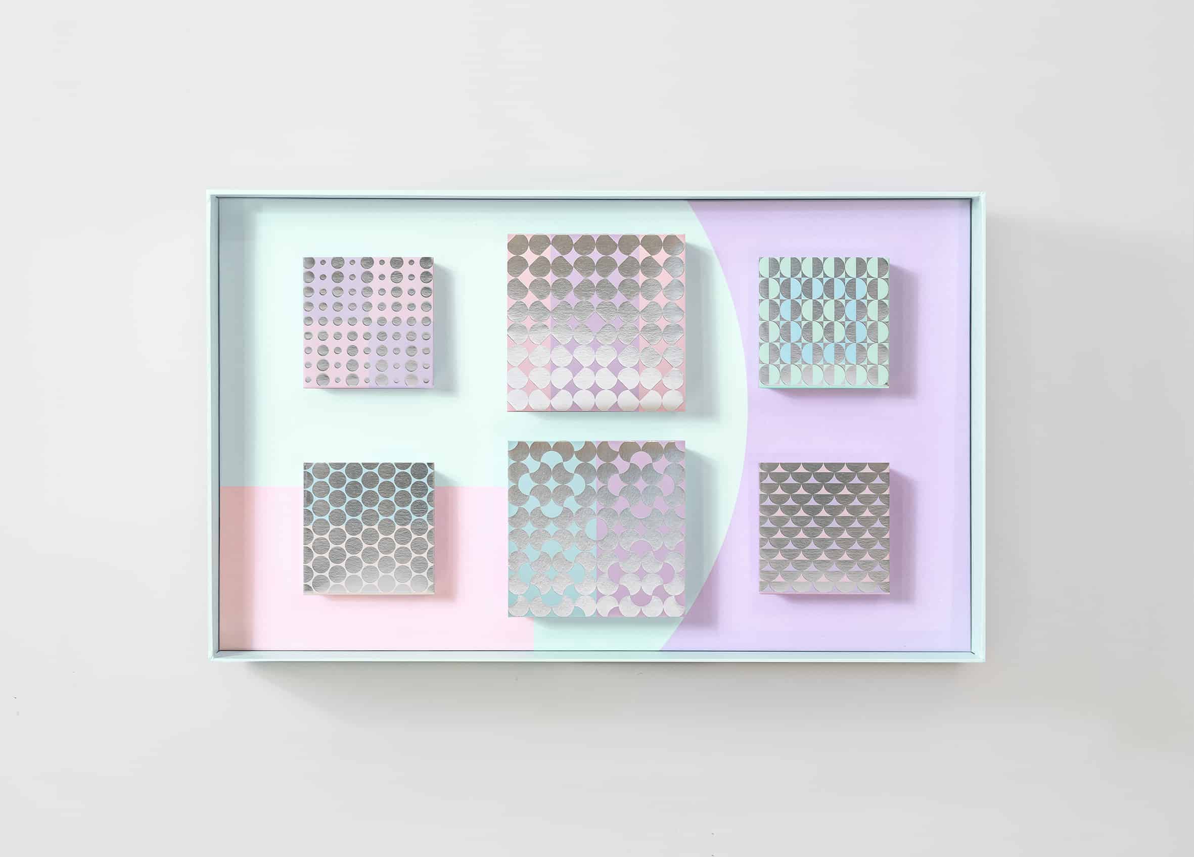
K11 is an energetic brand. NA used abstract graphic to give a fashionable and trendy style to this brand. A series of pastel colors has been applied in this design in order to give a warm and soft atmosphere to customer.
Adobe Illustrator.
NA started the project by researching with a totally different methodology to present the traditional Chinese food. Mooncake is to celebrate the mid-Autumn festival. Most of the designs on market uses brown colors to echo with season and time. But we tried to differentiate the color scheme from the market. And we did a lovely project.
We have received large applause from the public as well as the client, with the ever-refreshing contemporary packaging as a gift.
It is learnt to appreciate traditional oriental culture through abstraction, branding, and sensitivity, especially interacting with this metropolitan urban dwelling, Hong Kong.