Kellogg's Cereal by Mun Joo Kim

The Kellogg's Cereal project is a cereal packaging designed by our featured artist made for grown-ups. This unique packaging is simple, minimal and not your stereotypical cereal box design. Read on and enjoy how far this amazing concept design went.
The overview of this project was to come up with a cereal packaging design for adults. We are no longer kids and it is important that our cereal packaging reflects exactly that. The challenge of this project was to neglect the stereotypical cereal box design. I explored many shapes and came up with two ideas. After much dilemma, I decided to push both concepts. The simple solution was to work on both ideas and see how far I can develop them.
-Mun Joo Kim
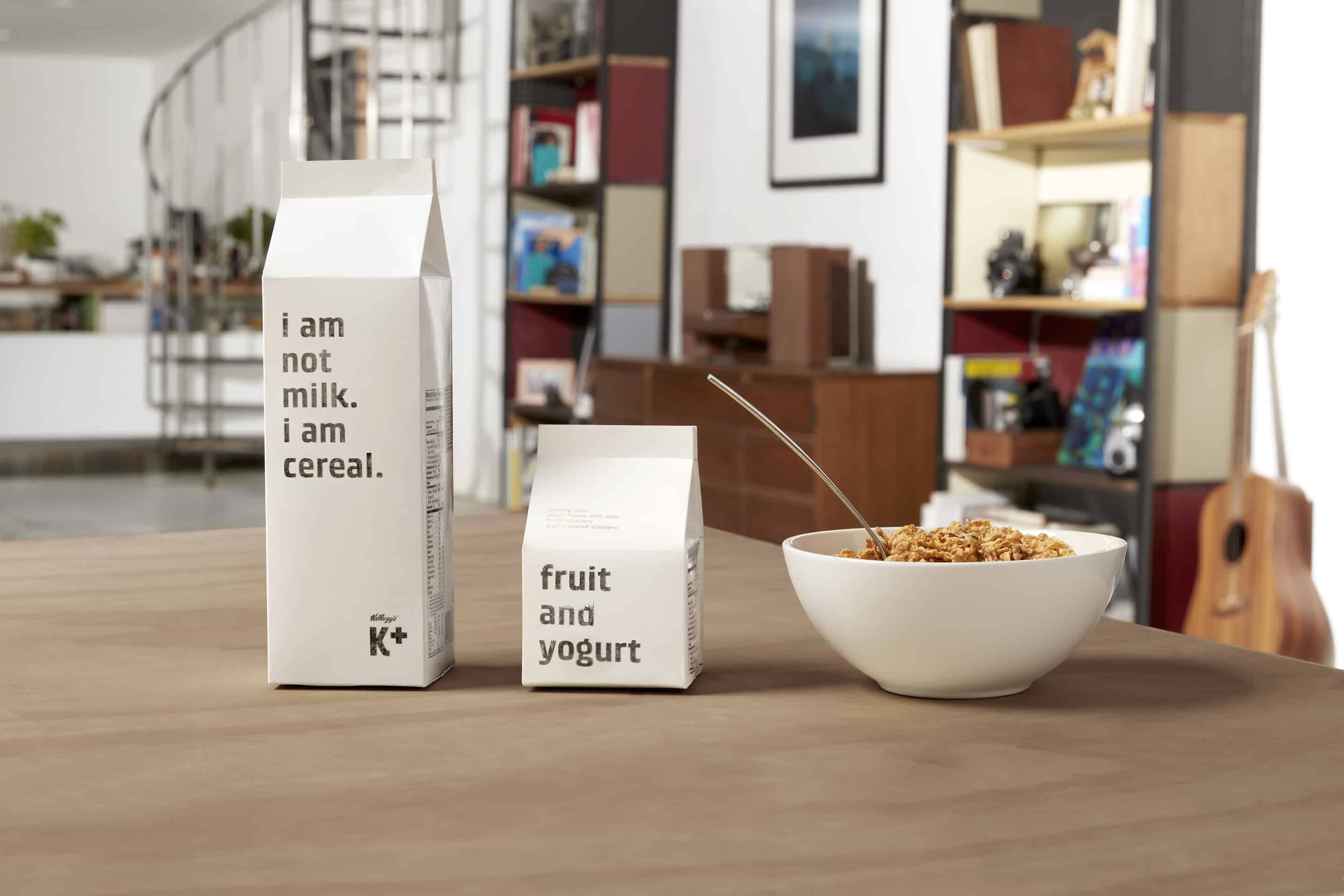
Special K was chosen for this re-branding project. Being a suitable cereal brand for adults was a key criterion when choosing the brand to work with. Brands like “Cheerios” and “Trix” strongly caters to the younger population while Special K caters more towards the adult population. Also, I had an urge to change the Special K brand into a unisex design, leading to the creation of a b-line for Special K called “K+”
-Mun Joo Kim
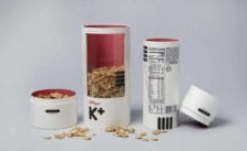
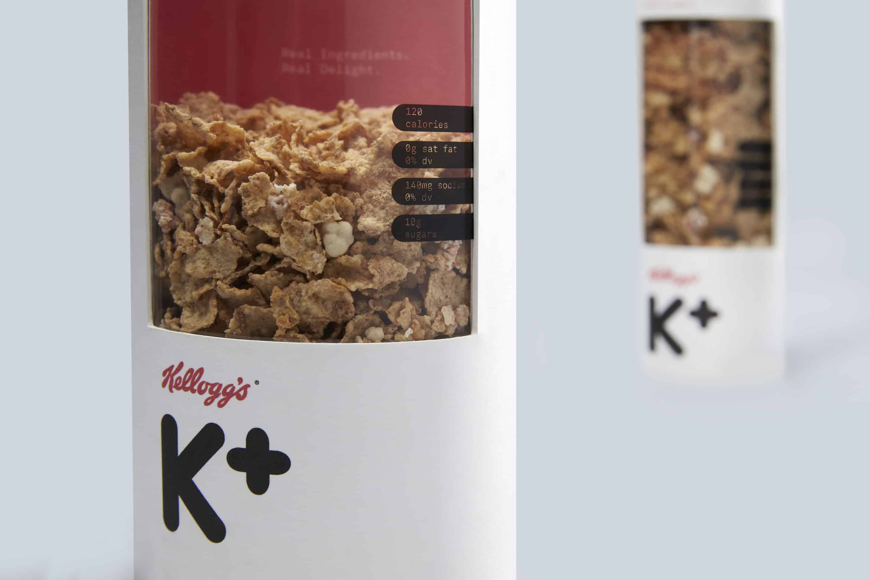
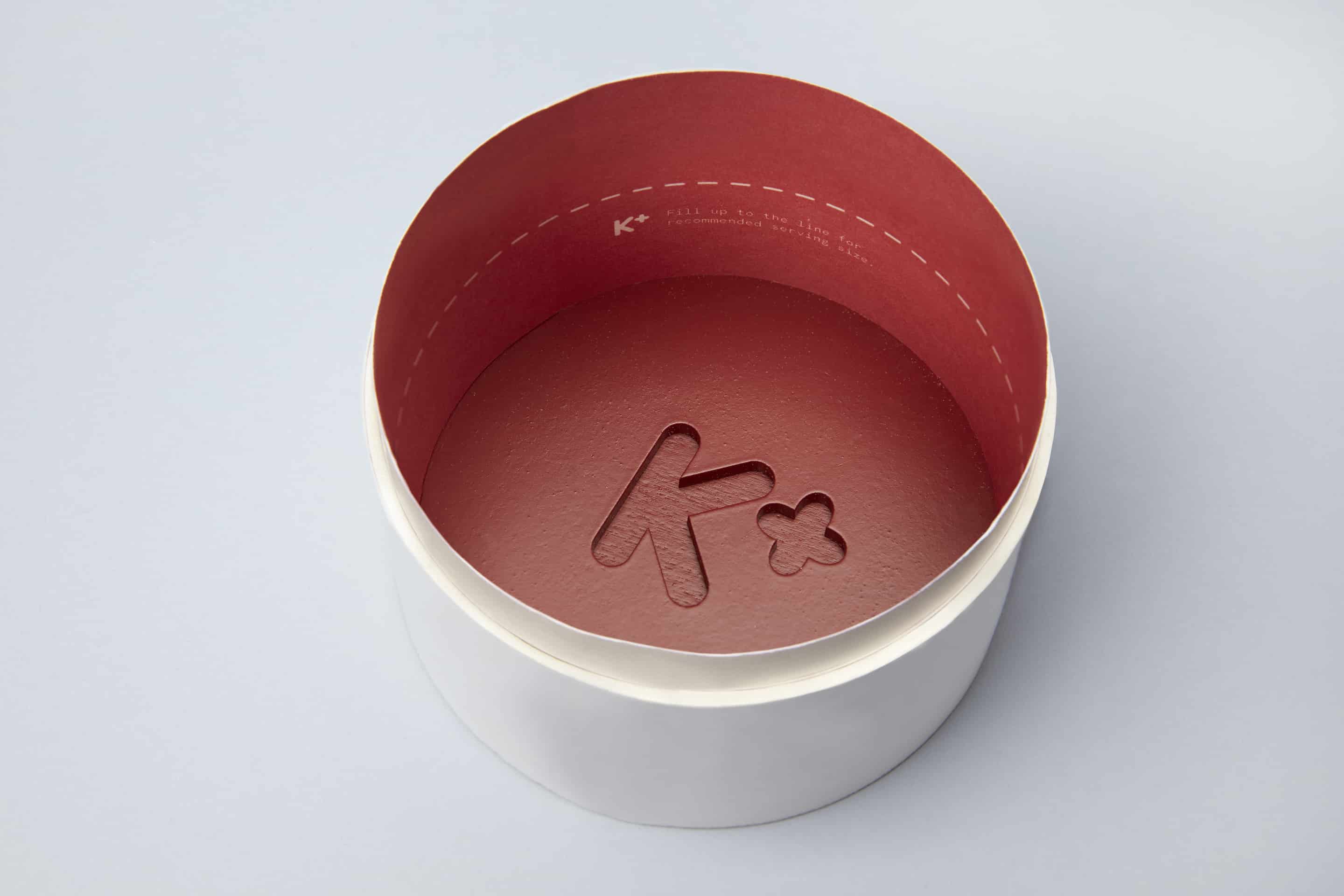
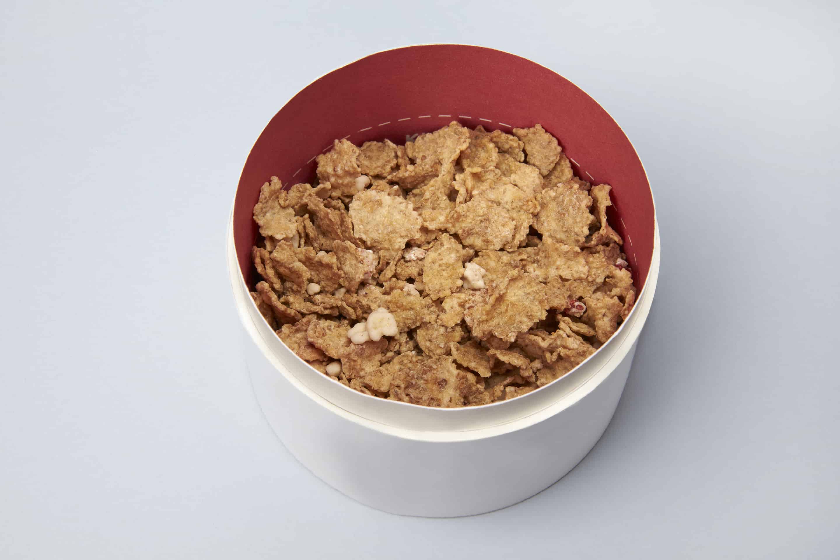
The font for the first concept is carefully created with geometric forms. The Kellogg’s logo must be on top of the K+ logo to show contrast between the two logos. This allows for easy identification of the logos, even when small. This first concept is more for the high-end consumers. It is designed with a measuring cup of recommended serving size inside the cereal package lid.
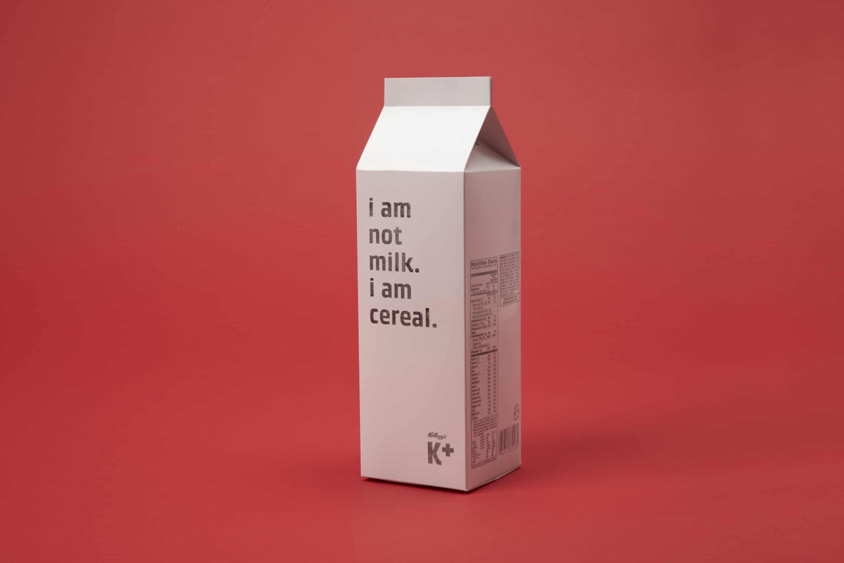
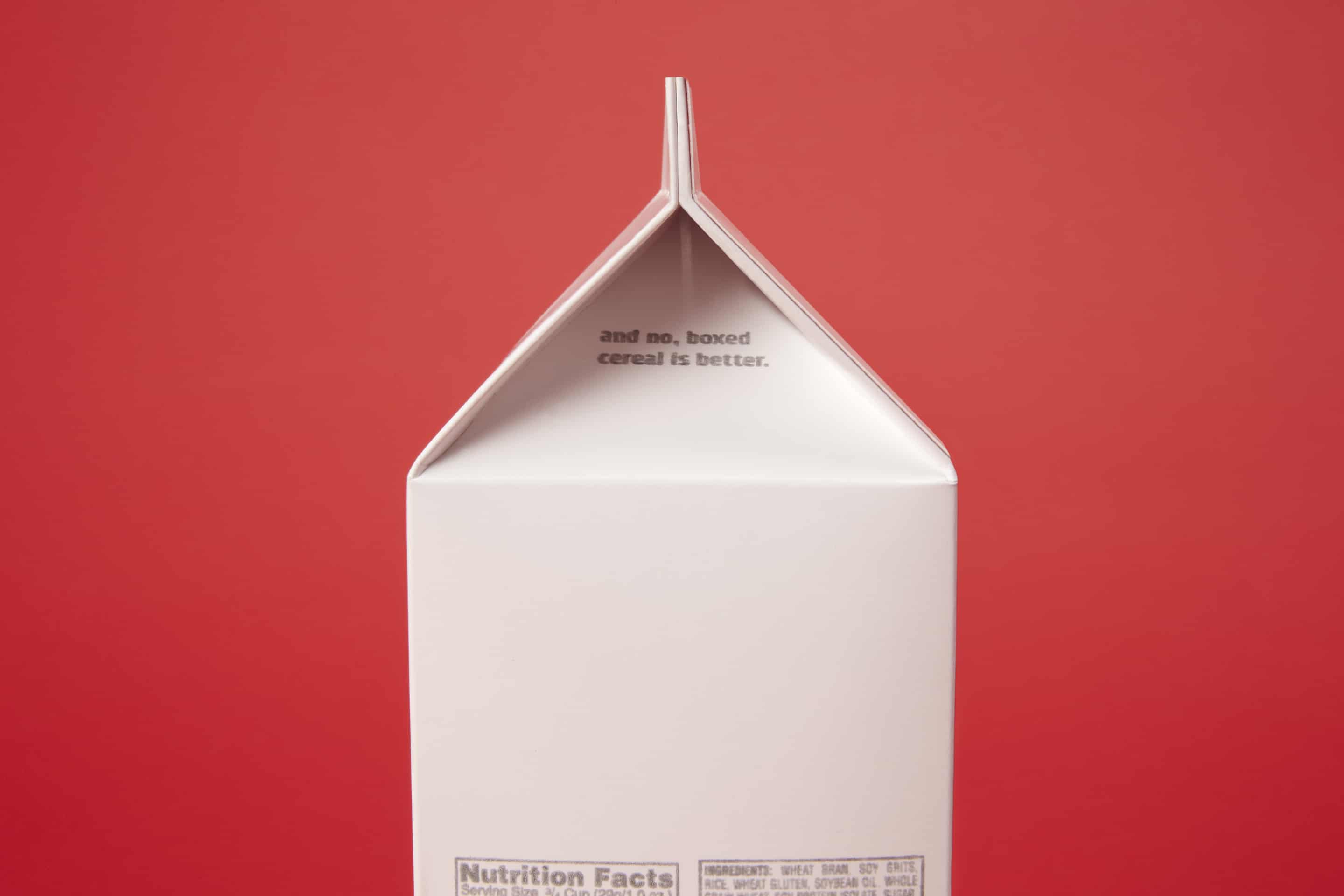
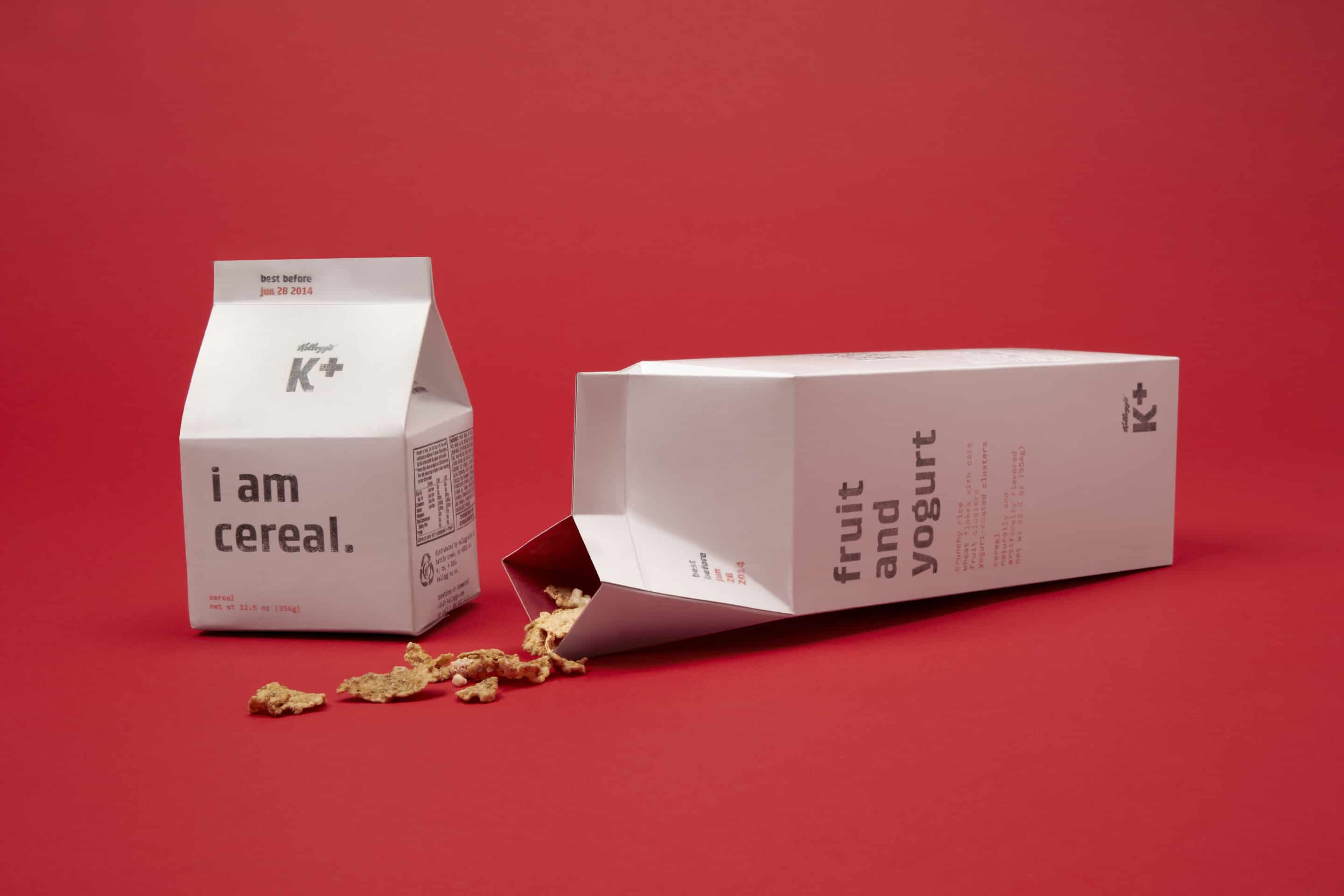
The font for the second concept is created with the typeface Kabel. Kabel gives off a slick feeling like as if liquid is flowing through. The plus sign for the logo is the same size as the top stem of the K. Kellogg’s logo must also be in black and white. The second concept is the charming and friendly side of Kellogg’s K+ brand. The cereal will be in a milk carton-like packaging with statements like “I am not milk. I am cereal.” written on them.
-Mun Joo Kim
K plus creates a positive reputation and symbol for this packaging. The positive sign symbolizes good health and better nutrients. These perceptions allow consumers to feel like they are making a good decision by buying this product. The target demographics are ambitious and aspiring young adults in their 20s.
-Mun Joo Kim
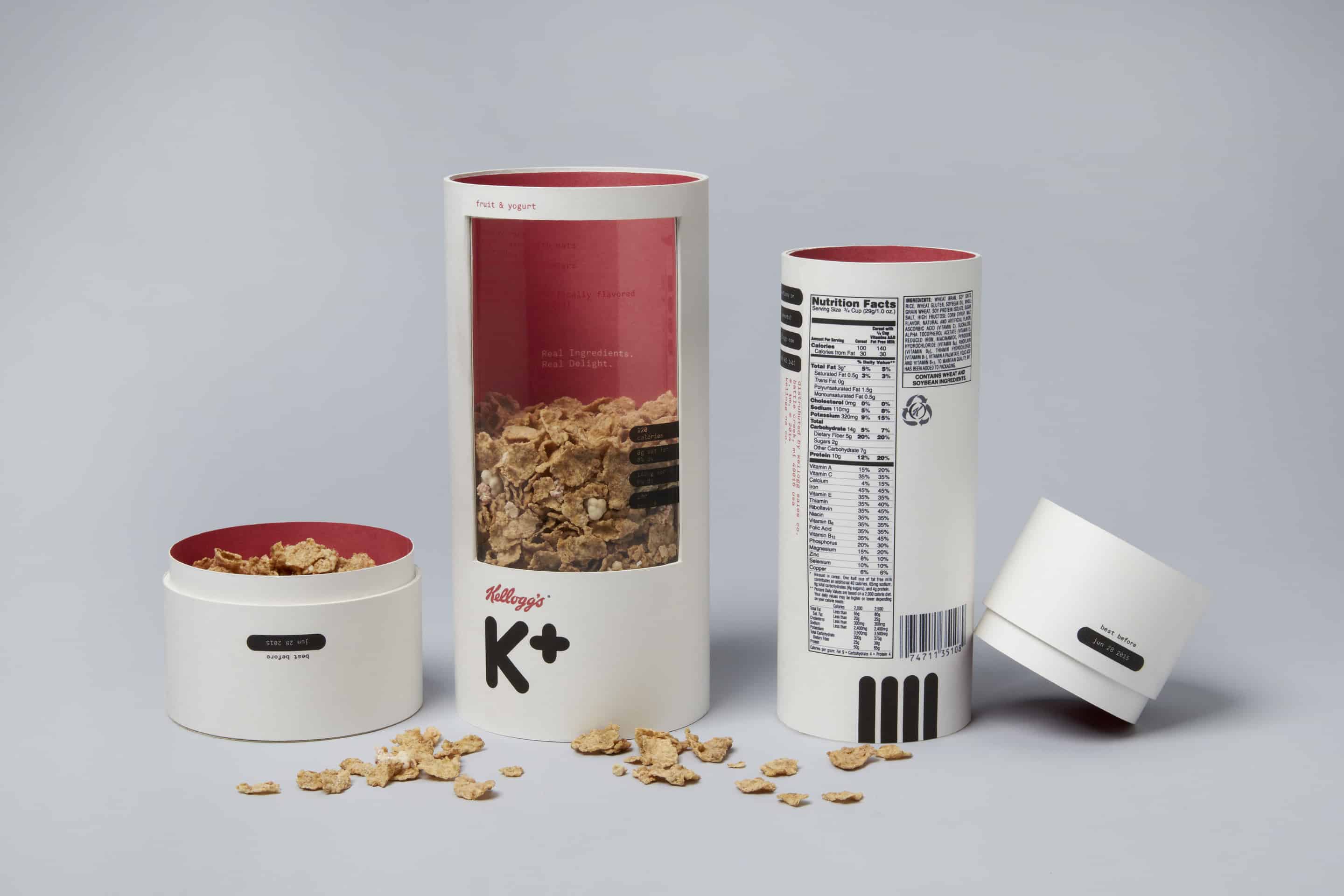
This project took me about two months. The cylinder is made out of cardboard and the opening was cut by a band saw. The material that I used to cover the window is transparent paper. The software to make the design of the product is Illustrator.
-Mun Joo Kim
Favorite quotes is from Benjamin Franklin — 'Never leave that till tomorrow which you can do today'
Pablo Picasso — 'Learn the rules like a pro, so you can break them like an artist.'
An advice I want to give to other artists is to "never stop learning". Be curious about life and explore subjects outside of your own circle.-Mun Joo Kim
ABOUT MUN JOO KIM
Mun Joo Jane, a BFA student majoring in Graphic Design at Art Center College of Design. Design has always been that friend that makes her mad, excited, and even traumatized. It takes her to uncomfortable places that are often off her grid. But this relationship with Design inspires her to experiment with art, like scientists do with science. She desires to be an inspirational designer to others.
See more of her artworks on Behance.