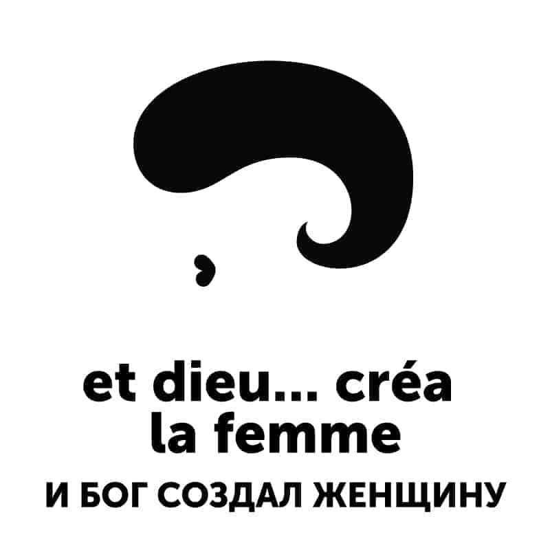
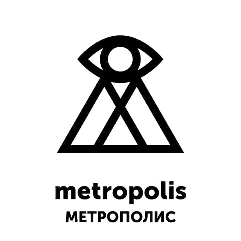
KinoGlyph
«Kino» means «cinema» and «Glyph» = «symbol». Ongoing project by Anton Shlyonkin and Anna Goncharova, where we make minimalist black and white «logos» for various movies and write short reviews about them. We try to create unique (for us) representation of the movie, rather than just drawing the main character of something obvious like that. Updated 3 times a week
The entire project can be found here: https://www.instagram.com/kinoglyph/
We wanted to do some variation on 365 days challenge, but with more focus in research and analysis, rather than just drawing. And also each of us had a list of movies we wanted to watch from designer's point of view. So, we decided to combine those two ideas in this project.
Everything starts with a sketch on a piece of paper or iPad's Procreate app. Then we make final design in Adobe Illustrator and, sometimes, we also make simple animations in Adobe Photoshop. In the end, it's not about the final result, it's about the thought process behind it for us.

Project just started but it is already fascinating to see, how different people perceive the same movie in different ways. Some viewers agree with our vision, some people argue — and thats great! We value the conversation. In the end of a day it is not about the final «logo»