LC Cafe

I was contracted to design logo for a coffee shop. The client required the logo to be a minimalist design which depicts the nature of the store as well as represents the initials of his name, hence the name “LC cafe”. For the entire career of mine as a motion graphics & graphic designer, I have been very intrigued by minimalist designs, and it’s only fair to say that minimalist design is my style. So when I was tasked with designing this logo, I was very thrilled to work on the logo design and accomplished the task effortlessly. I must say that the client and I were very happy how the design turned out.
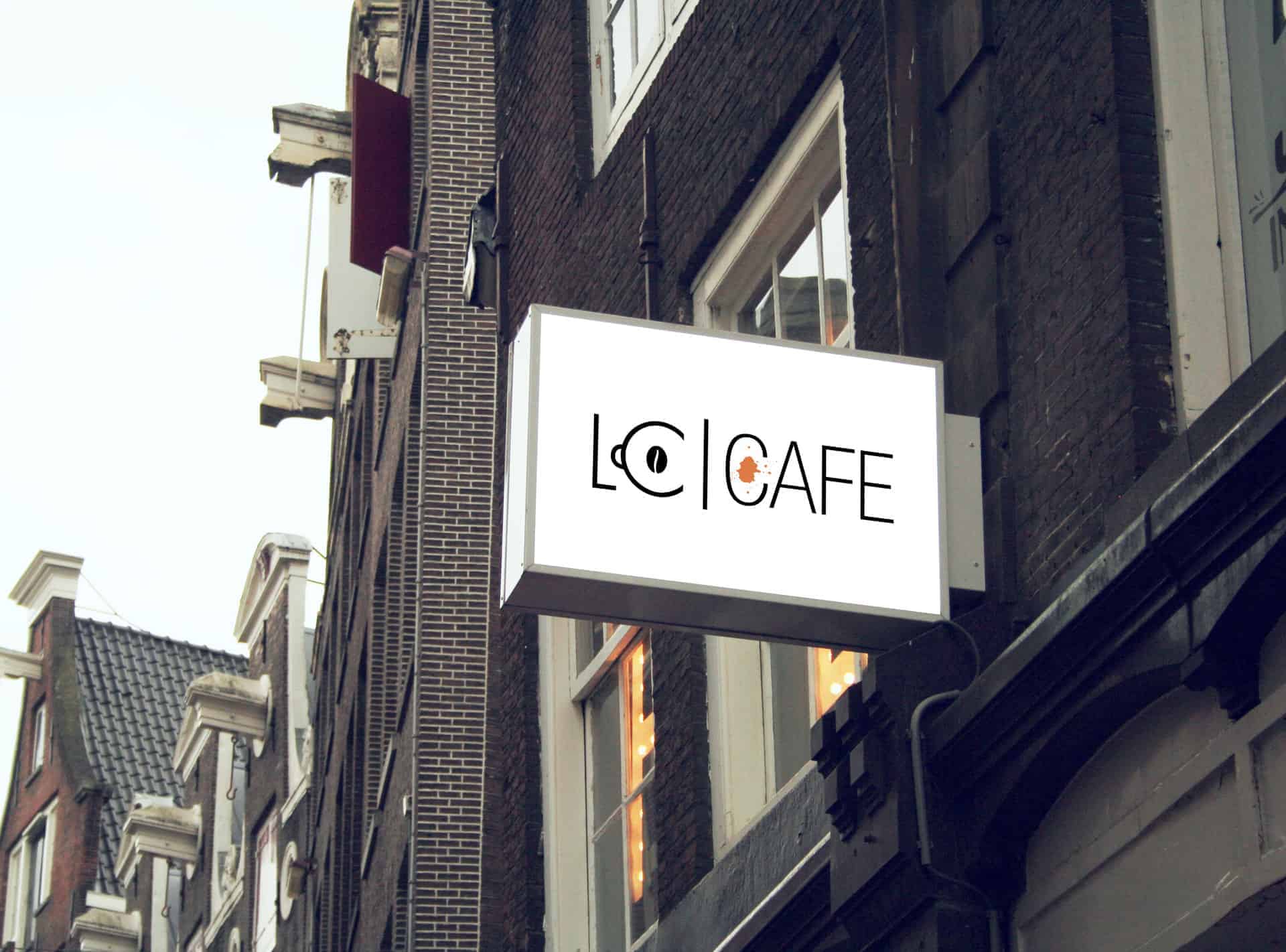
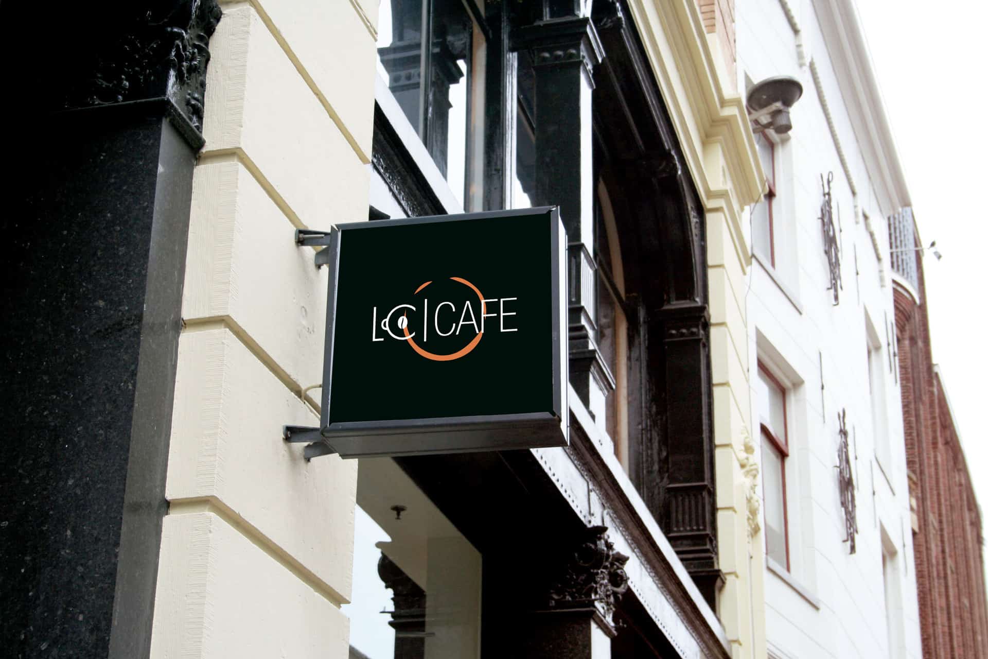
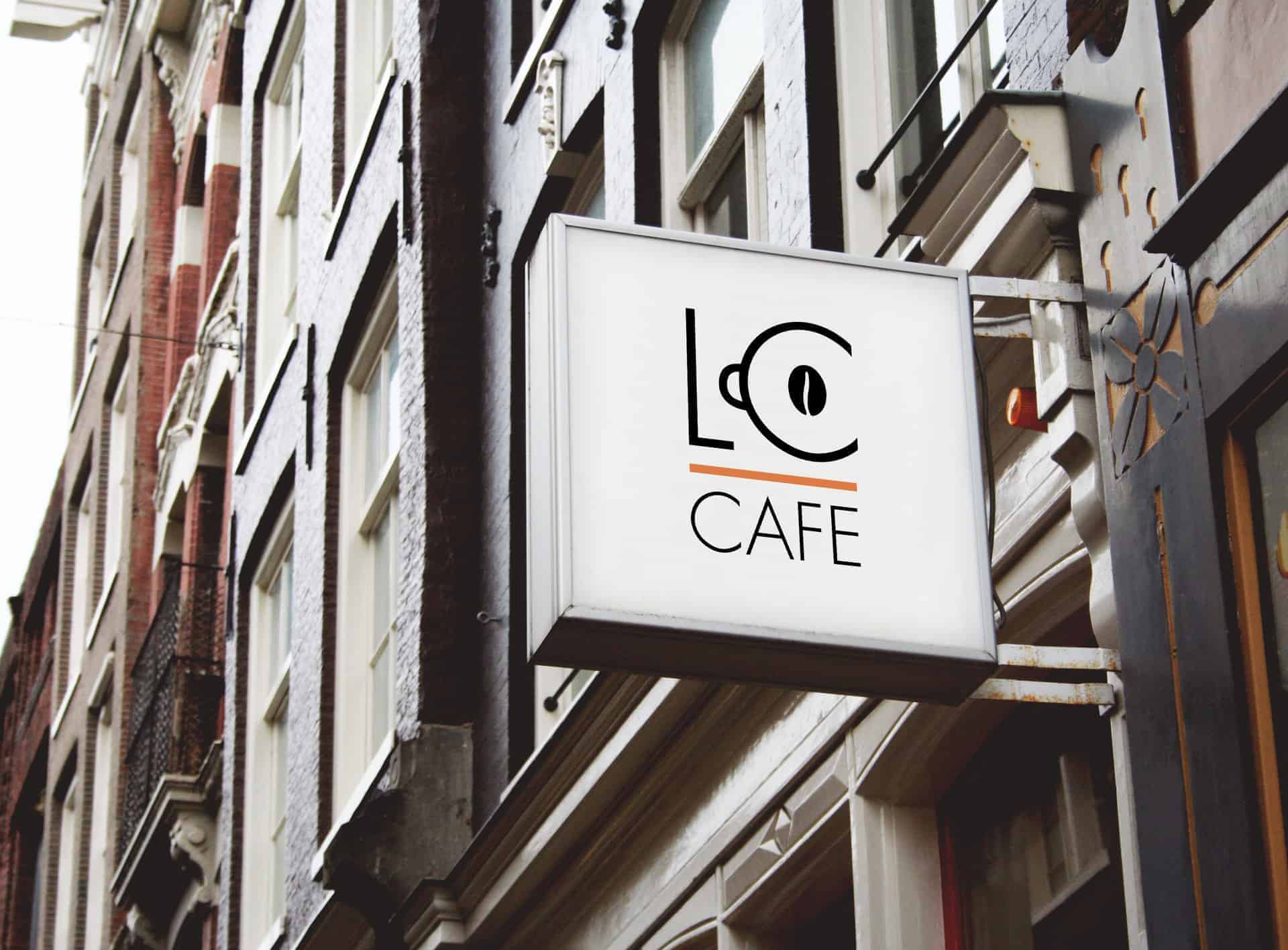
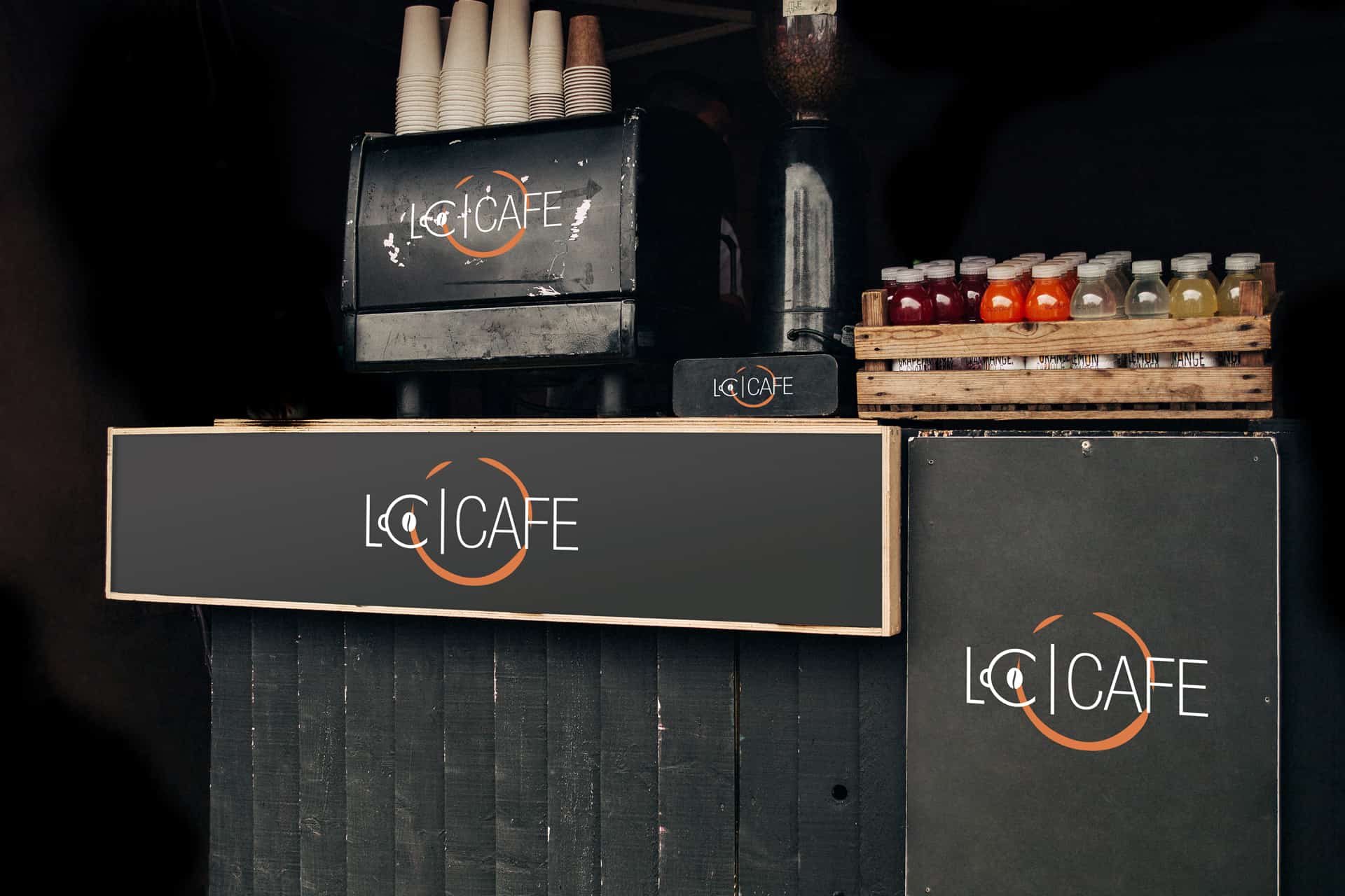
When I initially started collating ideas for the logo, the first thought that crossed my mind was that the logo should represent one thing that people love the most about cafes, ‘Coffee’!!! I began working on the logo with design elements that best-symbolised coffee, and hey guess what? A coffee cup came to my rescue ? so as you can see in the logo, the letter C, which is also the client’s initial was integrated with a symbolic representation of a coffee cup. The hard part was to play with the letters L and C and turn one of the letters into a coffee cup, yet making the letter look like an actual alphabet. I finally chose the letter C and turned it into a coffee cup!
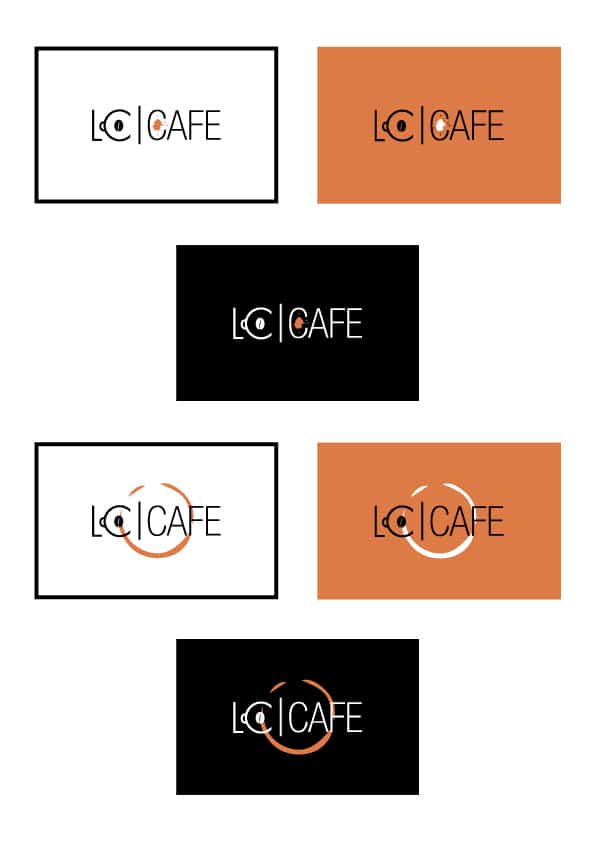
Talking about the colours that I have used for the logo, I chose black, white & orange to keep the logo as simple and eye-catching as possible. Black goes well with all most every colour & you cannot go wrong with black, and as for orange, it stimulates the brain, which increases mental activity and often stirs up a sensation of hunger, the colour orange also makes people feel welcome and when someone is comfortable, eating sounds like a great idea ( The client will be making big bucks, won't he?). I have designed 3 variations of the logo each with different background colour and combination. Fonts that are used are simple and easily readable to everyone. I just wanted the logo to look well put together, I believe I have done justice to the logo.
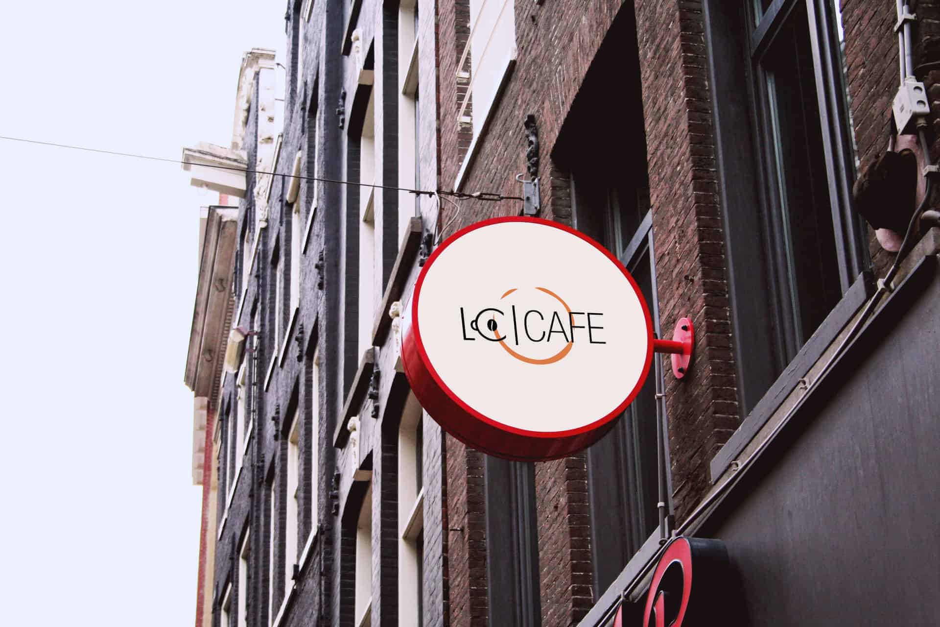
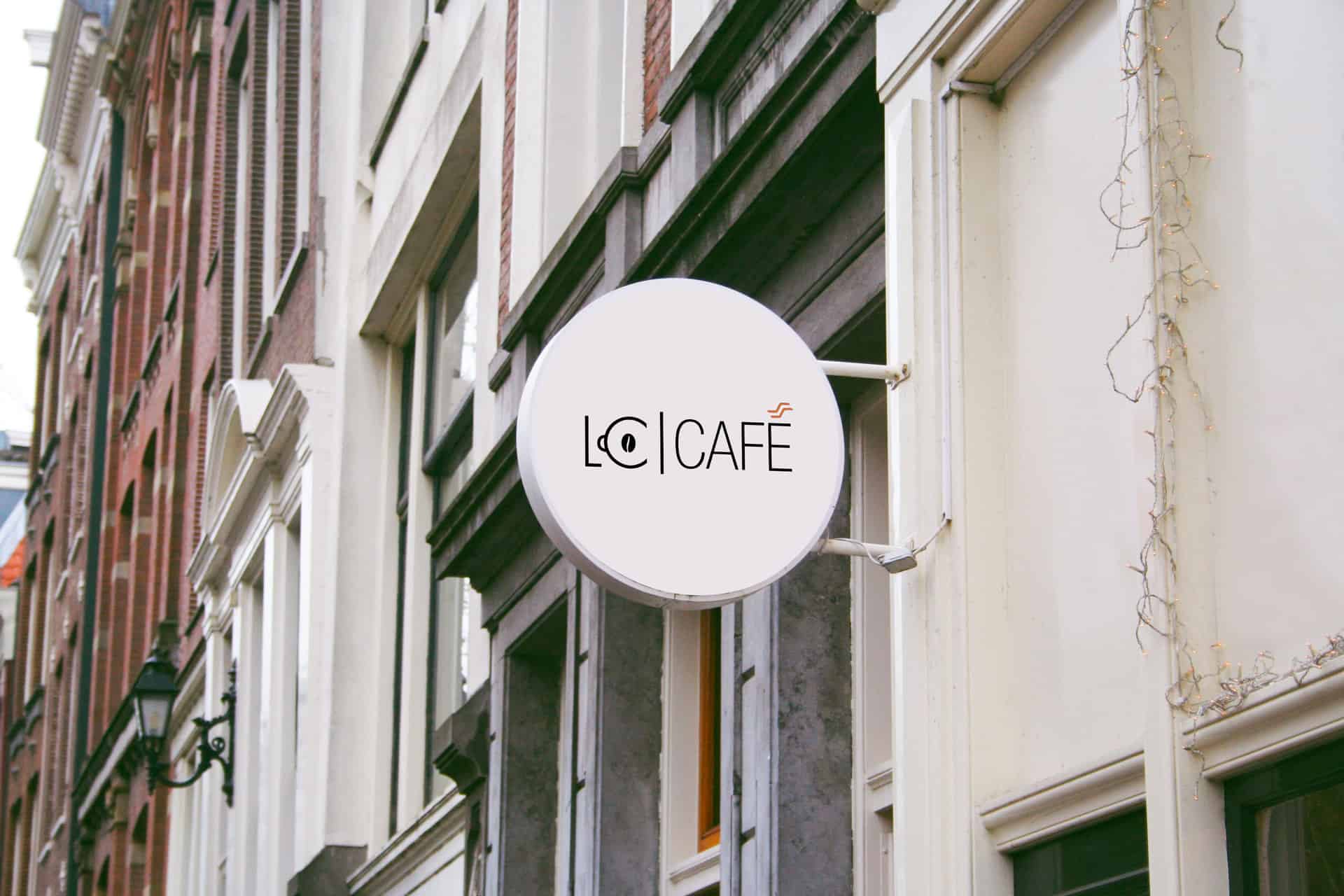
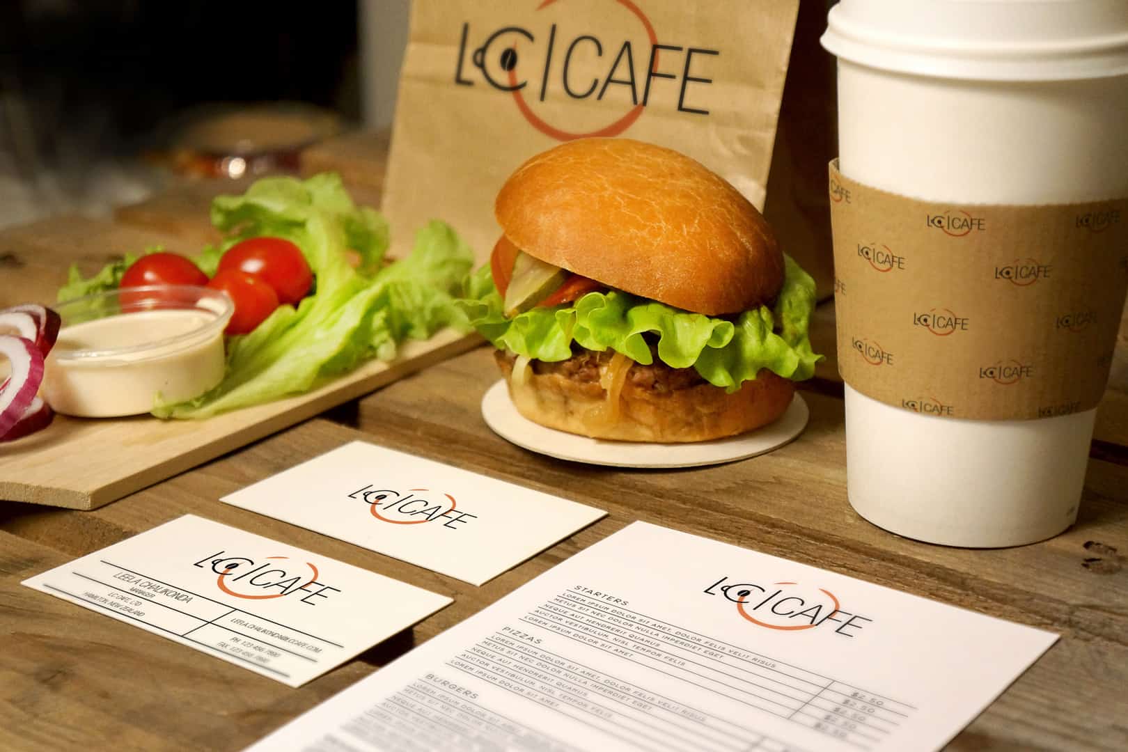
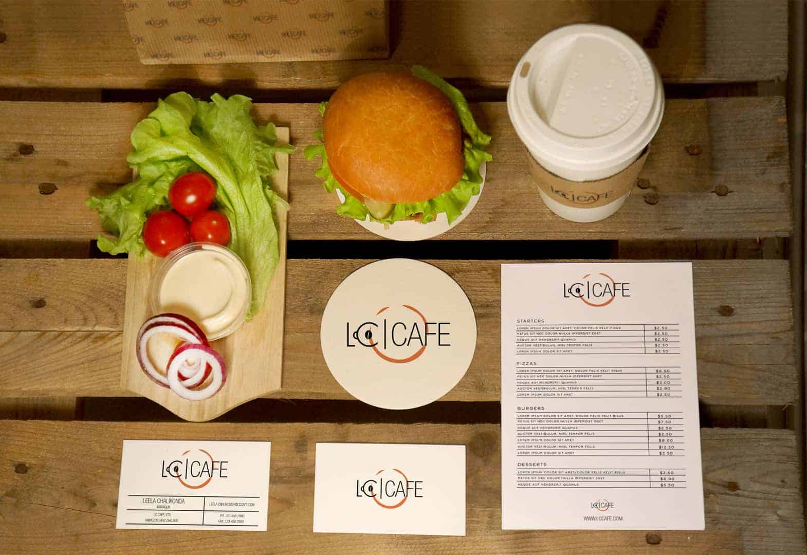
I fired up Illustrator, set up my document and started working on design elements, choosing the right font for the design elements was a task. Then finally I had 4 designs which I saved them in the black, white and orange background. Then I created cafe signboard mockup with all 4 designs and also the branding so that the client could visually see how the logo appear.
Softwares: Adobe Illustrator CC and Adobe Photoshop CC
Tools: Mostly pen tool

The client Name is Leela Chalikonda. He was more than happy, "looks bloody good" were his exact words when I presented my designs to him.
I followed the most basic rule any designer would follow while designing a logo which is,
1. Discuss
2. Research
3. Brainstorm
4. Sketch and ideas
5. Rough design
6. Feedback
7. Final design and branding.
8. Deliver
Amazing!
Excellent design approach
Awesome design!