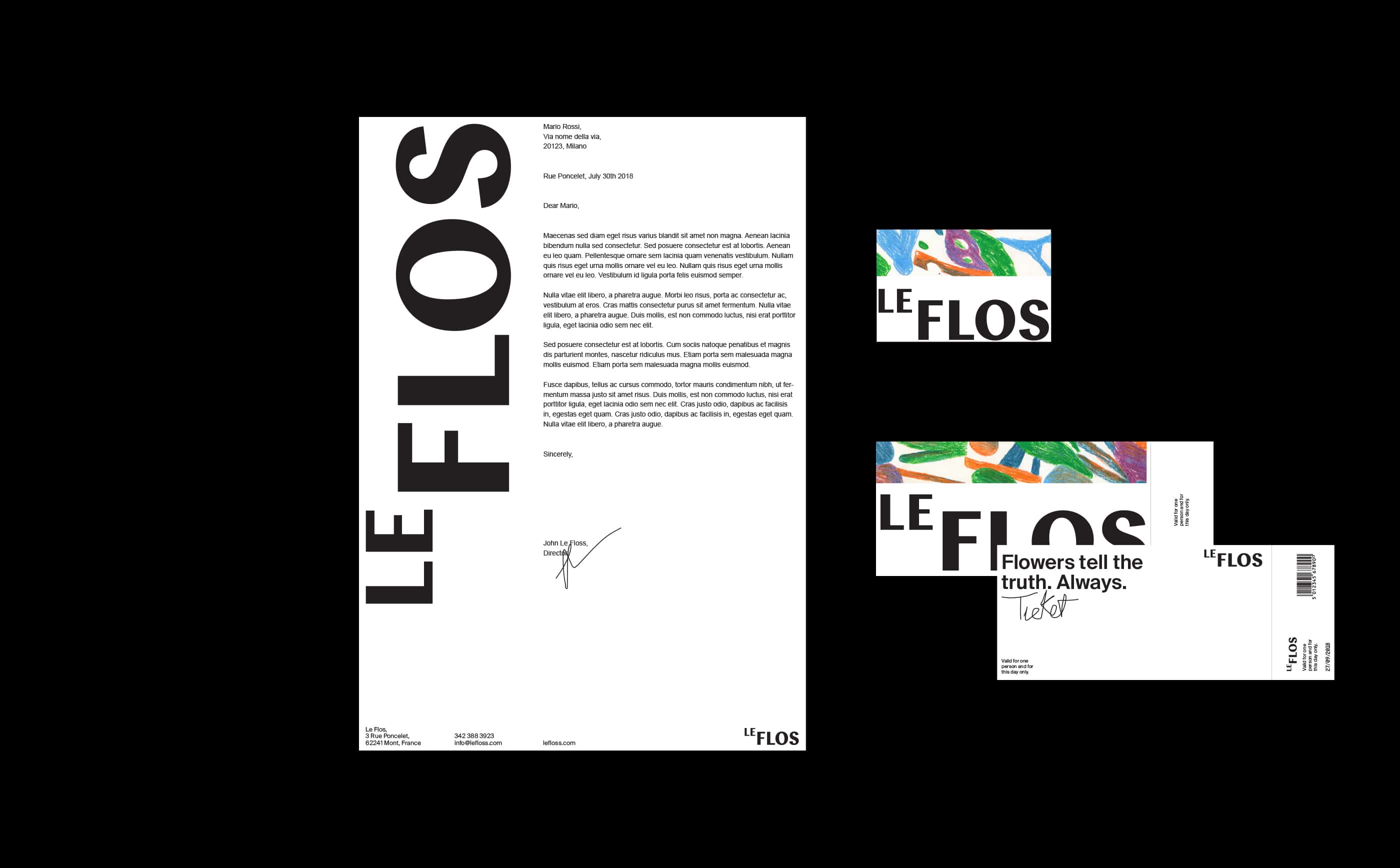
LeFlos Branding

Branding and identity for LeFloss, a garden in the south of France. This is not a traditional garden; rather than being only a place surrounded by beautiful nature, LeFlos is a meeting point, a place in which creative and cultural events take place.
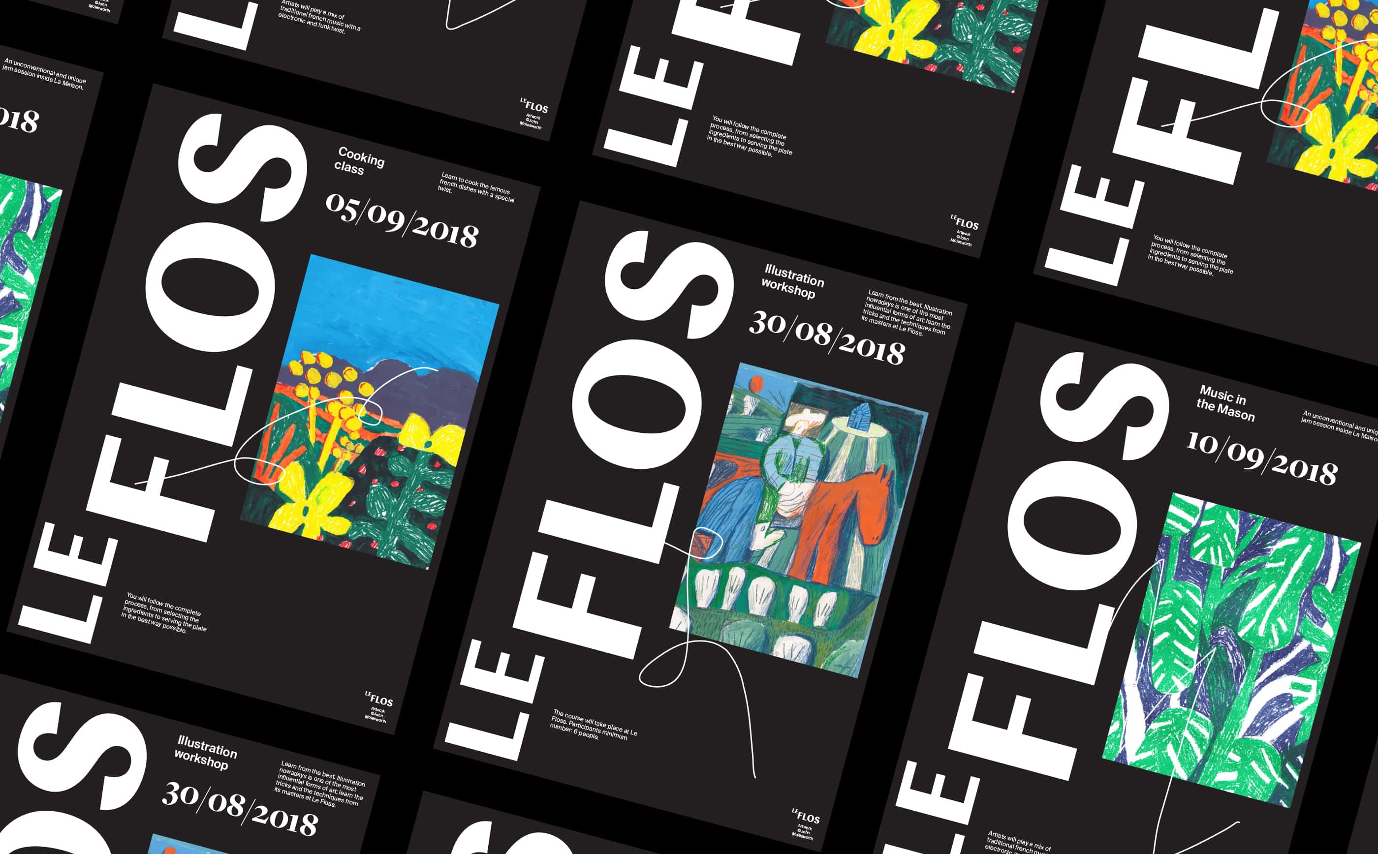
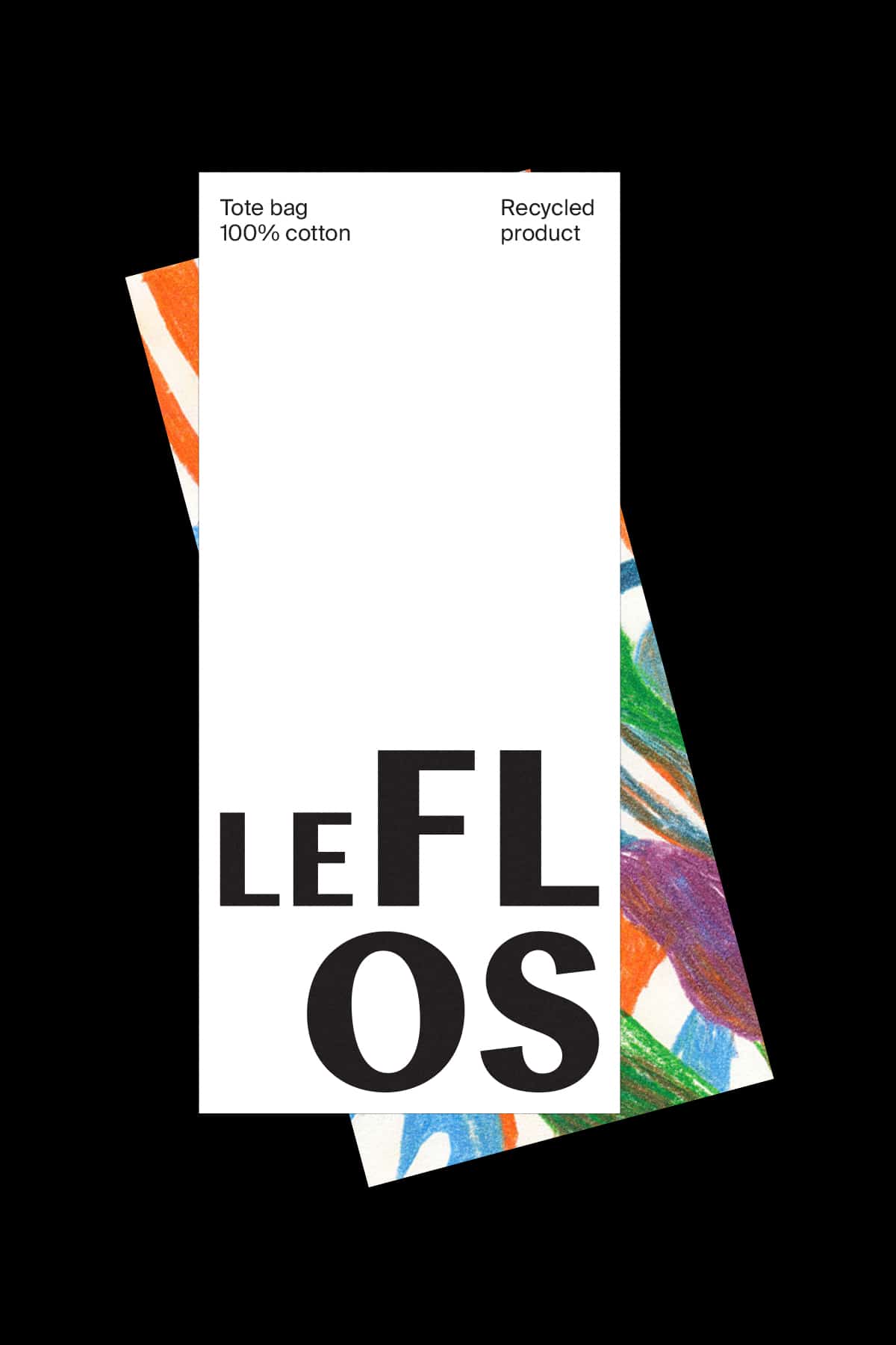
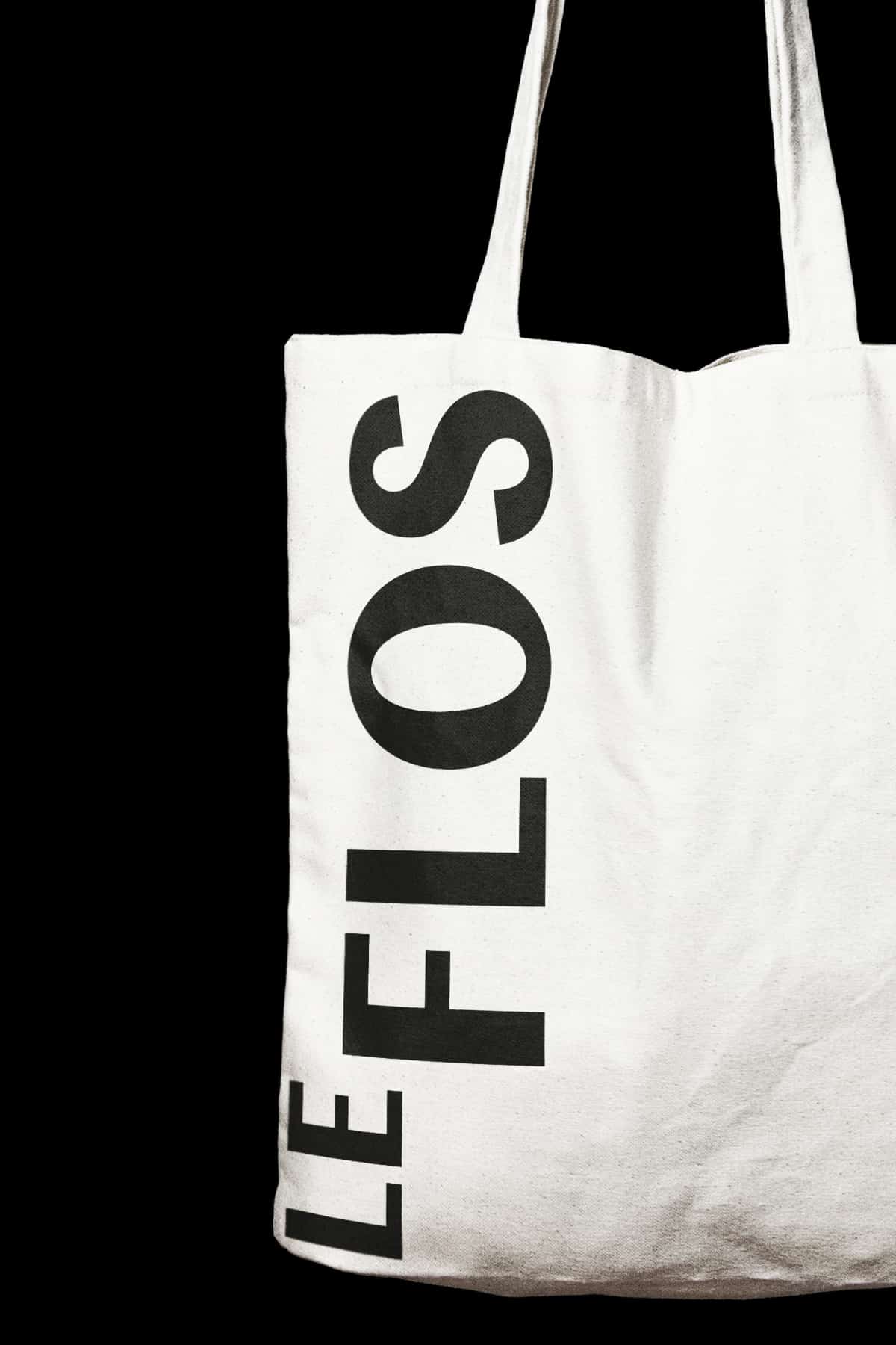
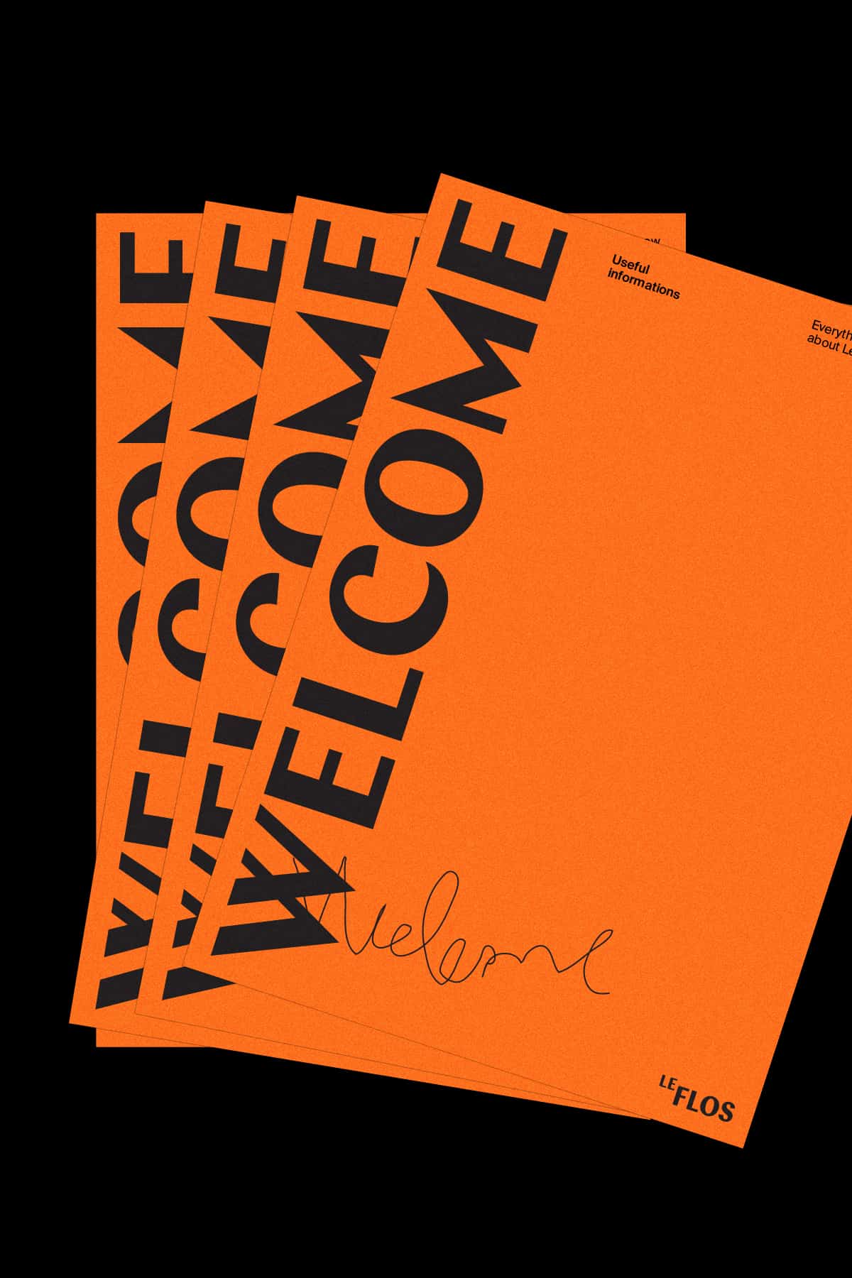
The idea is to communicate both the traditional origin of the place and its creative and free spirit. The mix is done mixing typography and illustration in an unconventional way. Letterings follow a rigid layout, while the style of the illustrations and the handwritten text break the grid and add an unexpected element.
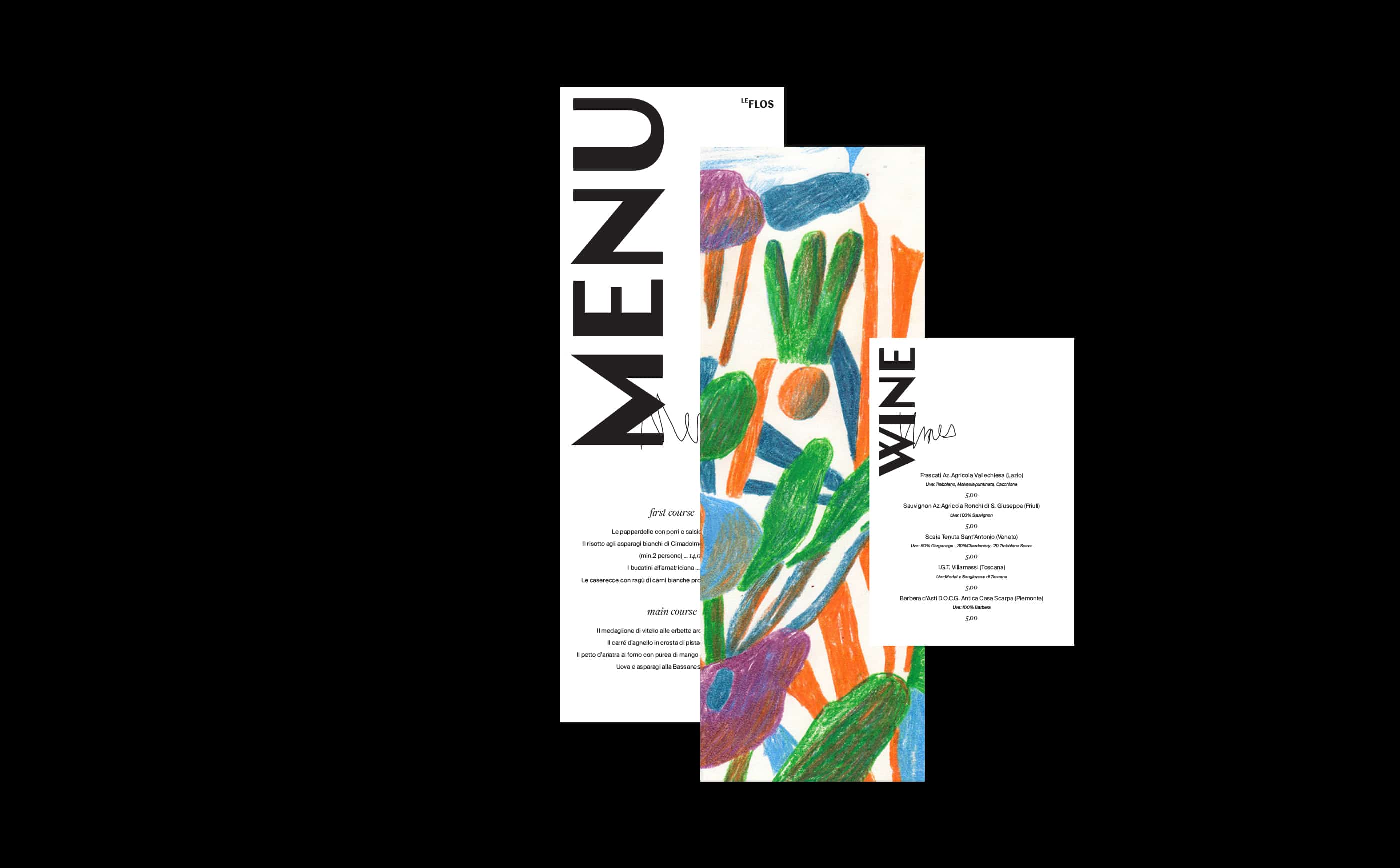
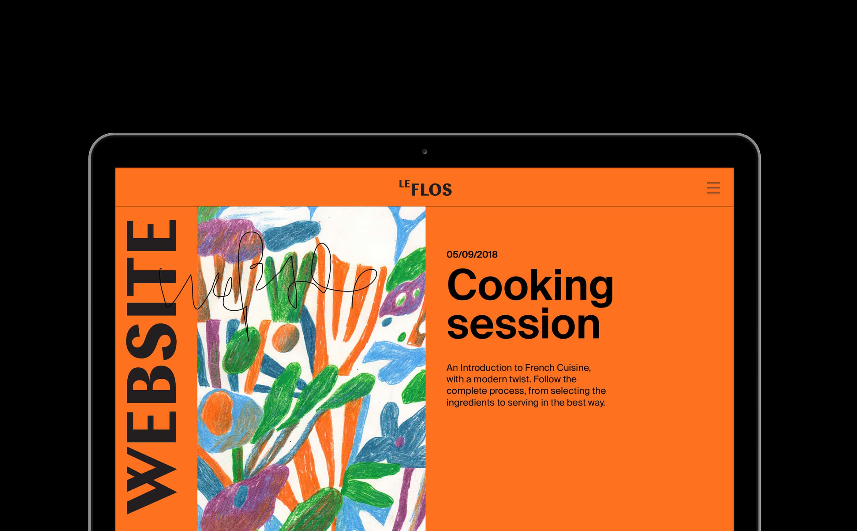
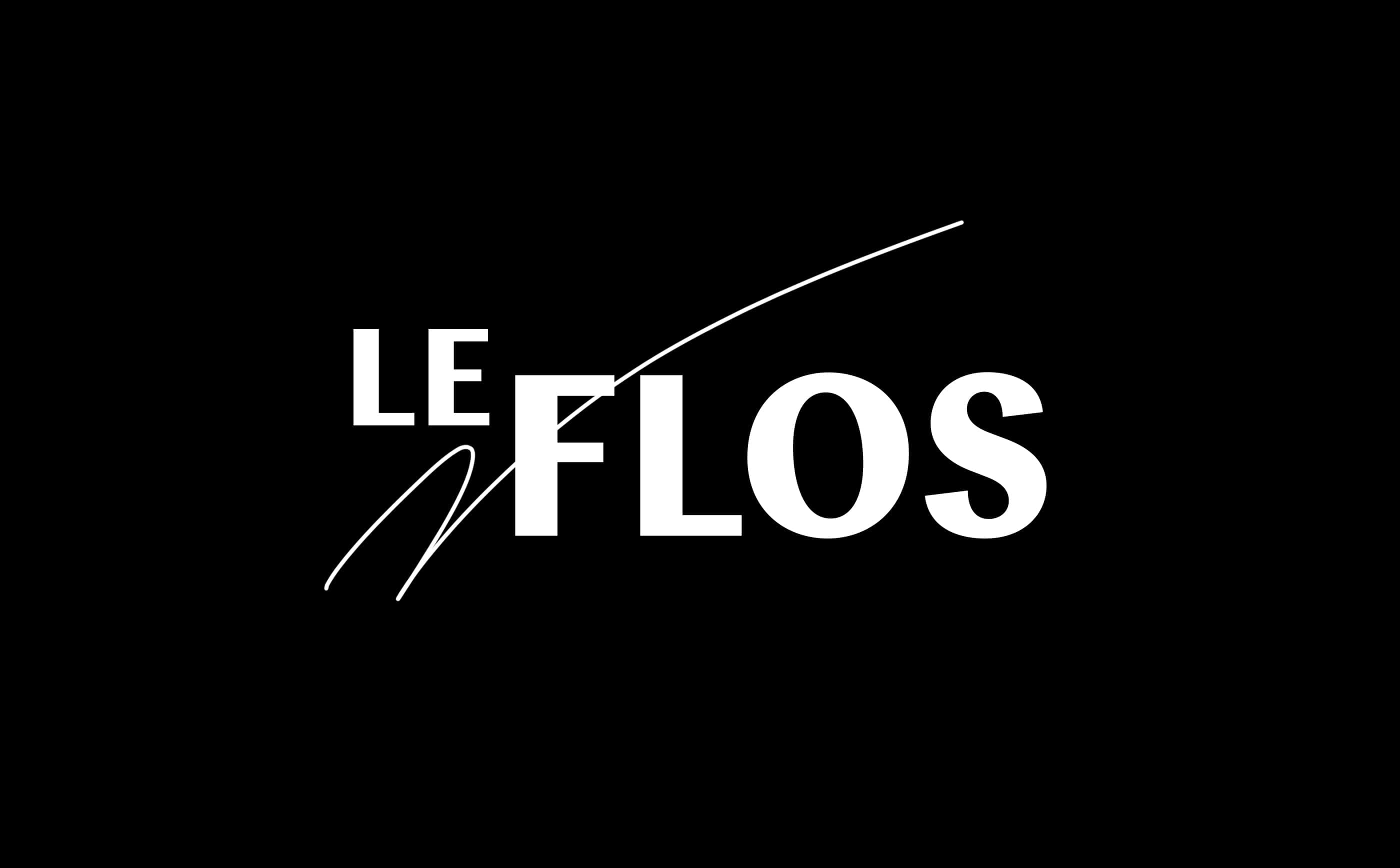
As every project, it all started on paper. That's where I got the idea of the "scribble" over the rigid typography. Then I began searching for a typography that could empathize both the traditional and the modern aspects of LeFlos. Chap, the primary font used, was the perfect choice for this matter. Suisse Int'l is used as the support type. The final step was a matter of finding the right layout using InDesign, Photoshop, and Illustrator.
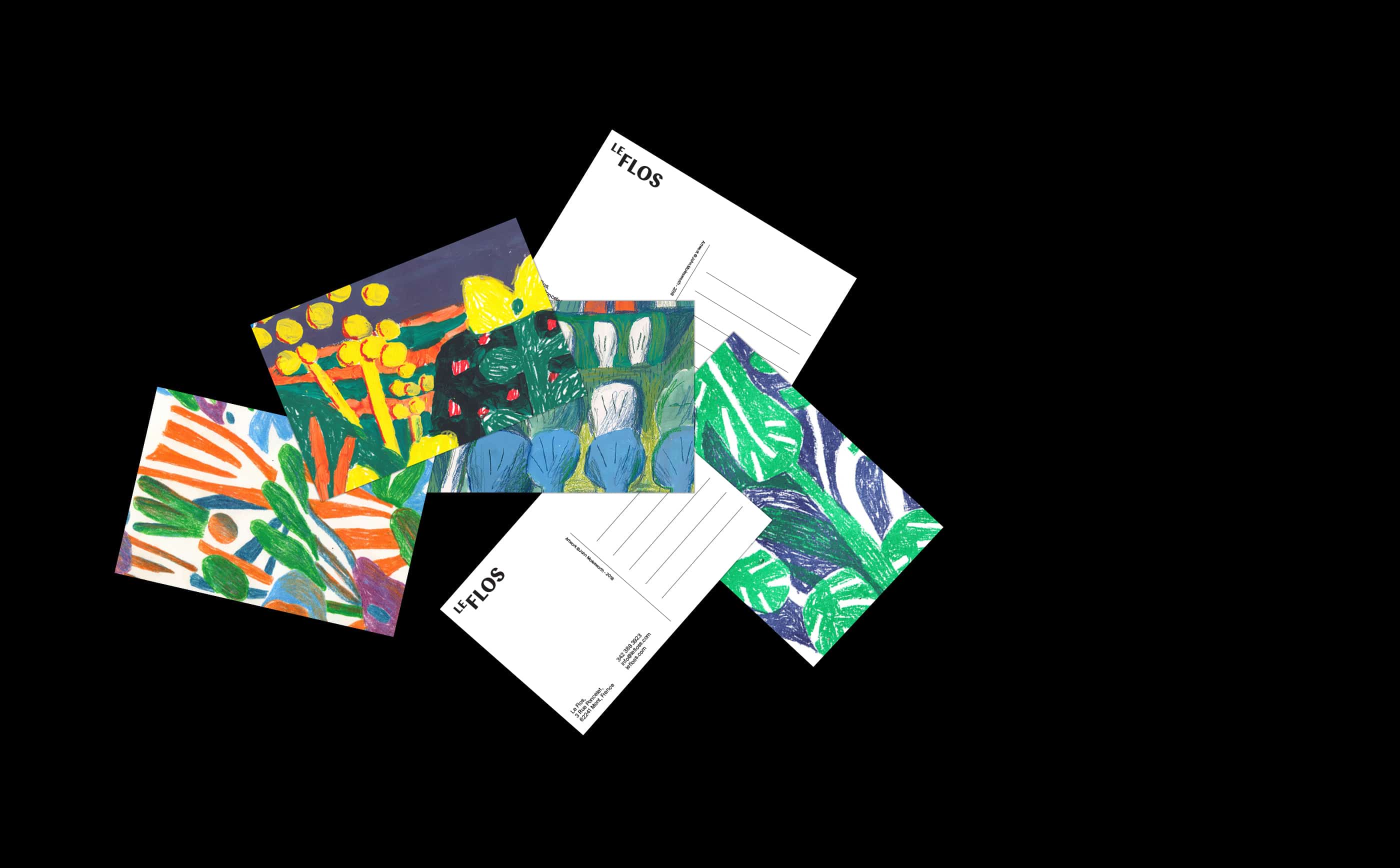
The thing I learned is that sometimes the unexpected is what makes a project stand out and interesting. Random scribbles over a layout made the entire identity stick together. Having a solid starting point is essential, but should not be underestimated the power of randomness.