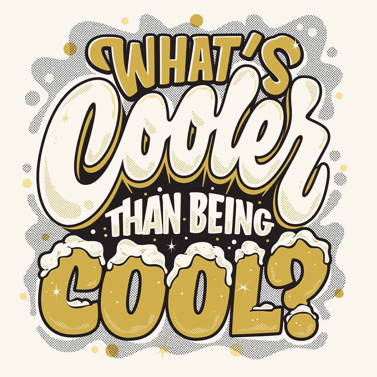
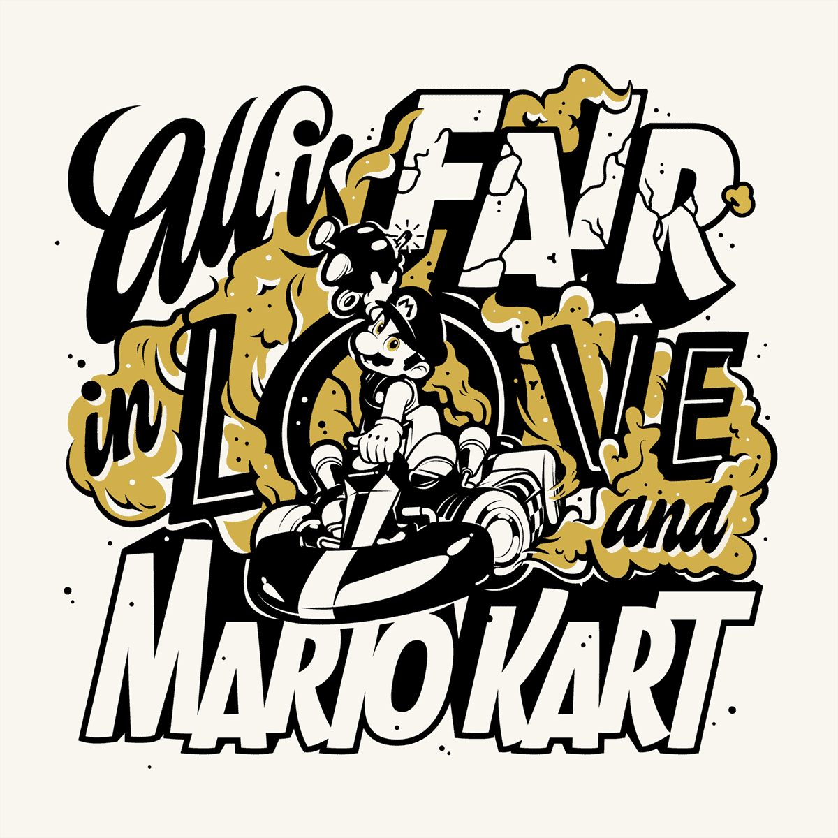
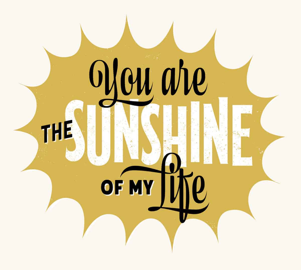
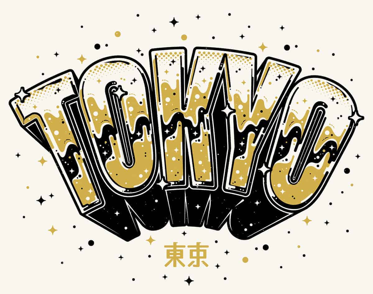
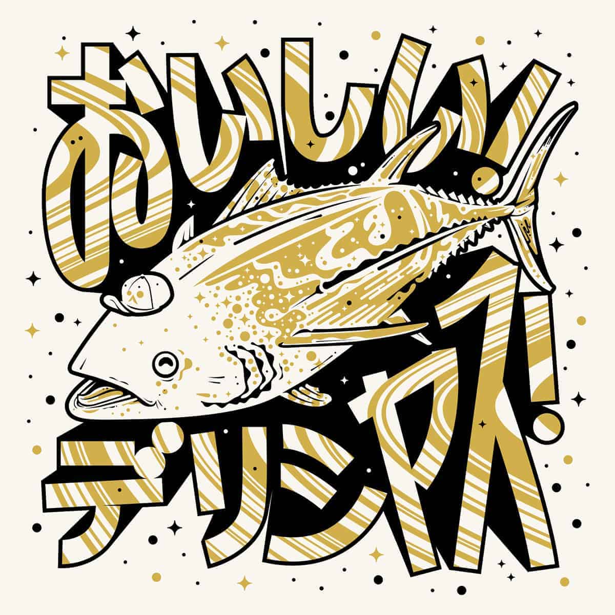
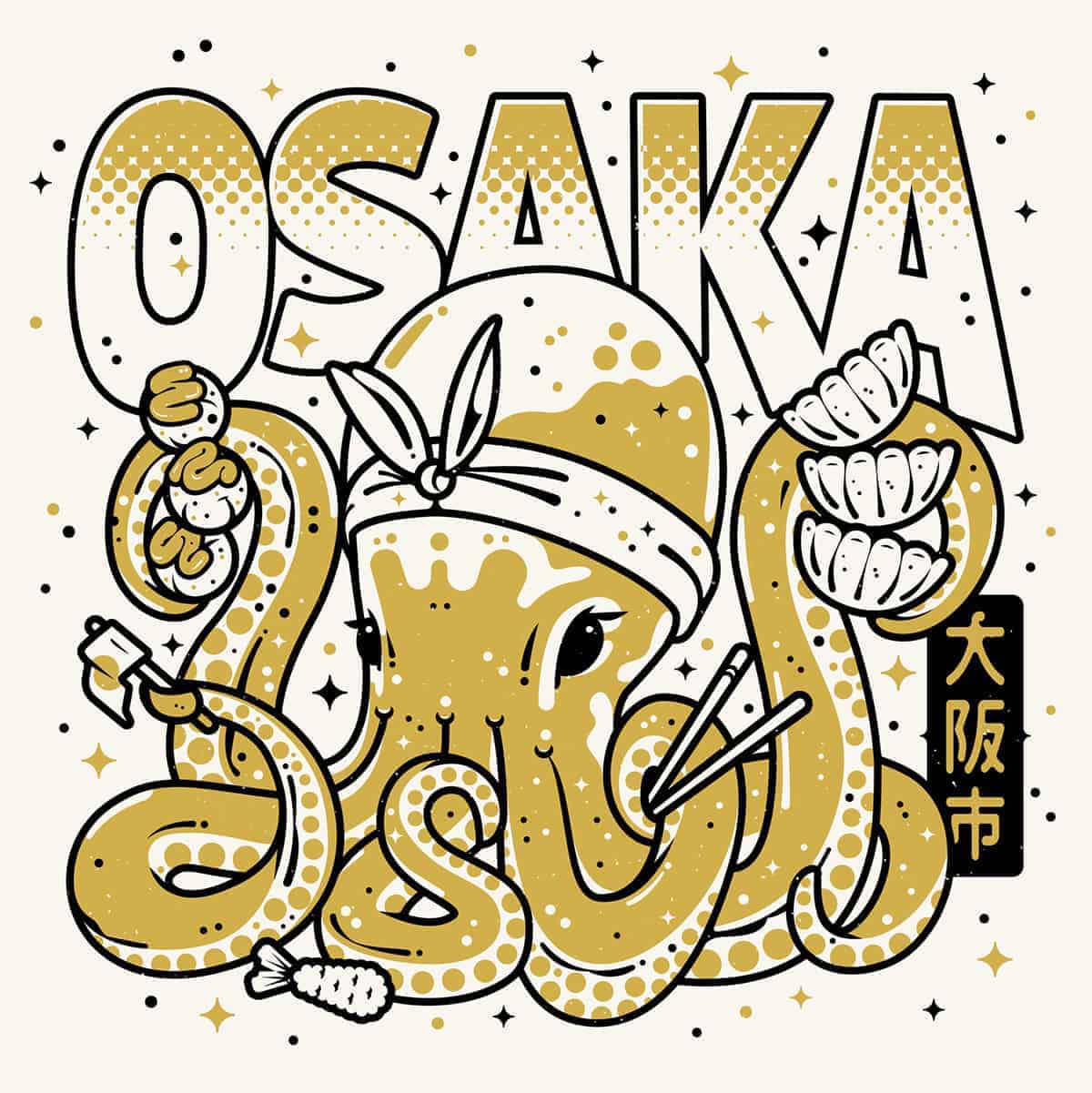
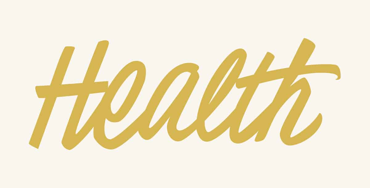
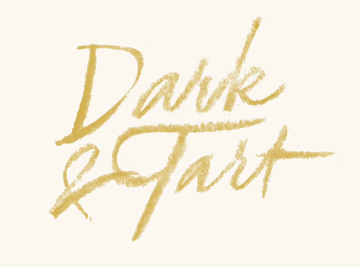
Lettering 2016–17

This is a collection of lettering from the past year, some of which is freelance client work, others of which are just personal explorations. Type and lettering was sort of my gateway drug into design. In college, it was discouraged, because it was seen as a bit too much of a niche. So I continued to pursue it in my downtime, weaseling little bits of custom type into projects when I could.
Starting out in professional design jobs six or seven years ago, I didn't have many opportunities to do it either, but I kept it as an obsession, and would practice after work, or on the long bus ride into the office. There's a part of me that may always be driven by this sneaky little obsession, determined to get better at lettering, and try new styles. In the past few months, I left my full-time role as a Senior Designer at a small studio in Chicago in order to pursue lettering more regularly, and I've been building sketching time into my daily schedule. It's been so rejuvenating — I did some of these for my trip to Japan just to playfully call out where I'd been, some are just simple experiments in style to push myself. I put them all together in the same page on my site, kyleletendre.com/lettering, with the same limited palette, just to unify things with such a big range of styles. And when I go back to look at the body of work I've started to make, it feels really encouraging, like I made the right choice to keep bullheadedly plugging away at lettering.
Most of the pieces in here are done in Illustrator, with some help from my Cintiq Tablet. I never sketched much for lettering pieces until the past year — either I was too sheepish to do it because my sketches weren't as curated and lovely as some of the ones online, or because I didn't have the time. But increasingly I've found it invaluable, and having access to a tablet through my old studio was really the breaking point. I'll start sketching things very small, and slowly work larger, and refine the overall composition, style, and shape. Once it's in a good place, I'll take a screen shot of it and work in Illustrator to build it. What's been so great about having a tablet is that if I get stuck, I can take a screen shot of where I'm at in Illustrator, draw all over it in Photoshop to fix the stiffness or adjust some curves, and then take that back into Illustrator and adjust accordingly. The rest is just churning away. I have a high tolerance for tedium and an insatiable appetite for podcasts, so I just work and listen to stories. Not so bad!
People have been very kind and supportive so far! I think type has always been a big part of what I do, but lately I've felt a real fire under my ass to keep at it, to improve my composition, and to make better work. And I think that motivation shows in the work. Mostly this has all been really reaffirming that leaving my old job was the right move. I wasn't able to focus very much on type there, and I was coming home feeling so frustrated and burnt out. It was a big risk to jump to freelance but so worthwhile. Now that I've been able to throw myself into lettering head-first, find my voice, get weird and have fun with it — it's been so deeply rewarding.
Follow me on Instagram @heykyle to see more of this!
Love this project. The way you treat hand lettering and the way you incorporate illustrations in the artwork is solid. I also love the color palette, good job!
I love it, nice calligraphy!