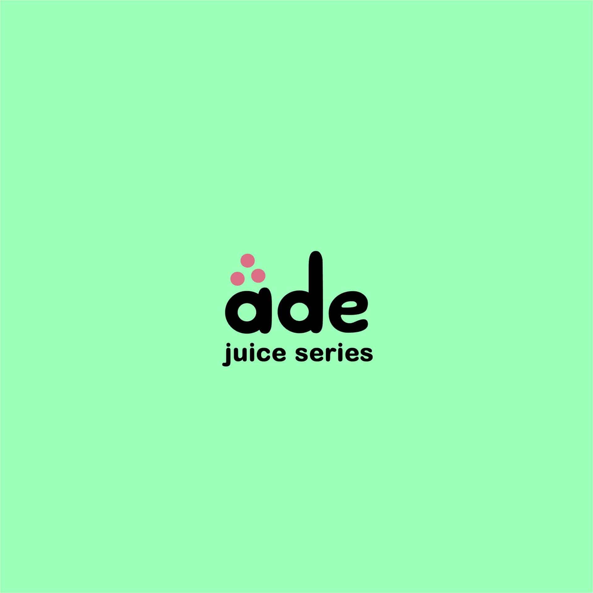
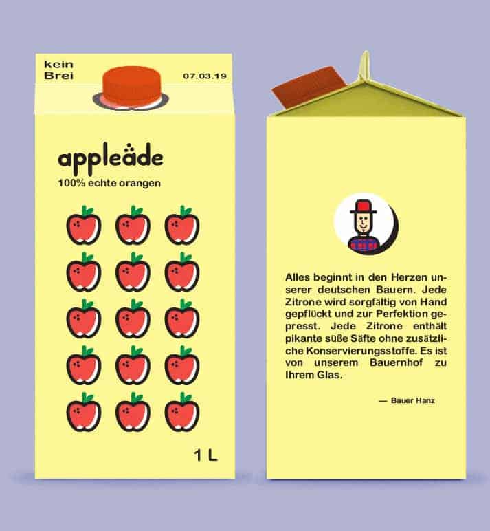
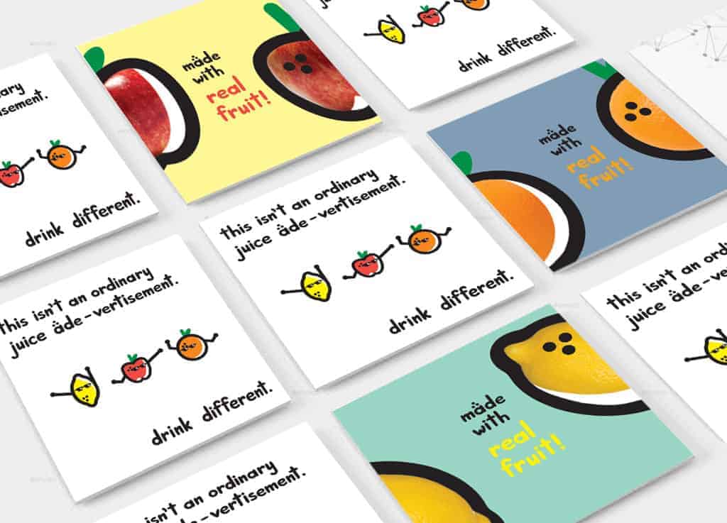
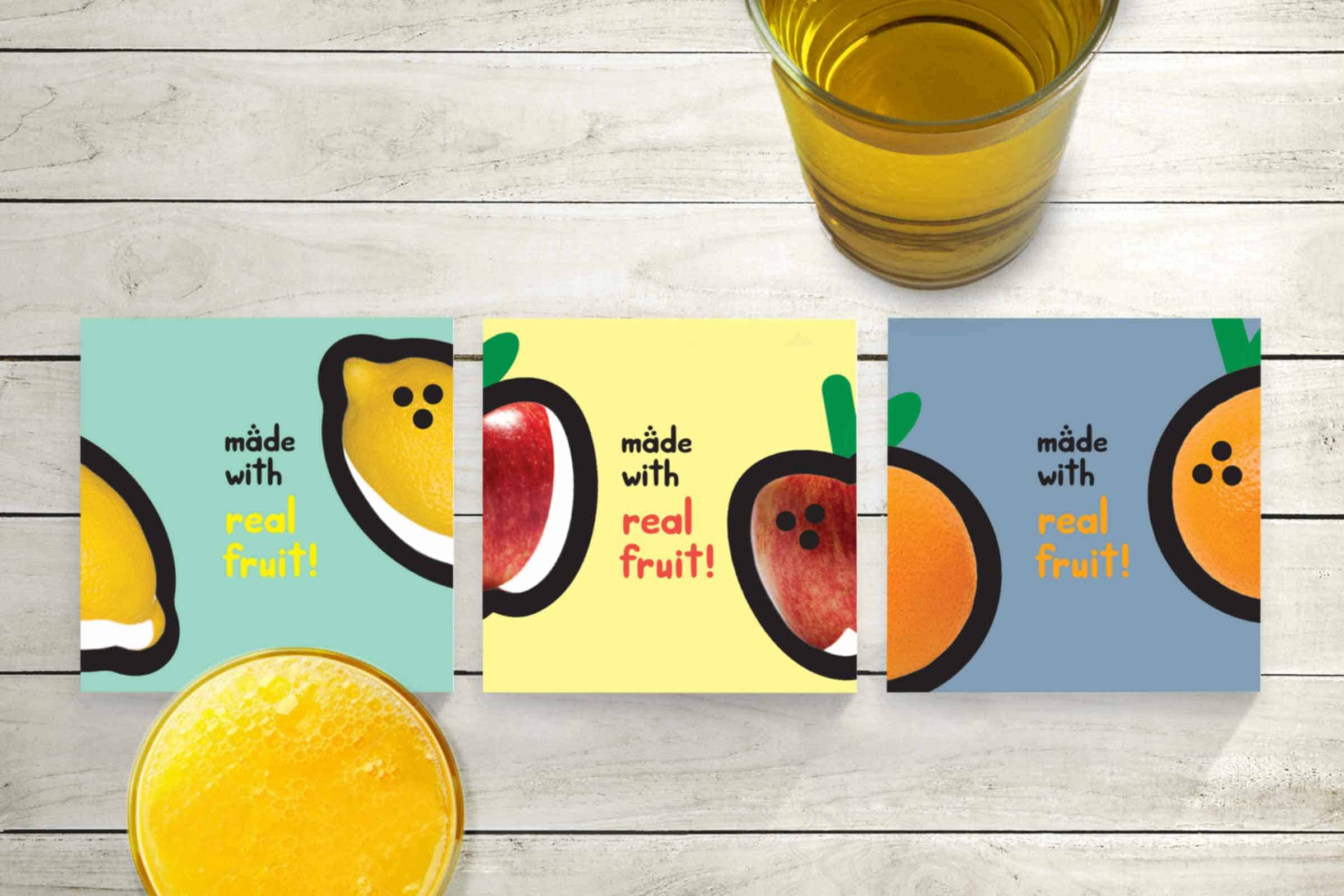
Limonade

This is a German juice series of Apple, Lemon and Orange flavours. Limonade was the first concept from which the other 2 drinks adopted the "ade" suffix and that suffix became the focal conceptual theme. The 3 dots are meant to symbolize the pores found on fruits as well as a close mimic to ä which pronounces the "ay" in "ade".
The idea emerged when the designer was craving fruit juice. It was decided that the drink have colourful and graphic aesthetic to take on a more young and fun visual approach to fruit juice.
This portfolio includes juice cartons, coaster ads and billboard ads.
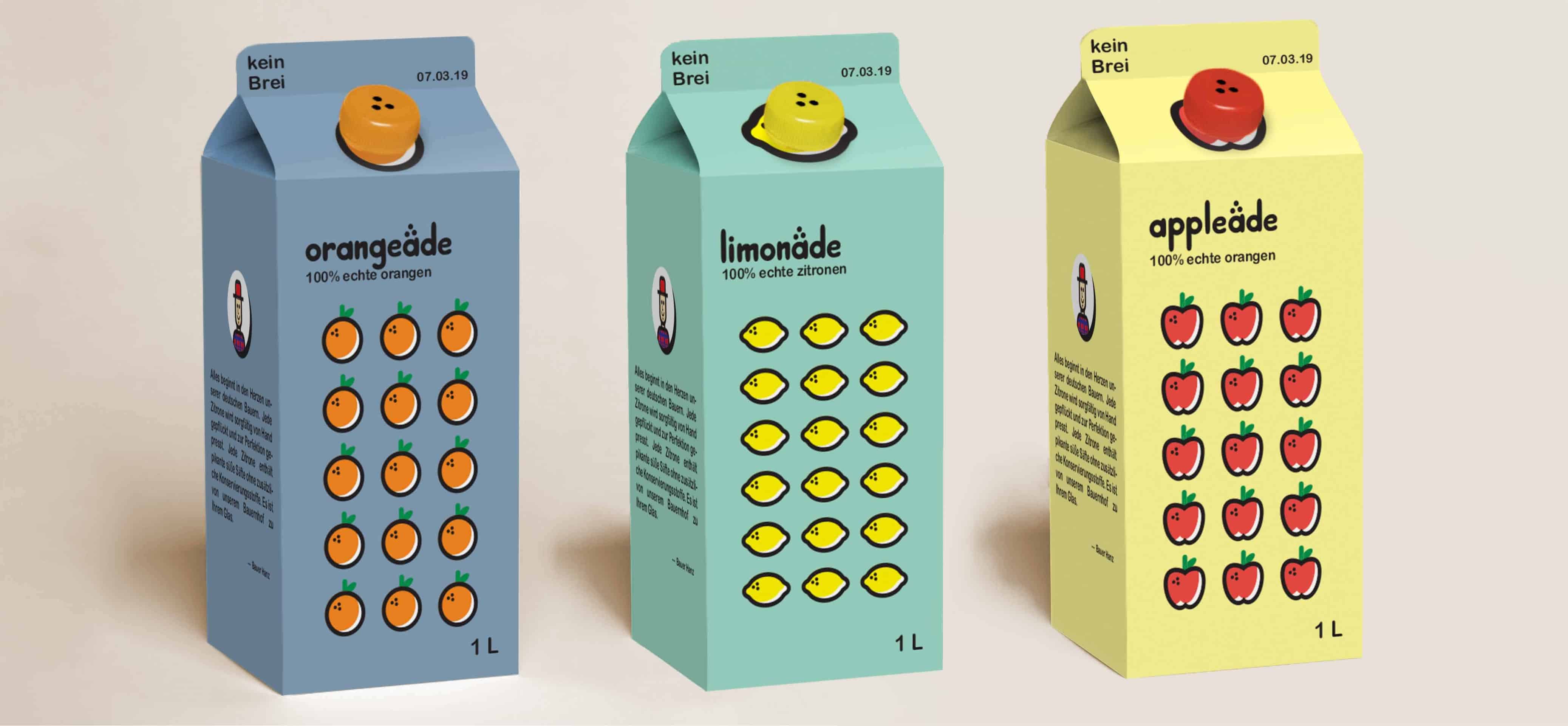
I have a love for fruit juice and fruits in general, so I wanted to give fruit juice a cute and graphic aesthetic. Simple illustration work and careful choice of colour palette are what ties the project together.
For a change, I tried a simple eye-popping graphics approach where there were no details and the focus was all on the line and bold colours. I originally started lettering the "Limonade" title on paper which I then made a vector on Illustrator and used the custom typeface to develop the other juices. Complimentary and bold colours were used.
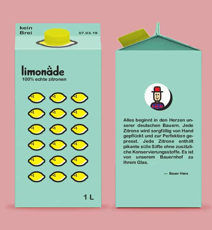
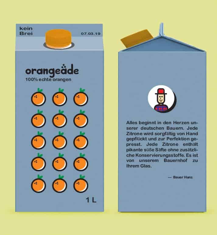
Adobe Illustrator was used to develop all of the graphics. The pen tool was used to draw up the line work for the graphics. Te names of the juices were made from a custom hand-lettered typeface initially inked out on paper and brought to Illustrator using Image Trace (with the smoothen tool to smoothen out the rough edges).
Photoshop was used to create real-life mockups of the brand. Images of billboards, cartons, and other applicable material were Google-sourced and the images were edited to fit onto them. There were no pre-made Photoshop mockups used.
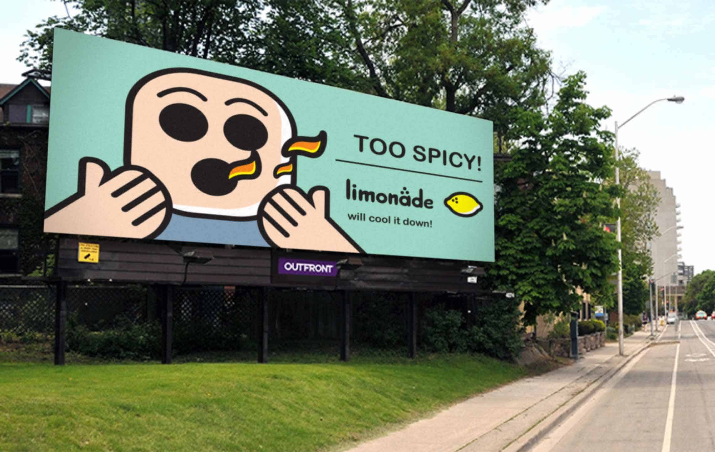
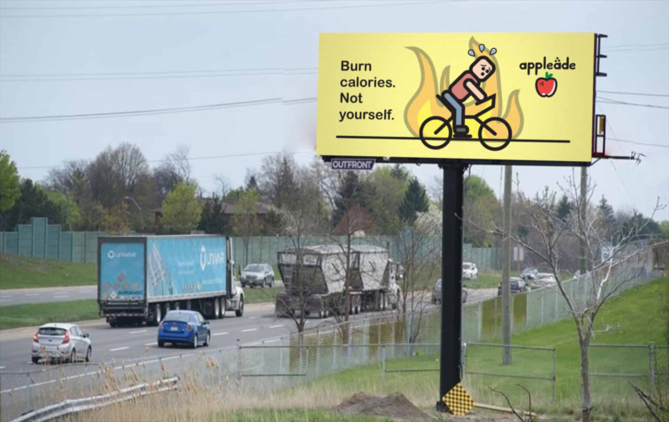
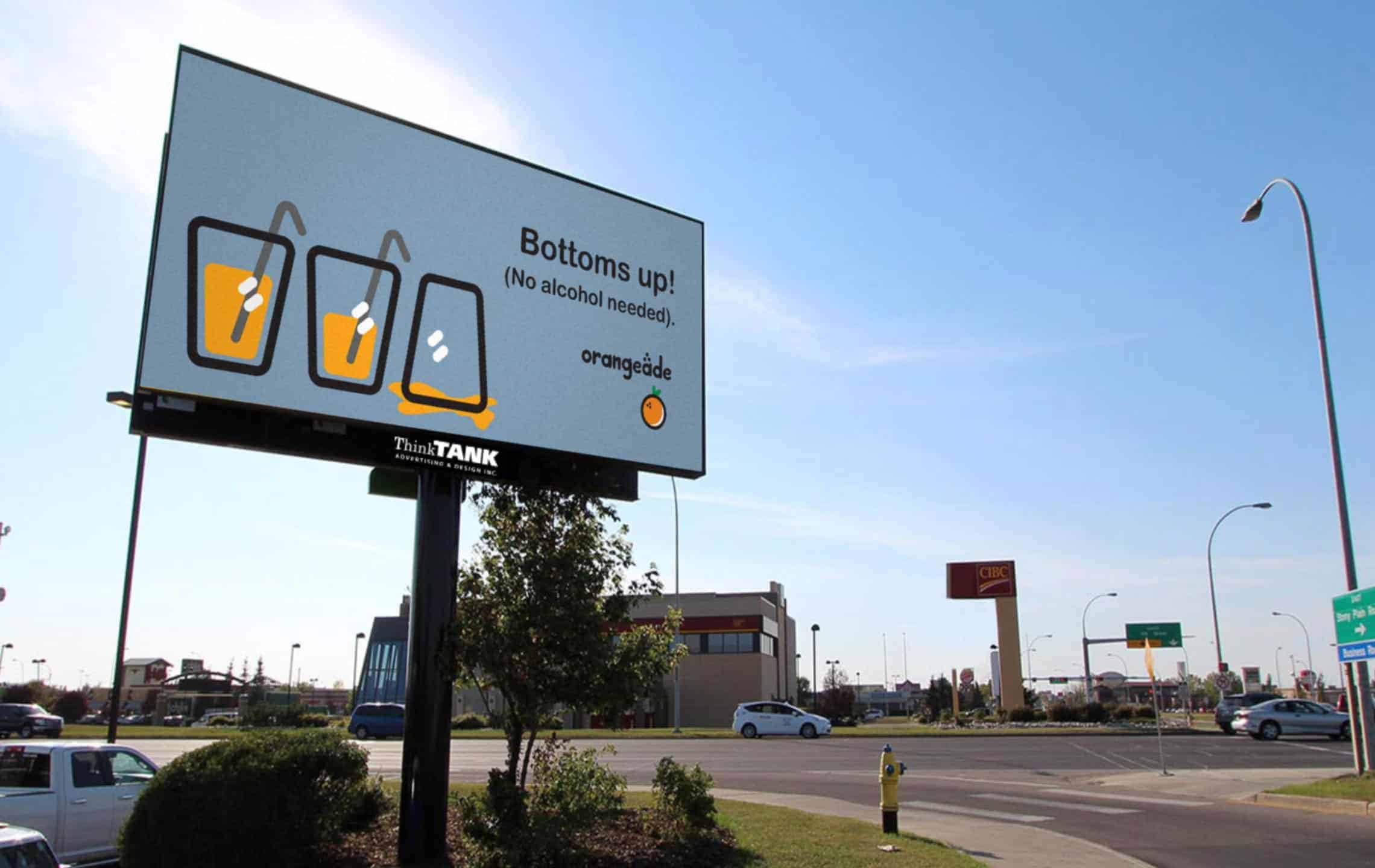
It has not been posted anywhere except Behance. It got very positive feedback, noting the colour palette and choice of illustration style This project allowed me to practice seeing colours and pairing them up for desired colour palettes. It allowed me to see what colour is suitable for what project or concept. The billboards were also an experiment on the marketing aspect of design. It took on relateable and humourous approaches because those are two of many concepts that work in advertising.