Little Donuts

Little Donuts is a small up-and-coming business based in México. Little Donuts offers the best quality mini donuts in the North of México.
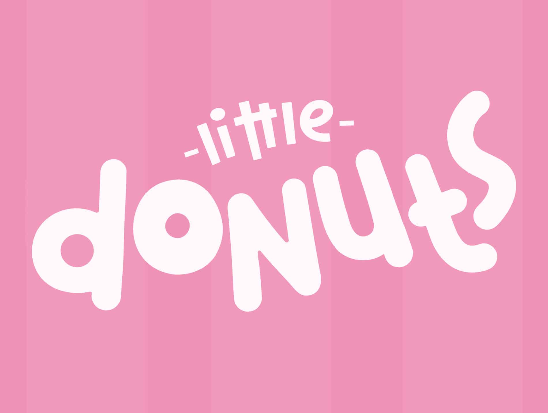
The idea was to create a friendly and kind image that reflected the values this business is based on.
Playful, creative, and fun are some of the ways we can describe Little Donuts, as a small business one requires an image that stands out among all the competition, that's why we aimed for something people will look at with fondness.
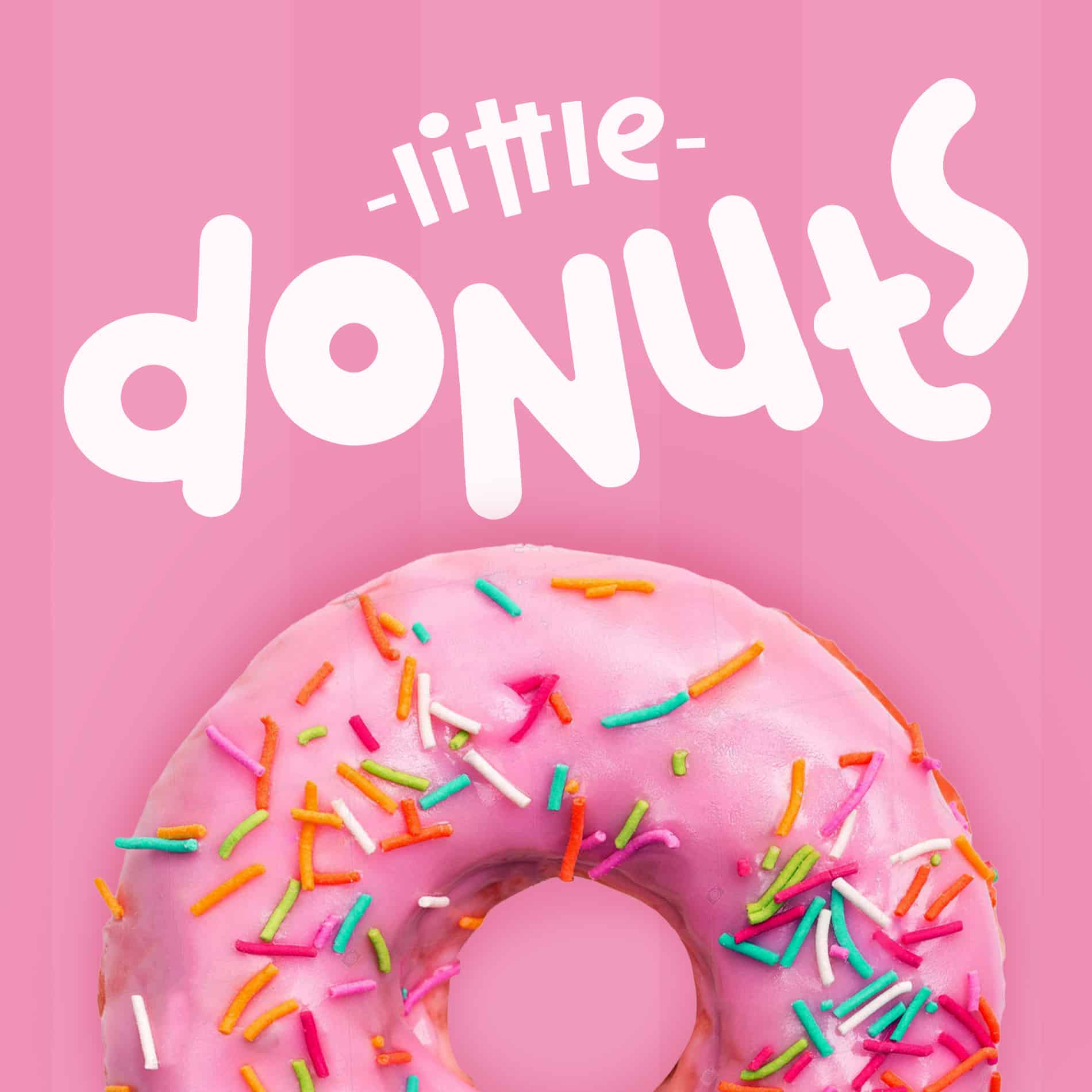
The use of the pink tones drives home the idea that this is a friendly and warm service, furthermore the most demanded and defacto donut they serve is the pink glazed donut.
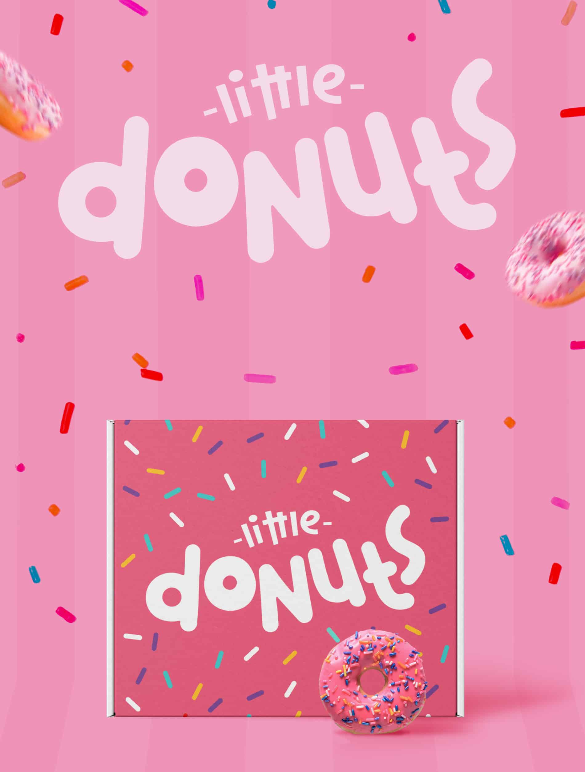
First, we work on the logo, based on what the client was looking for, we decided on a round-friendly font, no sharped corners, and cheerful colors, all this process was completed using Adobe Illustrator. Once we had the logo, the next chapter now working on Adobe Phtoshop, was to create some of the brandings, here I focused on the Packaging, with what I knew about the brand I knew exactly what to do, pink color, colorful sprinkles and of course, the logo that exemplified what Little Donuts is all about.

For now, we are still in the process of branding, still waiting to see the response of the people, but if it is just as the response of the client, this branding will be a success.
What font did u use for this logo?