Lobster Group
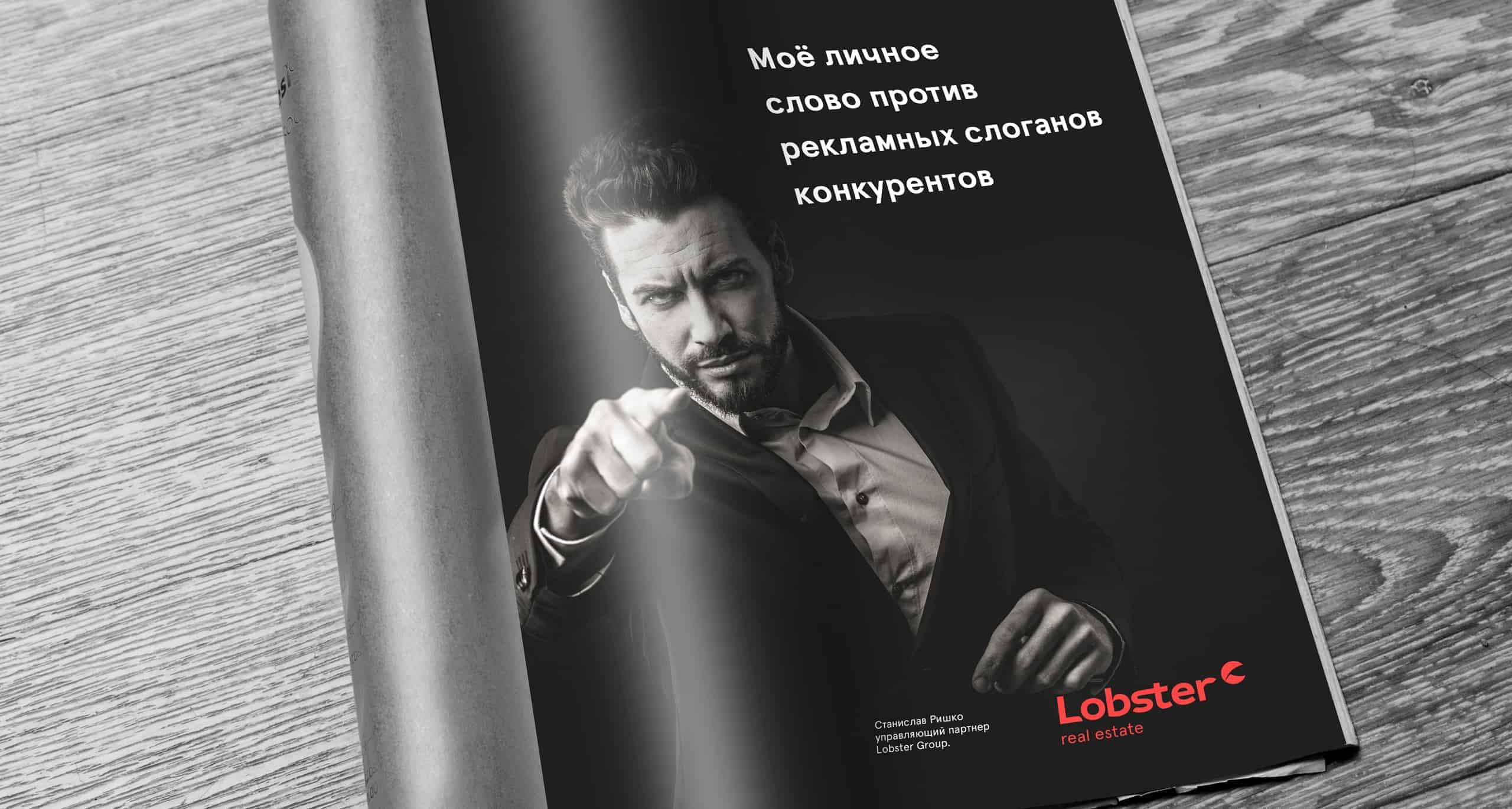
No matter who is a person in question: salesman, customer or estate agent, we're talking about personal guarantees and personal relationship for everybody. Identity stands for every successful transaction or project of the Lobster group.
Main words for the company:
• Personality and features
• Courage in innovation
• Attention to details
• Quality and competence
• Sincerity
The real estate market is really huge. There are a lot of companies that are doing their work and we was looking for the way to solve the identity problem. During the conversation with the owner we understood that he is doing his job with sincerity, big emotions and wish to change the world, for sure. And we decided not to hide this.
That's why we was trying to create identity like this company works only for a few clients who are able to afford this.
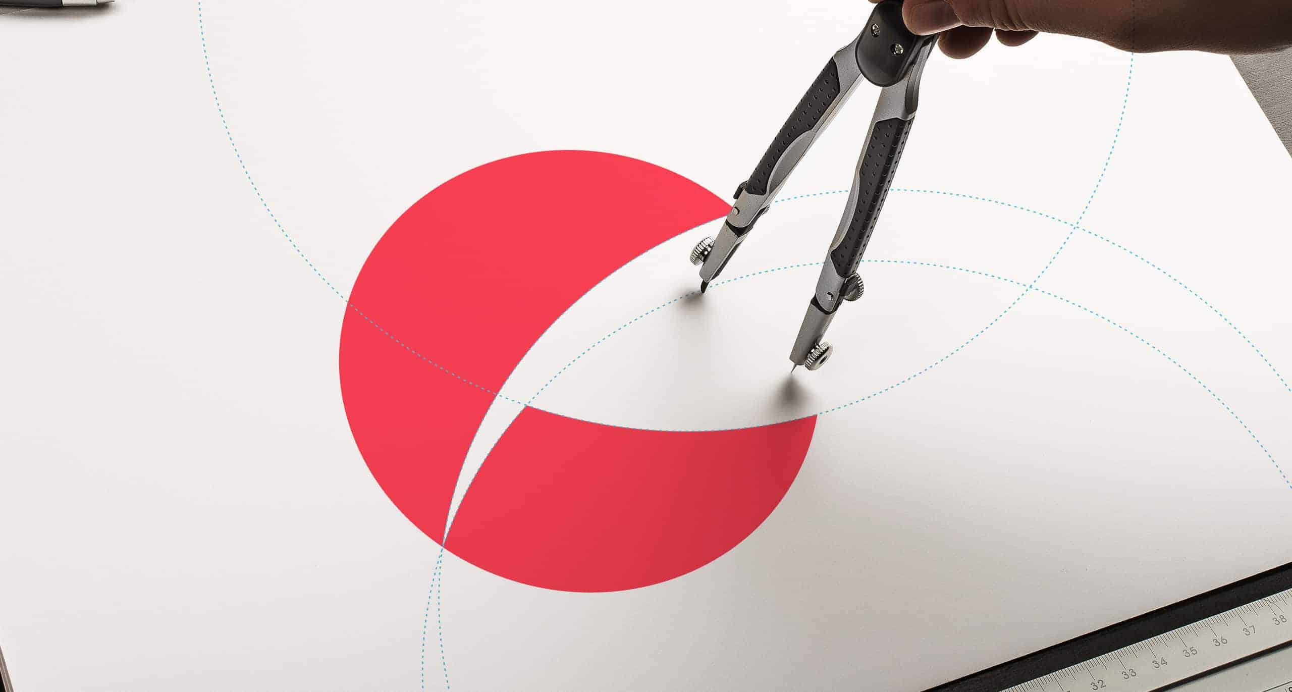
First of all, we've created a position system to understand where company will be at the market. There is only one tool: talking with the owner and thinking about this.
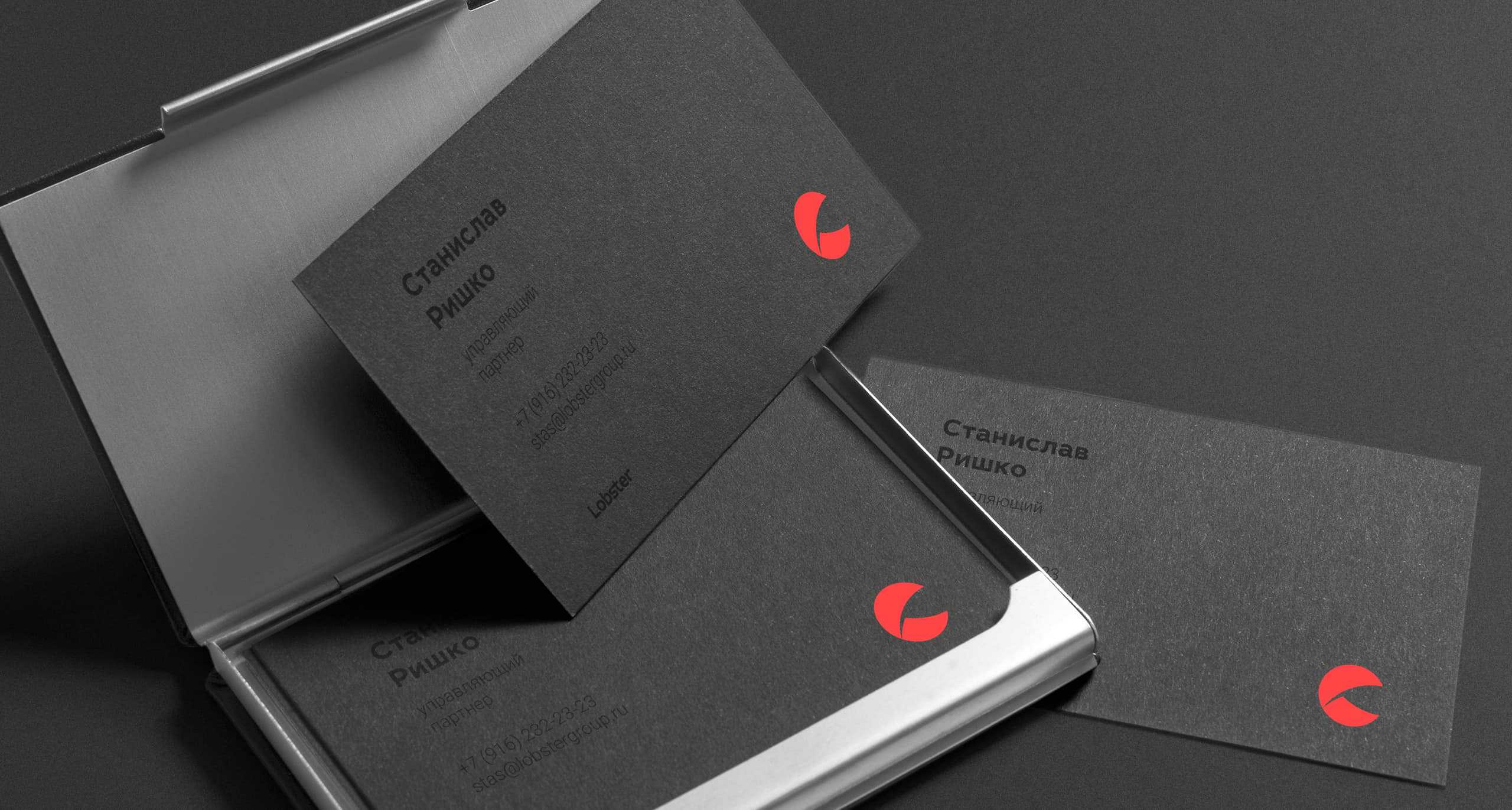
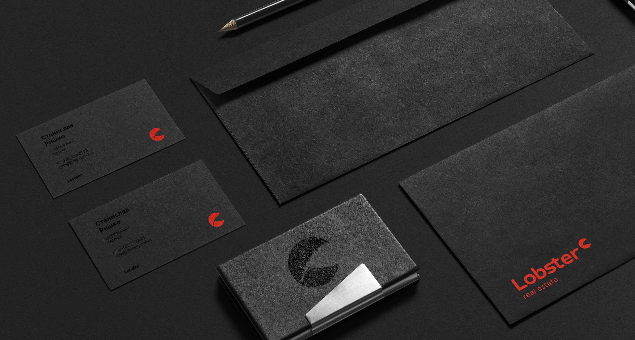
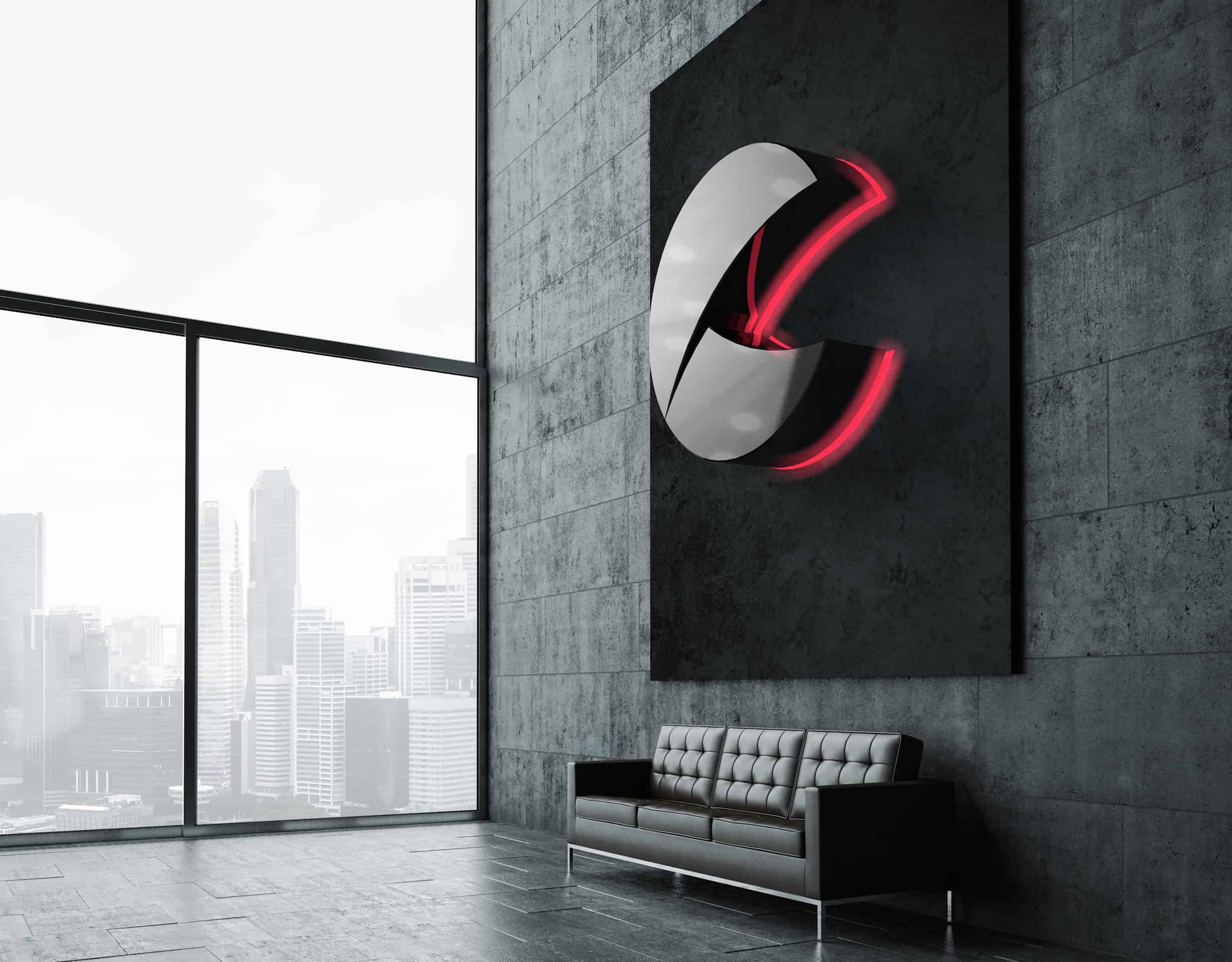
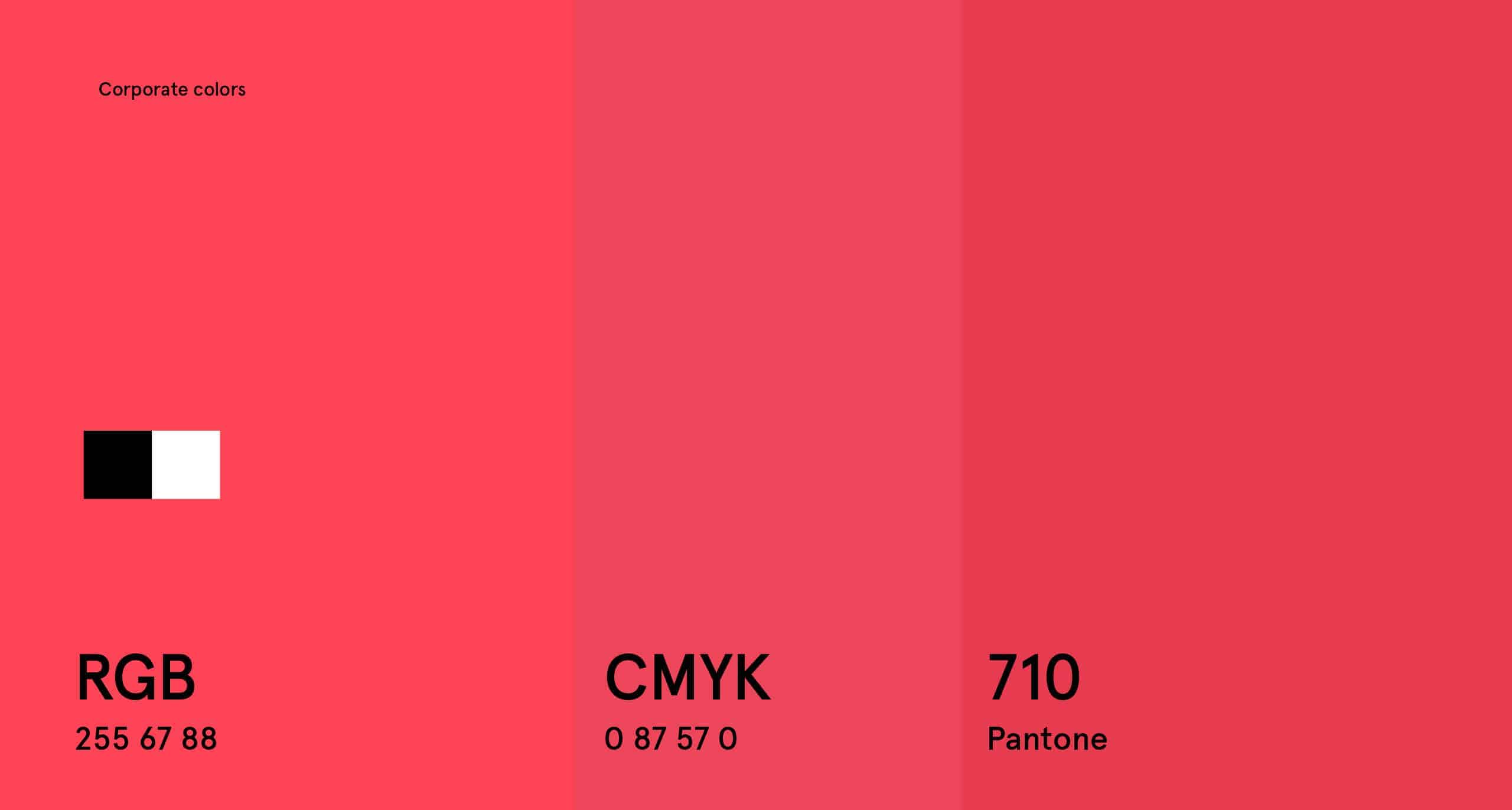
After this, we've created identity system in Adobe Illustrator. We was wondering a lot why this simple sign hasn't used before. To look like an exclusive service we used a black color as main, and a 'lobster' color as second one, so now it looks nice.

The company launched only 3 weeks ago, and we don't know a lot, but we supporting client web site, making marketing activities and social marketing also. Now we have responds from our employees and they like design system that we created.