Logo Projects
This is a collection of logos I have had the pleasure of making. Some are from freelance jobs, while others stem from agency contacts. I strive for diversity in my work, and it is my hope that this collection showcases that.
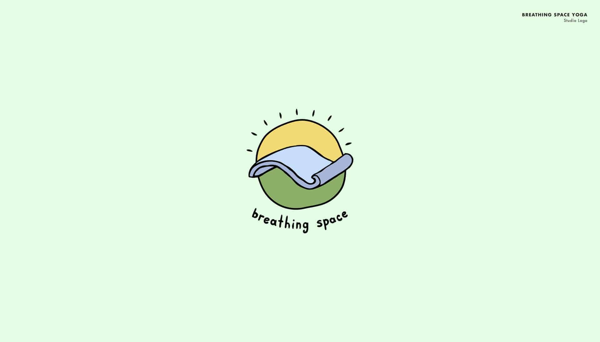
Breathing Space - I was having the hardest time coming up with a unique logo for this yoga studio. My epiphany came when I made the connection between the symbolic breathing space (clear thoughts, relaxation, and inner escape from the everyday) with the literal one, a yoga mat. From here I compared a this mat to a magic carpet. Both are pieces of real material where the extraordinary is achieved. The style and color chosen to implement this concept was based on both client preference and the goal to create an inviting mark.
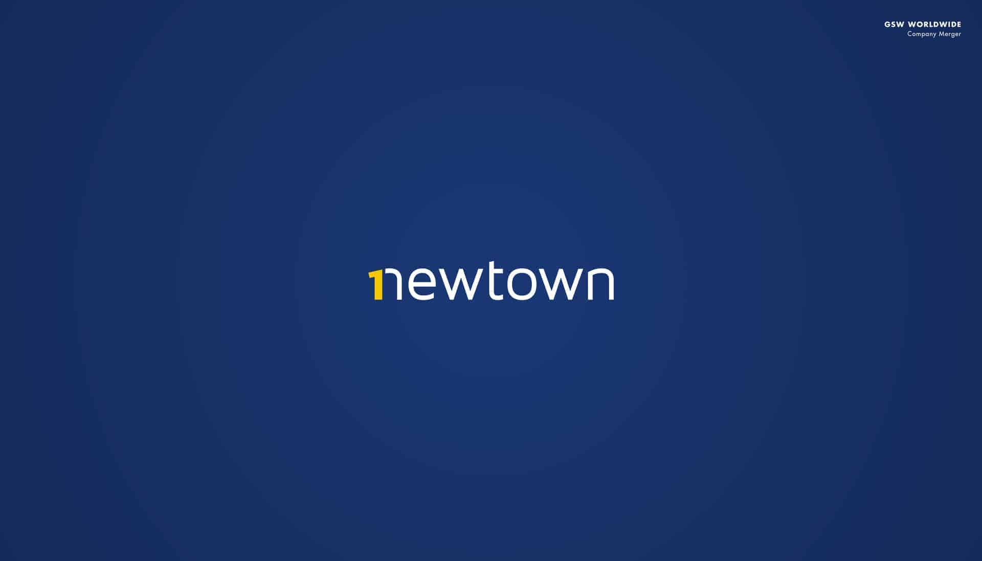
1 Newtown - I currently work at a company known as GSW Worldwide. In our Newtown Pennsylvania location, there were several divisions until the decision was made to bring all efforts together under one roof. For this initiative, a mark was needed. My boss asked me to create a logo based off of a sketch he had made where the word was spelled out "onewtown." While I loved his initial idea, the message seemed a bit lost in translation. The final mark you see is my attempt at continuing his concept, while making it more accessible for viewers. The overall style is aimed towards modernity, brightness, and the colors were chosen to continue this.
Movimento Jiu Jitsu - The Movimento Gym is located in Chicago, Illinois. With the guidance of instructor Israel Reyes, students learn the martial art of Brazilian Jiu Jitsu. Israel expressed the need for a new mark, and said how it needed to work on several levels: on their gis (uniforms), a gym wall, and on posters present at competitions. He liked the idea of a big impactful logo, that upon closer examination, the viewer sees more elements. The martial art is very much based on balance, so the lockup I created represents the convergence of two equal and opposing forces and the style represents the grit that any successful practitioner needs. Lastly, the color scheme for this logo was requested by the client for the vintage vibe it brings to the project.
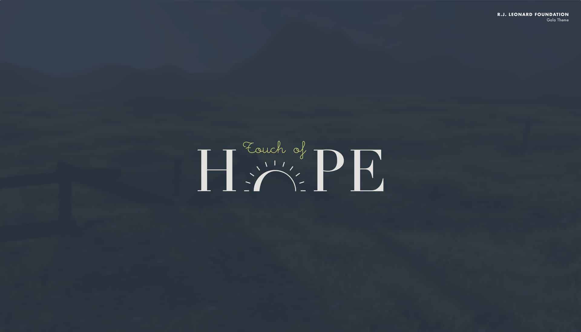
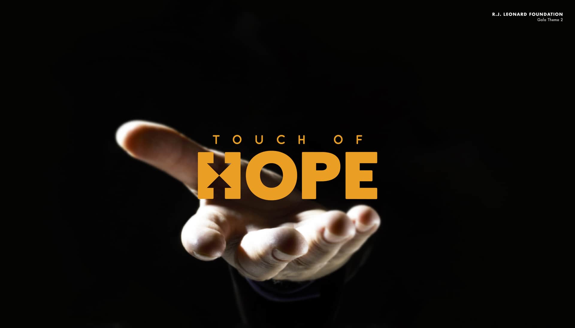
Touch of Hope - I created several concepts for a Gala that the R.J. Leonard Foundation is putting on to empower youth impacted by foster care in Bucks County, Pennsylvania. While the chosen logo for this Gala is another concept of mine, I personally grew as a designer on two of my initial ones. The two "Touch of Hope" logos that I made were designed to explore different aesthetics. One is welcoming and light, while the other is bold and empowering. On Gala Theme 1, the sun is shown rising to a brighter day, much like the lives of these youths. For Gala Theme 2, the 'H' has two arrows coming together that represent the meeting of people for a combined cause.
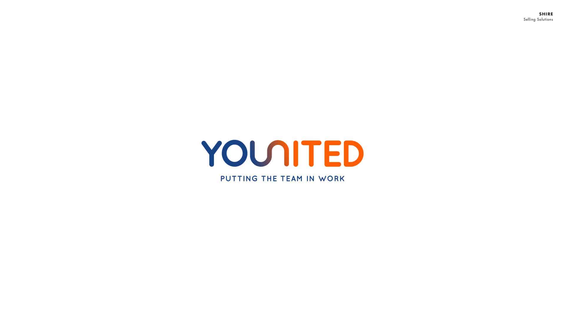
Younited - The Younited logo was made as a symbol of morale for a sales marketing team. YOU begins the word, and is present to grab viewer attention, while the rest conveys the concept of collaboration. The mono-line aspect of this mark is in the service of a modern look, while the colors represent determination and energy.
I am trying to begin each project with my sketchbook, a Staedtler pen (my personal favorite), and the use of a stopwatch on my phone. So far, I’ve been doing pretty good! If I have ideas right off the bat, I'll jot them down as quickly as I can, with no concern for tidiness or refinement at top of mind. If that is not the case, I implement an idea generating practice I picked up somewhere along the way; set the clock for 2 minutes and write out any words that come to mind surrounding the concept, and then repeat this, but for the look and feel instead. For each time, go as fast as you can with the goal of filling up a whole page. When all is said and done, you end up with two lists that usually get the juices flowing. From here, I'll hit pinterest for further inspiration, and continue sketching until I am ready for the computer, getting more and more detailed as I go. Depending on each project, I'll use Illustrator, Photoshop, or InDesign to bring my work to life!
As a recent college graduate, I am still learning things everyday. So far responses have been positive, but the work is also relatively new and I am interested to see how it stands up to the test of time. The big thing for me so far has been client relations. It always surprises me, but the self-proclaimed "uncreative people" who commission these projects can bring some pretty awesome ideas to the table without even knowing it.
Have a wonderful day!
check out my portfolio: behance.net/taylorsantangelo
send me an email: [email protected]
shoot me an invite on LinkedIn: linkedin.com/in/taylor-santangelo-178885106/
and if you can, consider donating to the R.J. Leonard FDN: rjleonardfoundation.org