Logos | Emblems 2015 by Milos Milovanovic

Let's check out the logo collection of our featured artist, a collection of his projects and personal works from 2012-2015. Read on and enjoy!
These designs are small selection made in period 2012 - 2015 for various clients around the globe. I have also included and couple of my personal projects in this showcase. When the client comes to me with a new project, I firstly send my questionnaire, which contains 18 questions. When I receive client's answers, I read it few times and sometimes ideas comes to my mind, sometimes not - there starts first stage, brainstorming. Since my approach is mostly illustrative I do a lot of sketching. Some of the showcased designs are mostly characters (people), so I spend most of the time to find their right expression and to suit it to the business.
- Milos Milovanovic
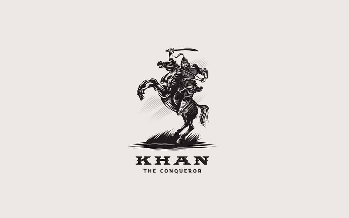
Khan the conqueror: This design was a personal project. I had that idea in my head for a long time, so I wanted to realize it. I wanted to achieve that "victory feel", with strong and fearless pose and expression of the horse , but also and on the horse rider. This is my most recent design and I am very pleased with it.
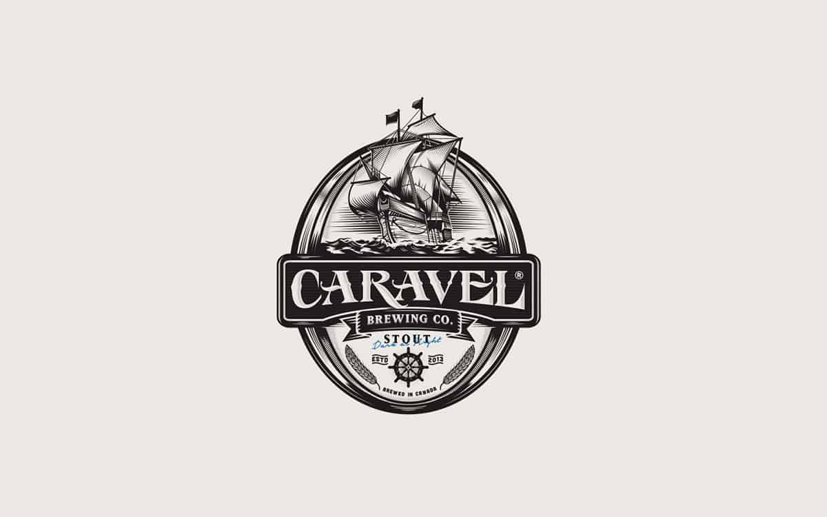
Caravel Brewing Co, is a craft brewery located in Canada. They create 6 different craft beers with quality ingredients and small batch brewing. Caravel is 15/16 century sailing ship (Santa Maria/Pinta/Nina were all caravel style ships) and the theme is exploring new taste.
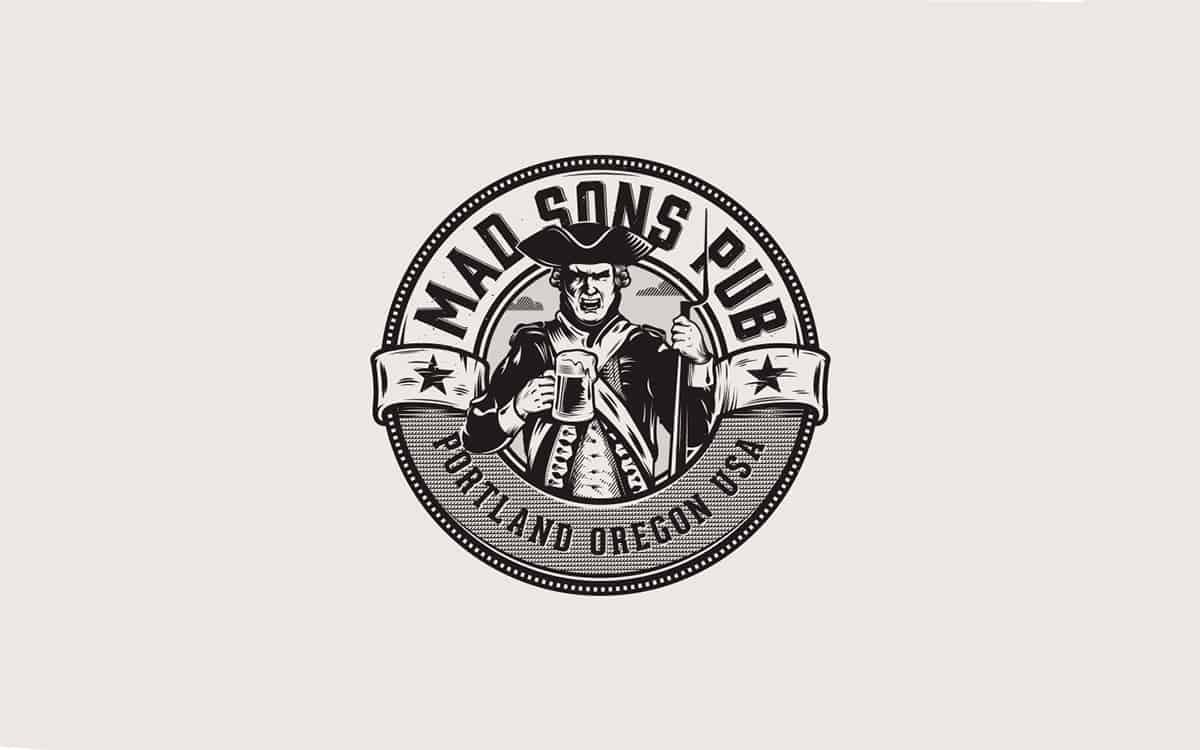
Mad Sons Pub is a "Revolutionary War style Pub" located in Oregon, Portland. The client came with idea, having revolutionary war style gun or canon. Somehow later, that didn't worked to us, so I came on the idea to create a Patriot, holding a beer mug and to relate to the actual naming: Mad/angry expression of the Character. Interesting thing is that, later I found out that the original name of the pub was MADISON'S.
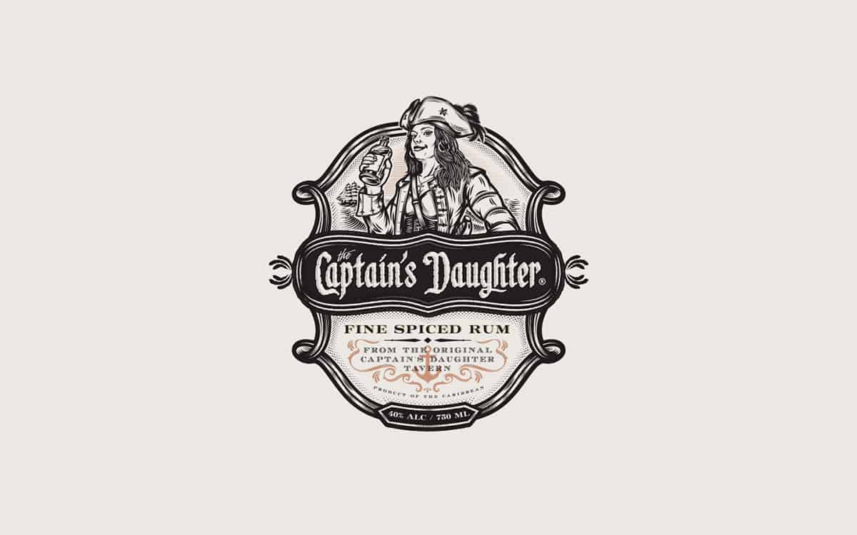
Captain's Daugter is a Rum Company. It is inspired by the Pirates of the Caribbean sequence, as well as nautical themes. I created this piece as main and alternate option. The goal was to create a logo, that can be used as and a label.
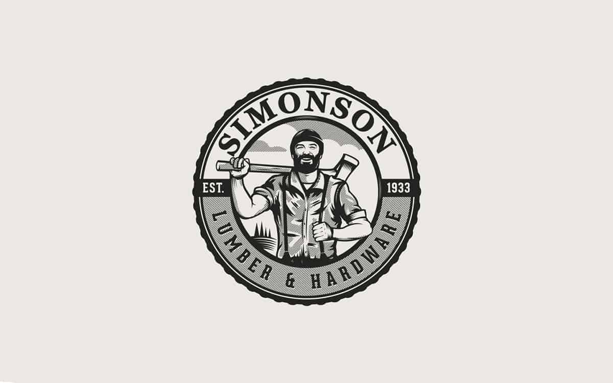
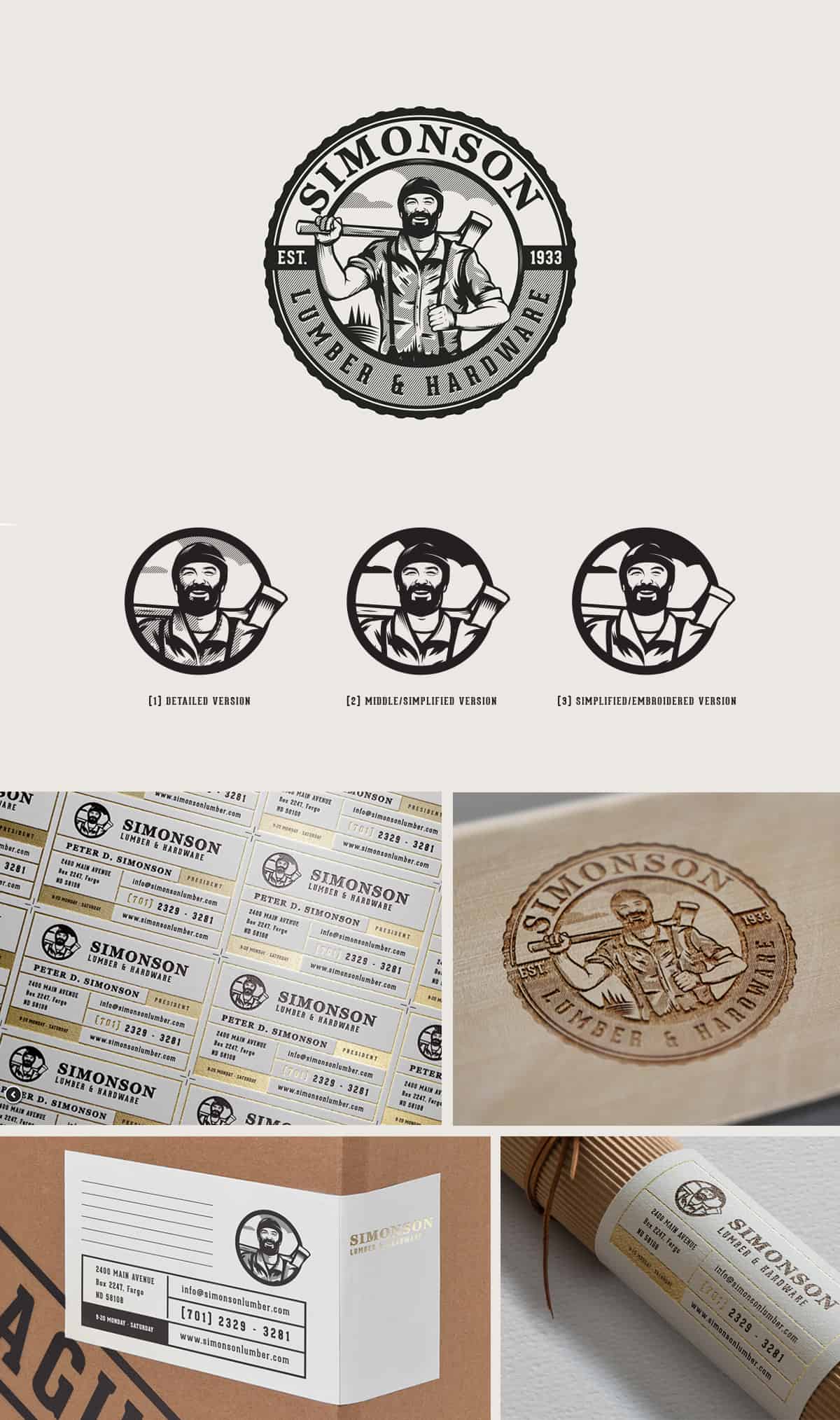
In this creative process is included brainstorming and sketching, but most of all is that flow and technical execution and to pull out the best from it. I especially like to work with the details, so that is also a stage in which good part of time is invested. Beside detailed/complex logos, I also create and alternate/simplified options for them: embroidered - suitable for small sizing.
- Milos Milovanovic
Regarding the color - I like to represent designs in black. To me, it has a strong impression. As they say, "black is the new white". I always start with the analog: pencil and paper. Writting down the keywords from the brief and doing the most simplest ideas - just brainstorming. When I find the right idea, I start with digital. Further exploration and build goes through the Adobe Photoshop, using my graphics tablet - simply because it's easier to manipulate, erase, edit and saves some time. When I complete that stage, next stage is polishing and vector process in Illustrator with mouse. Why with mouse? - Some things I just can't achieve with graphics tablet at this stage. It's just I got used to do it with mouse. It takes a bit more time this way, but for me is easier to do some particular things with it, like shading.
- Milos Milovanovic
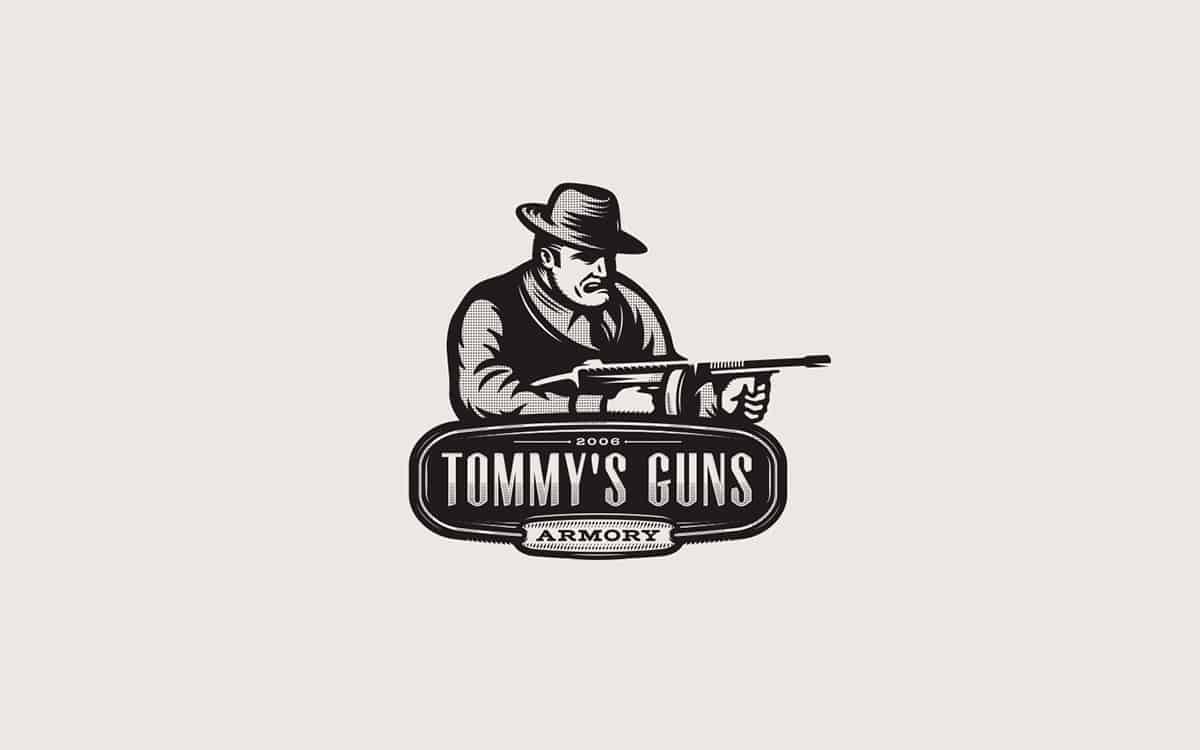
Tommy's Guns. The owner's name is Tommy. Client has a gun store/armory so he proposed to have a gangster with Tommy Gun in the logo and through that, his name of the gun store as "Tommy's Guns".
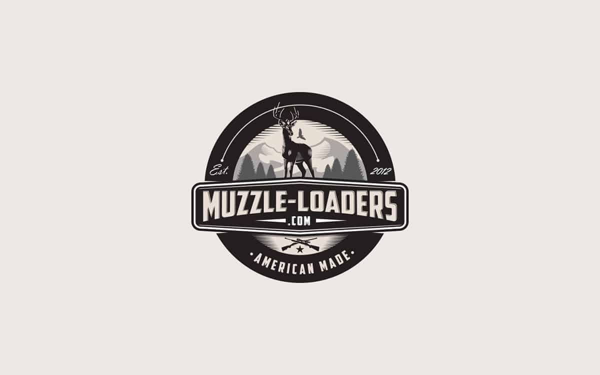
Muzzle Loaders: They sell rifles/firearms (hunting equipment). The imagery they want, was to incorporate the tradition of hunting with a new fresh look - blending old and new. Regarding the colors, I've used earthy tones, combining nature scenery, with deer in foreground and the bird in the background.
You heard it billion times before, but hard-work truly pays off. Every minute you spend on it, you are investing in yourself. Also, the internet is full of resources, so save on your hard drive things you like or make boards via Pinterest. This is one of the ways that you can learn and these stuff could inspire you and later. Next advice I could give, it would be to work on your personal projects. When you’re doing a personal project, you are your own audience, so you should please yourself with it. When you are pleased then your audience is. Do kind of work you want to get. Don't build a giant ego, share your work to the people you trust, ask them to give you honest opinion and most of all love what you do, be passionate about it, be patient and have fun with it!
- Milos Milovanovic
ABOUT MILOS MILOVANOVIC
Milos Milovanovic is a 25 year-old freelance graphic designer, based in Serbia. He specializes in logos, branding, illustration and packaging. Most of his design work tends to lean on the illustrative side with vintage/retro feel to it. See more of his great artworks in Behance and Dribbble.
Enchanting graphic skills ! Ingeniously my mate ...
So much good work lately Milos! Congrats on the feature! Well deserved! Love your style!