Lumière Perfume

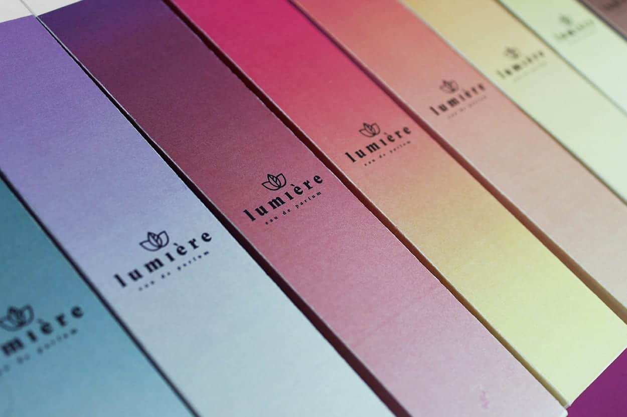
This was a project made during my second year at Faculty of Fine Arts of the University of Porto. Lumière is a fictional brand of perfume and its name comes from a famous cinema in Porto during the 80's. The premise of the project was to take an existing brand and transform it into something completly different. The final object I had to present to show my work was a packaging of product sold by the brand.
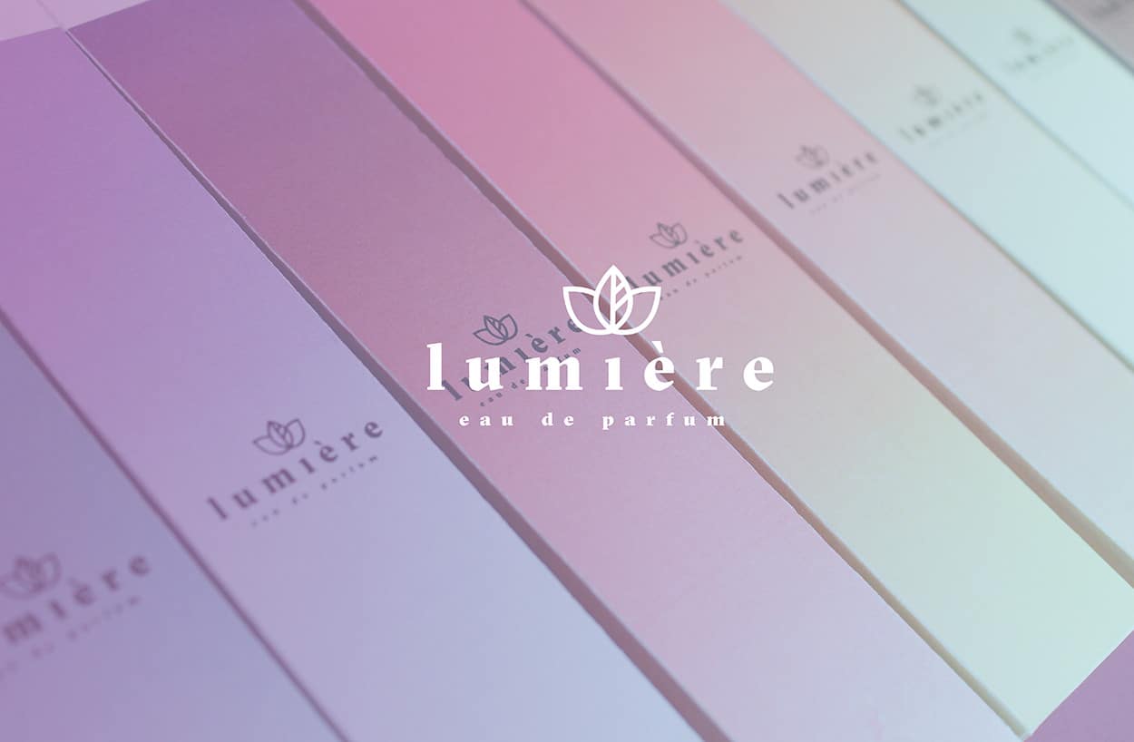
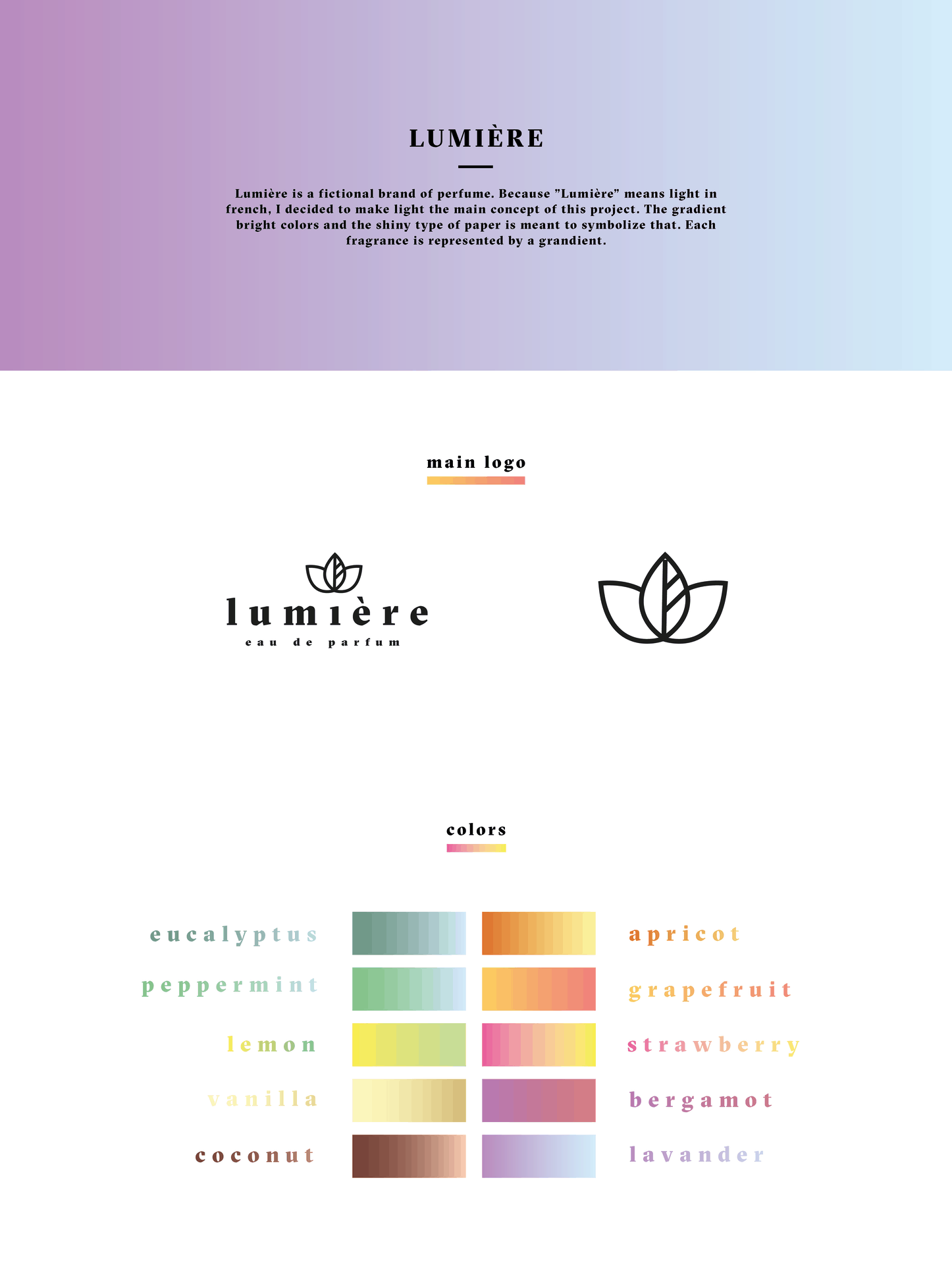
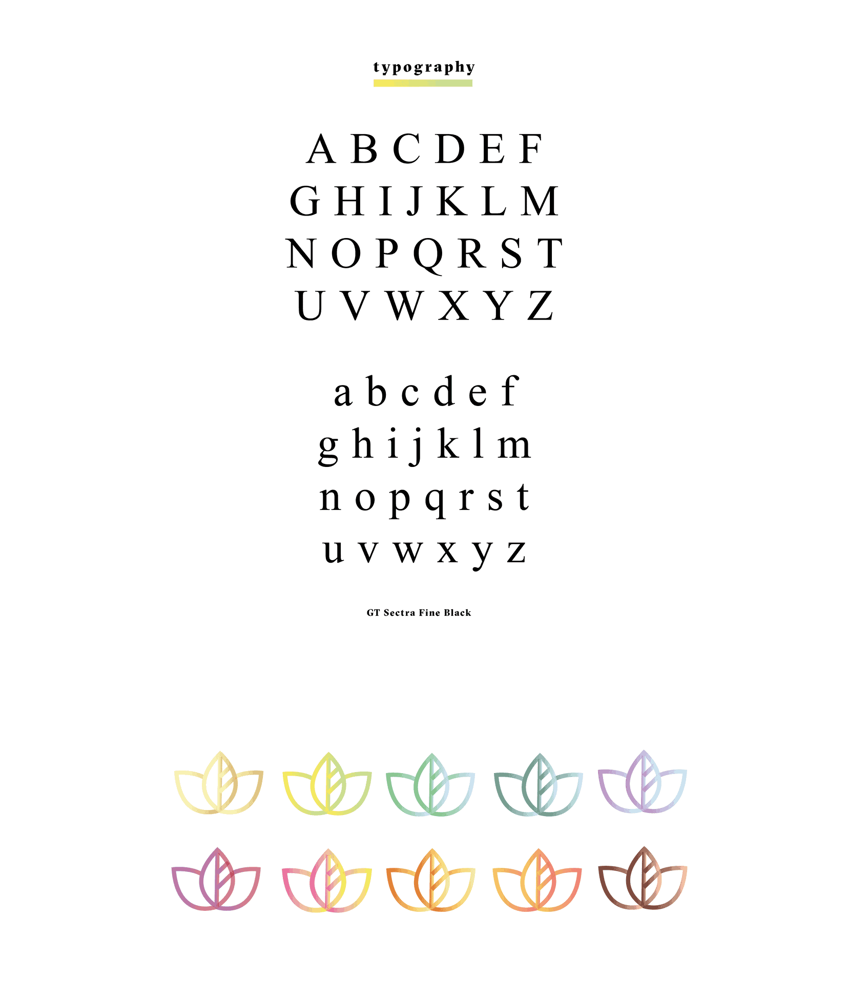
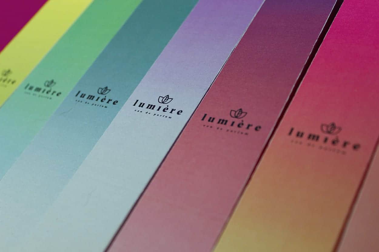
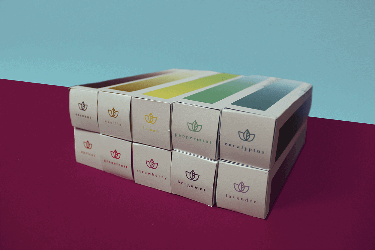
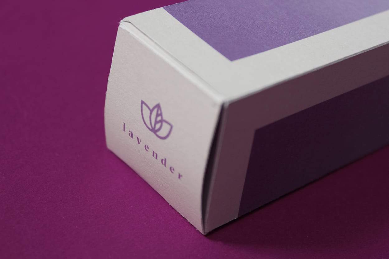
"Lumière" means light in french, so I decided to make light the main concept of this project. The gradient bright colors is meant to symbolize that. I decided on using gradient colors inspired by the 80's look, since the original cinema was a trendy place in Porto during the 80's and tied ti its pop culture. Each of the 10 fragrances is represented by a grandient color, which I tried to enhance through choosing a type of paper that has a very subtle iridescent shine to it.
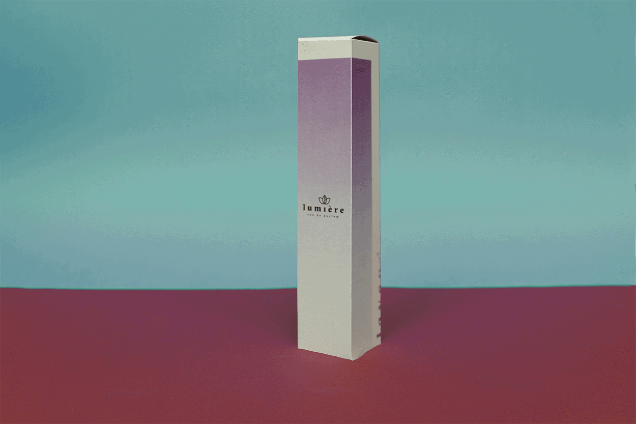
When I pinned down the main concept and the fact that I wanted to make a perfume, I started to sketch the type of the packaging and its dimensions. Then I used Adobe illustrator to make the planification of the packaging, the logotype, as well as the brand. I chose 3.5x3.5x17.5, because I wanted it to be tall and elegant.
This was one of the first branding and packaging projects I've ever made. I consider it one of the most important project in my learning process. It taught me the importance of choosing the right materials to communicate a concept and a purpose in the best way possible.
It looks really pretty! Nice packaging
Thank you!