M Wearables

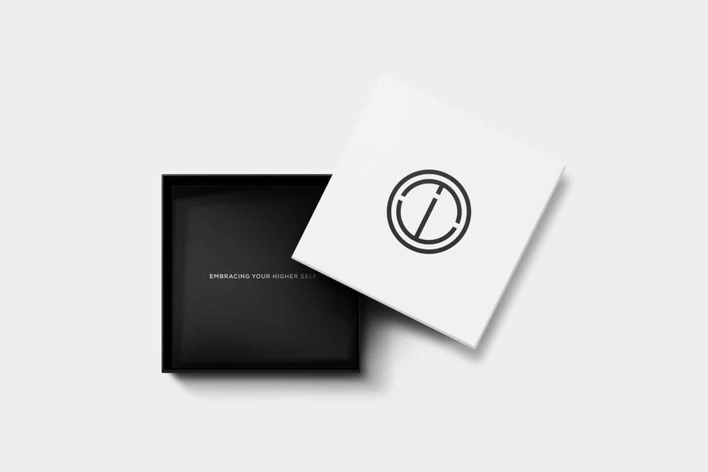
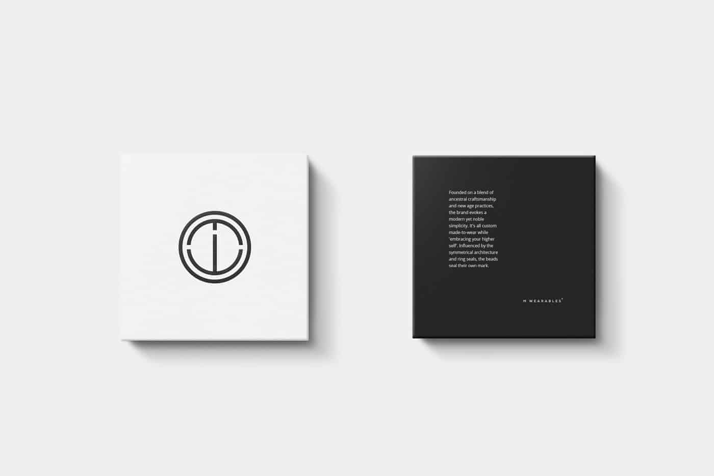
Founded on a blend of ancestral craftsmanship and new age practices, M Wearables evokes a modern yet noble simplicity. It is a true symbol of architectural symmetry marked by a medieval wax seal. A custom made-to-wear bracelet, 'Embracing your higher self'.
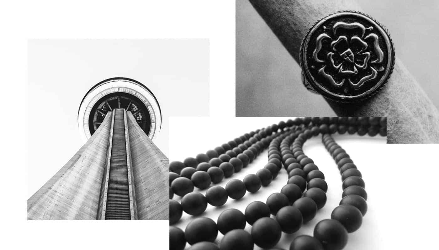
A mix of dark grey and true white provides space for the crafts to shine through.
The combination of Nexa Family font in two different weights ensures a perfect match through unity. Heavy is used for headlines while Regular is to be used for body text. There's no need for more. Just one. The one.
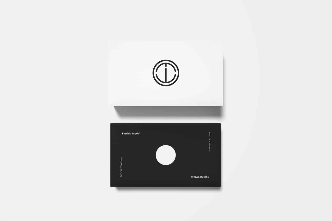
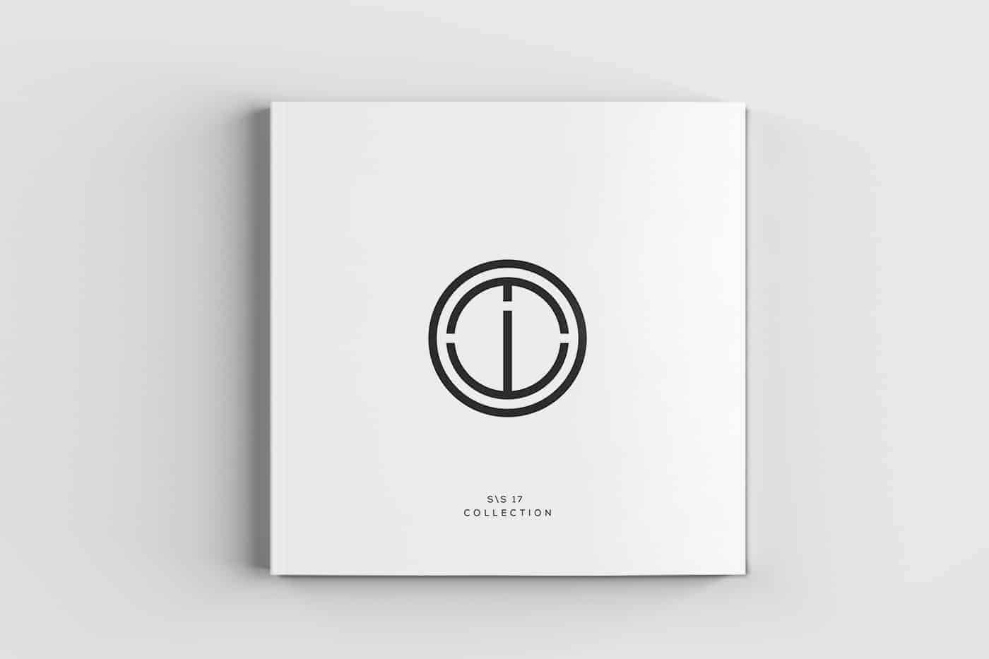
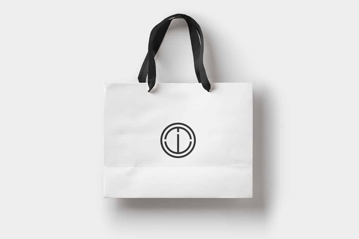
The logo has been sketched and further designed in Illustrator. It is composed of a circle, the symbol of wholeness, a mark of perpetual continuity, which embraces the inner parts as the jewelry does to it wearer. They are the abstract representation of the brand initials: M, W.
InDesign has become in handy with our purpose-driven business cards and catalog, making a loud and clear statement. Whatever connects us, comes from the inside.
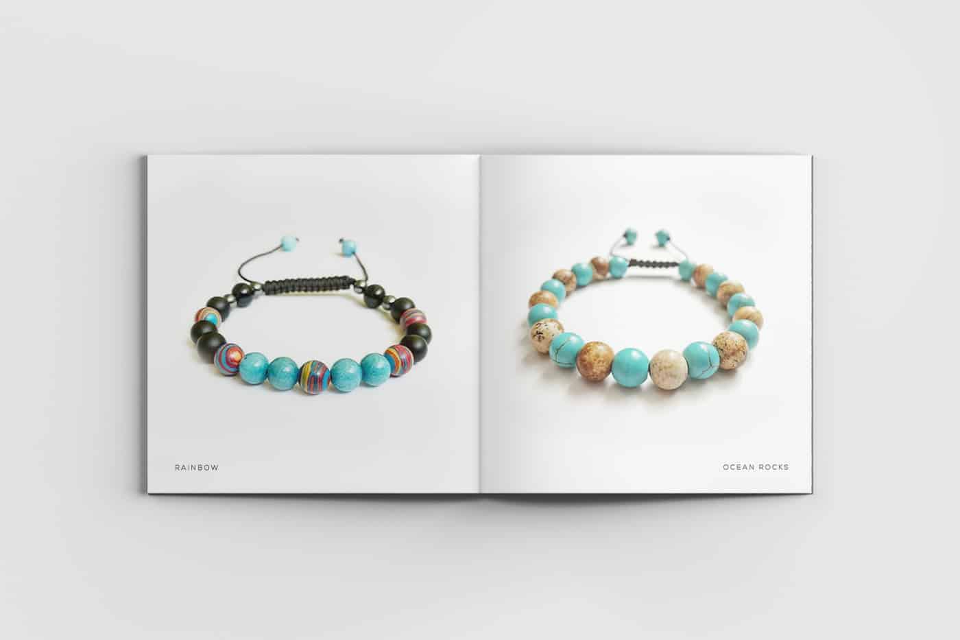
Also designed in line with the brand's minimalistic attitude, the catalog it is a showcase only of the finest pieces of jewelry that have been handcrafted for the Spring / Summer Collection of 2017. No distraction, just art.
The packaging is clean and elegant, born of contrast, having one focus only. The connection between the bracelet and its wearer. Like a warm embrace of a long and truthful relationship.
As I always cultivate a close relationship with the client from start to finish, the process is transparent and engaging. The early in-person facilitation, thorough contextualization, and practical argumentation, plus our constant feedback cycles have determined another happy ending that is, in fact, a new beginning for the two young partners.
I've learned once again that if you put the client's needs at the forefront of your designer wants, the project will be successful and less stressful.
Nice design! Nexa is one of my favorite fonts... works great on minimalist designs
Right you are, Denny. It works so well and I think it's all about the context in which the font is thrown onto the final applications.
I love the simple logos, it looks very elegant and chic.
Thank you very much, Michi. I’m glad you like it.