MEC

This academic project was developed by three portuguese design students, João Alarcão, Gustavo Seguro and Diana Magalhães, at FBAUP in Porto, Portugal. The purpose of this exercise was to design a publication that featured some opinion articles of a portuguese journalist.
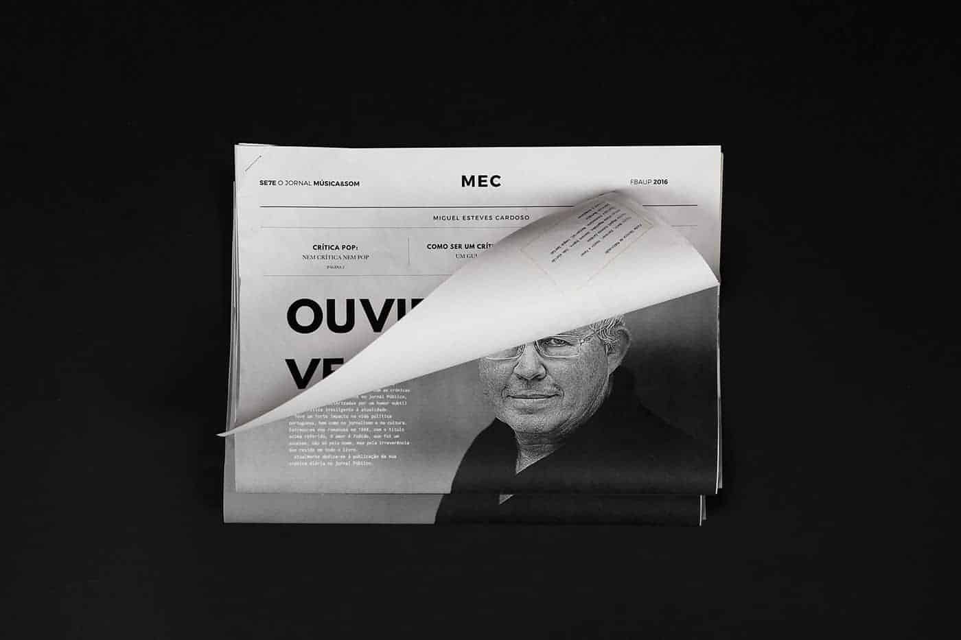
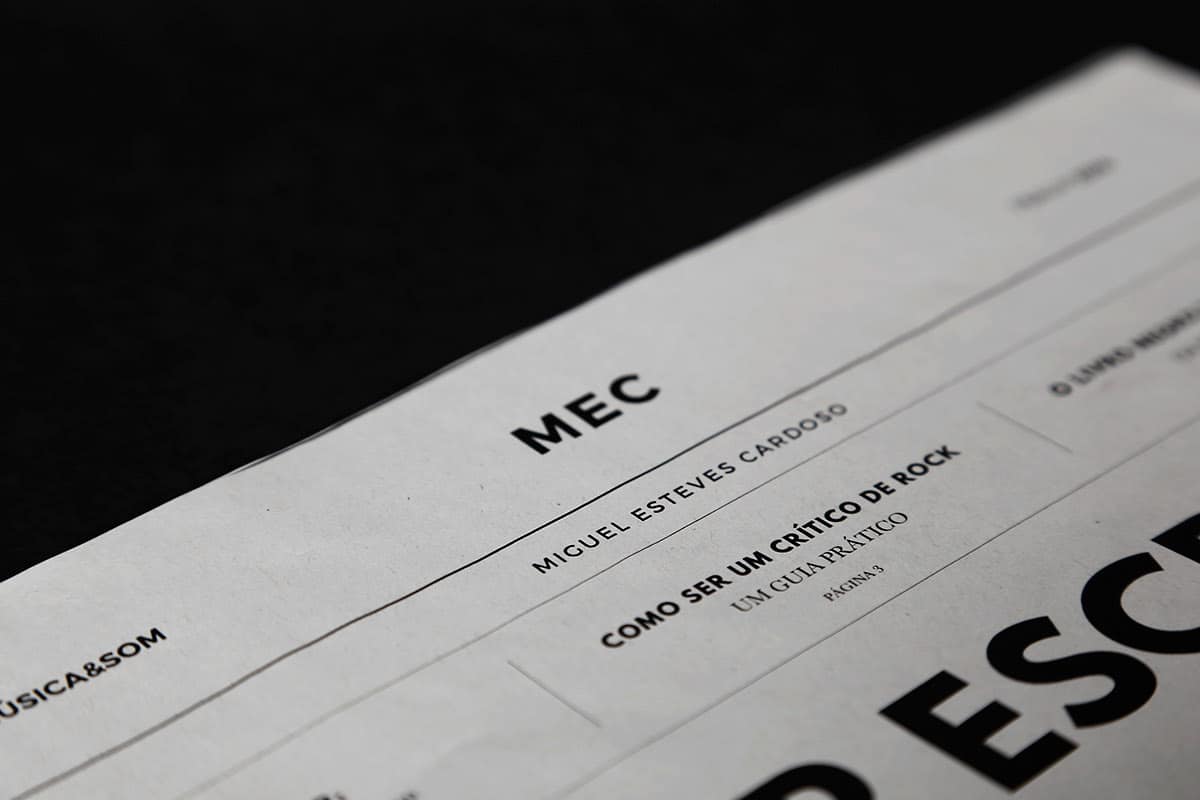
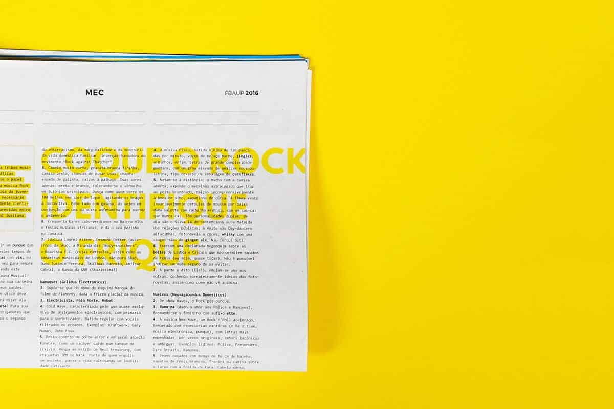
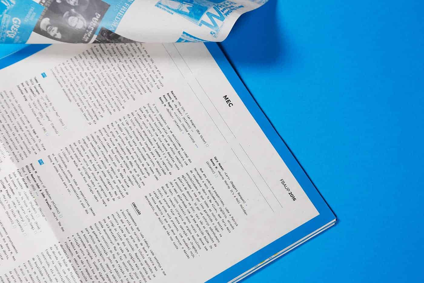
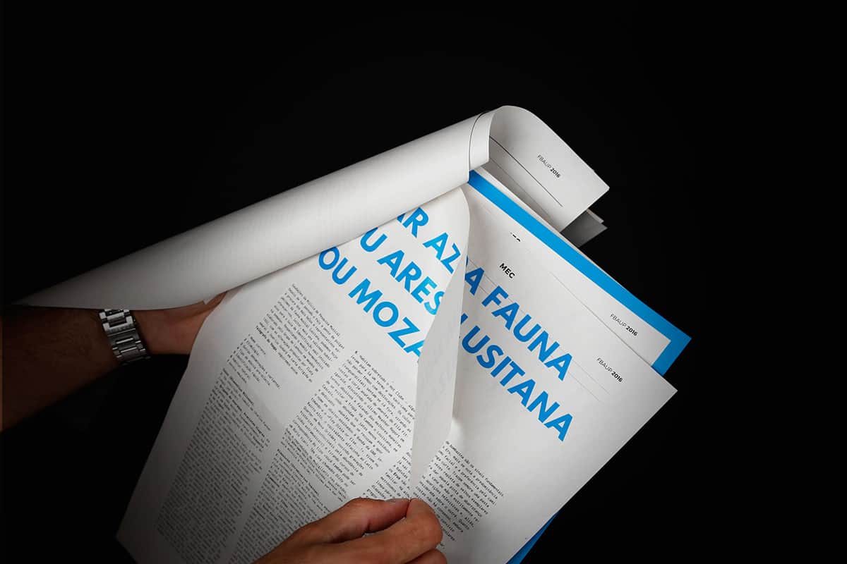
This editorial project is a compilation of some of Miguel Esteves Cardoso's texts published originally in newspapers and music magazines, which was the key for the press inspired design concept. It was printed in black, blue and Yellow, fusing the concept of a mass distributed newspaper and the playfulness of MEC's humorous texts.
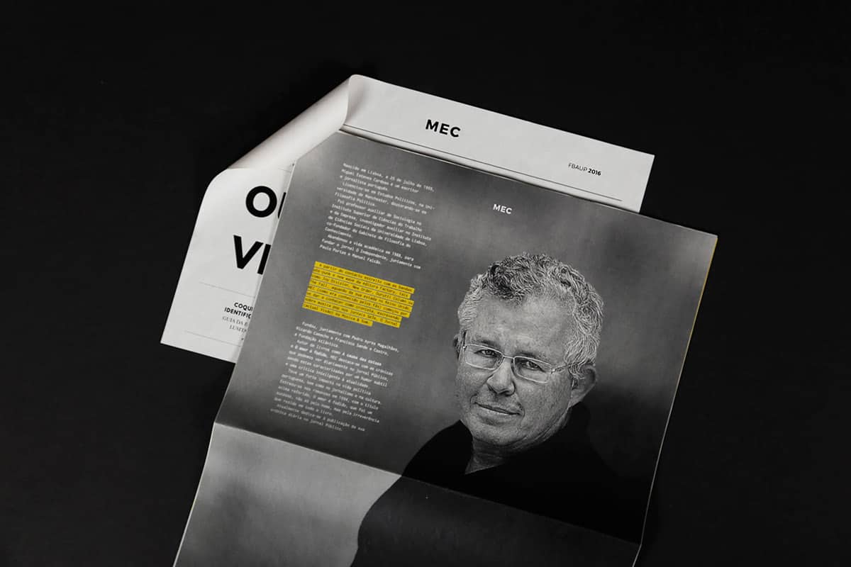
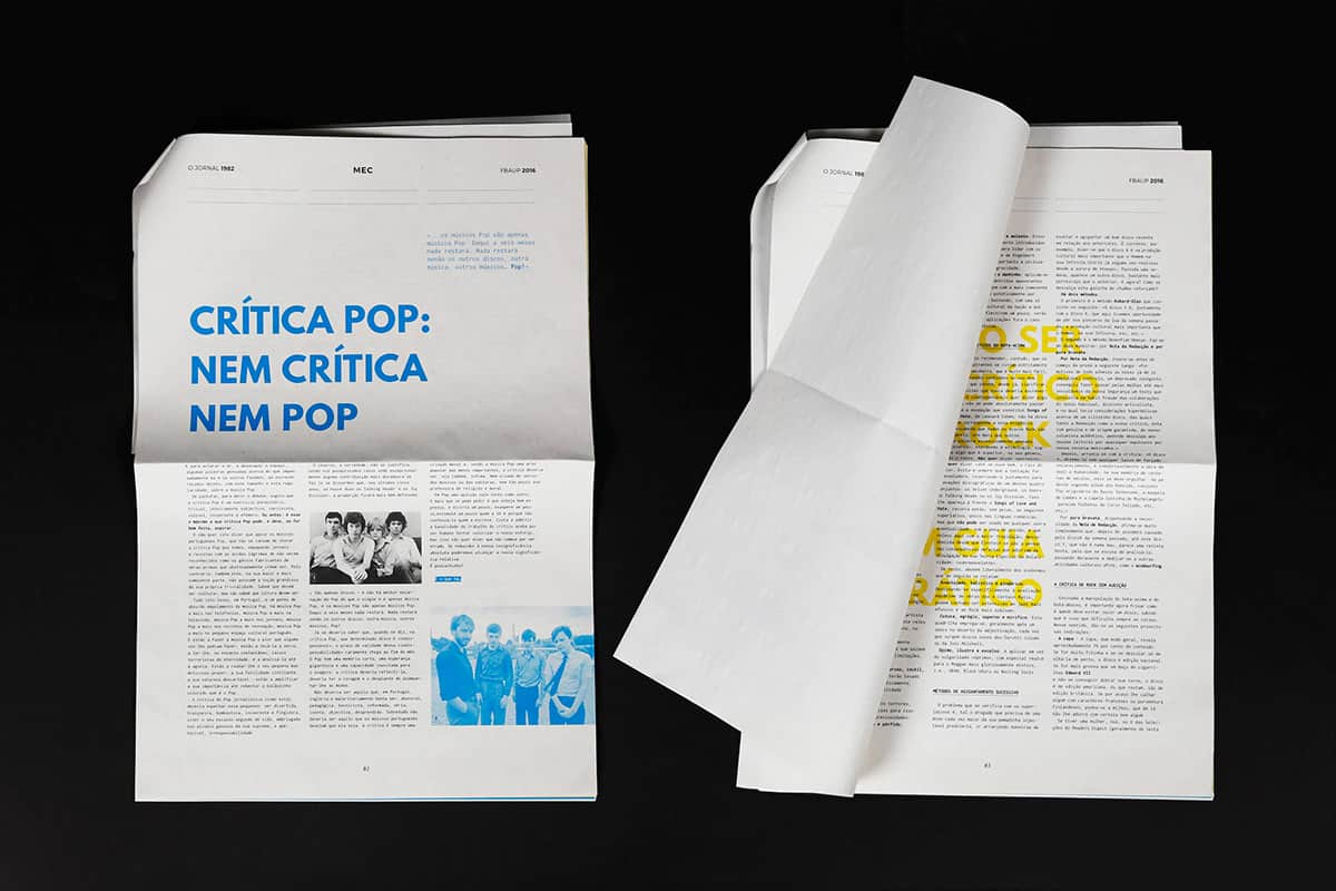
Most of the work was done in Indesign while experimenting with collages and paper overlays to achieve this multi layered newspaper. It was a project that demanded a constant printing flow to make sure that it would all come up together in the final production.
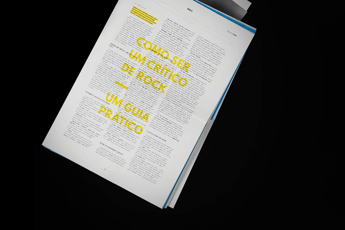
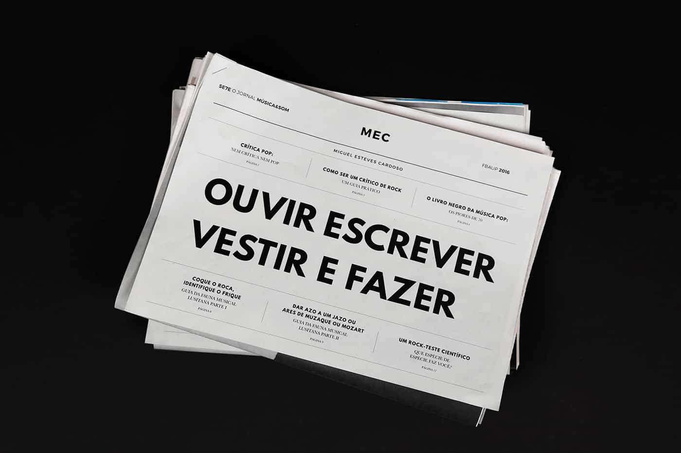
In the end, we came up with an original and completely refreshed mood for an editorial project first published in the 80's. We believe that, through this design choices, we conveyed a more relaxed and humorous feeling to this humorous texts and brought them again to the present since its content is still pertinent and accurate.