Meta Rebranding

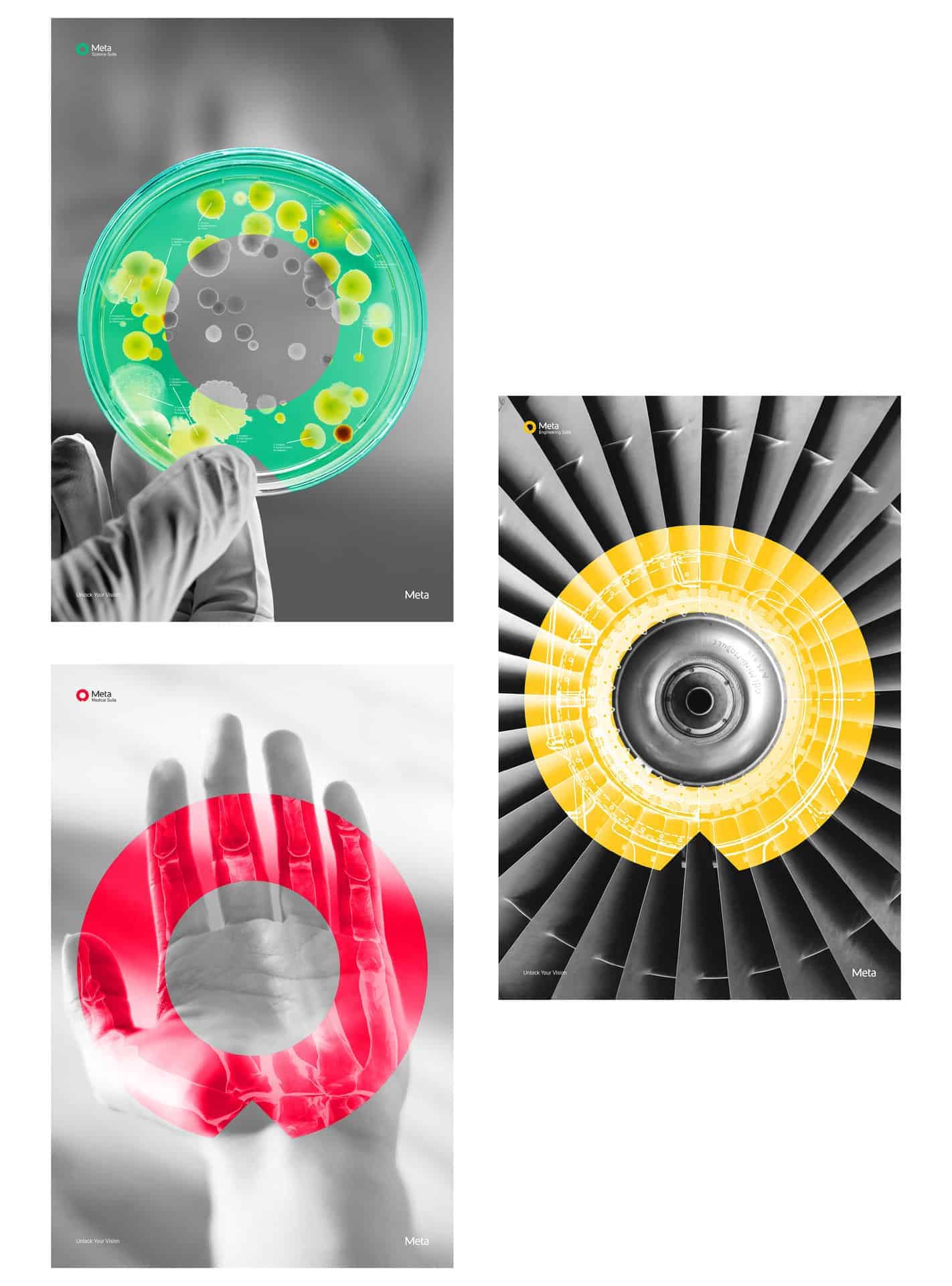
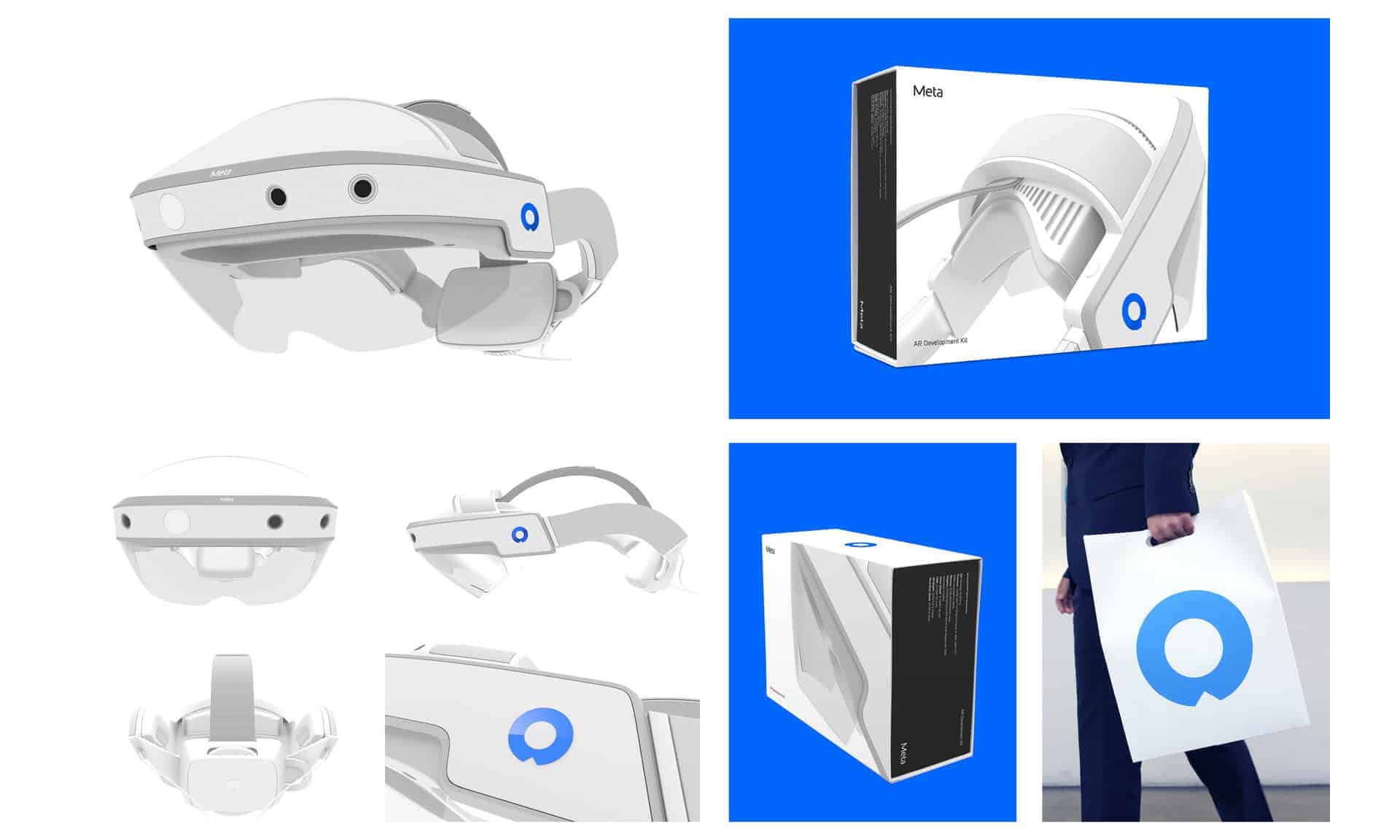
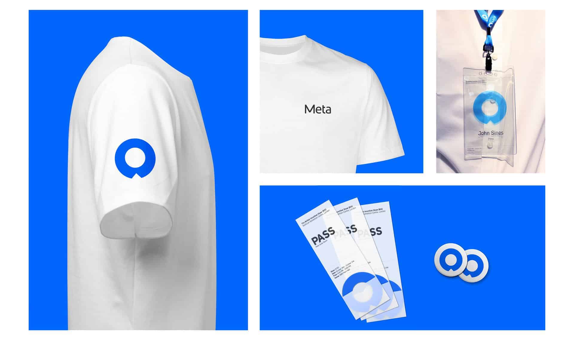
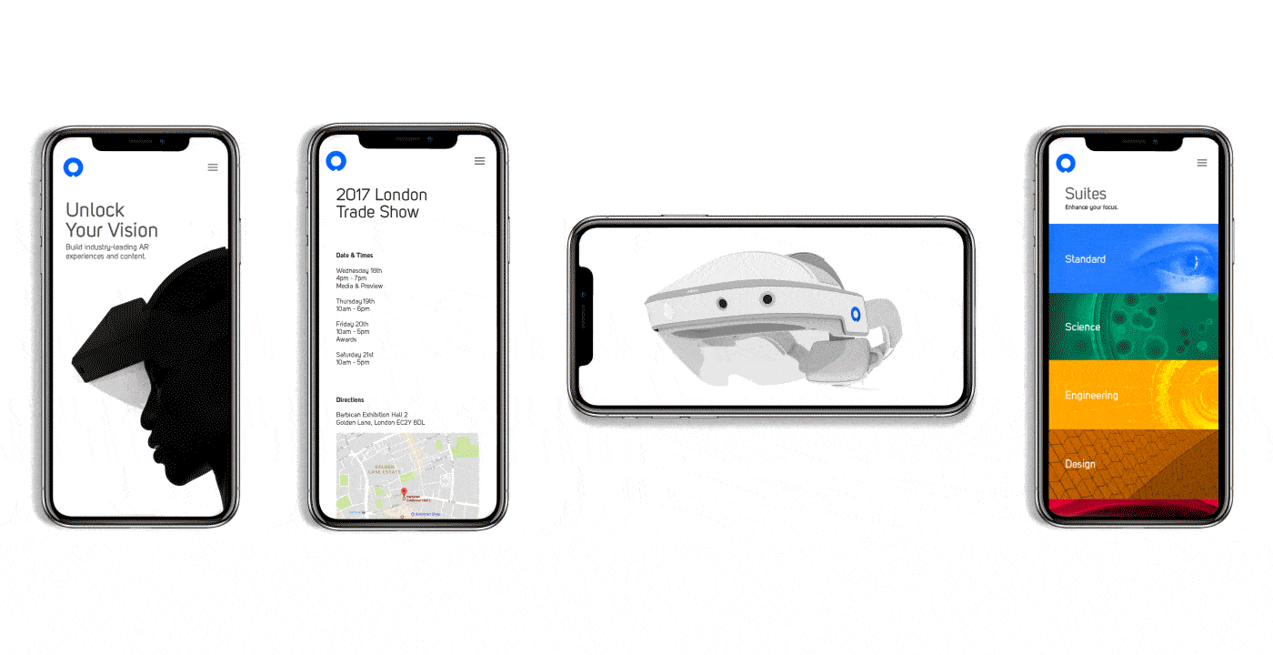
Meta is known for making augmented reality products. They combine real world technology with holographic images. Meta headsets are transparent and the real world can be seen through the screen. Meta’s technology doesn’t confine its users in the screens, but lets them be free and natural. The identity system captures the three design guidelines of Meta and represents the company as a human-focused brand.


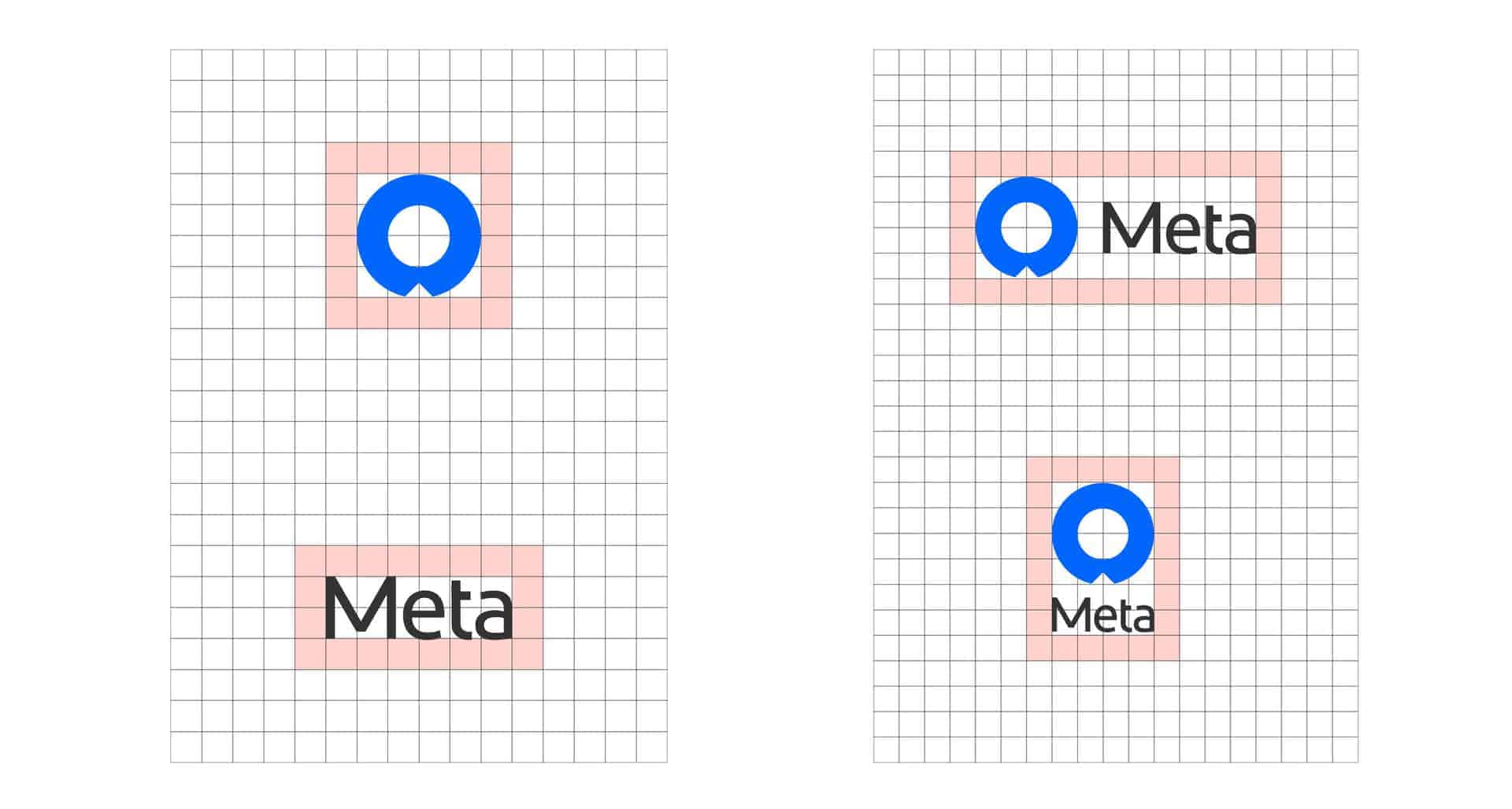
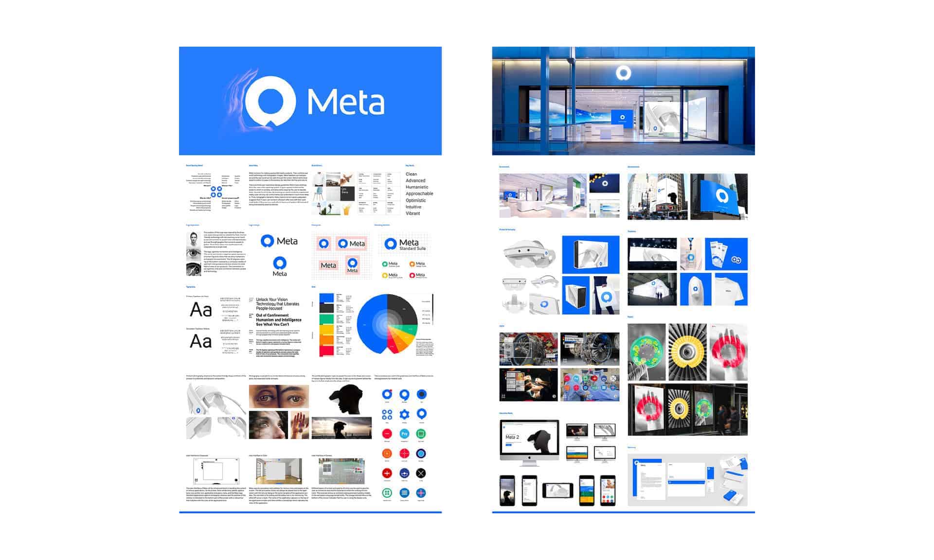
While researching the competitive landscape in the AR industry, I found a good differentiating point for Meta. Every move Meta implements in their products and experiences are very human-focused. I believed that there will be a place in near future for a technology company to be about people, not only advancement and innovation. This humanistic idea and vision became the cornerstones of this rebranding. The logo represents three different objects: a human figure, an eye, and a compass. The logo is simple and timeless combined with a sans-serif logotype with organic yet systematic curves to convey the humanistic qualities and technical side of the company. While looking at places where people became free and more able with technology, the color of blue was selected to relate back to the skies and oceans.
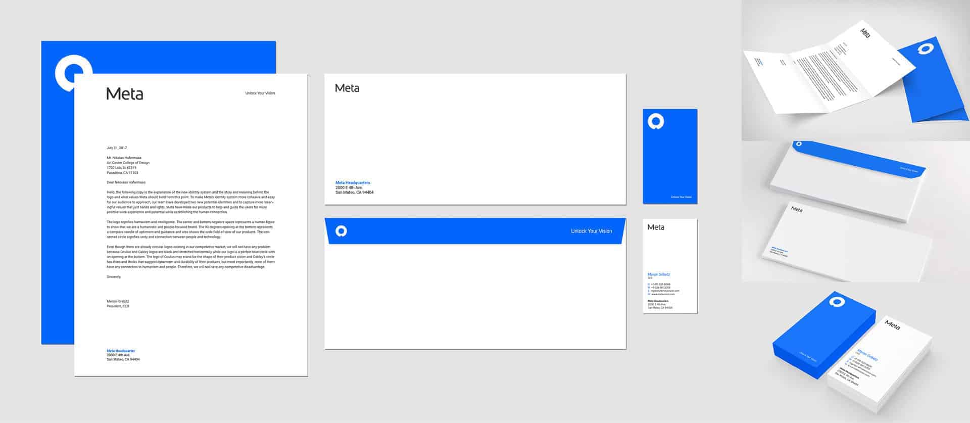
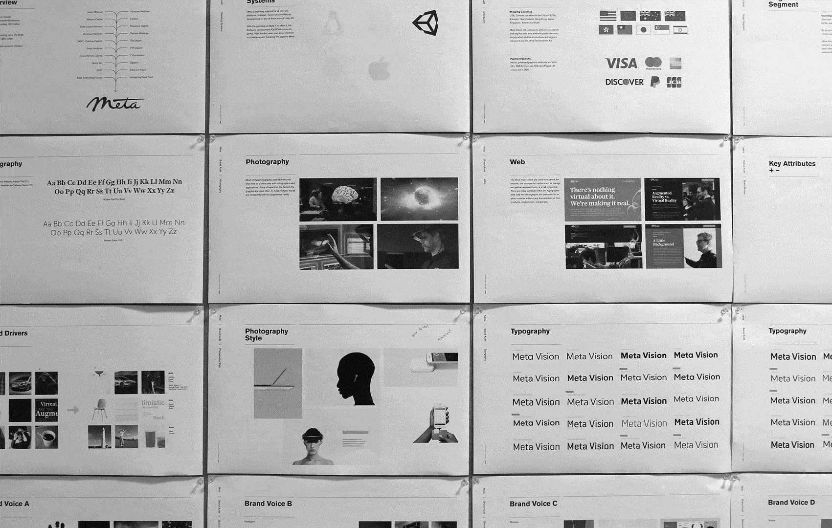
I used Adobe Illustrator, InDesign, Photoshop, After Effects, and Cinema 4D. The first part of this project was brand auditing and research. By examining the current brand assets, I was able to analyze the current problems of the brand. With market and competitive research, differentiation points for Meta's advantages were established from logo, color, tone of voice, materials, retail, UI/UX, and packaging. A final logo and logotype was completed in 6 weeks, then a full brand experience and collaterals were explored and created using various softwares from print, motion, interaction, spatial, and other medias.
The response from my audience was an interest in the narrative this rebranding unfolded and how the company's vision was promoted through intuitive storytelling. I learned that a successful branding takes a hundred layers of rationality, but to move people's heart, a layer of emotion and narrative is needed to package that practicality and logic.
The aesthetics used in this branding project are those of the modernists. I wanted to carry on their philosophy of objectivity and a positive point of view on the future as I dreamed of a utopia for Meta; a humanistic place where people can rest and feel safe in a world overwhelmed with technology and innovation.