Munique Palace by Leonardo Juchem

Munique Palace is the residential that arrives to follow up the development of the municipality of Portão, a city from Brazil’s Rio Grande do Sul state. It’s the city’s biggest and best residential enterprise already designed. A pioneer work, with a differentiated pattern of construction, one that includes classic features and contemporary facilities. The enterprise was given this name due to its architecture, which is inspired by Munich’s buildings in Germany.
After traveling and spending some time in Germany, the customer saw in the European style a great opportunity and inspiration for his new venture in southern Brazil, a region that has many german descendants. On his return to the country, it was decided that the name of the residential would be Munique Palace, and the brand would have to carry characteristics of Munich.
- Leonardo Juchem
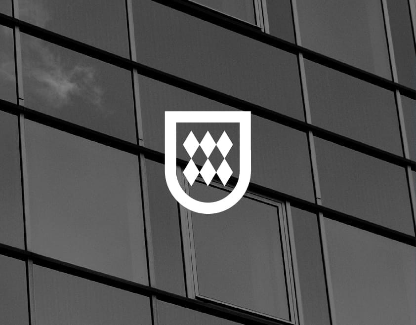
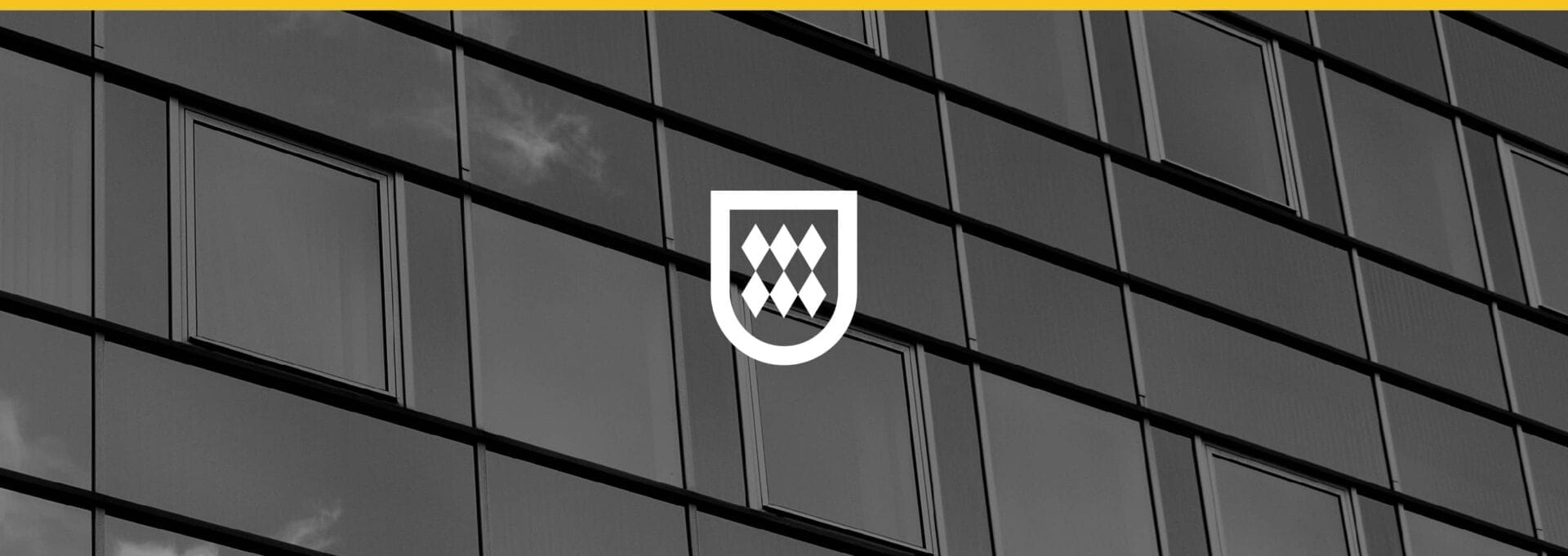
The residential complex is inspired by the urban setting of Munich, in Germany. Therefore, the concept of the brand has been designed as an identity that unites lines, shapes and colors from that region. Besides, some of the customer’s requirements were that the brand would need to be elegant and minimalist.
- Leonardo Juchem
![]()
![]()
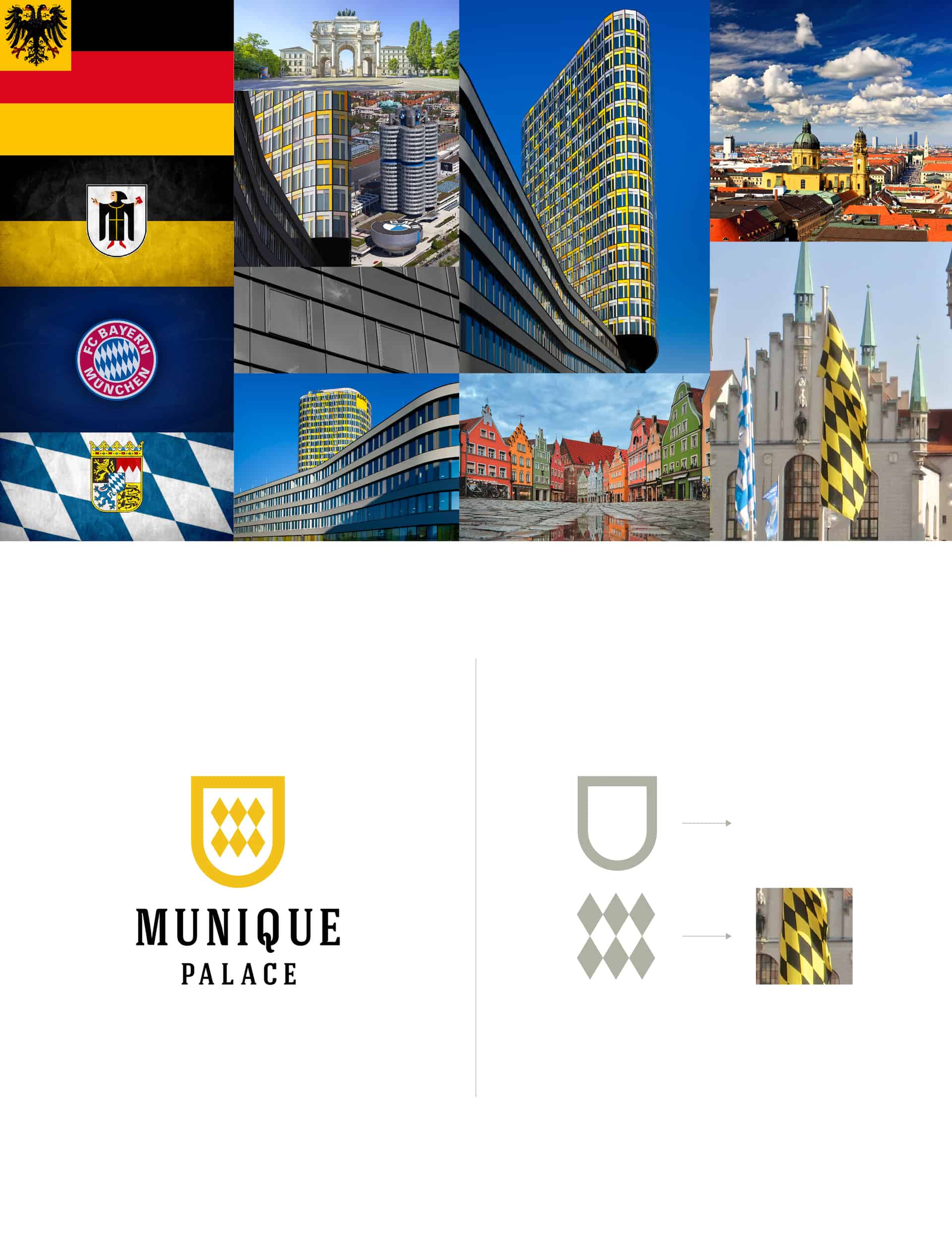
Before the creative process, I tried to collect as many visual references of the city as I could and then put together a moodboard. The ideas came from the images it presented: buildings, streets, houses, flags and coats of arms. After some tests, it was decided that the symbol shape would be based on the flag of Munich, as well as its colors. Since the symbol was based on the flag, it made sense the typography should convey the versatility of the architecture. Therefore, the choice had much to do with this aspect, combining classic and contemporary style.
- Leonardo Juchem
![]()
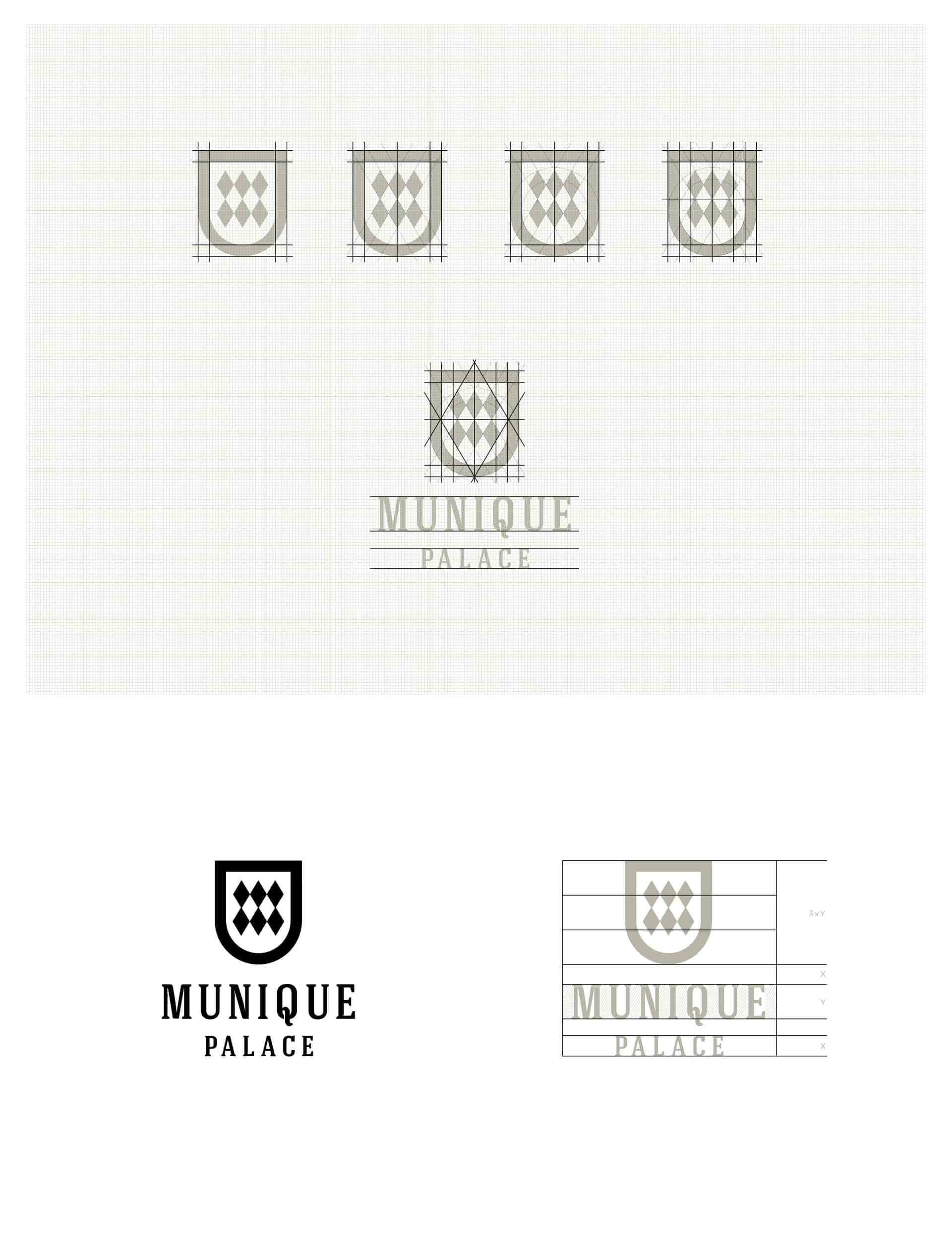
There’s no secret. Basically, Illustrator and Photoshop. I used Illustrator for drawing the visual identity and Photoshop for editing images and mockups. Ideas came along with the creation process, right after the analysis of the group of images presented in the moodboard. The biggest challenge was to find a solution that would convey exactly the concept the customer wished for while contemplating the minimalism. It was necessary to complement the symbol with typography. That’s what made the challenge possible to be completed.
- Leonardo Juchem
For the revisions, I've made few ones. The customer approved the project right after the first presentation. After that, only a few finishing touches were made regarding the grid measures and the brand’s finish.
- Leonardo Juchem

About Leonardo Juchem
Leonardo Juchem graduated in Design at the Feevale University at the end of 2014. He is currently working as a designer and art director in the city of Novo Hamburgo, located in Southern Brazil. His day-to-day comes down to creating graphic pieces accompanied by a good sound on Spotify and a large cup of coffee. In the spare time, he likes to read something interesting or playing video games. You can find more of his works on his Behance profile.