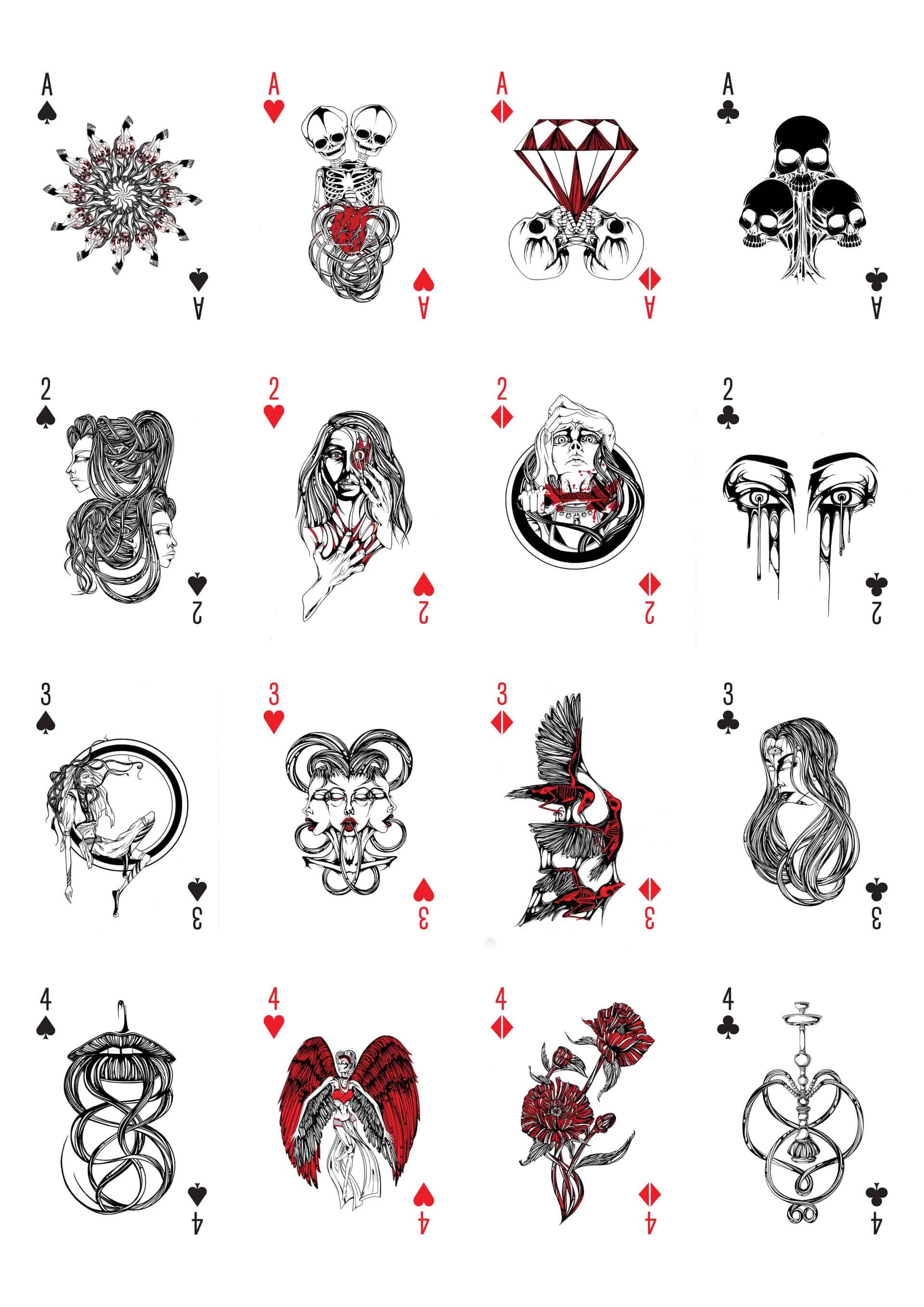
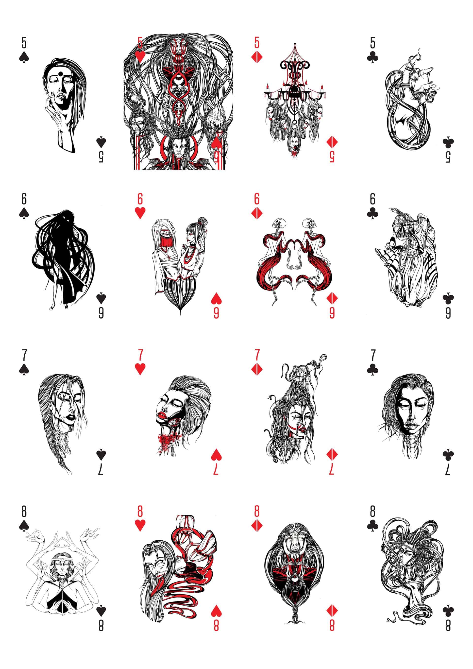
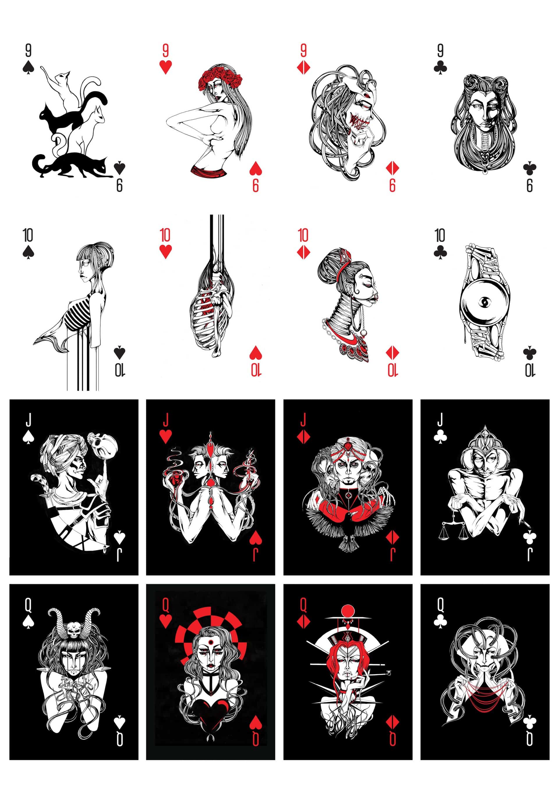
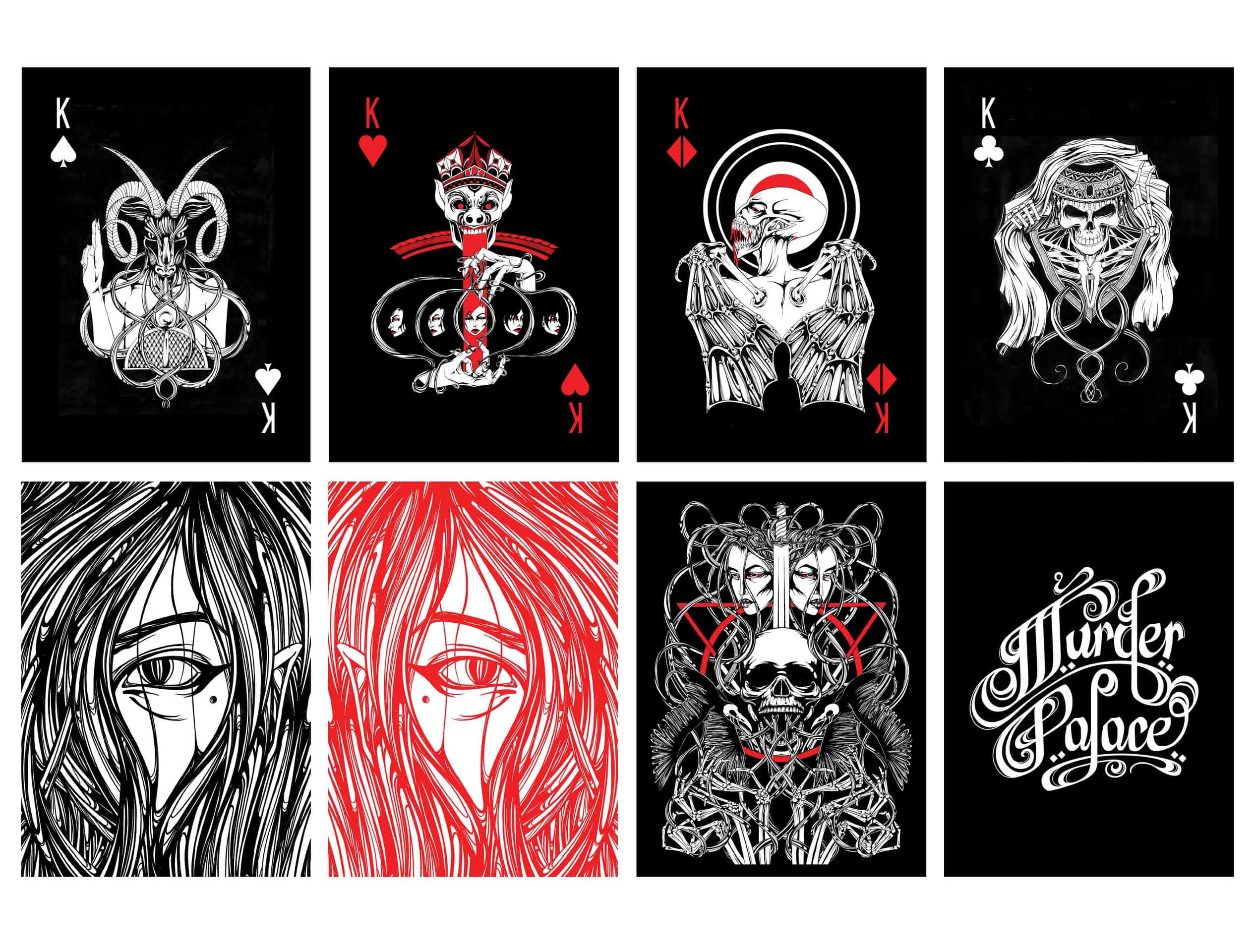
Murder Palace

A 2015-2016 project to create an illustrated card deck. Comprised of 55 original ink illustrations (+ hand-drawn type) 'Murder Palace' is explorative of darker themes. Each card has it's own unique illustration, and each number strives to be a mini series in it's own right.
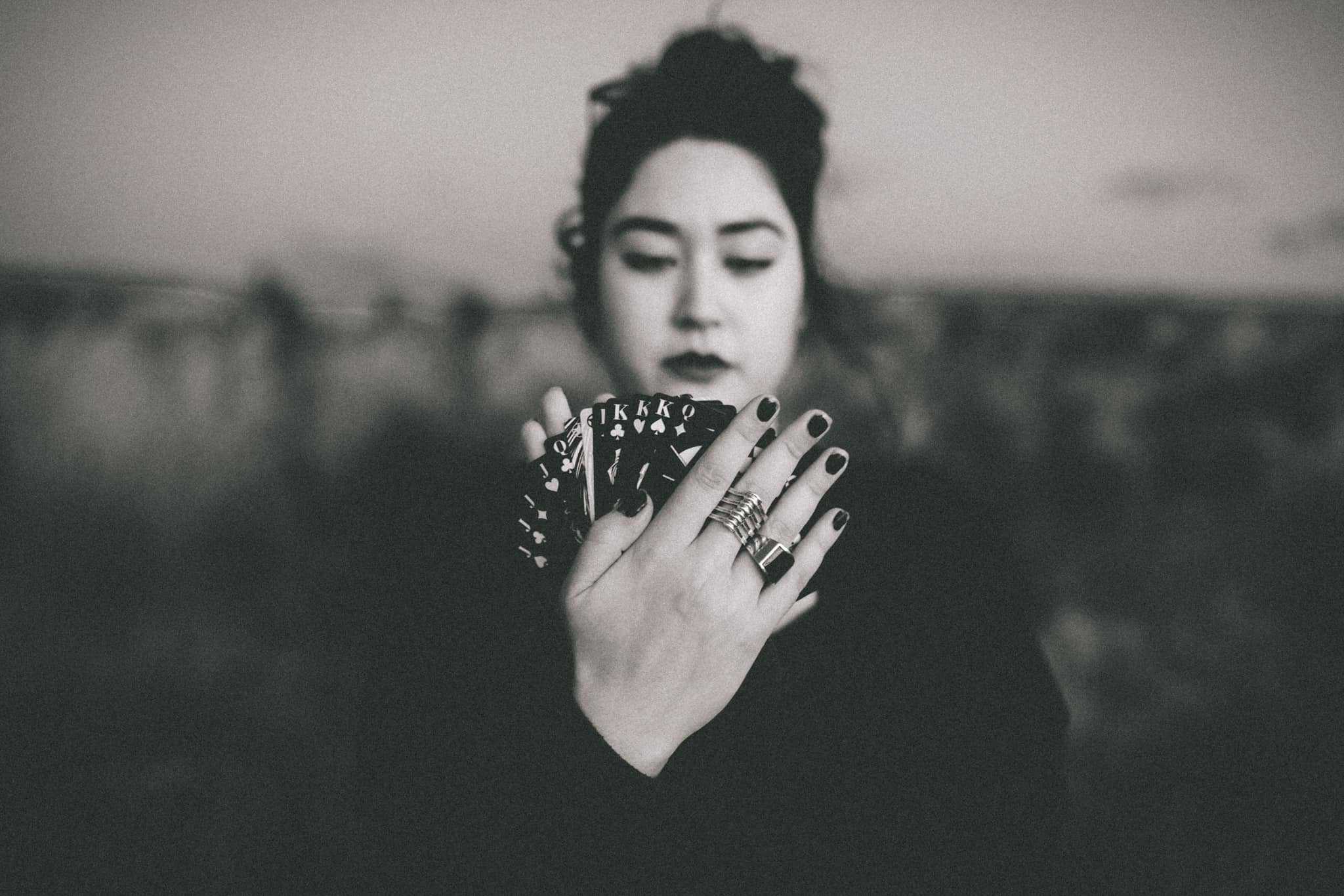
Photography by Amy Kate Atkinson.

How did you come up with the idea? Colour choices, materials and styles?
Based on the gruesome myths and legends surrounding the Le Pretre Mansion, in New Orleans, I had originally built an entire, to scale, laser-cut, paper architecture version of this mansion. The first concepts were to use this to house illustrations, originally meant for a small book or graphic novel, to be neatly packed away within the structure. I dubbed this project 'Murder Palace' as a sequel of sorts to the 'Murder Castle' paper architecture I built of H.H.Holmes' hotel of horrors (sometimes called; The Murder Castle).
Through various renditions and illustration concepts using various mediums, the idea to instead create playing cards was born. Colours were kept to a minimum of black, white and red to be in keeping with the darker tones and to align with black suits (clubs &spades) and red suits (hearts and diamonds). Over time a style for the project's illustrations was born quite naturally.
Tools, Software and Process.
Each of the 54 cards plus card-backing is hand drawn then inked using Japanese sumi-e ink. I have a preference for Fabriano paper stock on 210gsm for the original illustrations, though not all were completed on these stocks. I used a liner brush on all illustrations and for tiny details, a calligraphy nib. I had to think a lot about how illustrations would transfer digitally and for each card's design/editing, which made ink work a great candidate. Ink/line work scales down great and I could add colour at later stages.
Ink paintings had a size range from A4 to 60x80cm (a bit excessive thinking back) which were all scanned, coloured corrected with Adobe Photoshop and scaled down to American, poker size, playing cards and laid out using Adobe Indesign. I additionally made simple vectored clubs, spades, hearts and diamonds icons in Adobe Illustrator.
How did people respond?
By in large people enjoyed them. A lot of people thought they were very dark but enjoyed them nonetheless!
What did I learn?
I learnt a lot from this project. Because I basically had to do ink work every day for a few months I became crazy good at line work! Planning, because there was 55 paintings to get through I really had to just plan my ideas ahead of when I wanted to draw them and keep a vague list of things to possibly draw. I also just had to learn to get through crazy monotonous editing and layout of all the cards and just deal with it; it's not all just going to be creative.
I enjoyed this project a lot and it probably marks the change from my want to be a designer to my want to be an artist/illustrator.
This is also a project that is a little older if you feel the need please look me up on my Behance which is being updated:
https://www.behance.net/MikiP
Or my Instagram which is the most up to date:
https://www.instagram.com/mikip.art/