N.O.W. by Marianna Pefani
N.O.W. or Network for Offender Women is a website that aimed to provide help and assistance to former women offenders. The website provides various information that could help them in their life - job postings, therapy and a lot more. Originally, it was a thesis project but didn't push through, but as a designer Marianna Pefani decided to go on with the project.
It all started when a friend of a friend of a friend (it always starts like this) contacted me for the branding of an non-profit organization. But it wasn’t so simple. It was a university project that needed a logo to “give birth” to it. I thought it was inspiring, so I said yes! I started designing the logo first, but unfortunately the project didn’t continue. As a typical designer, I didn’t leave the opportunity to pass me by and I took some steps further by designing the whole identity. But this wasn’t enough for the “typical designer”. I completed also a parallax site presenting the organization and then I thought “We’re in 2015”... it should be responsive too! You can imagine the next step. And here we are!
-Marianna Pefani
The Network for Offender Women (N.O.W) is a within and between nations network that aims to improve services that assess and/or treat people with a combination of mental health problems and offending behavior or criminal history, especially in low-and middle-income countries. The research was long but the competitors few. There were a lot of logotypes from other similar organizations but they were old and they were missing the inspiration/ concept. So I came to the conclusion that it had to be fresh (color palette), modern (typography), lighthearted (puzzle icon) but at the same time serious/trustful (straight lines), inspiring (conceptual icon) and friendly. I used these principles on the identity and web design too.
-Marianna Pefani
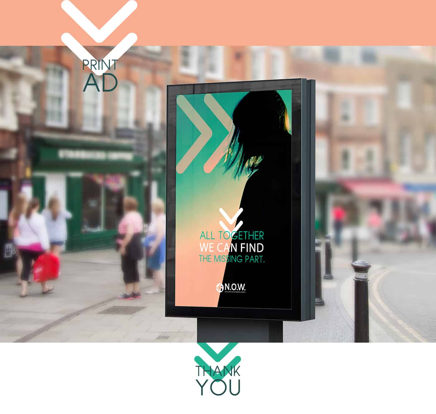
When I saw the brief, the only thing that stucked in my head was that the puzzle represents problems and confusion but in the end, it’s just a game. So I had the concept! This organization could turn a problem into something positive. The “Missing part” quote I use in some of my material represents what is missing from the people that the organization is trying to help. The idea was now completed. The web design had to be clear, light and have a logical flow (parallax). I created icons and elements that came from the logo.
-Marianna Pefani
I love designing the old way, sketching-scanning-vectoring! I am a flat design fan, I love minimalism and clear lines, whenever the projects need it. These design preferences are the result of my admiration for typography. Hand-sketched and digital. My style could be characterized as free and handmade. Designers, don’t give up! The world needs qualitative design in every country, city, corner! We are not artists! Only when we want to! :P We are Designers and we are here to serve this purpose! Get your pen tablets, make a great research and go out to leave your mark on the world!
-Marianna Pefani
About Marianna Pefani
Marianna Pefani was born and raised in Athens, Greece. From her early years she's been sketching and drawing with every kind of material. Newspapers, crayons, cold clay, etc. Studying Graphic Design in the Technological Educational Institute of Athens wasn’t just a choice for her... it was a necessity. After her studies, she started working in advertising companies and at the same time she was doing her personal projects, as this one. See more of her works on Behance, Tumblr, Dribble or Instagram.


Such an inspiring and awesome concept!! I love the colour palette you use!!
Great project Marianna!! Really inspiring!!
Fantastic work! I really admire designers like you!!
Thank you guys very much for your kind words! ;)
Awesome stuff!
Need more projects like this one, fresh, consistent, inspirational ones. Great Concept Ms Pefani !!
Great project Marianna! I have some ideas that I would like to discuss with you! Please contact me
Of course Georgina! We can talk whenever you want ;)
Very smart project Marianna!!Keep up the good work!!!
Great work Marianna! Your unique talent creates fresh and inspiring projects.
Great work! Really inspiring! Especially the puzzle pattern I find it quite smart ;)