Neptuna

Delightful canned tuna, handmade with a great storytelling and a gorgeous design.
The need to create a new solution came from my daily routine. I eat tuna regularly, and I see no value proposition in the flavors or the packaging. "We could improve that," I thought. "Why not?"
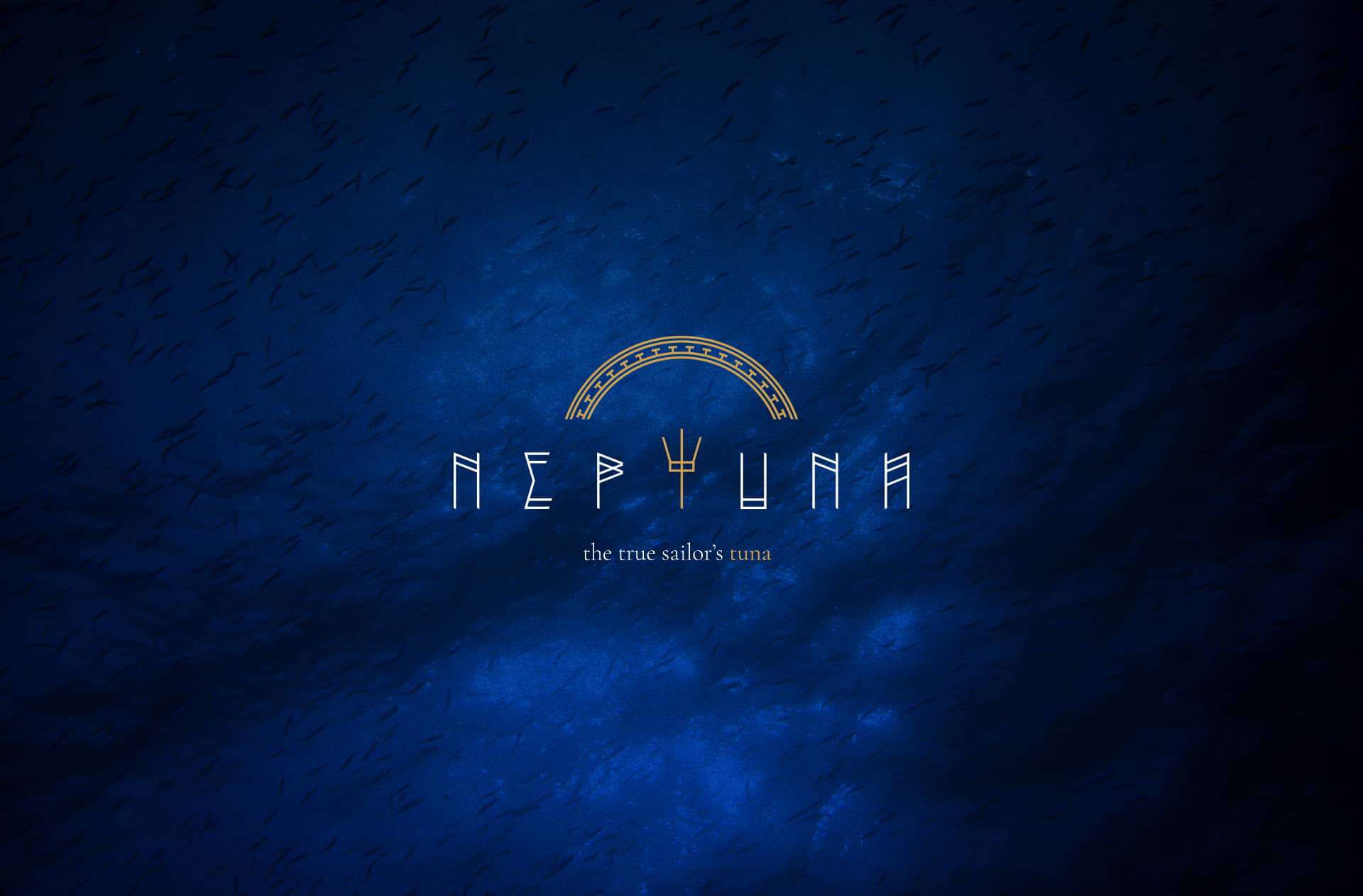
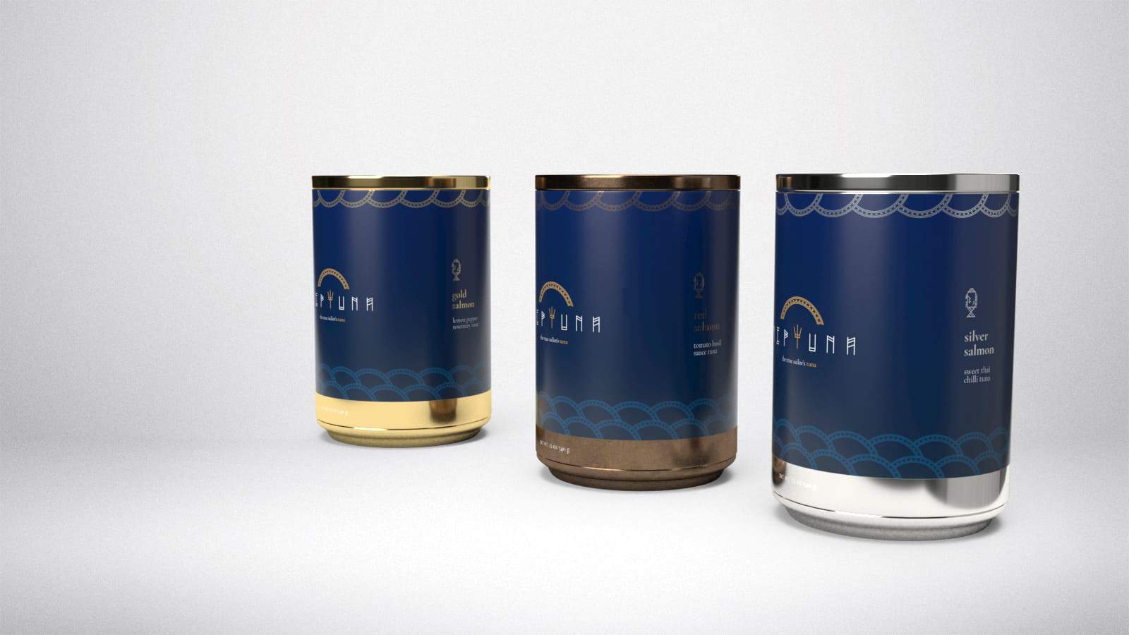
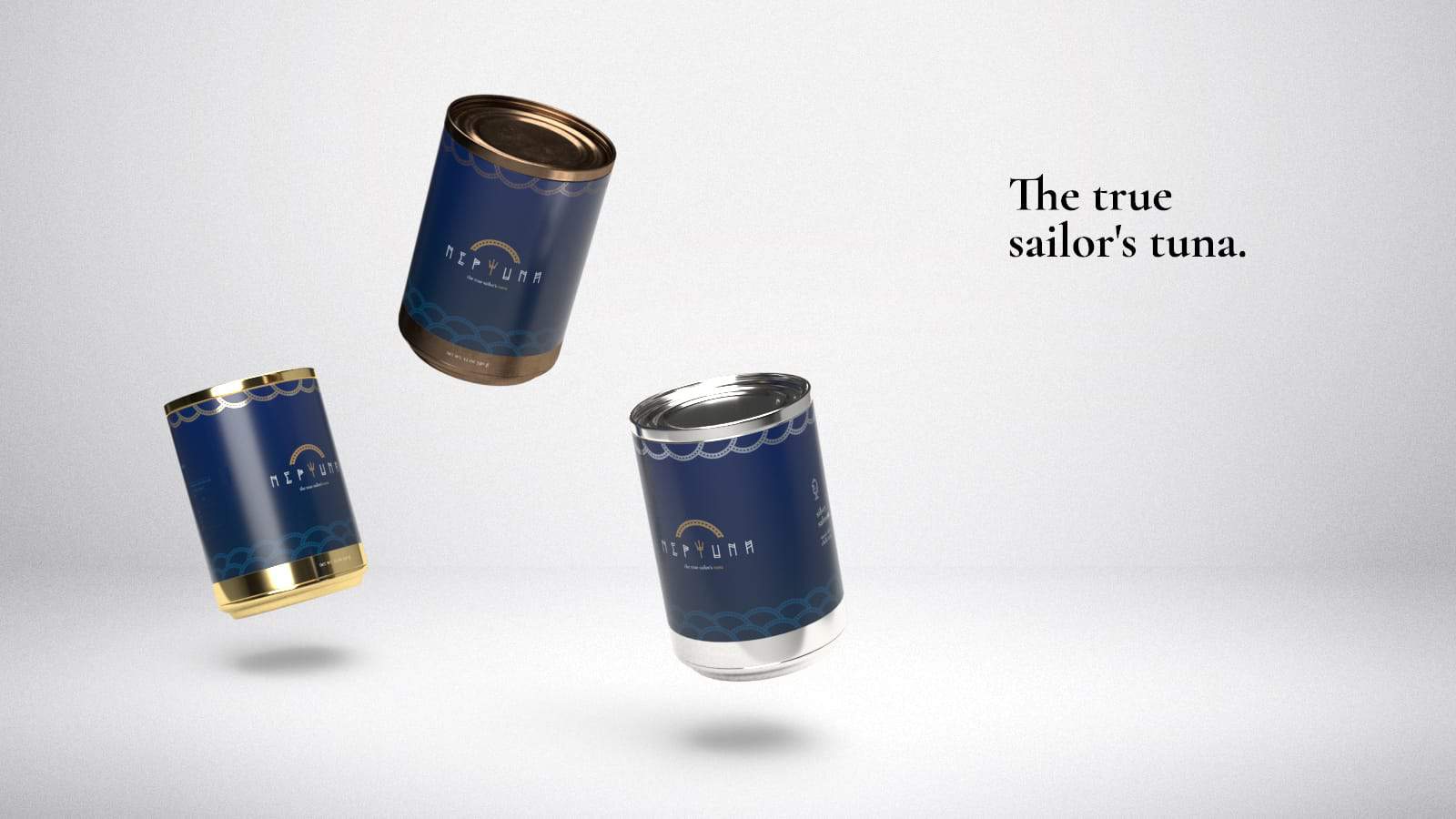
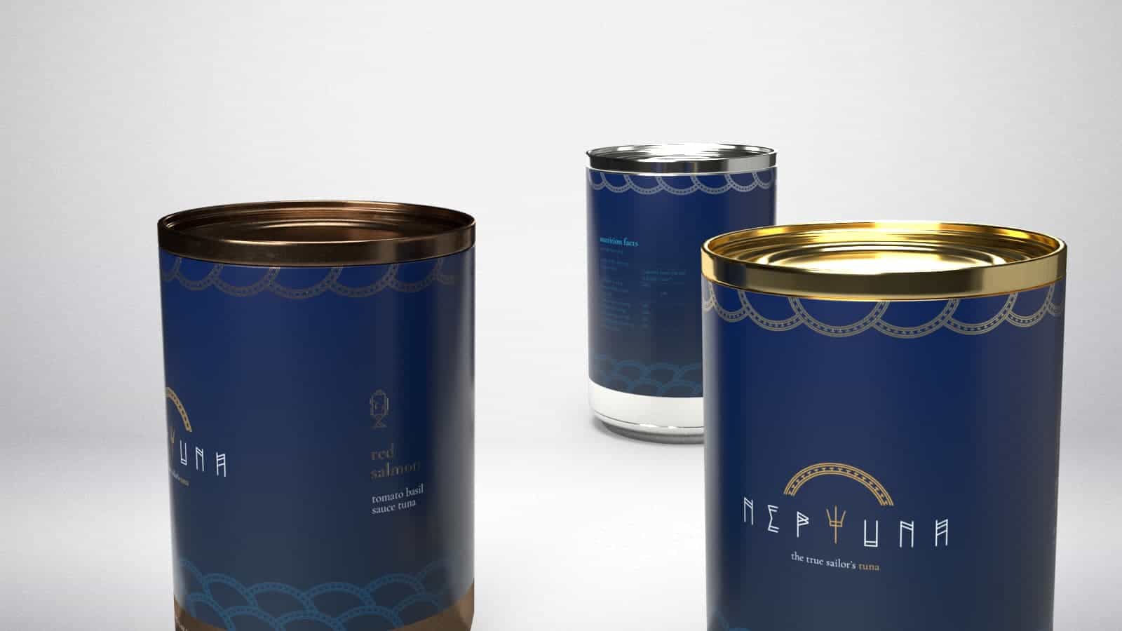
And so came the idea of Neptune. A premium brand of tuna, extremely tasty, with a bold and refined design.
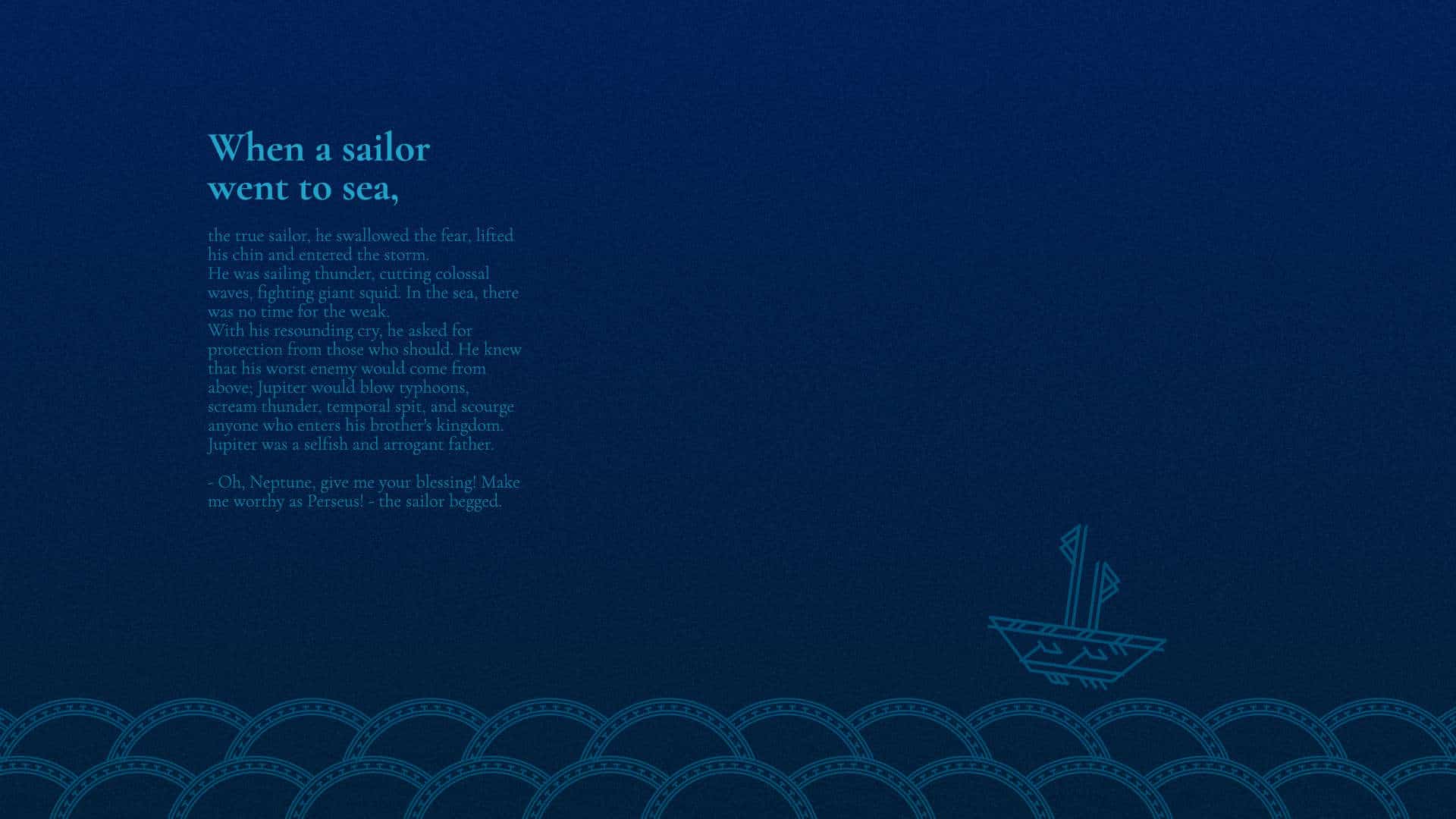
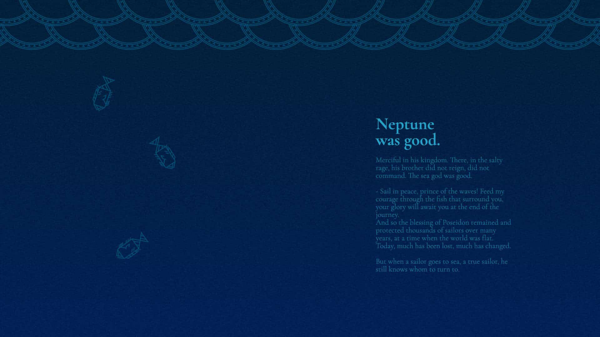
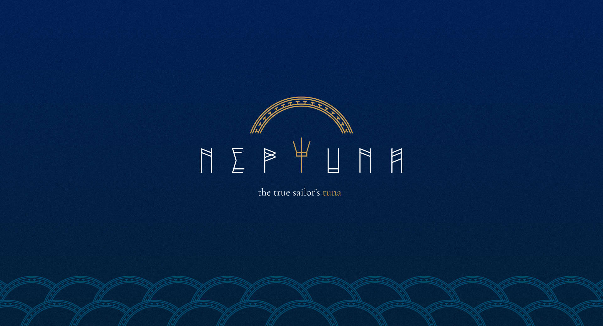
The used metals assume noble colors, as well as the dark and dense chromatic palette. The inspirations in Greco-Roman mythology are clear and reinforced in the divine aspect of the product.
In order to create this exclusivity, I had to manually create the typography for the logo, making a mixture of minimalist design with Greek griffins.
Manual Illustration:
I started the creative process by illustrating in sketches and raf the brand, the packaging. How to make something mundane become something premium?
Adobe Illustrator:
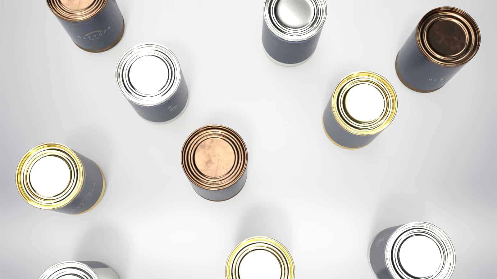
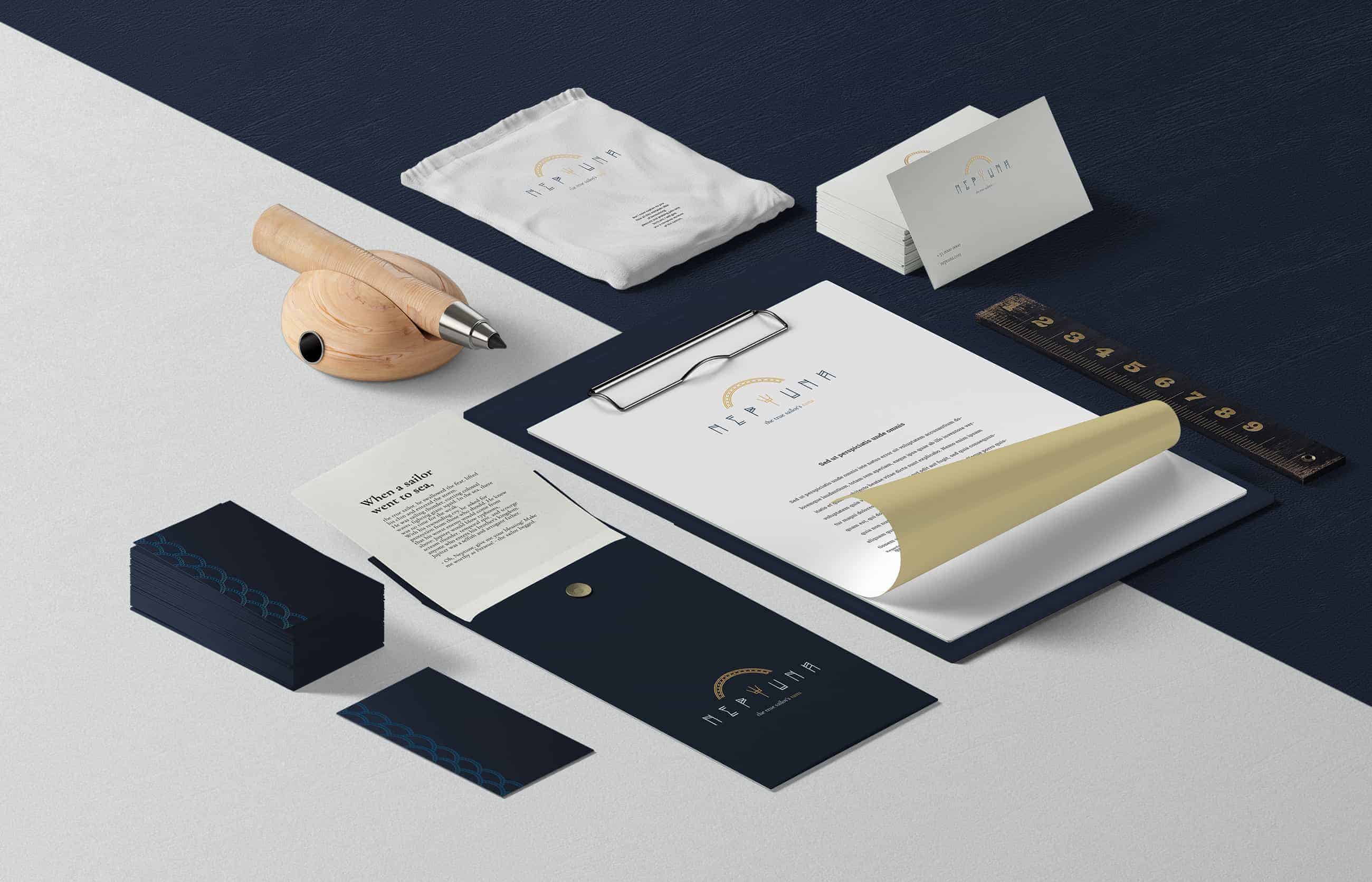
After this process, I started brand creation and visual identity in Illustrator. Logo, chromatic palette, texture, illustrations and typography, all vector and clean.
Adobe Dimension:
That done, it was time to work 3D mockups on this powerful platform.
Adobe Photoshop:
After rendering, I did post-treatment of the images and corrections in Photoshop, guaranteeing uniformity and visual quality to the work.
The acceptance of the product was nice, the coolest testimony I heard was this:
"I used to be ashamed to take tuna to work because of my diet! Now I will have pleasure, the packaging looks beautiful and the extremely tasty!"
But the product is only a ghost, conceptual brainstorm, so... sorry guys!
This design is on point!