NÓS Brand Identity
Aline Dias, consultant with extensive experience in master coaching and business management, sought our help to give name and life to her new company. A company that combines coaching, consulting and digital marketing through a young and dynamic brand, as its director, which in no way resembles the boring format of several current coaching brands.
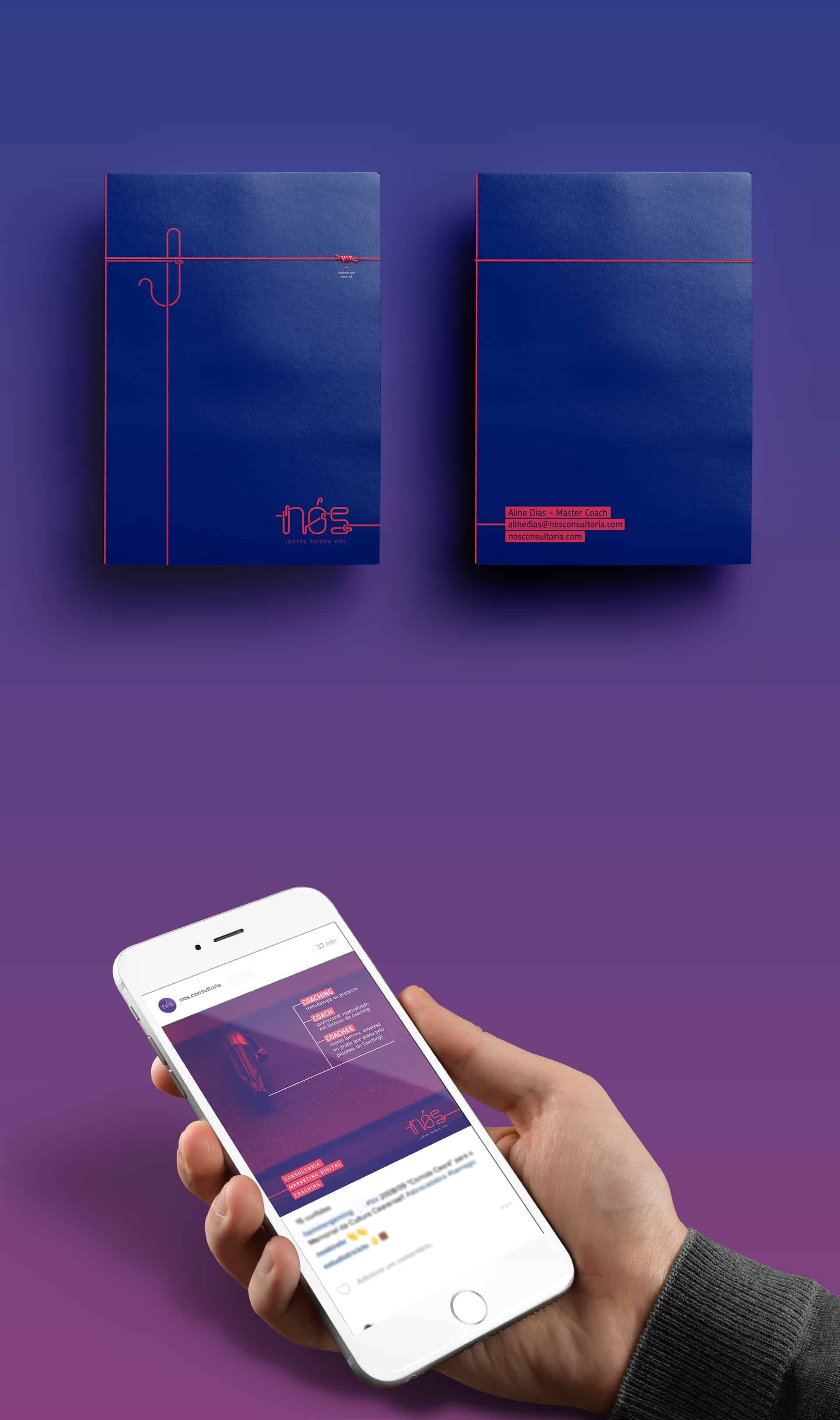
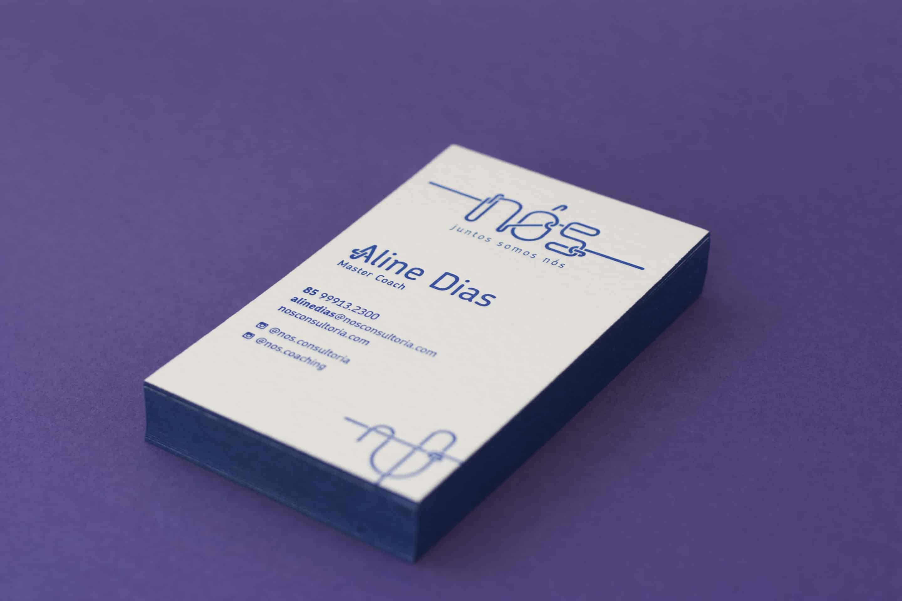
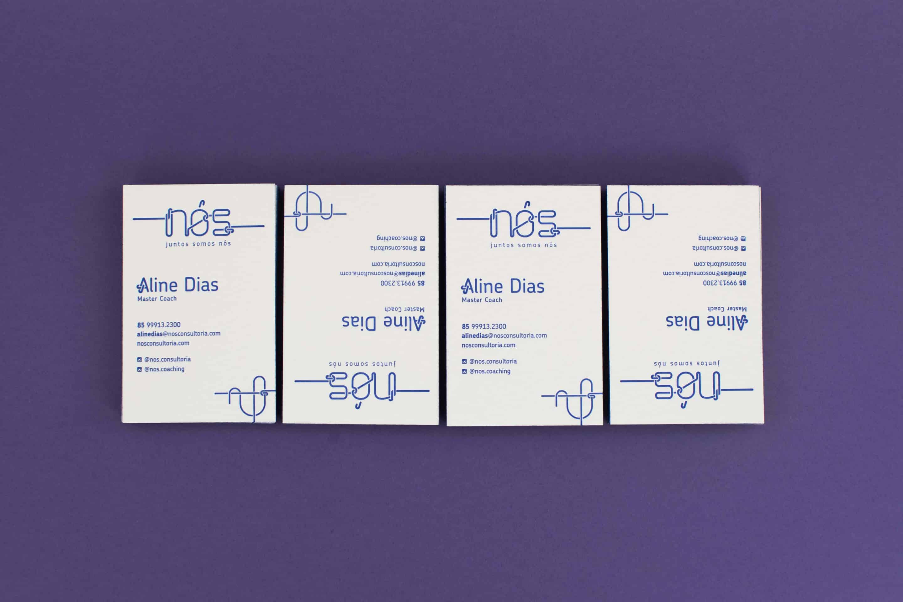
We were responsible for the naming, logo, stationary and promotional materials.
Our naming proposal was inspired by one of the oldest legends of lateral thinking, the "Gordian Knot":
At one time the Phrygians were without a king. An oracle decreed that the next man to enter the city driving an ox-cart should become their king. A peasant farmer named Gordias drove into town on an ox-cart and was declared king. Out of gratitude, his son Midas dedicated the ox-cart to the gods and tied it to a post with an intricate knot. So, in 333 BC, while wintering at Gordium, Alexander the Great attempted to untie the knot. When he could not find the end to the knot to unbind it, he sliced it in half with a stroke of his sword, producing the required ends (the so-called "Alexandrian solution").
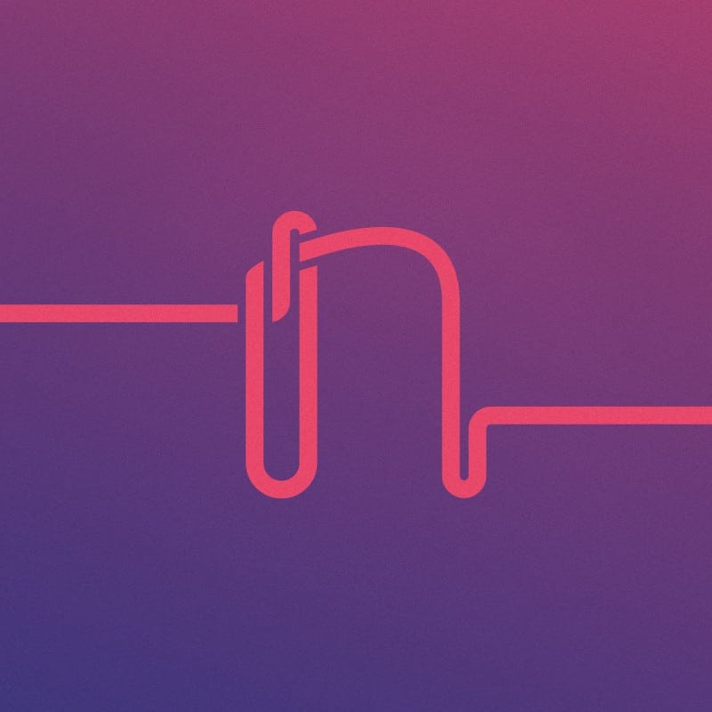
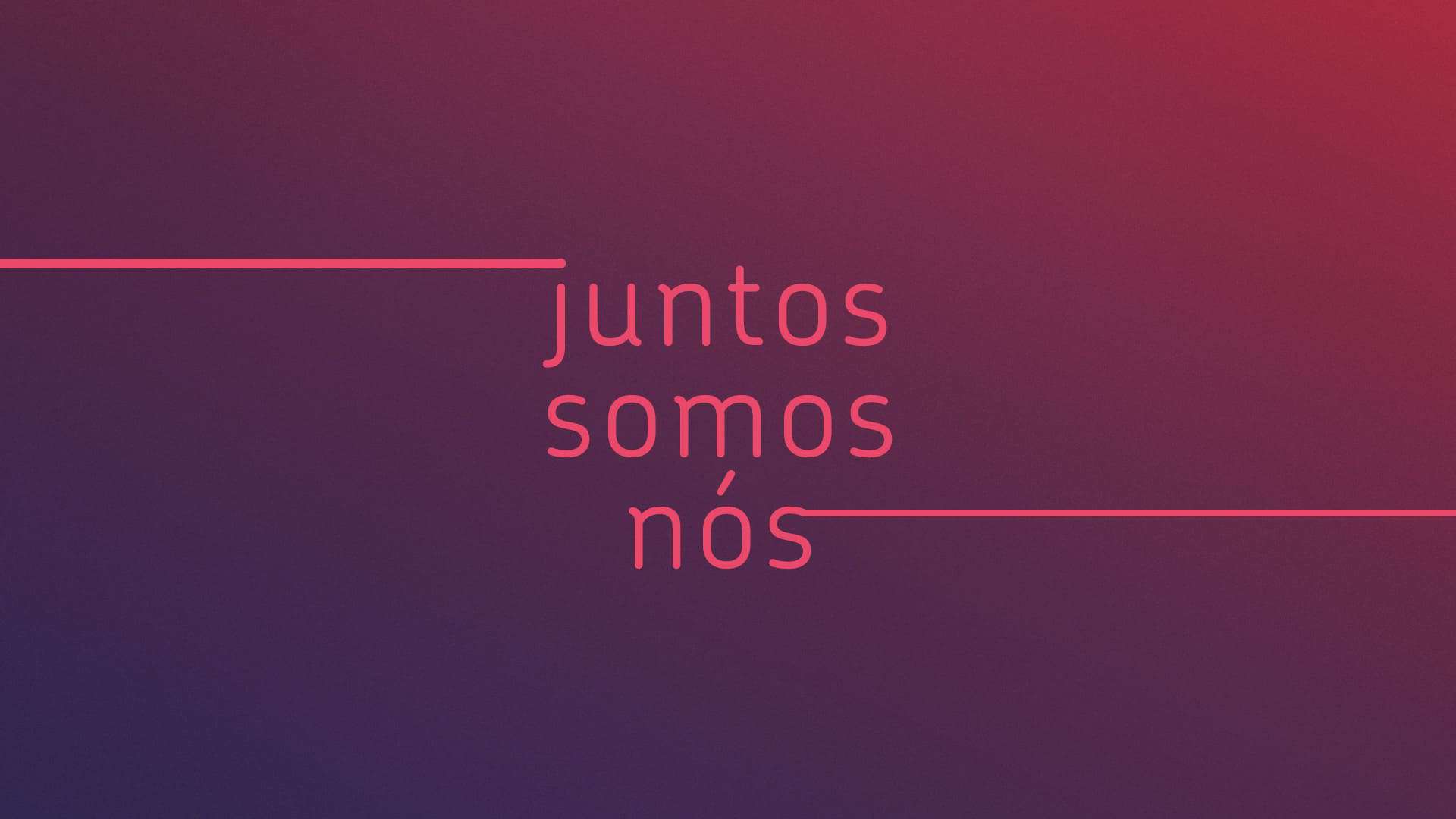
The legend is a metaphor for thinking "outside the box", the solution of a problem seen as impossible in a practical way. Using the plural word of the word "nó" (knot in portuguese), we created the company name: NÓS (the same as WE and also the plural of KNOT in portuguese), the problem previously impossible solved together.
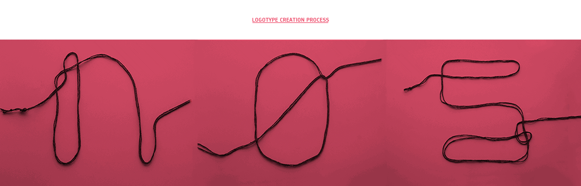
The brand lettering was created from actual shapes of letters constructed with a single line, with the only rule being using a simple knot at some point of the character. After refining the logotype, the language was translated into all the contact points of the brand, from the letter "A" in the director's name on the business card to the icon on the mother`s day postcard.
All our artwork begins with a research phase. In this case, we used real knots to simulate letterforms and tried to make them fell like they belonged to the same type family. We set some rules:
1- There had to be one and only one knot in each of the letters.
2- We had to use only one line for the whole lettering.
3- The final lettering should resemble a humanist sans serif typeface.
After the testing phase, we photographed the best ones and worked on them in Illustrator. Each letter went through several refining steps until reaching the one you see above.

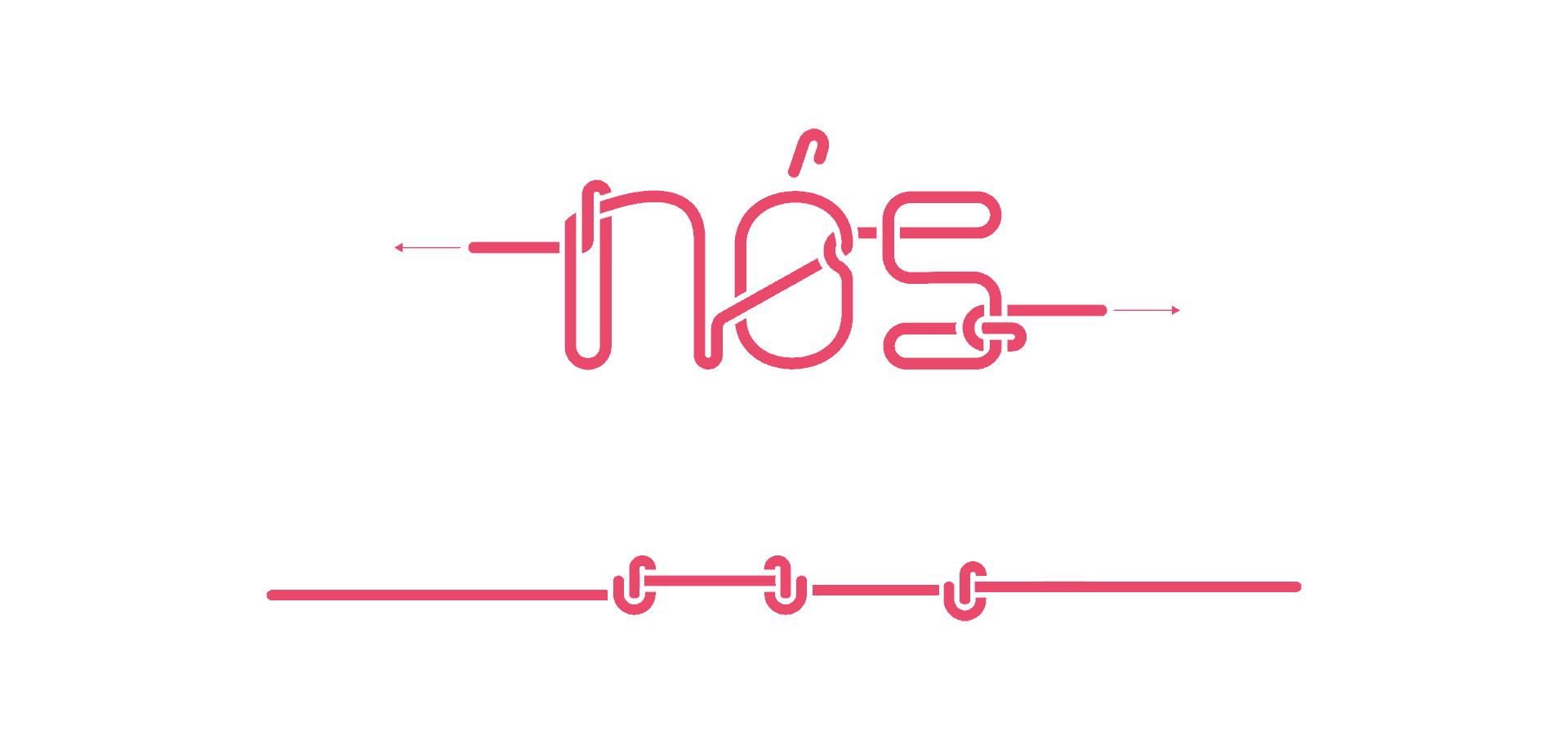
We were proved, once again, that nothing substitutes manual work. We, designers, should always get away from our computer screens, at least in the project inicial phase, and prototype with our own hands. The results of this process are more mensurable and help new ideas generation, besides being a way to have fun while working.
Our design kitchen is open for orders worldwide. Feel free to mail us.