NU
NU is a production company committed to building stories that stand at the intersection of art and social change — with a deep belief in the power of impactful, inspirational and authentic stories. Their projects vary from TV, Features, Documentaries to Auditory and Experimental.
We designed a bold and explorative identity system, both in form and content to honour its experimental spirit and its mandate of creative independence.

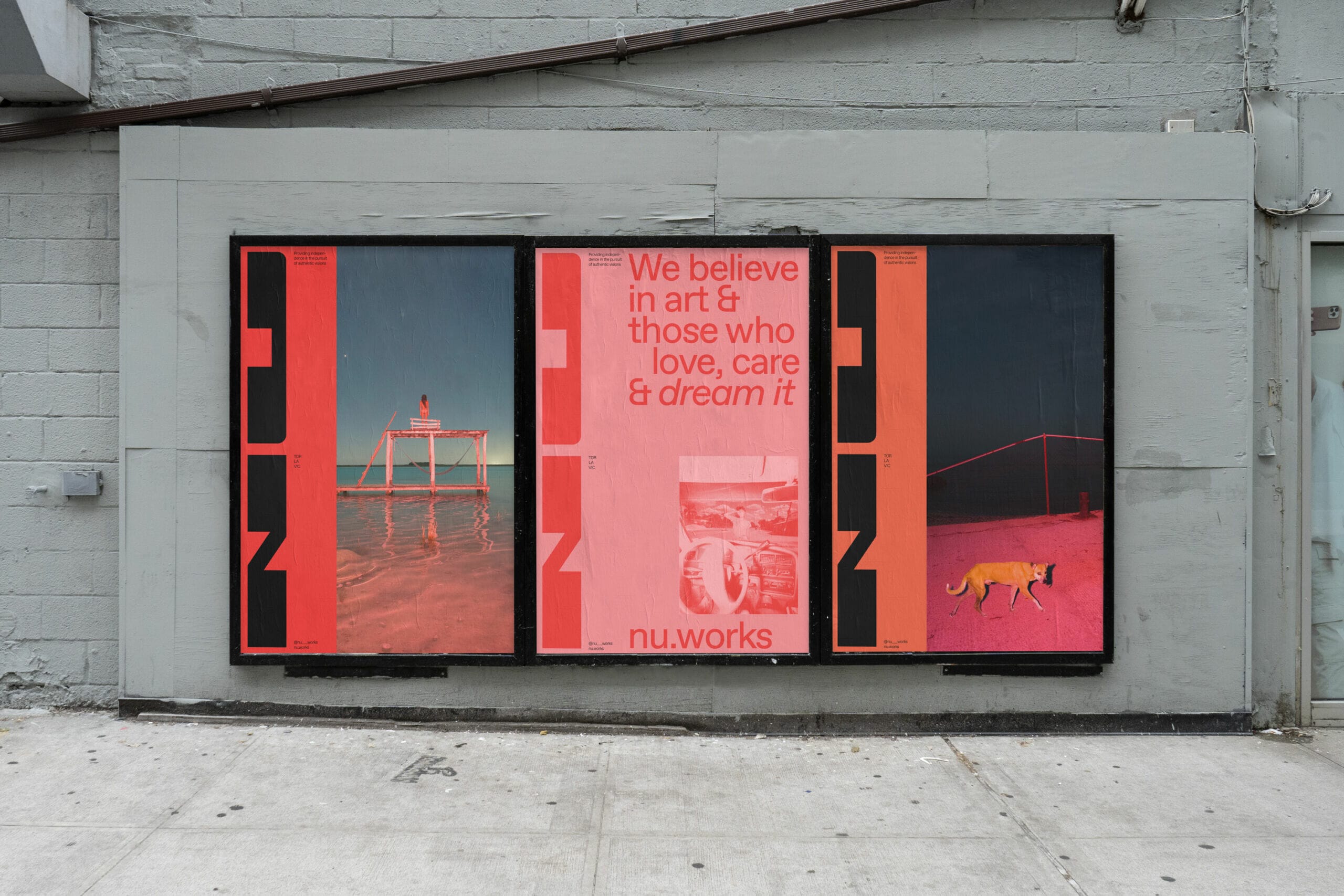
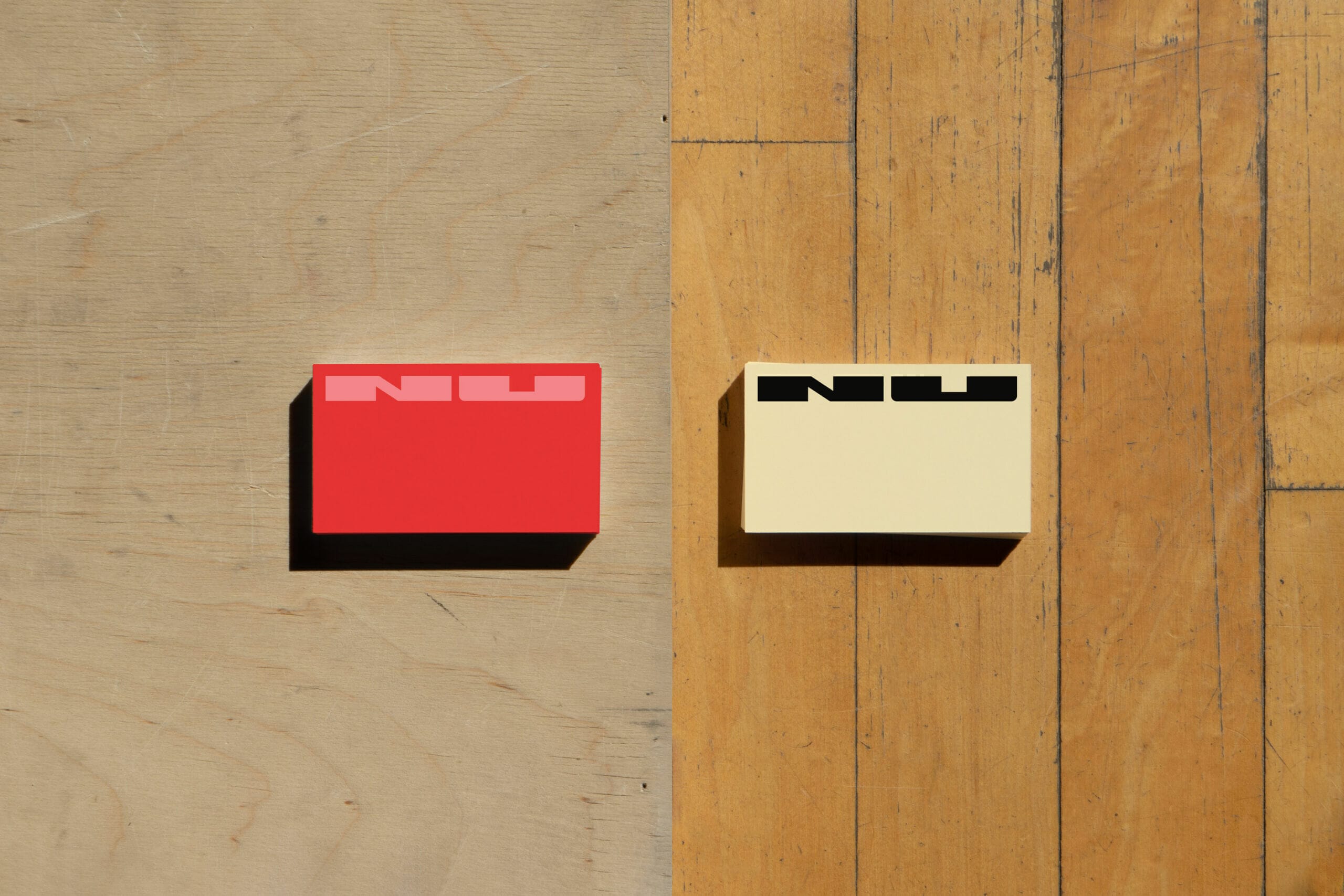
We began by drawing inspiration from the actual format and process of film itself. The logo’s base form and formation variations are derived from the shape of film perforations as well as the multiple formats within storytelling. The logo’s shape can shift, providing fluidity and expansiveness throughout the identity. We also reference storyboards in the visual language which when paired with the identity’s bold colours add movement and dimension throughout.
We used standard graphic design software to develop the identity but experimented with scanning 16 mm film footage to capture the textures, colours and energy of the format. We furthered our explorations by playing and manipulating the scans and even incorporated them in animations.
We also collaborated with photographers who possess unique aesthetics and personal points of views such as, Benoit Paillé and Sam Locksley, whom we felt conveyed the essence of the brand and pushed it forward.
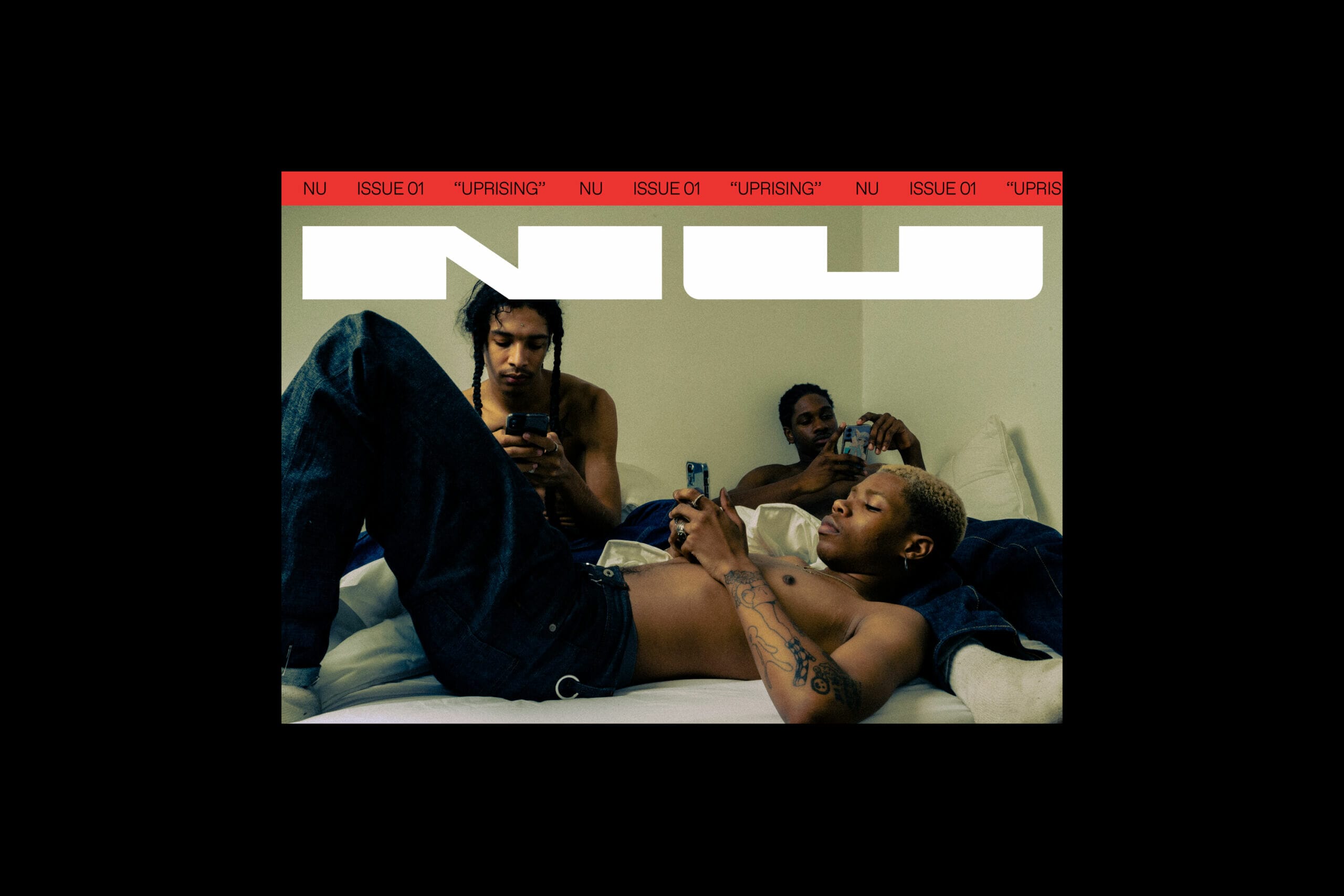
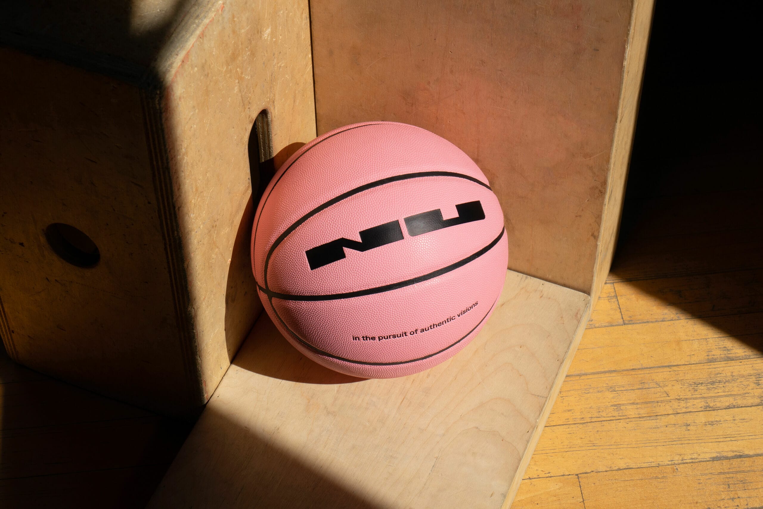
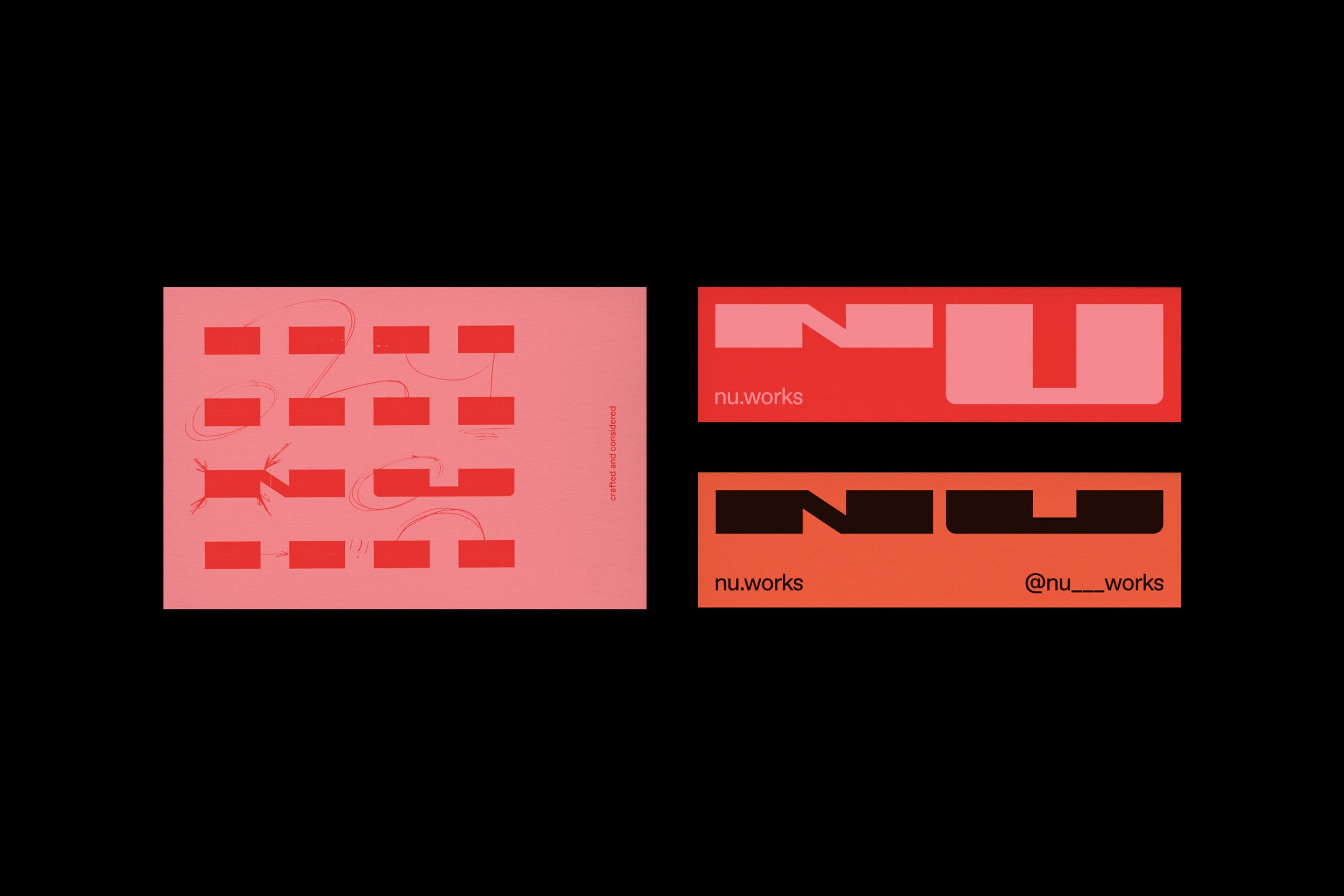
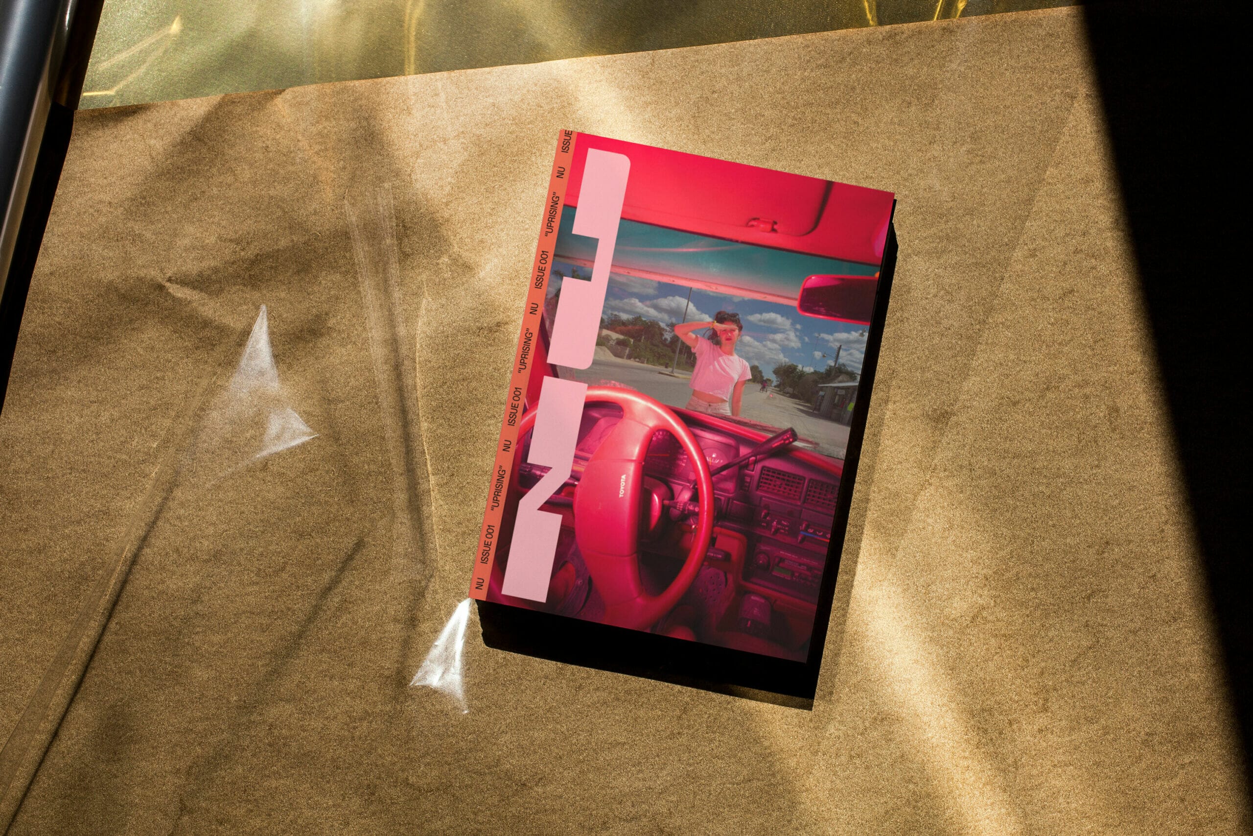
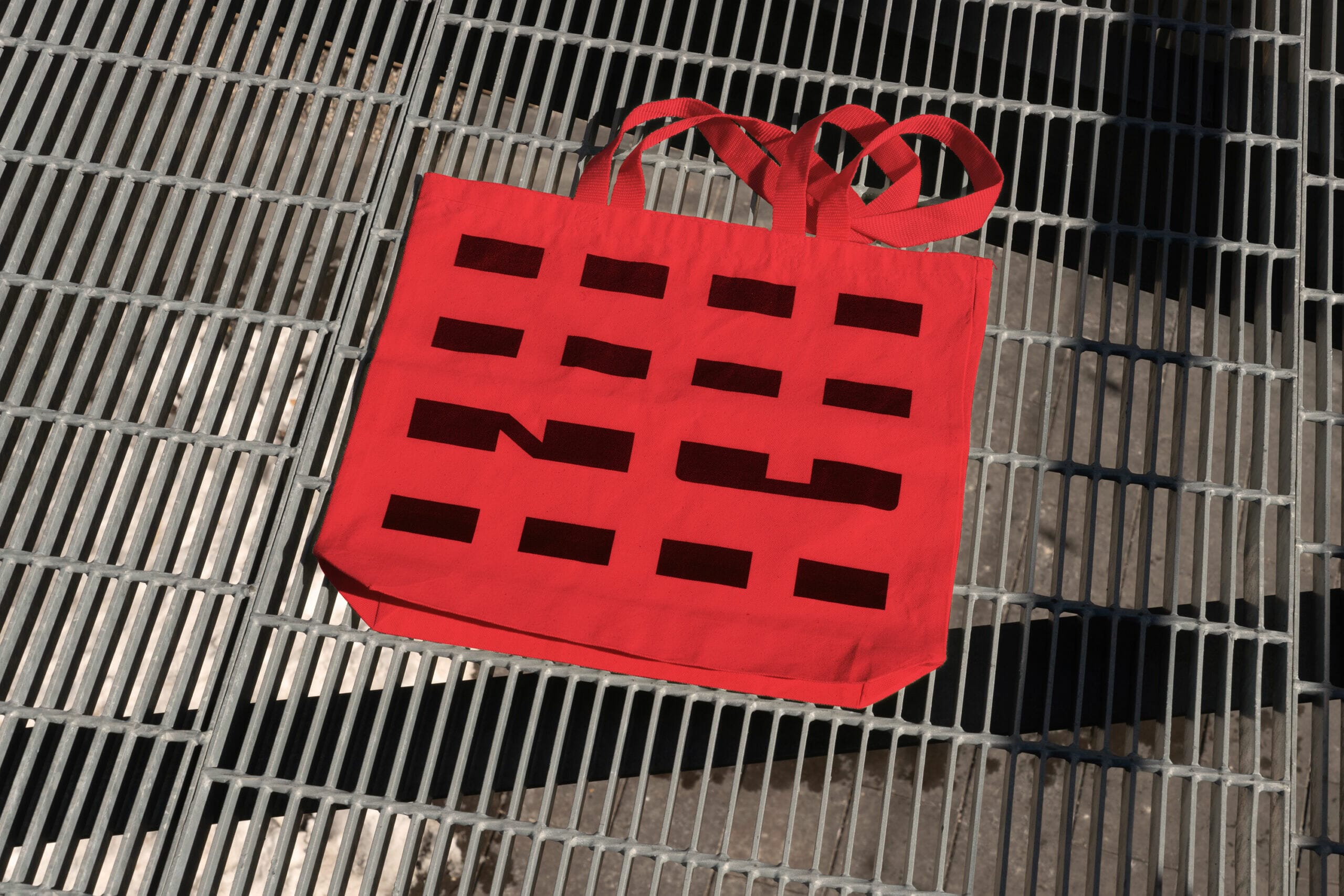
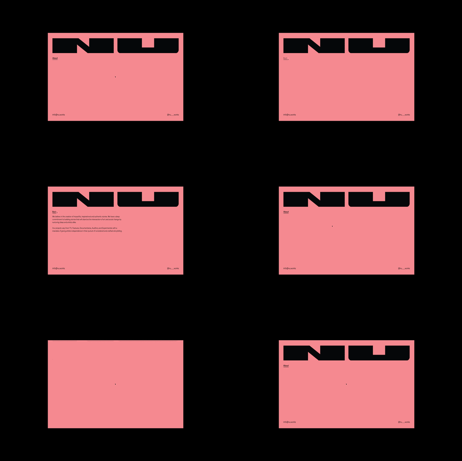
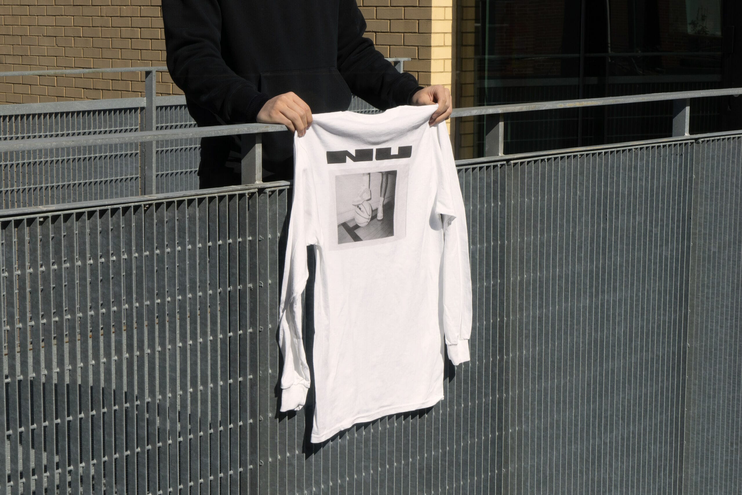
Overall the boldness, clarity and flexibility of the identity received an incredibly positive response. Due to the expansiveness of this identity our applications were playful and resonated with many, such as the basketball, taking the brand narrative into a personal perspective.
Sometimes those perfect projects come your way where social change, humanity and creativity all intersect in the pursuit of true authentic stories. This project aligned itself with our most profound values of giving back to society in ways that feel true, engaged, dignified and human… to celebrate the beauty we find.
Love it! Simple and clean.