Nucleus Global rebrand case study

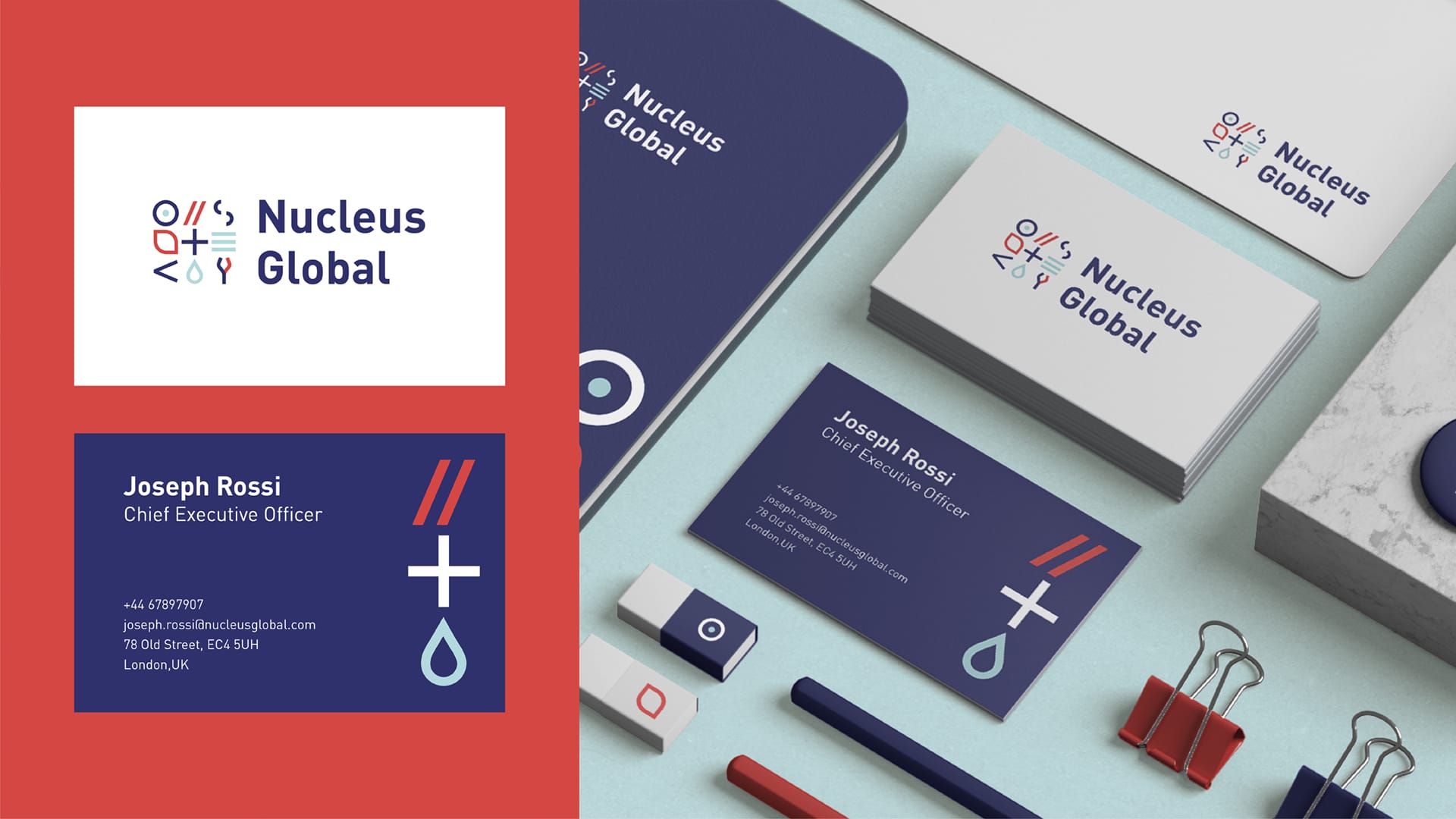
Rebrand exercise for Nucleus Global, an umbrella company of 14 agencies which operates in the medical communication field. Nucleus Global and the agencies had their distinctive look and feel, therefore one of the key goals is unifying all groups under a singular aesthetic. The brand should reflect the pride of being an expert modern contender in the healthcare communication industry.

The main goal of the new identity is creating a strong brand, staff and clients are proud to work for.
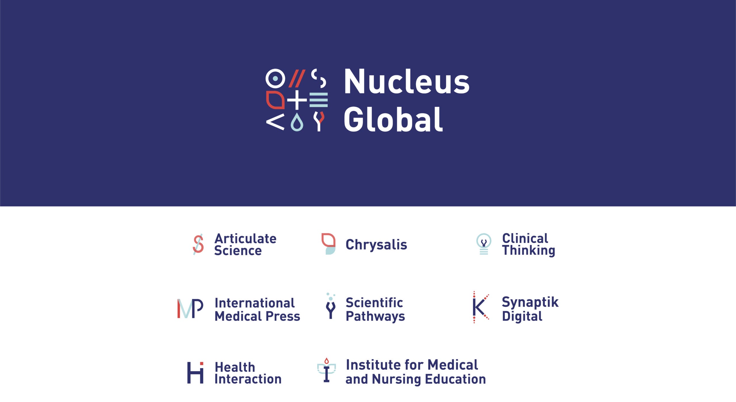
At the same time, it is pivotal to show how Nucleus Global is proud of being the parent company of its 14 agencies.
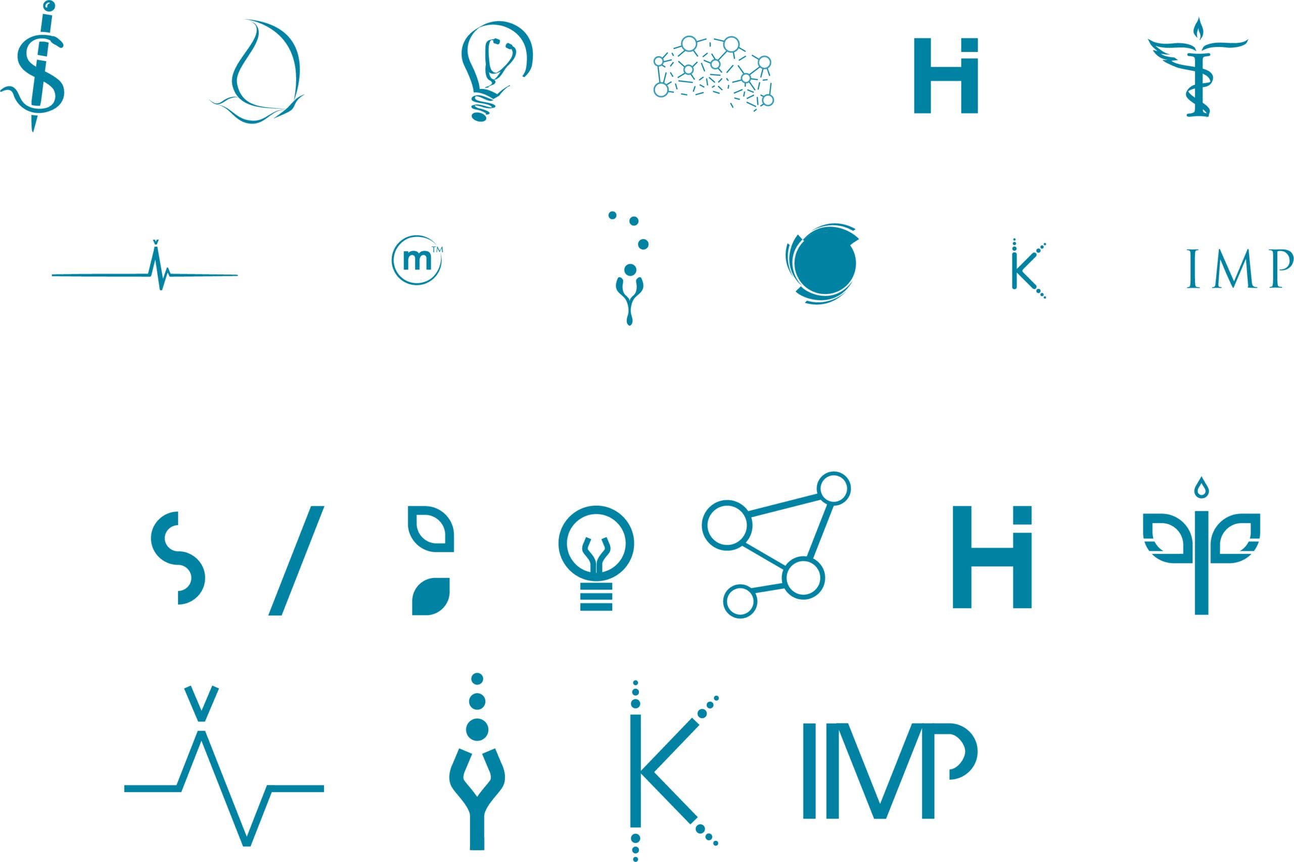
The choice is to keep agencies’ branding symbols to maintain in their employees something to recognise in.
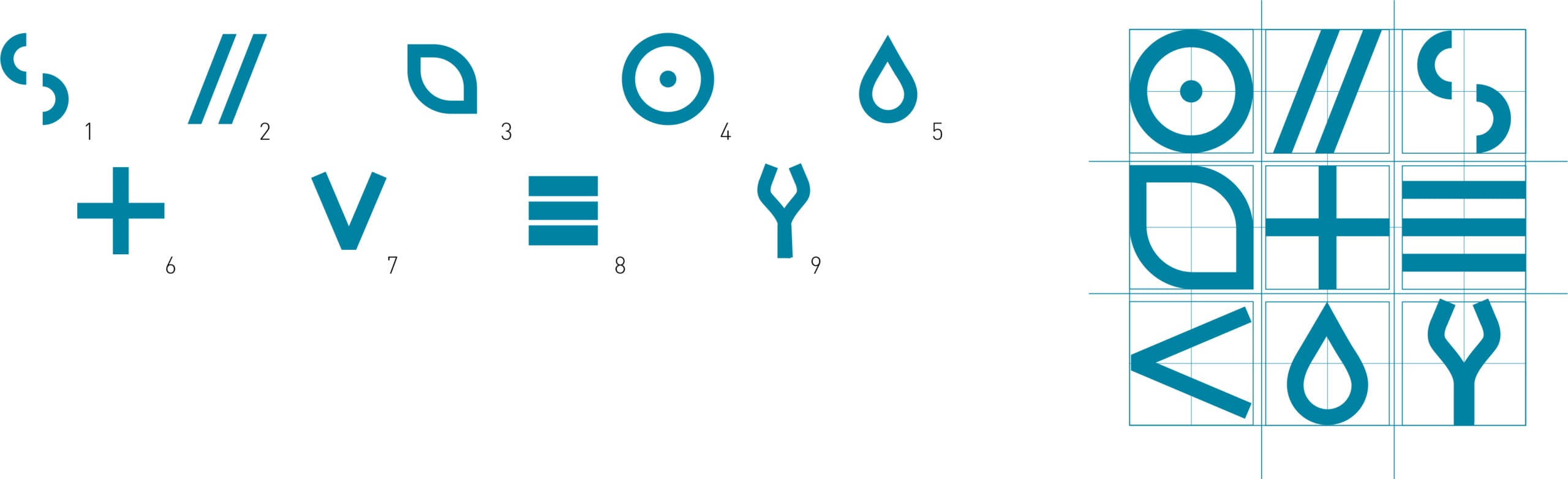
Giving importance to these symbols, become crucial. Therefore, all of them have been synthesised into geometric shapes.
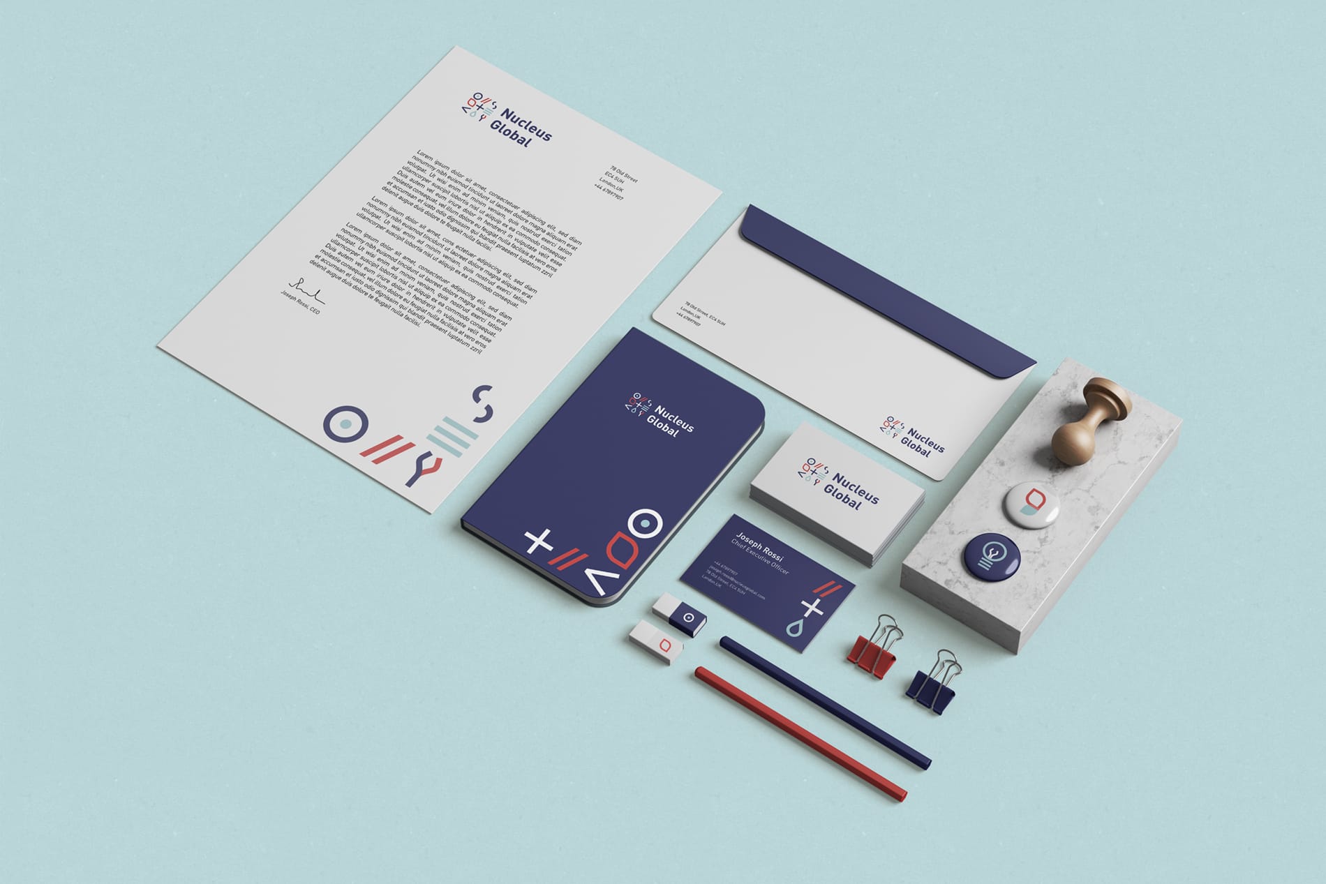
The software I used to develop the project were Adobe Illustrator for logo and graphics, and Adobe Photoshop for the mock-ups.
![]()
The project received very good comments from the European and American teams and positive feedback from art and creative directors.