NYBG Tea Labels

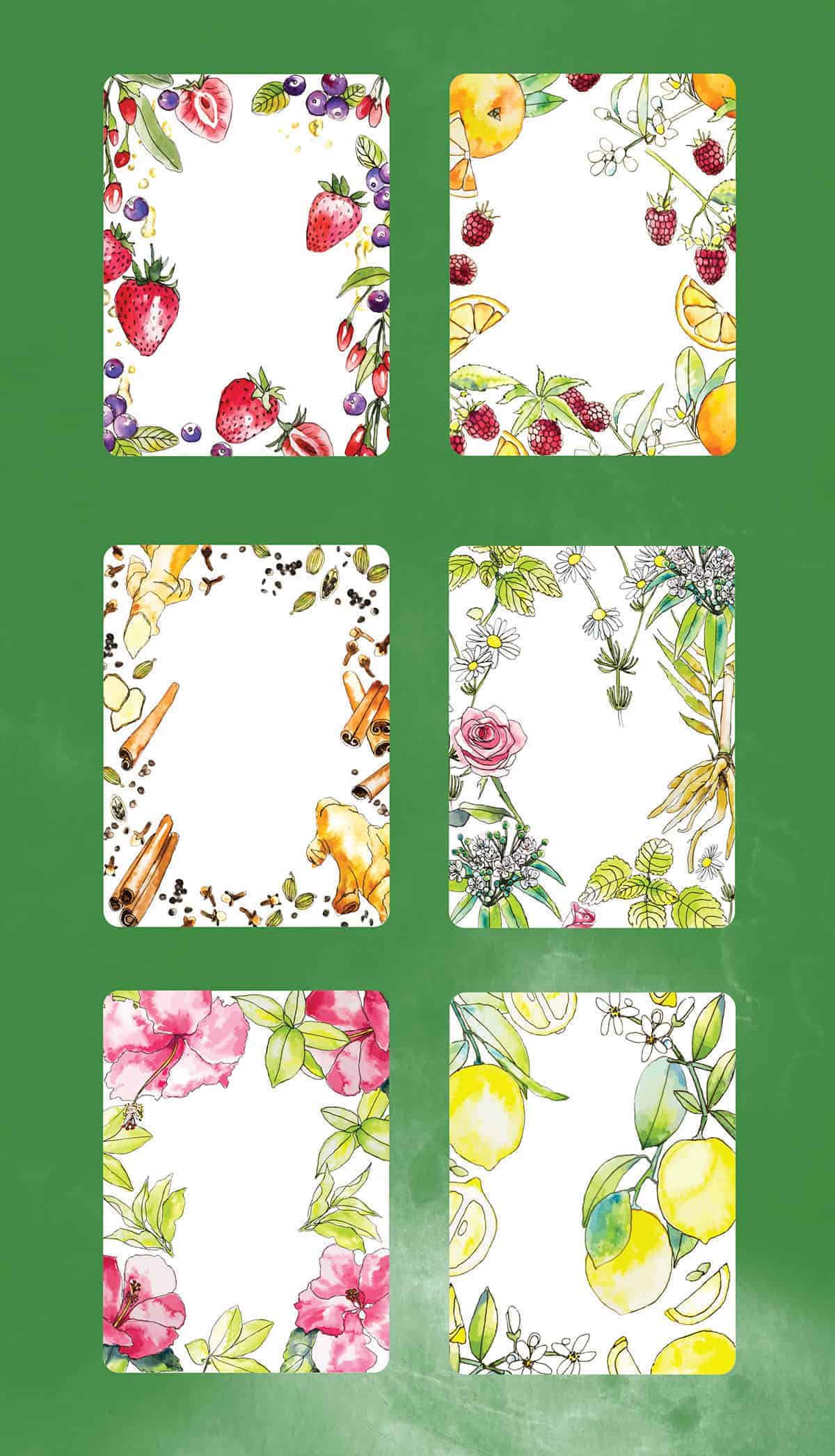
This label re-design project is part of NYBG Shop's current efforts to update the aesthetics of many of their long-running products, in accompaniment with the recent rebrand of NYBG itself. My job was to create something eye-catching and current that both captures the essence of NYBG's clean, minimal re-brand while adding a fun, engaging visual appeal that communicates the product's contents. To achieve this, I created a series of watercolor illustrations tailored to each tea flavor and paired those illustrations with a label that evokes the Garden's signature Conservatory dome and the Garden brand.
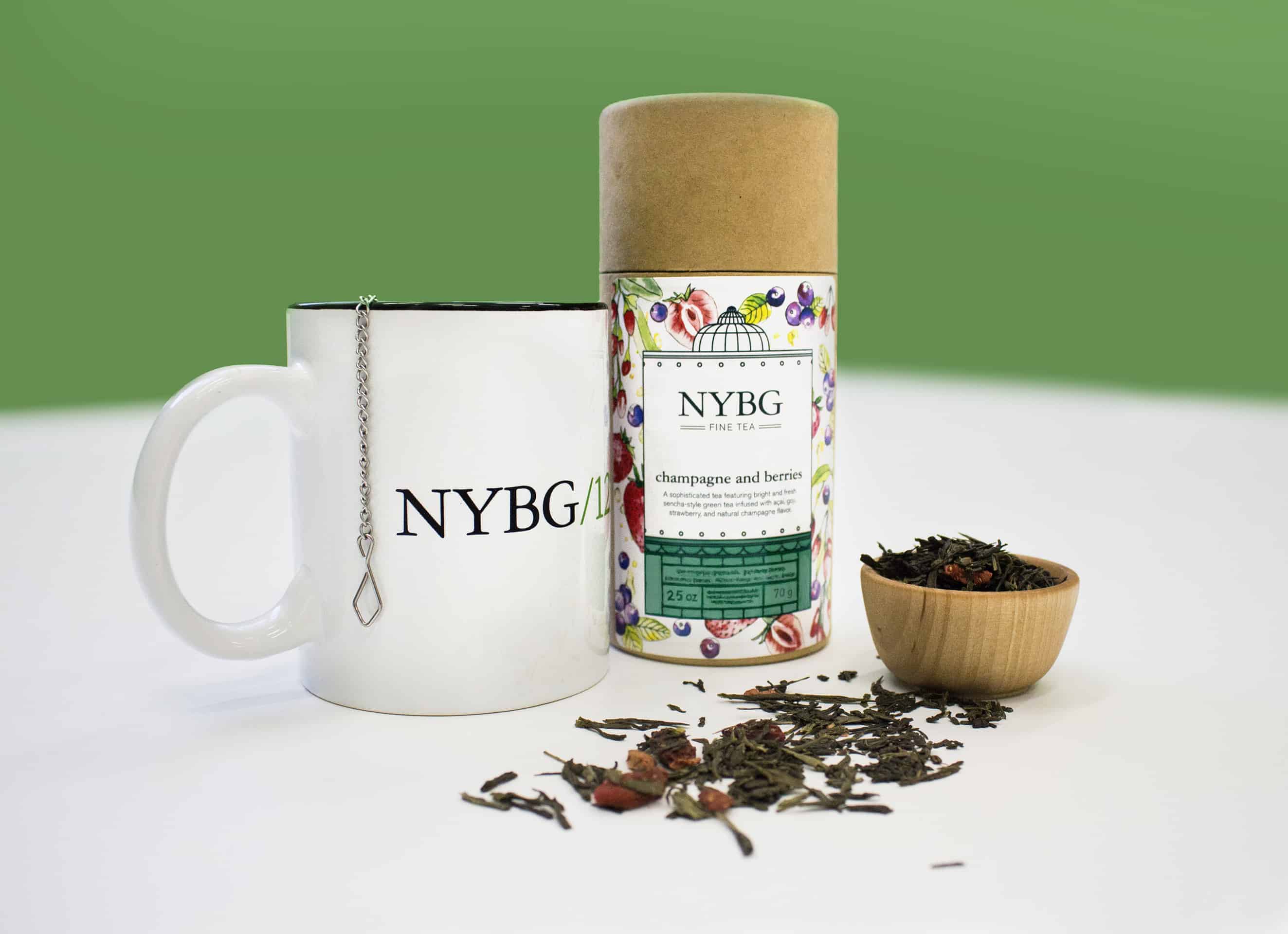
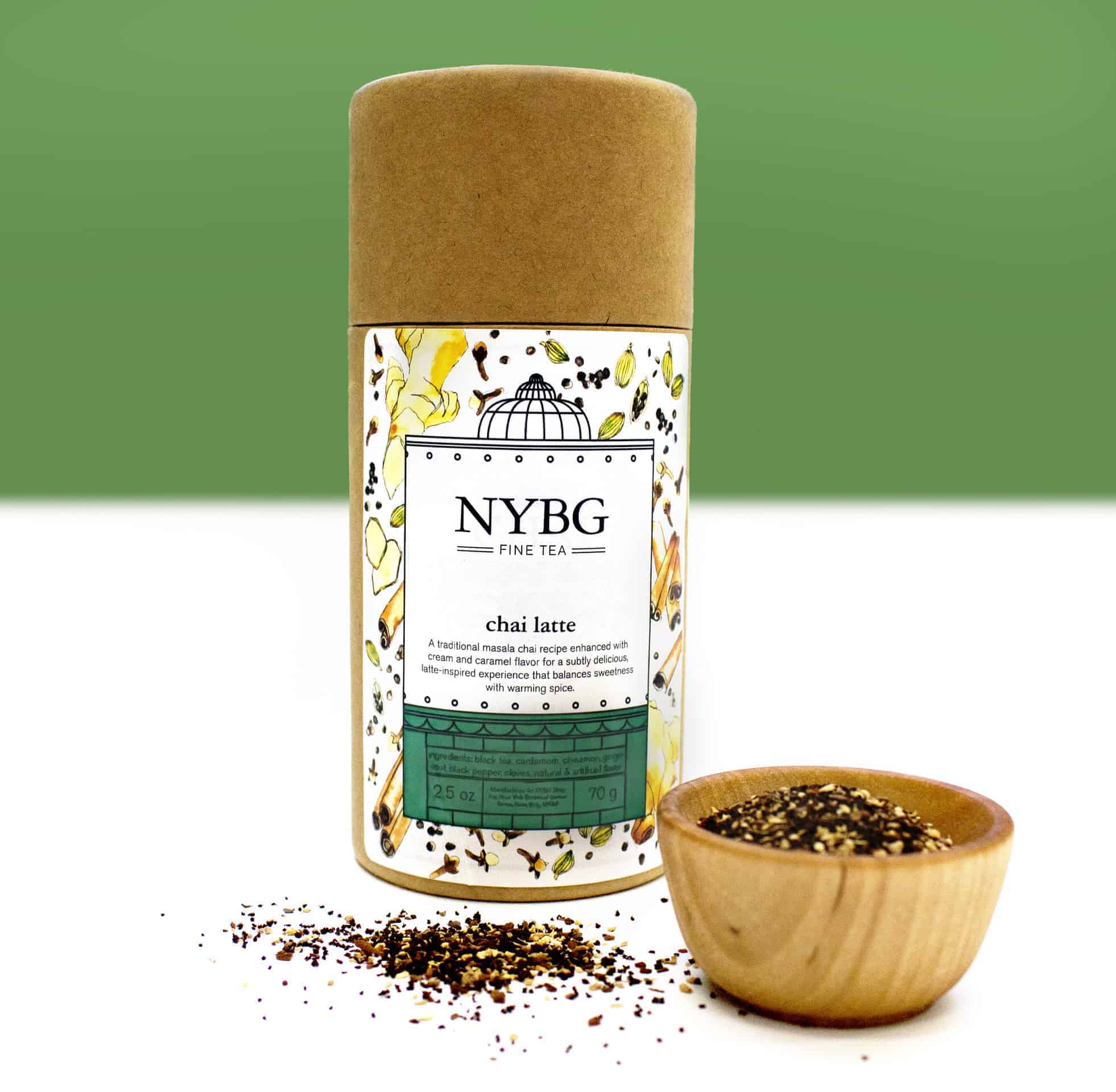
The idea for the design came in response to a few limitations that were placed on the project: We were limited to a simple, rectangular label placed on a cylindrical container; we needed to make something that would mesh well with a recent design overhaul happening at NYBG; and we needed something easily tailored to the different flavors of tea, but with a consistent overall look. I work largely in watercolor in my illustration work, so the idea of making custom flavor-specific watercolors for each label was something I felt confident I could execute quickly and successfully (and have fun doing!). I used a more stylized bold color + black outline to reference the clean, black lines of the NYBG’s branding, and created a distilled rendering of our garden’s conservatory paired with our brand fonts, making something that really rang true to the Garden. I wanted something clean and modern, but also something that referenced the Garden itself and its botanical roots.
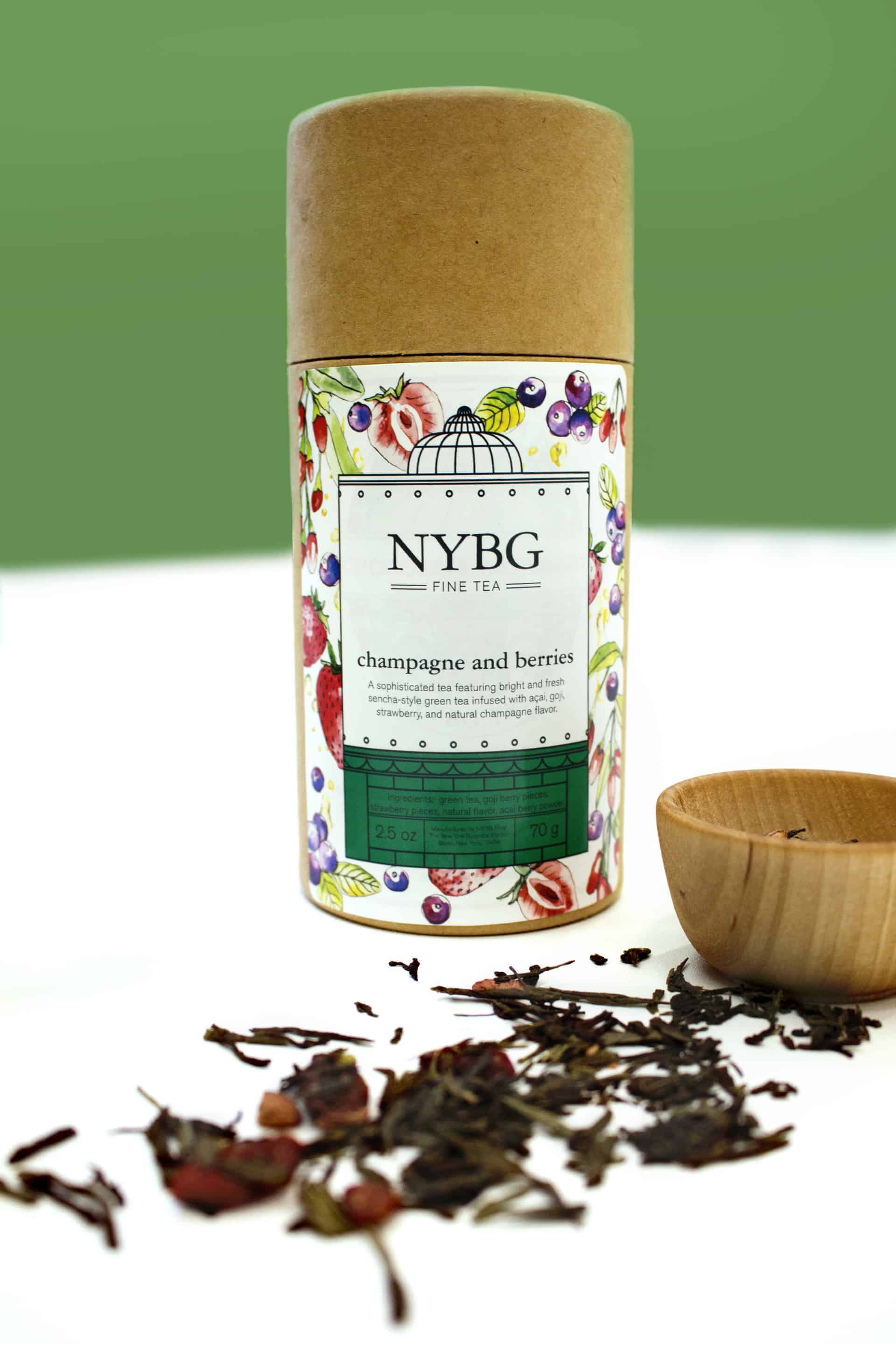
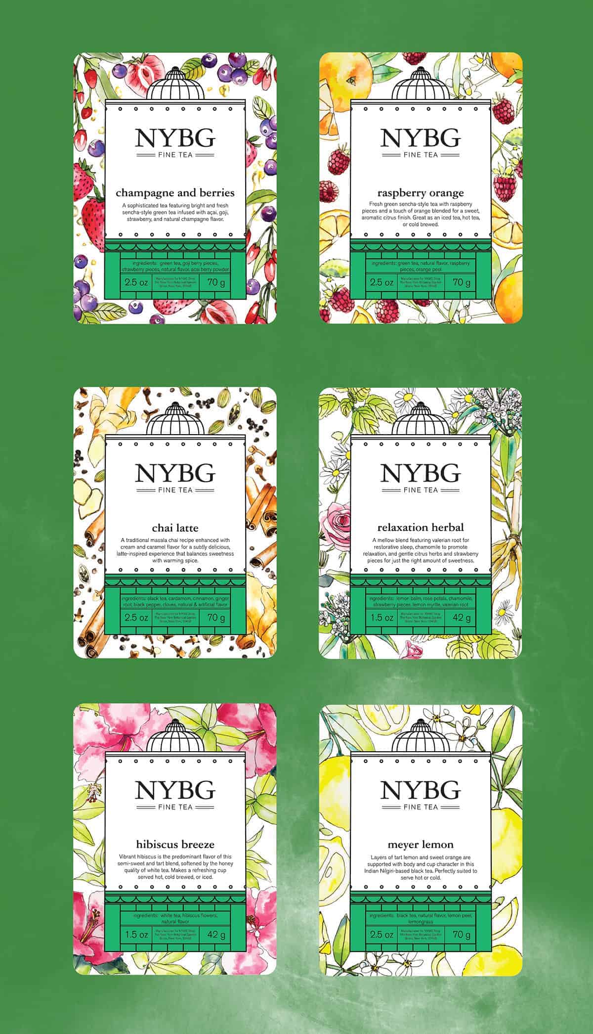
The project began by creating original watercolor illustrations of each ingredient, drawn from photo references. The illustrations were then digitized using a DSLR camera and touched up in Adobe Photoshop. The line-based label was then created by referencing designs and photos of NYBG’s Enid A. Haupt Conservatory, and gathering the necessary label information for each tea. The watercolor illustrations were then converted to vector graphics and added to the border of each label.
So far the project has been received very well internally and will be coming to the NYBG Shop very shortly (the labels and teas are currently in production). I found that staying up-to-date with current design trends and working within production limitations can make a hard-to-begin re-design much more focused and approachable. I also found when working with food products, it’s always important to check and double check legal requirements for what information is needed on your labels!
This project is one of many design projects I’ve completed for NYBG Shop, and, in case you’re interested in seeing more, you can visit NYBGShop.org! Thanks for viewing!
Like it: looks very elegant.
Love tea and this packaging is spot on!