PEARL

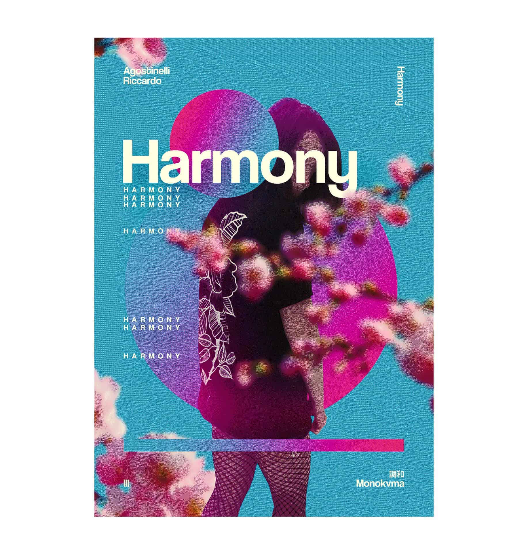
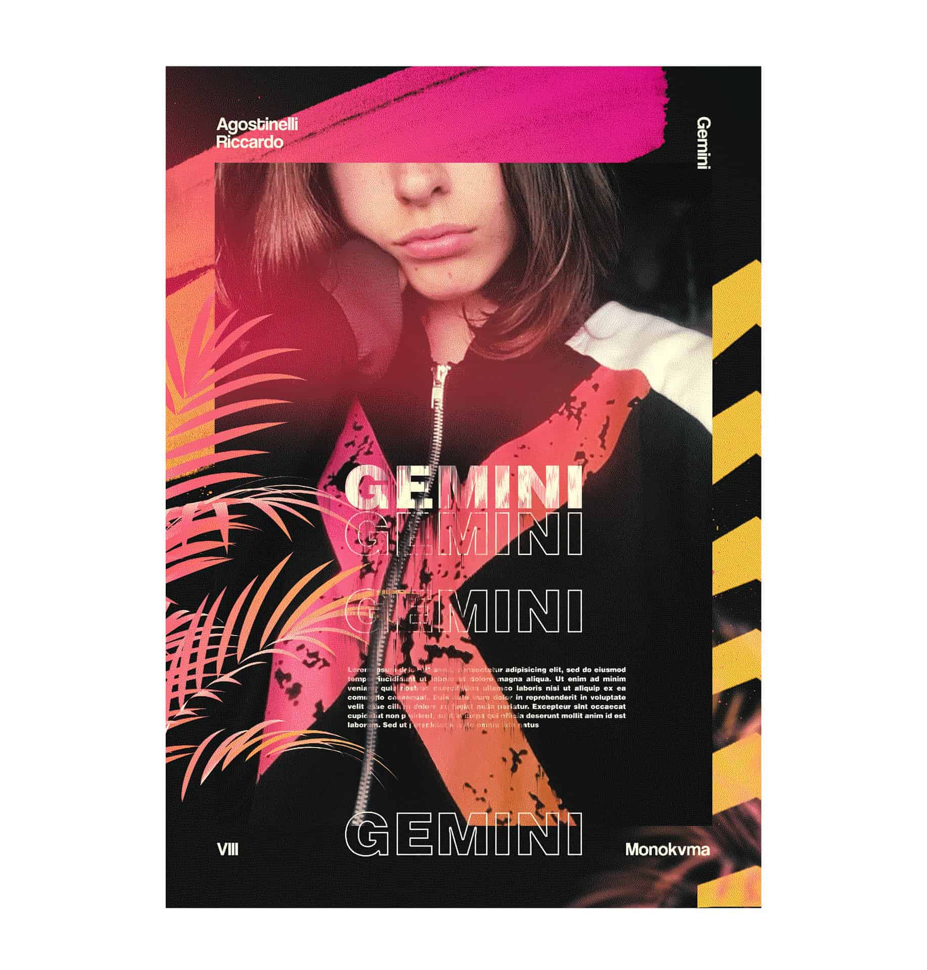
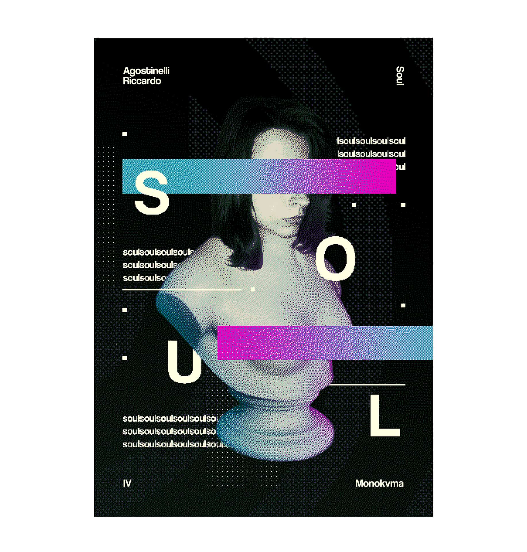
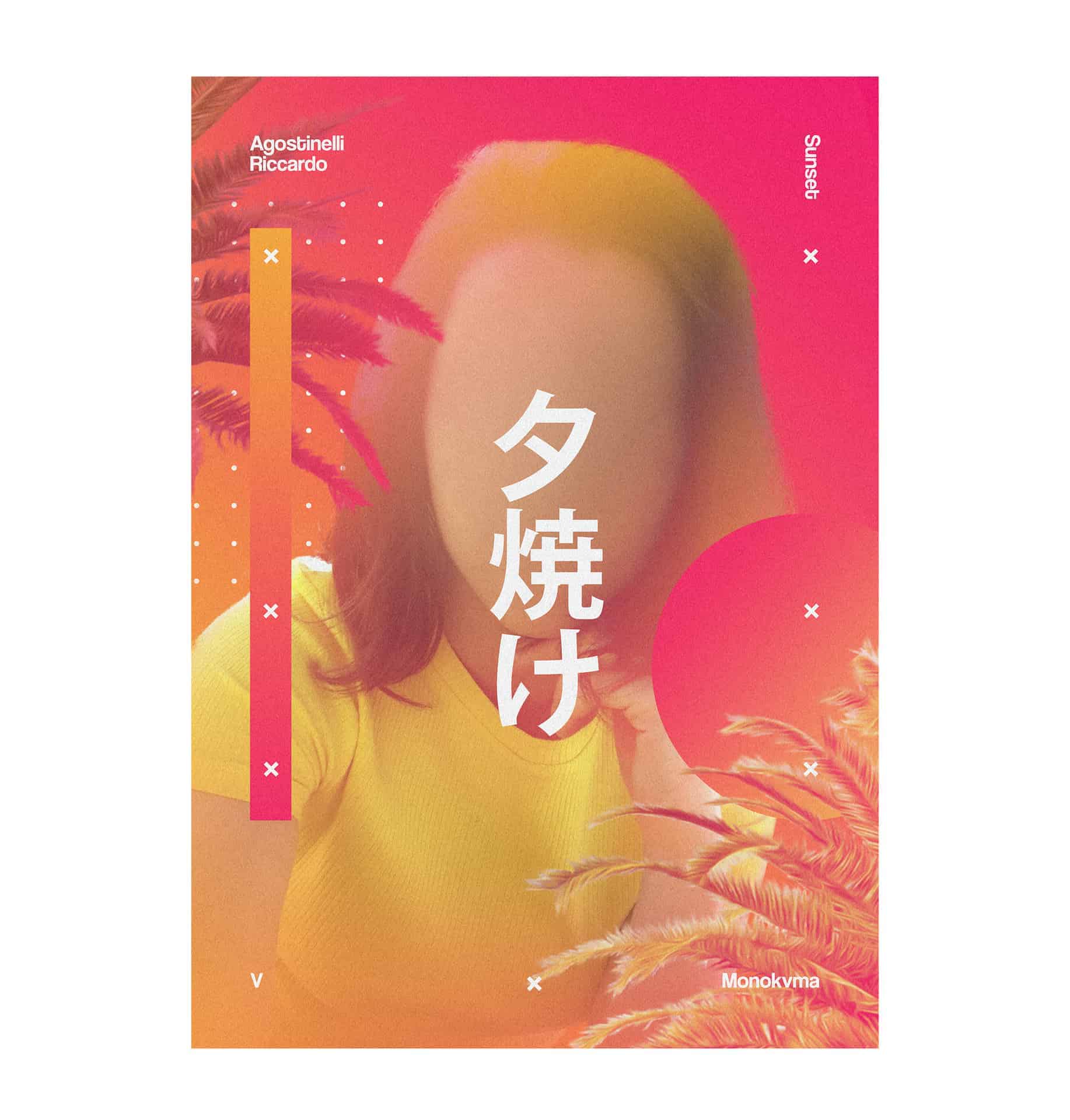
PEARL is a collection of various posters i’ve made to test my skills on poster design. I'm really attracted on typography and colors in general so i wanted to make a gallery with the same subject in every poster but with different styles. I love japanese culture, so i added to the project some japanese texts and symbols. I tried also many different styles like glitch, aesthetic and retrowave style.
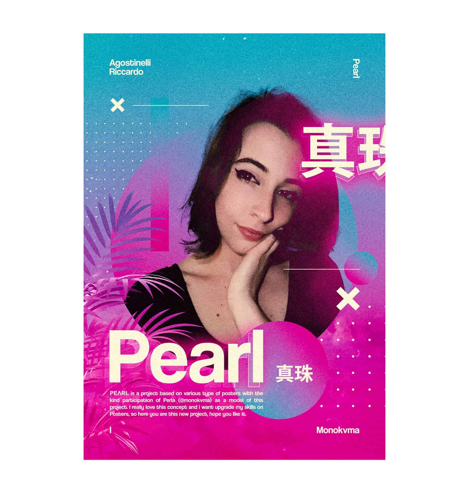
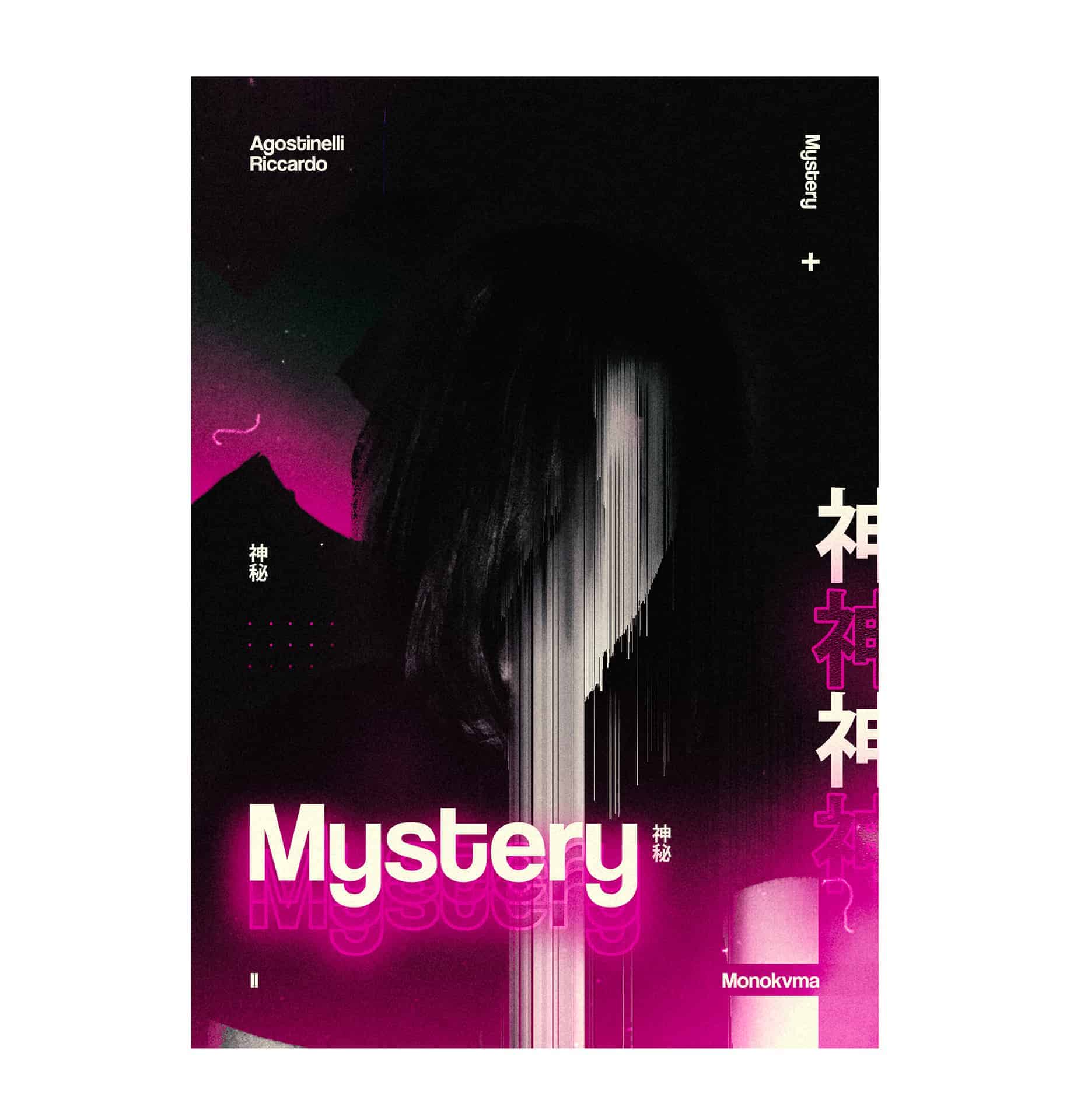
The main idea was to make three different styles with different color combinations: the first one is based on cyan and magenta colors, the second one on yellow and magenta and the third one on green/aqua and purple colors. In every style there are two positive posters and two negative posters, based on a black background. And i also added different fonts based on various styles.
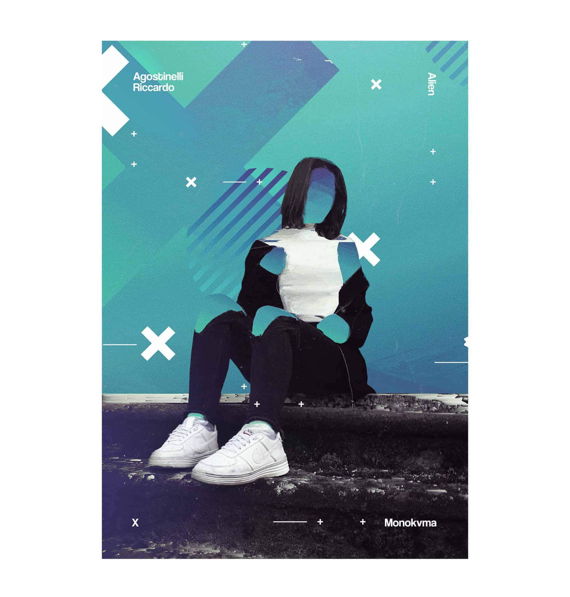
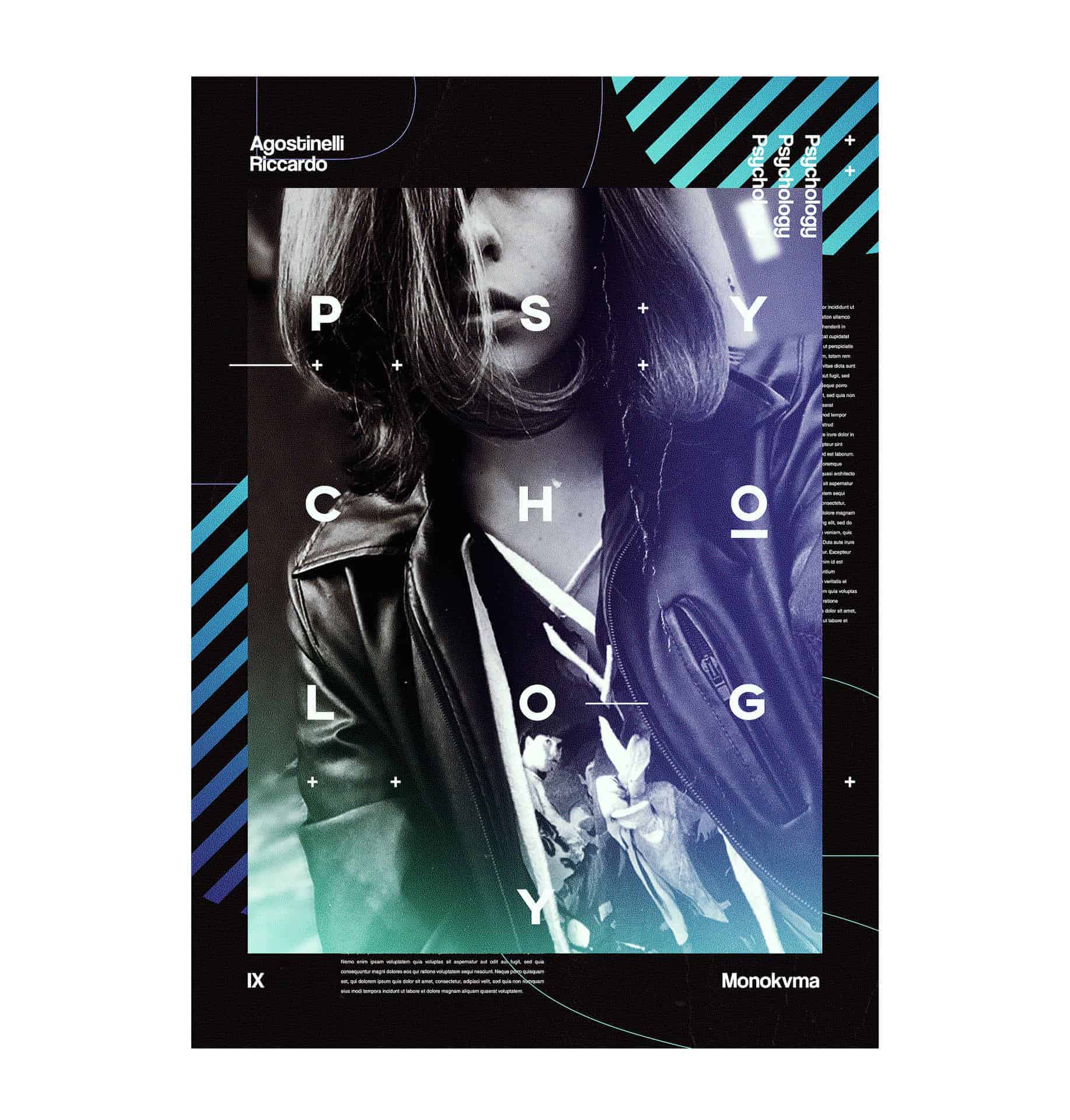
First i decided to ask to Perla, a person i've met online, to send me her photos to make this project. She was very surprised and happy, so she accepted and she sent me her best photos she had. Then i made every poster in Photoshop, one of the main softwares i use to make design. One of the first things i was used to do is masking some of her photos, then i’ve chosen three different color gradients and, starting with them, i realised the posters. To make details like glitches i used the Pixel Sorter plugin in After Effects while to make the color correction i’ve used some LUT’s. I added also some 3D renders i made on Cinema4D but most of the project was made entirely on Photoshop.
I’ve recently uploaded the project, so not many people watched it. I’ve tried many things while i were making this posters. I wasn’t used to make too much posters in a short time but i tried the best to make every poster different from the other ones.
Check out the project on Behance!
https://www.behance.net/gallery/65758397/PEARL-Poster-Collection
I love this style! Awesome work!