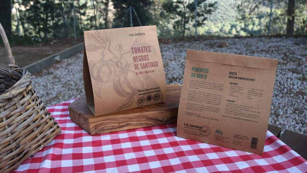
Pementos do Couto

Redesign of the packaging for Pementos do Couto that will express its origen, tradition and quality from its owner, Cooperativa O Val, en Narón, Galicia, as a representation of its own values.
Pementos do Couto are famous for being "the ones that are not spicy". They are similar to pimientos del Padron, very famous sometimes spicy peppers in All thanks to the investigation of an illustrious gentleman in the monastery of Couto a long time ago, according to legend.
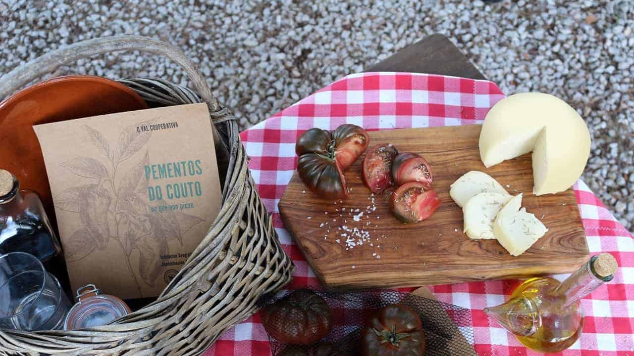
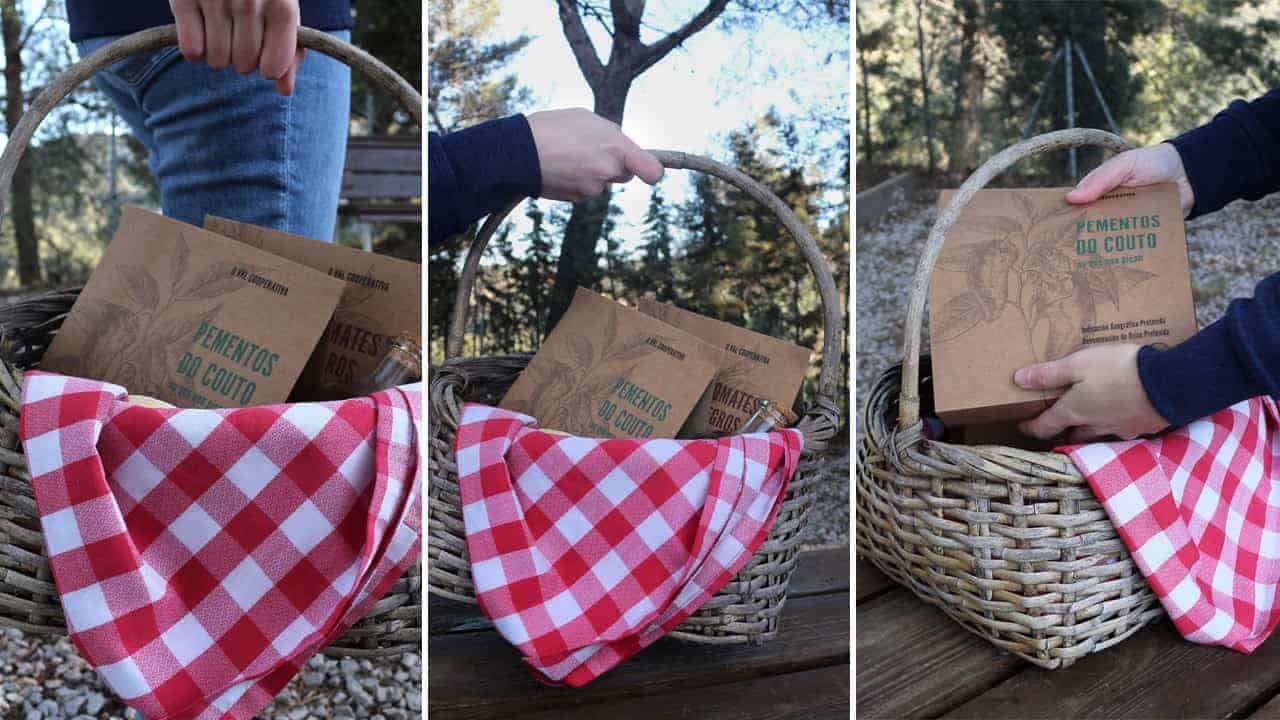
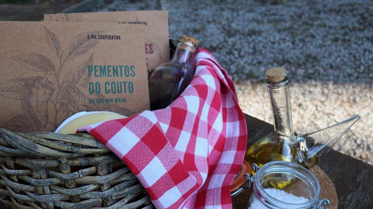
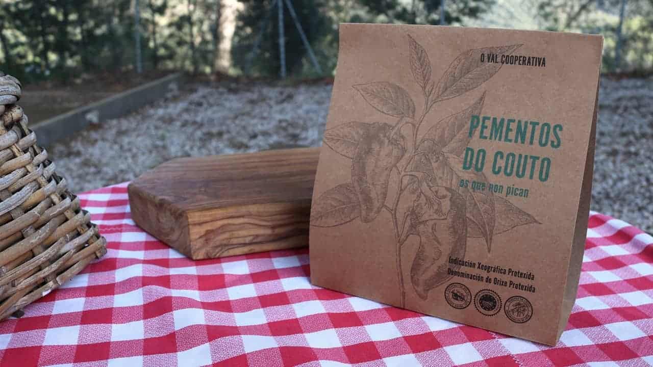
With this new pacakging design, we want show tradition, quality and pride in things well done, Cooperativa's motto. We used carboard with a print of an old kind of illustration like you would find in old books to achive that three values.
After research we came up with some ideas and began to make some rough proposals in illustrator, using photoshop to create the collage of the illustration, as it is now a composition with diffentent plants. When we were happy with the proposal, we made a couple of prototypes just printing out some of the bags, create the web and make a "real packaging" so we could take pictures.
As this was an school project, when we first show to the classmates there were really exited about the illustration even if the first photos were not the best ones. We hope the new photos, that are in this post, do more justice to this product.
Nice packaging!
I love the design! So chic