Pennsylvania Ballet

In 2015, the Pennsylvania Ballet needed a way to revamp their marketing tactics. The Temple Analytics Challenge, which is an annual competition for data visualizations created by students, gave the Pennsylvania Ballet a rare opportunity to garner unique solutions to their problem. Through in-depth research and analysis of the ballet's ticket sale data, I found that numerous data points that presented the web to be a main source for not only ticket sales, but overall consumption of the arts. This led me to direct the infographic on the topic of web marketing, and boosting the ballet’s online presence. By creating a website-like layout, I was also able to organize the information in a clear and understandable way that pushed the solution of an updated, modern online presence.
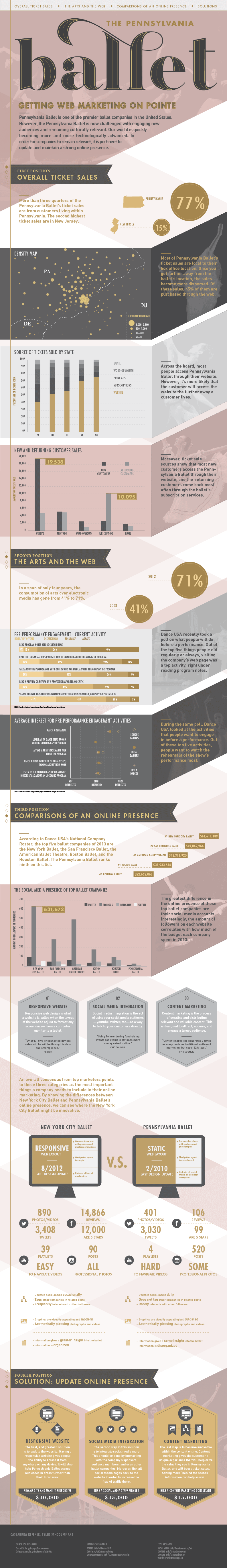
I came up with my concept through my analysis of the Pennsylvania Ballet's data. I learned that they're web sources were the main way they sold tickets. I researched how other ballet's marketed themselves, and I learned that they focused heavily on their online presence. I based my aesthetics off of this story. I wanted the color scheme to reflect the tone of the ballet; I first went with a delicate pink color, and then I added grays and golds into the mix to add a feeling of elegance. The angular shapes I use in the background and as sections, as well as the ribbon section headers, come from the idea of ballet shoe ribbons. Finally, I wanted the infographic to have an overall feeling of a modern website. I added in a main header at the top of the infographic, and I used imagery throughout the piece to give the piece some depth.
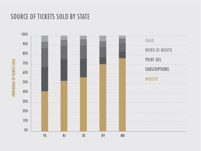

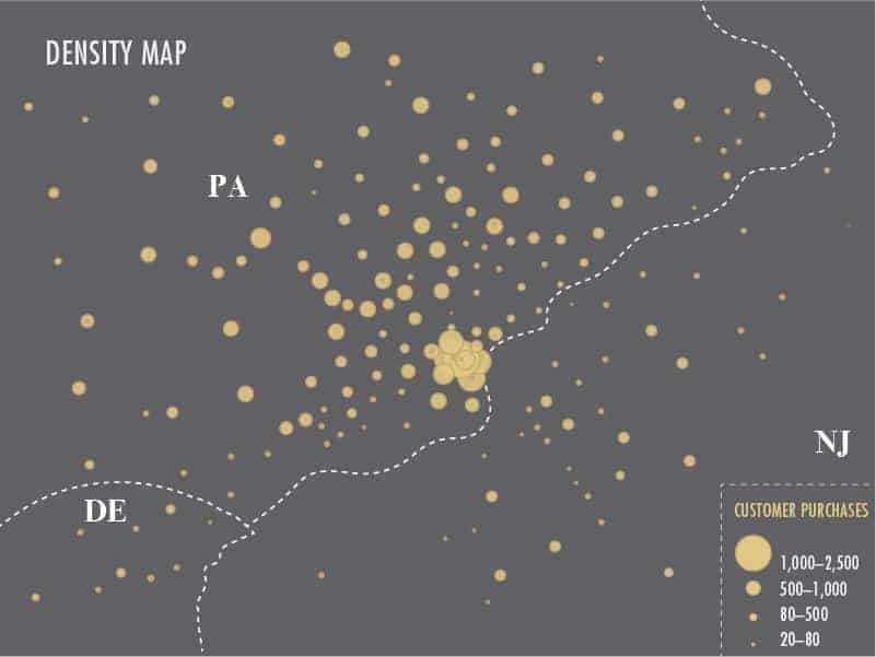
At first, I used excel to analyze the data I was given. I had to clean up the data, and use a pivot chart to sort through the information. I looked for patterns within the data in order to create a story that I could work with. For example, I saw that in the ticket source column, the greatest amount of ticket sales were purchased over the web. I also looked through multiple resources to find more information about how ballet's are marketing themselves. I then took this data, and used a mixture of the charts program in excel and the program Tableau to design specific charts that I needed. I took these charts into illustrator, and I traced them in order to make the graph more unique and fit into the design of the entire infographic. The rest of the infographic is also created in illustrator.
I won first place at the Temple Analytics Challenge. This was the second time in a row that I won this challenge, and it really surprised me. I was up against 300+ entries, and a lot of them were business students who had taken classes on how to analyze data. I learned that people are interested by data, but it really helps when the data is represented in a visual way that goes past a simple graph. Creating a visual that goes in depth into the data's story really helps people interact with the information in a unique way. I also learned that I love creating informative pieces like this infographic and I want to continue working with projects like this.