Petra Mints

Designing for the cannabis industry is a specialized field. Besides the regulatory obligations, we (and our client) place a high value of safety and transparency. It was important that both the package and the product be identified clearly as cannabis and that the package be securely sealed on purchase while remaining elegant and attractive.
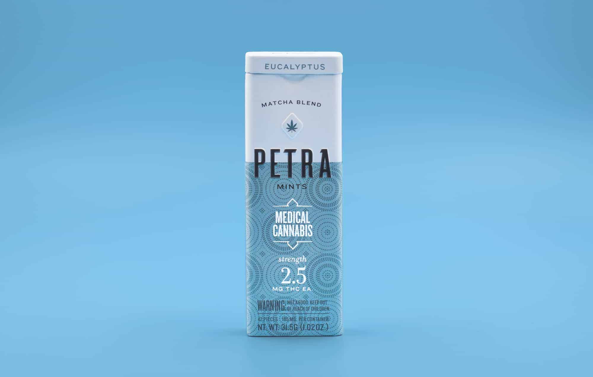
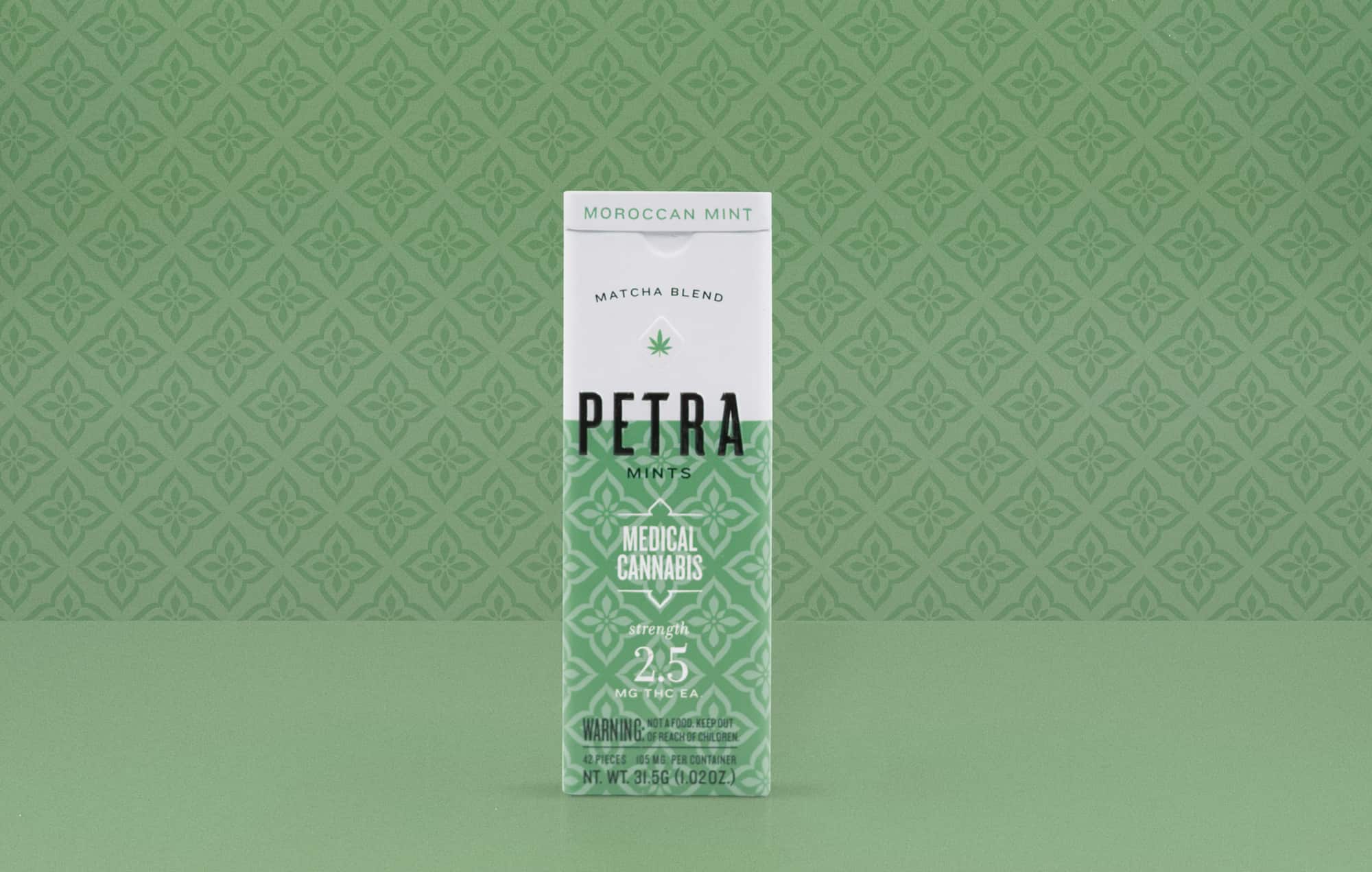
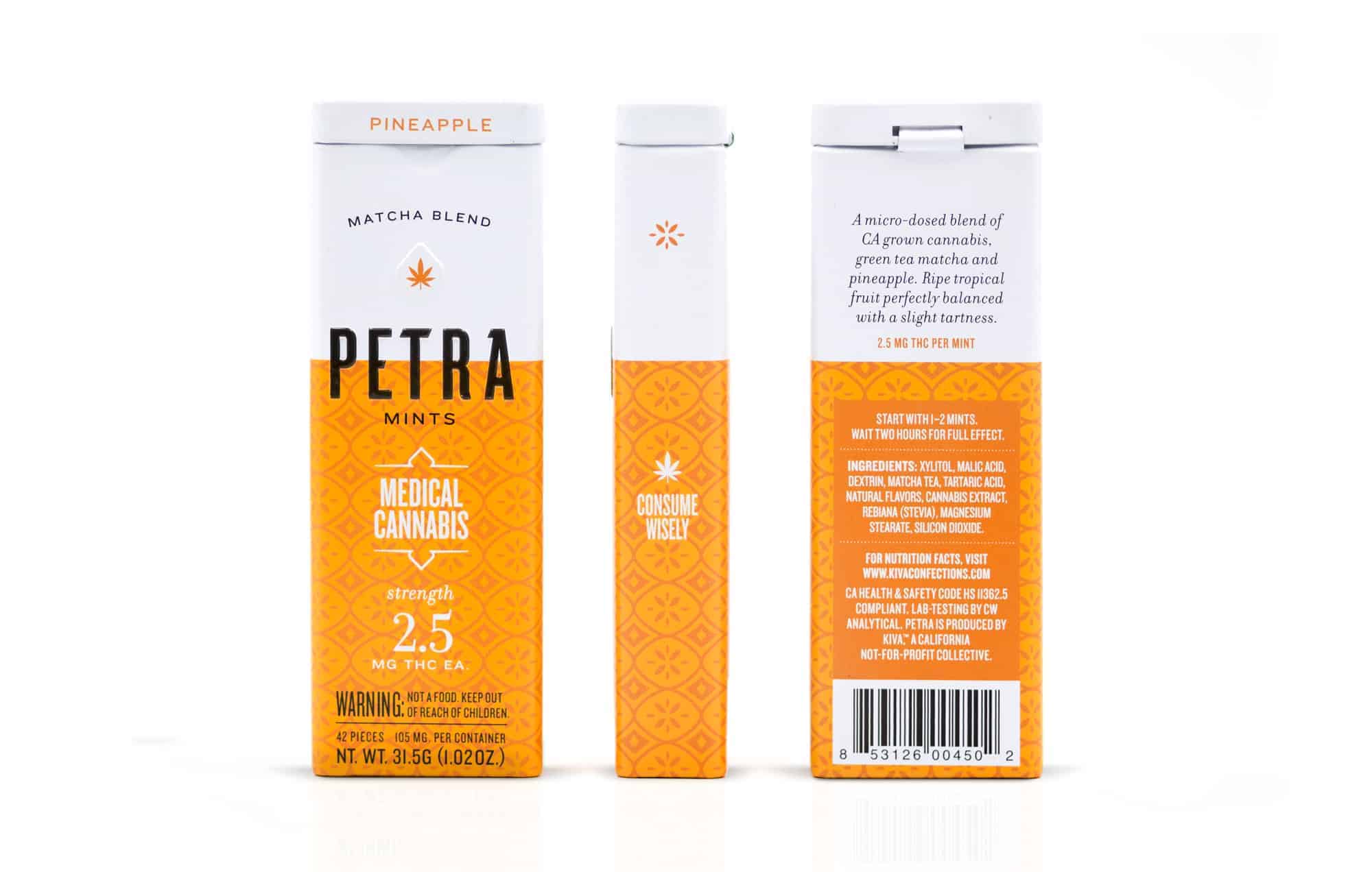
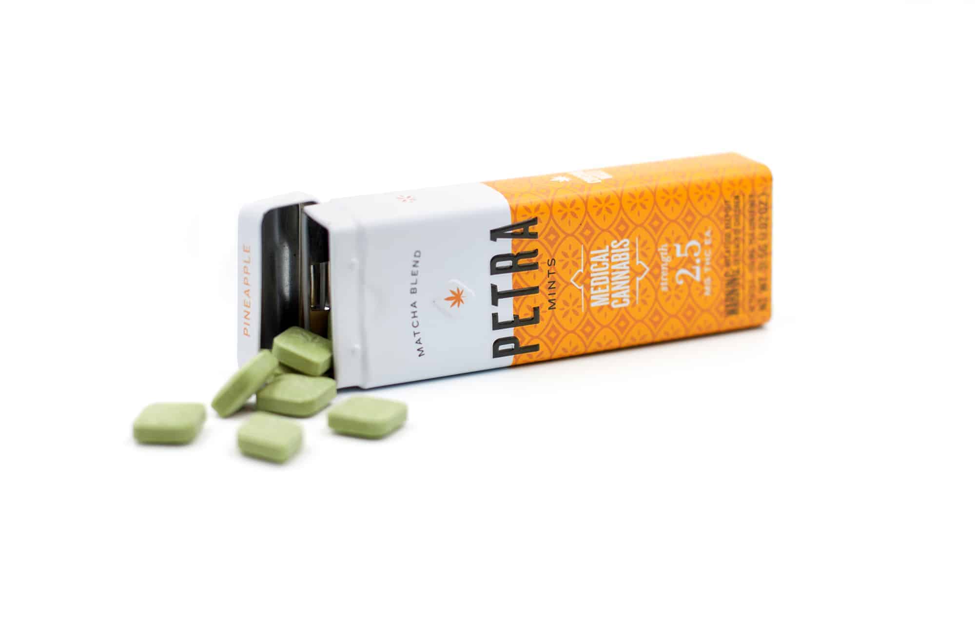
Within the confines of a very small (pocket sized) package, Petra has to quickly communicate the brand name and the parent brand name, what it is (mints), the fact that it is cannabis, the strength of the cannabis, (2.5mg is an uncommonly low strength that is coming to be known as "microdosing"), the strain/effect of the cannabis, the flavor, regulatory warnings, ingredients, nutrition facts, suggested dosage—all without being overwhelming or ugly.
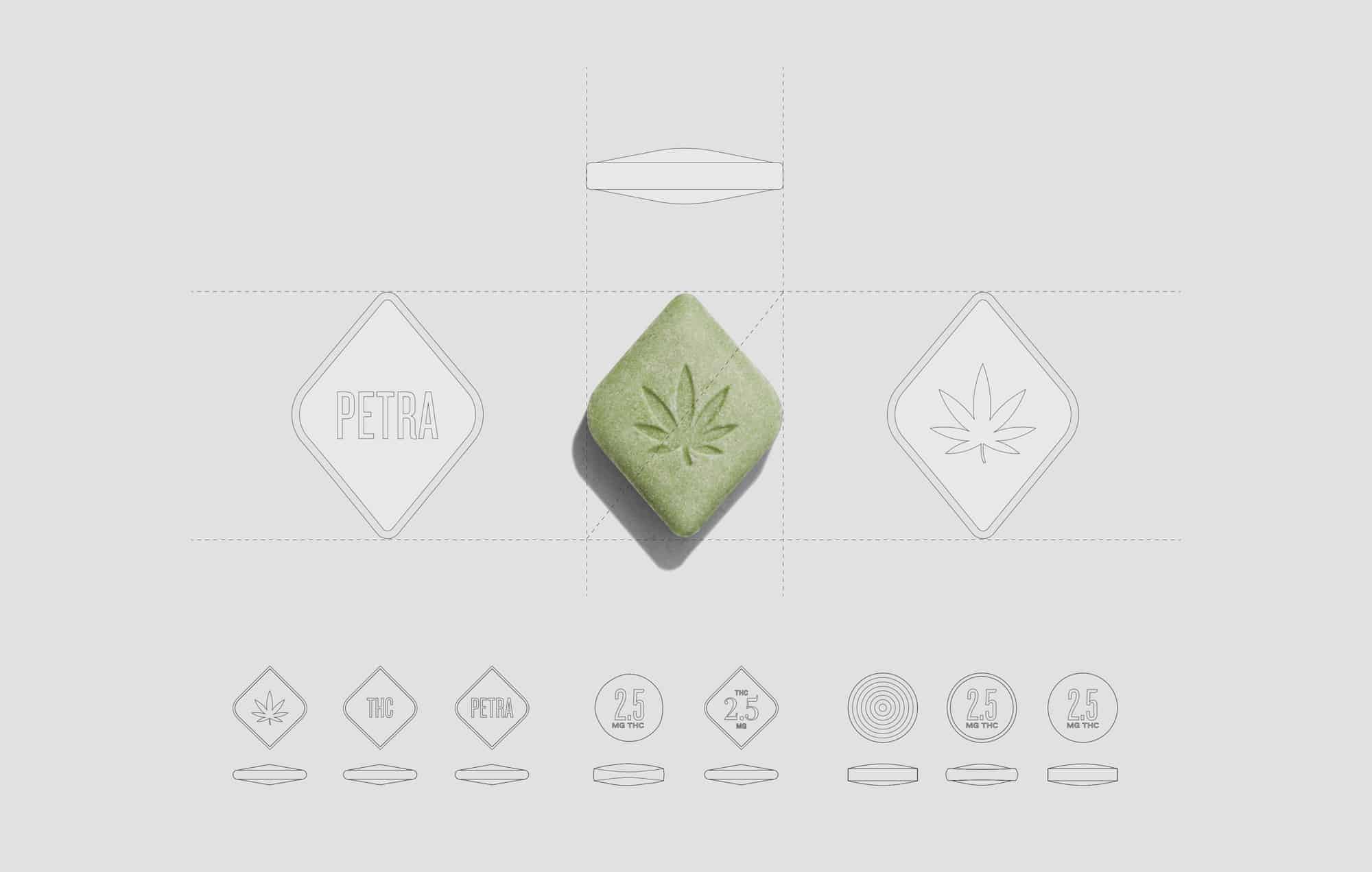
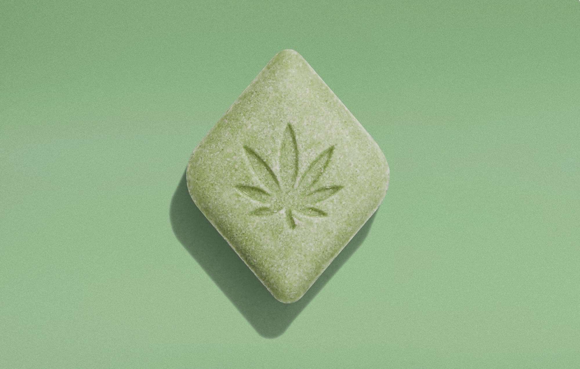
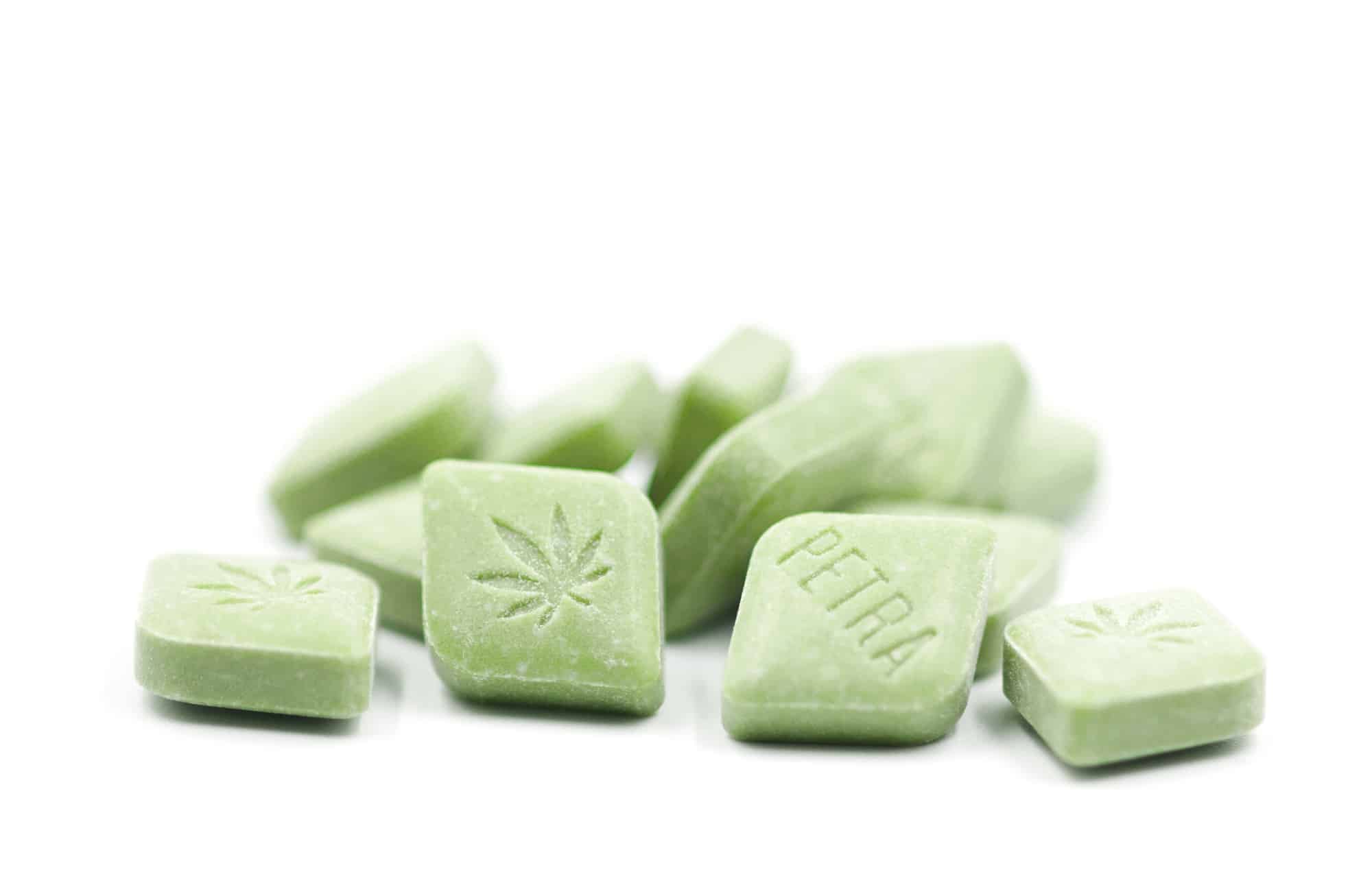
For this line of microdosing mints we wanted to create a look that was consistent with the branding of their existing products, but also unique in character. We designed everything for this product—from the logo, to the packaging form factor, to the package design, right down to the shape and feel of the mints themselves.
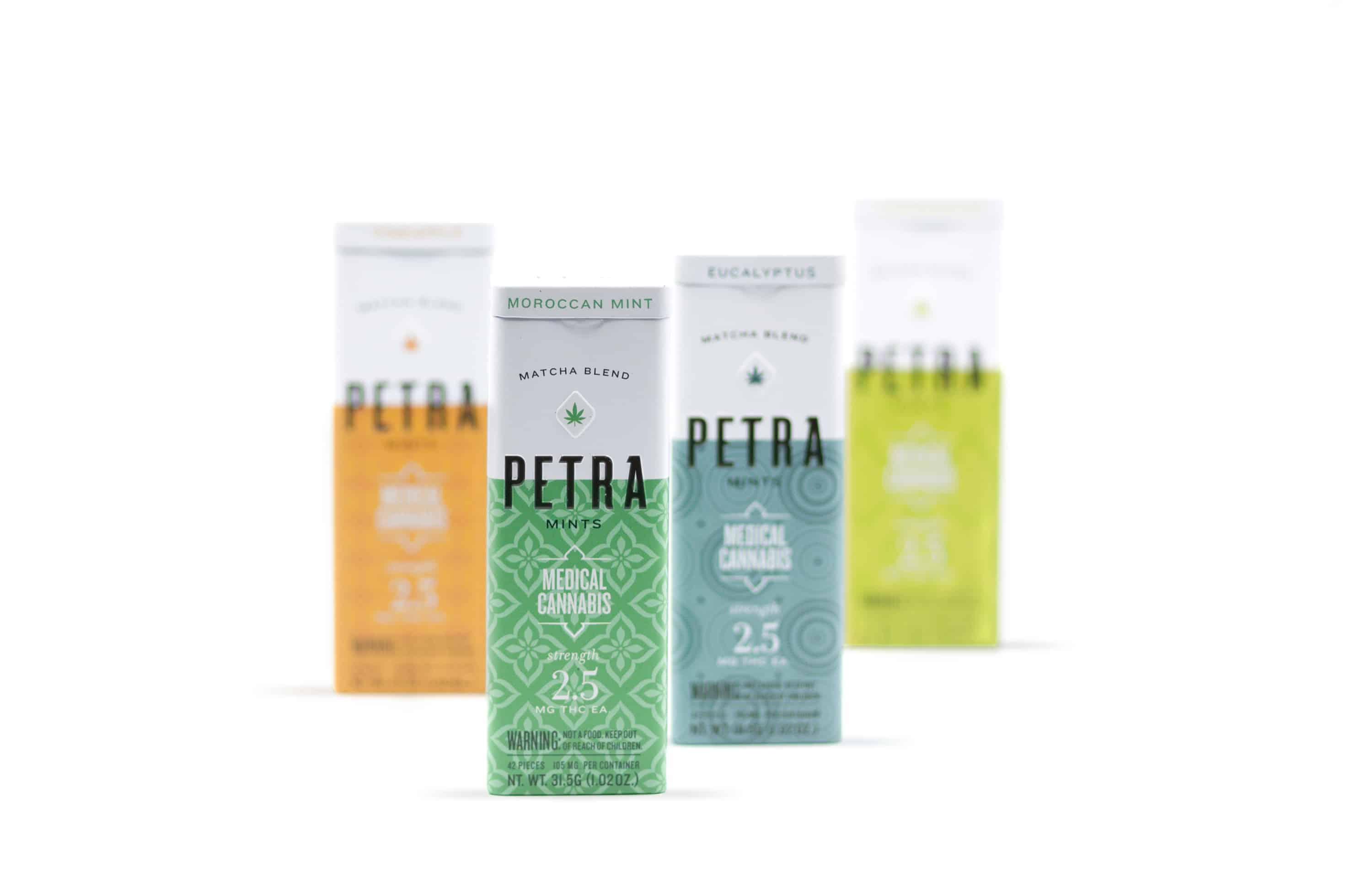
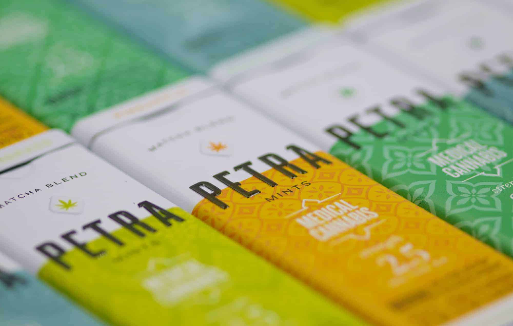
The colors of each tin express their flavors—cool blue for Eucalyptus, soft green for Moroccan Mint, etc. The patterns are derived from the countries where these flavors are indigenous. It's a simple, playful, meaningful, and infinitely scalable system.
Because these are very low dose (2.5mg THC), most people take several over the course of a day. For that reason, the package had to be durable, pocketable, and discreet enough to be used seen in public. The slim metal tin is designed to slide easily in and out of a pocket. The graphics are designed to look more at home in a Whole Foods than a head shop, reinforcing the brand's position as a mainstream product.
Pretty much everything was designed in Adobe Illustrator. We rendered the four main panels of the package, plus the top and bottom at actual size and wrapped them around existing tins of similar size for our initial explorations, eventually moving to 3D prototypes from the manufacturing company.
We are very particular about color, so we had several rounds of test prints done on the actual metal until we achieved the perfect color and finish.
People love the design (and more importantly the product!). It is the first non-chocolate based product from Kiva Confections and the response has been overwhelmingly positive. In a recent industry report it was reported that Kiva moved ahead to grab the number one place in marketshare amongst ALL cannabis brands in California. Strong sales of Petra mints were cited as the determining factor!
How about new packaging that conforms with new laws.