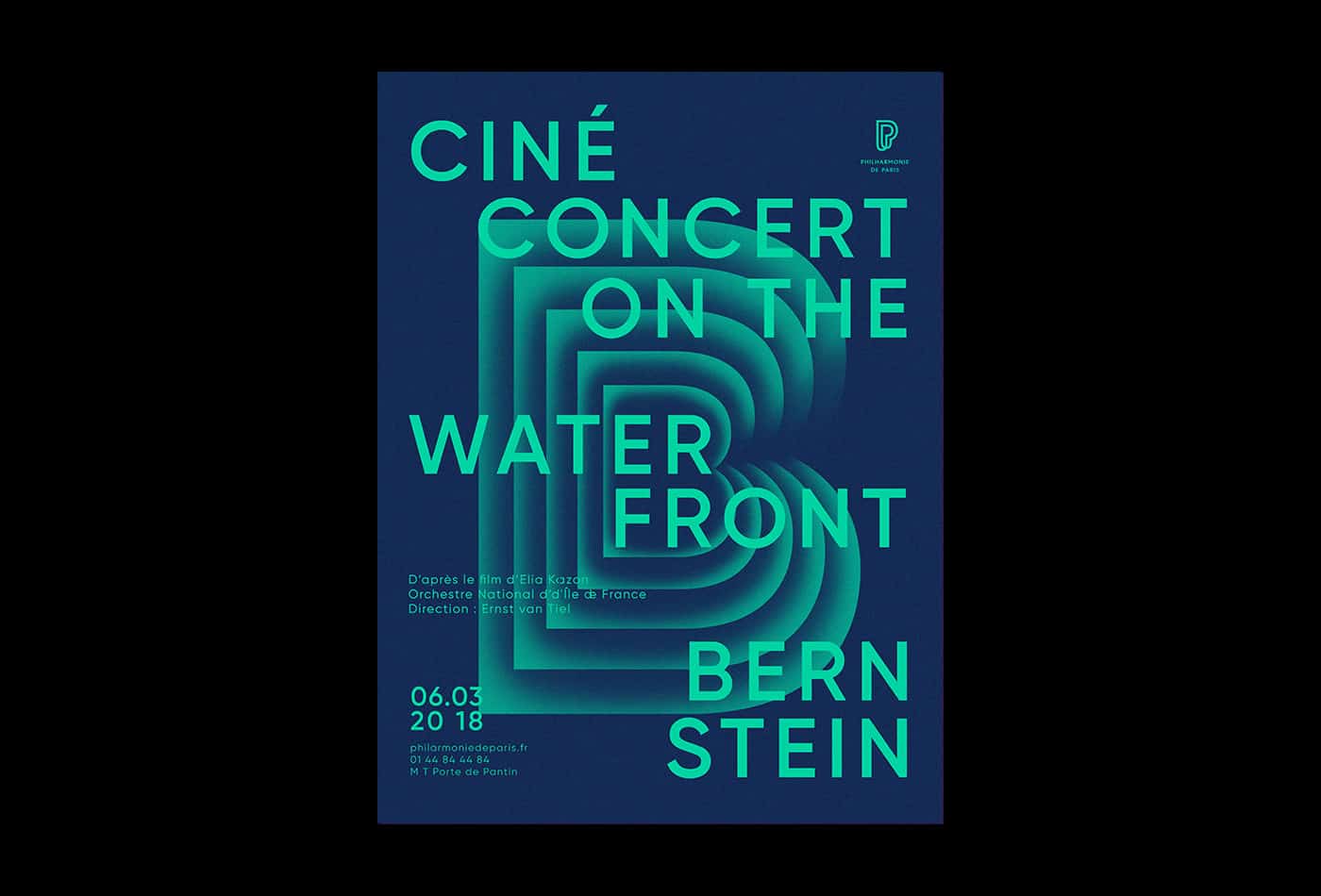
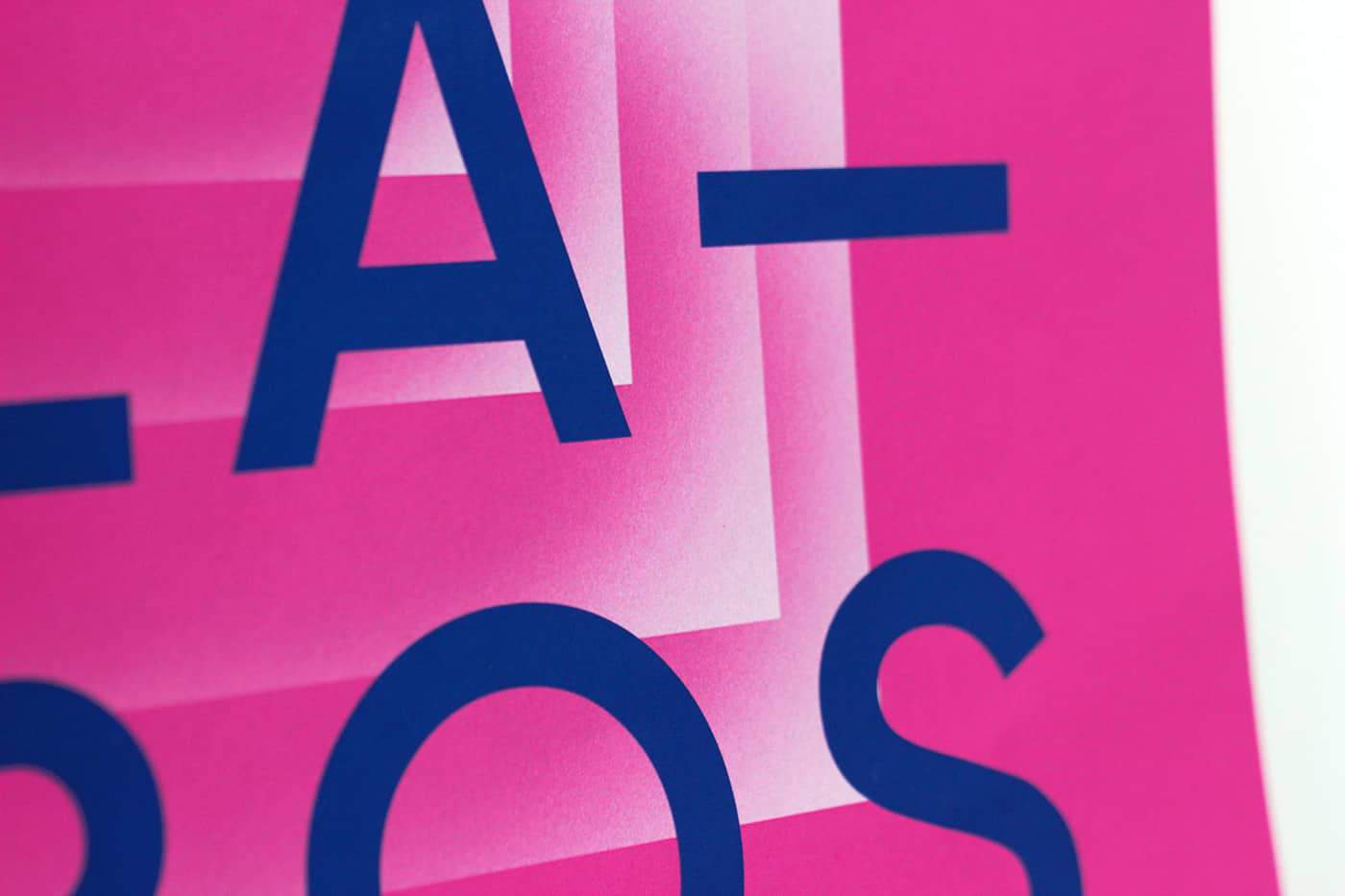
Philharmony - Poster serie

Experimental poster series for the 2018 season of the Orchestre Philharmonique of Paris. Each poster is animated in a way to play the rythm of the music featured music piece when displayed on a screen billboard or when using an AR app.
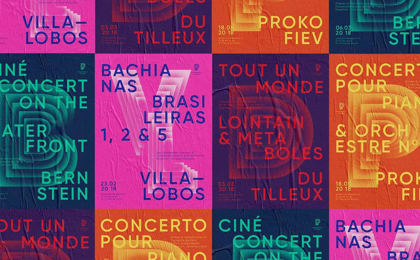
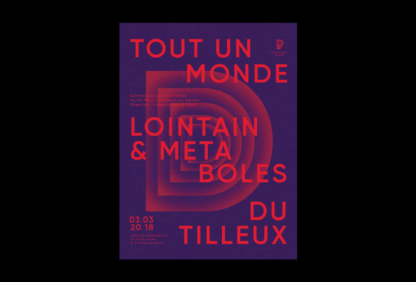
Based on the etymology of the word «philhalrmony» which means «love the music», the center letter symbolizes the heart beat as well as the pulse of the rythm. Color scheme and rythm of each poster are based on the feeling conveyed by the music piece it showcases.
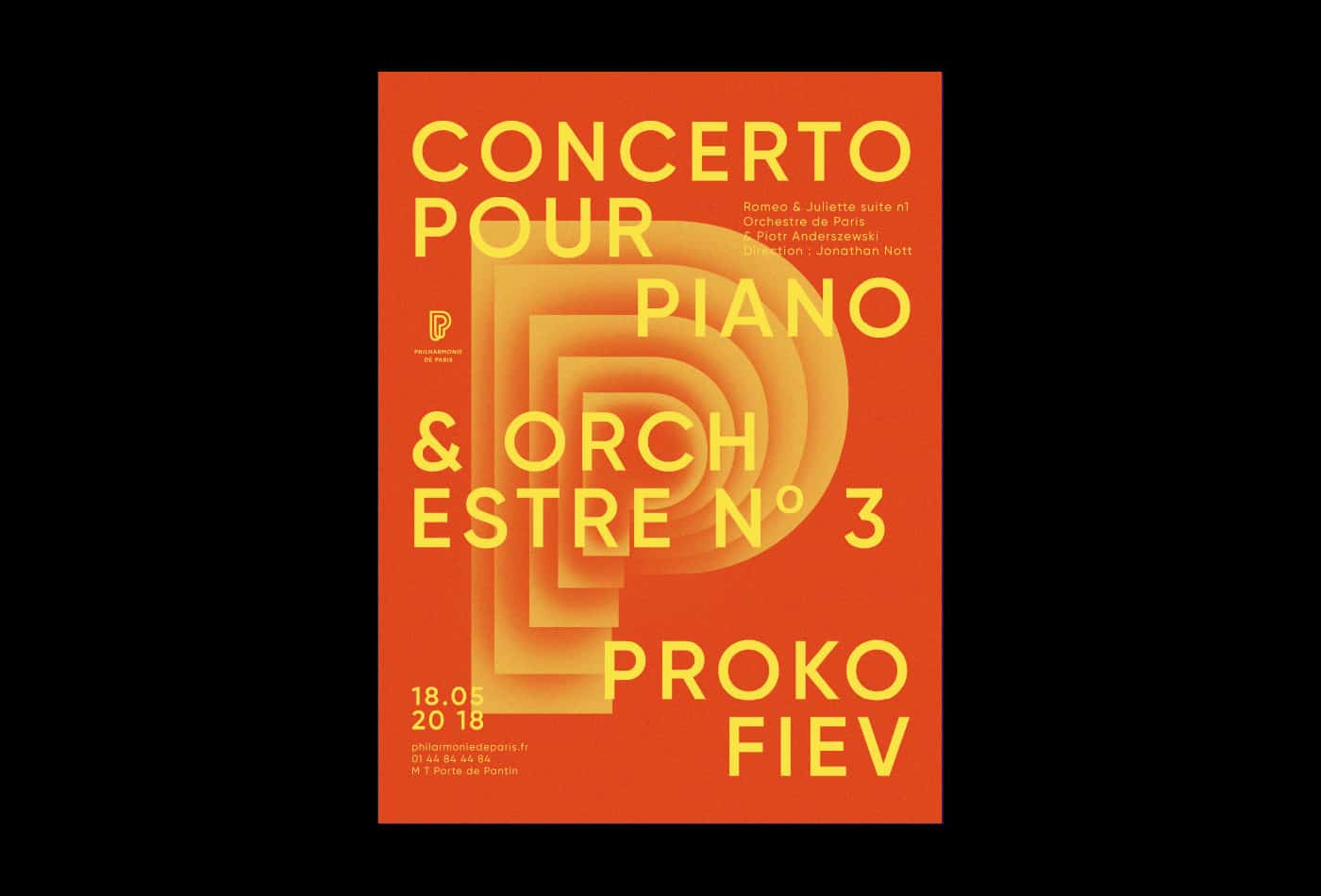
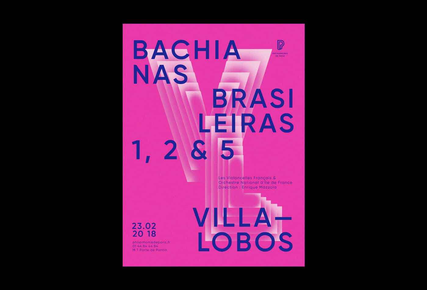
I used Adobe Illustrator for the first sketches. I played around typography to find a good composition and color palettes. Then I added the texture and effects with Adobe Photoshop. Lastly, I used Adobe After Effects to animate the letters.
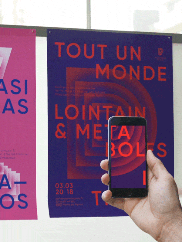
Posters have been selected to be featured ar TDC 2018 Exhibition. The project was a good exercice because each music piece had to have its own identity, but the whole serie still have to look coherent in a way to recognize directyl what it was made for.