Porto Special Edition
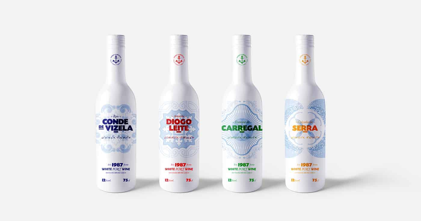
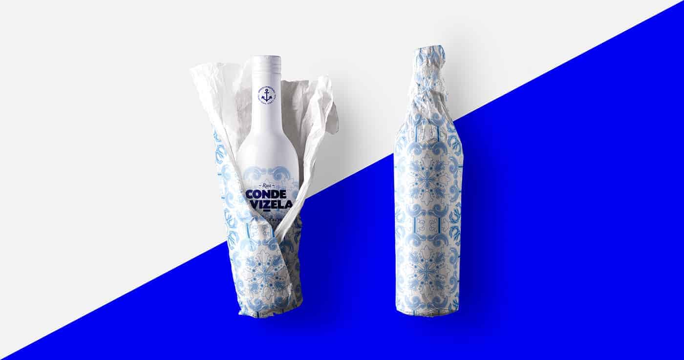
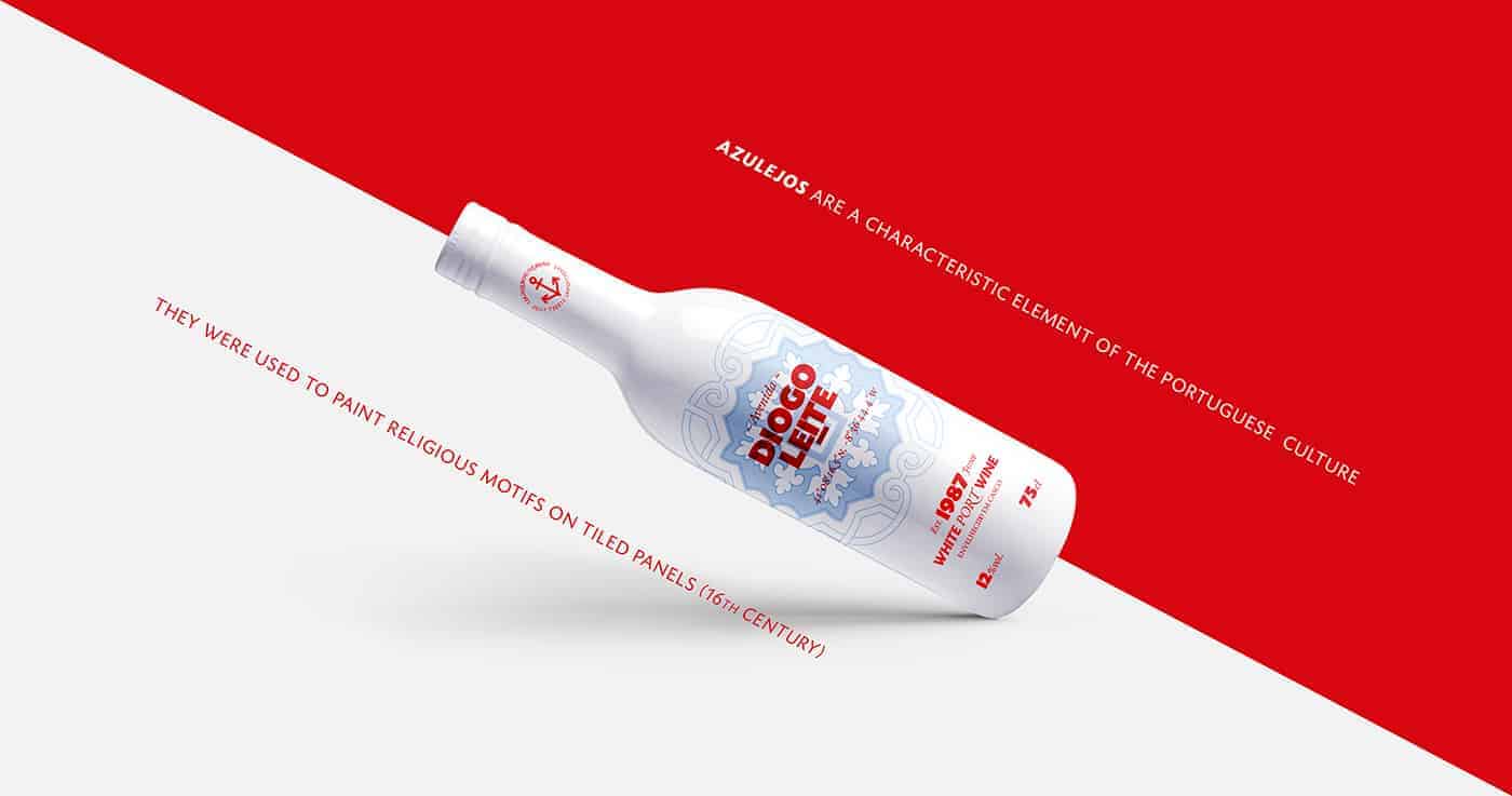
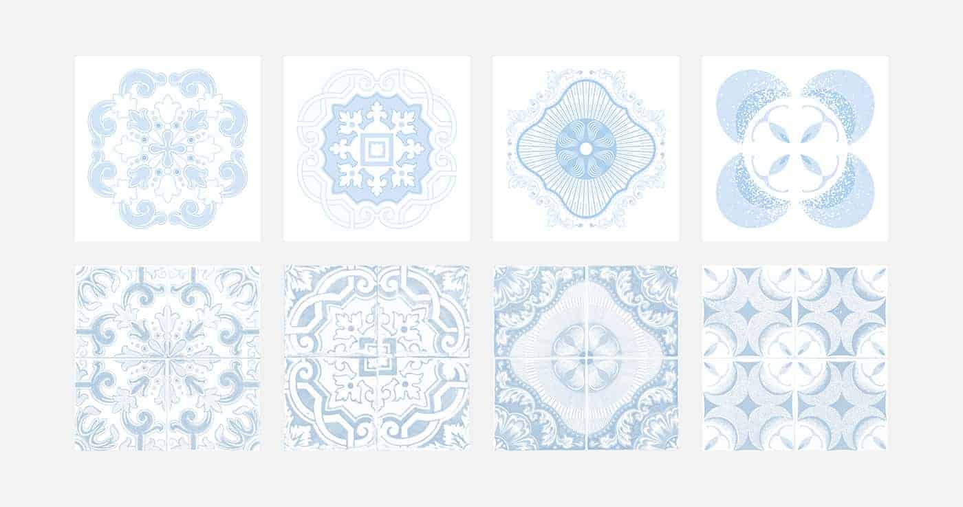
The project shows a visual representation of the city and its streets. It is the graphic synthesis of the city of Porto. The different designs are inspired by specific "azulejos" found around the streets of Porto.
The real street/avenue name is on the front of each bottle alongside with the GPS coordinates (in case you want to admire the original art).
The main four colors used to differentiate the bottles were selected from the city coat of arms, plus the shades of blue that are used in the traditional "azulejos".
Porto is a city in northwest Portugal known for its stately bridges and port wine production. Its name comes from the Portuguese Porto which means port.
When I first visited it, I was overwhelmed by the amount of "azulejos" that you find around the streets. And how Portuguese people created such beautiful murals using this technique.
I thought it would be a good idea to combine two of the things Porto is most know for: wine & "azulejos".
The main idea was to design a wine bottle inspired by the patterns that you can find in the streets of Porto.

It was a straight process actually. From the photos I took during the trip to Porto, I made a selection of the "azulejos" that I thought could work better on a bottle and re-designed them being as close to the original as possible so people could recognise it afterwards.


Most of the people that have seen the project already have liked the idea and the final designs. So that's quite rewarding.
I learned that you can find inspiration for your projects anywhere, anytime. That keeping your mind and eyes open surely brings beautiful ideas to explore and develop.
Nicely done!
This is really pretty! I love it, the design is super cool.