Proper Crook by Alex Kinal Wagner
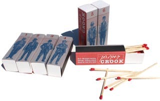
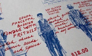
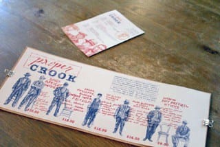
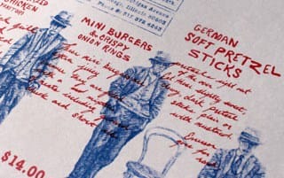
Proper Crook is a fictional community kitchen restaurant and bar inspired by the Chicago Noir Era. The restaurant features a seasonal menu and is open for late lunch and dinner, extending into the late night bar scene. A classic typewriter treatment is blended with custom hand–drawn text and cross–hatched illustrations to highlight the vintage metropolitan mob lifestyle.
Proper Crook gets it name from the inspiration and story. It is a play on the meaning behind the words and was chosen because ”crook“ and ”cook“ are very close together. Proper Crook is inspired by the city of Chicago and the mobster lifestyle from within the Noir era.
- Alex Kinal Wagner
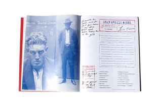
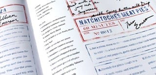
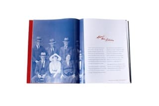
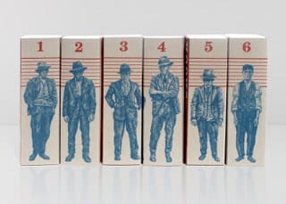
The ideas for the design solutions came from the research of old time mobsters—particularly within their mug shots. There was something I found very striking about their attire and the energy from their portraits. I found it totally baffling that most of the line-ups or mug shots I found were done in chairs or in pairs—that’s something you would never expect. I wanted to include this to create something visually entertaining, while remaining somewhat sophisticated like the crook’s appearances in their photographs.
- Alex Kinal Wagner
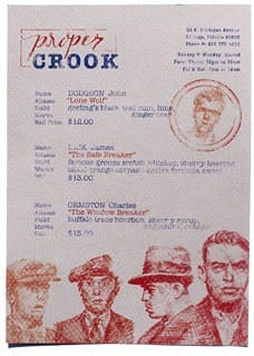
The main challenge I faced while designing this restaurant brand was figuring out how to properly portray the theme of the era I was drawing inspiration from into the typography of the menus without using the obvious go-to fonts. I knew that I wanted this design system to be unique—hand drawn—but how would I create hand type that would correctly communicate this became the question. It was then I found chalk-like writing on and cursive writing mixed and typewriter fonts within my research of old photographs of mug shots and line-ups.
- Alex Kinal Wagner
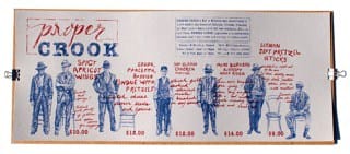
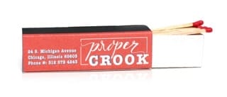
During the process of this project, Proper Crook’s brand logo went through several variations—from experimenting with fonts to hundreds of hand drawn letters and words to really find the right set of letters. All of which ended up being scrapped and redone till finally a combination of script lettering with the typewriter font was found. The menu system itself went from something vertical with just typewriter type, to something using hand type that was then redone horizontal and mixed with the illustrations to relate to a line-up really pulled the final design solution together.
- Alex Kinal Wagner
About Alex Kinal Wagner
Alex Kinal Wagner is originally from the Finger Lakes Region of New York, he moved down south to study his passion of graphic design and illustration at the Savannah College of Art and Design. Recently graduated with his B.F.A. He is now a freelance designer and he's also looking to collaborate with other creative minds in the Greater New York area. You can find more of his works on his Behance profile or website.
So Beautifully illustrated! Love the colours and the entire feel!
Very cool! I love all things that are either vintage or have a vintage look/feel to them, so this is right up my alley. I love it.