Radisson Amsterdam by Fre Lemmens

Fre Lemmens' project was about rethinking a classic for the future by going back into the past. When Creneau International chose his work the rich history of the Radisson Blu Hotel Amsterdam City for inspirational nuggets, they soon resurfaced with a golden concept. Literally. The story of the hotel dates back to the Golden Age, the 17th century, which brought Amsterdam its wealth and its characteristic appearance.
Treasures from over the entire world were shipped to the city’s prospering citizens: porcelain, silk, gold and spices. Guests who stay the night at the Radisson Blu Amsterdam City will experience their own Golden Age as they are bathing in the welcoming golden glow of their room. Each space throughout the hotel is laced with references to the treasures of yore: the interiors are finished with surprising and contemporary items that refer to the 17th Century and Amsterdam in general.
-Fre Lemmens
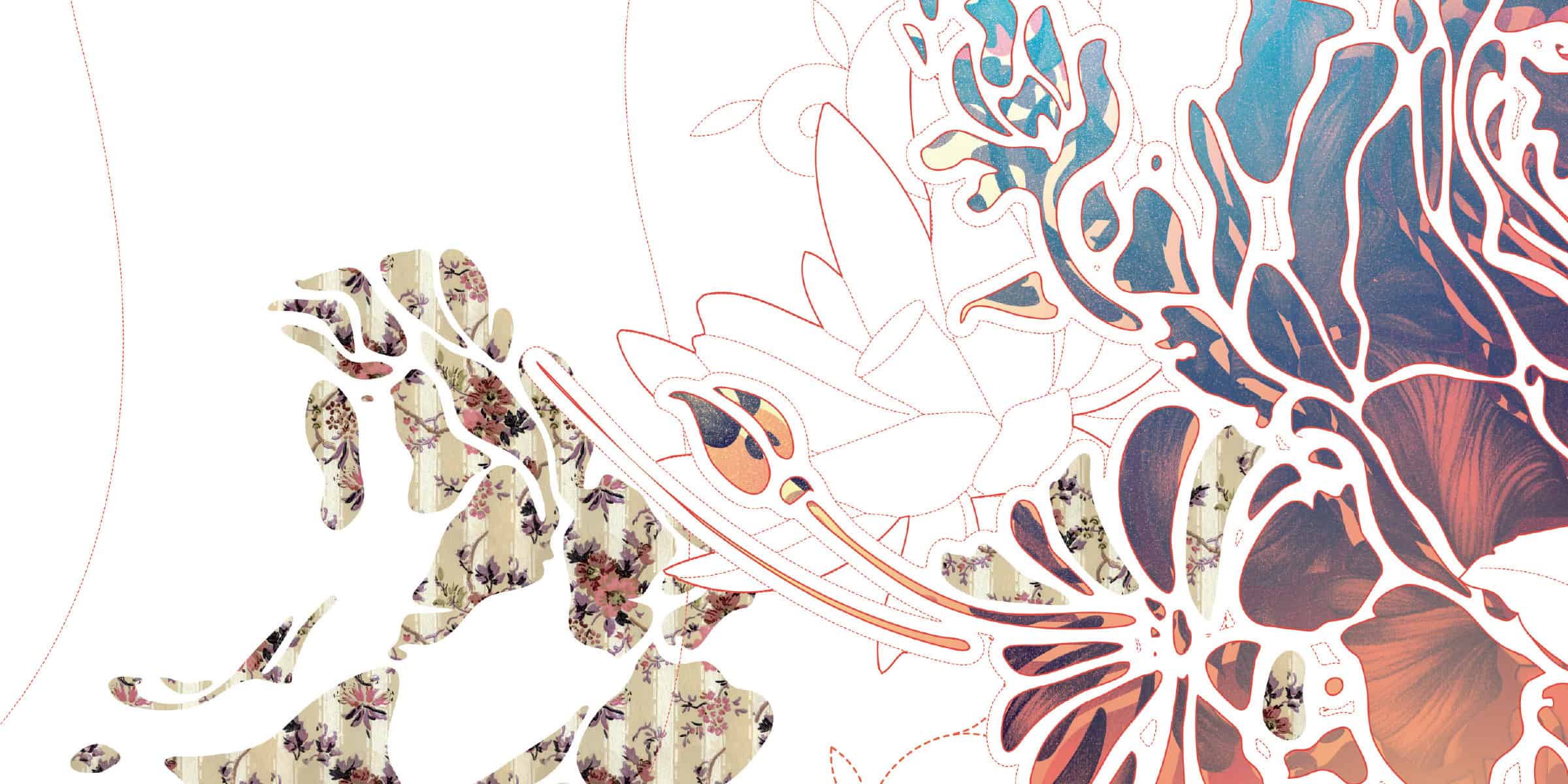
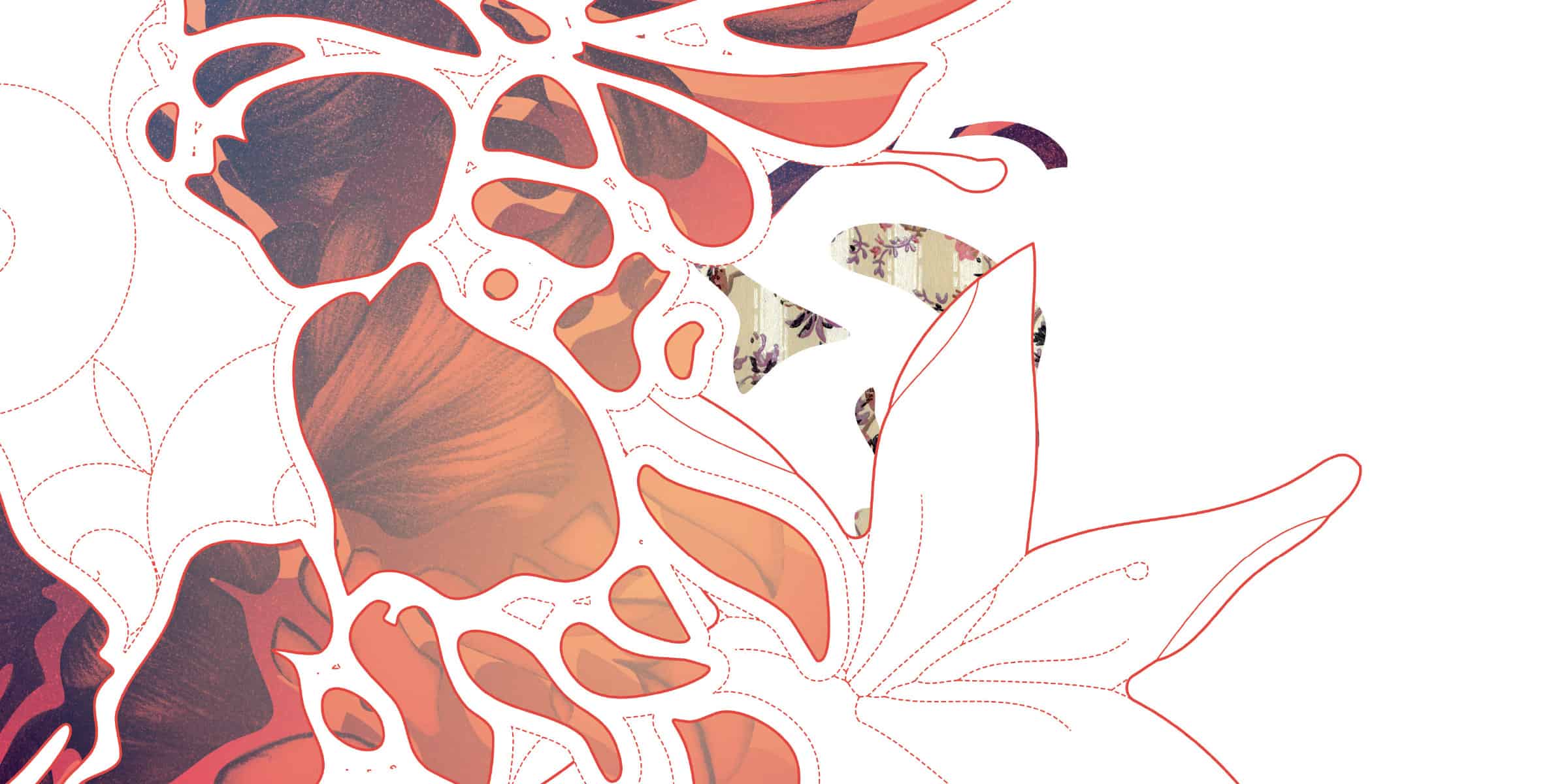
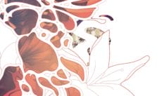
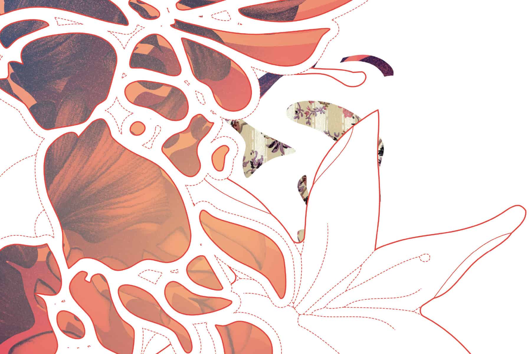
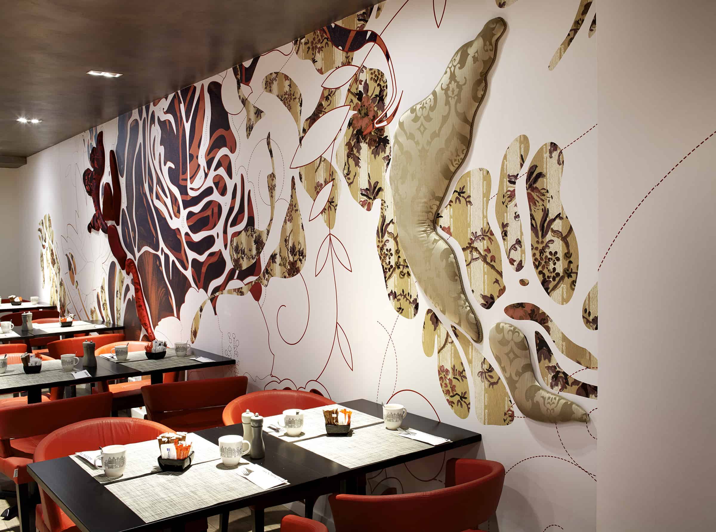
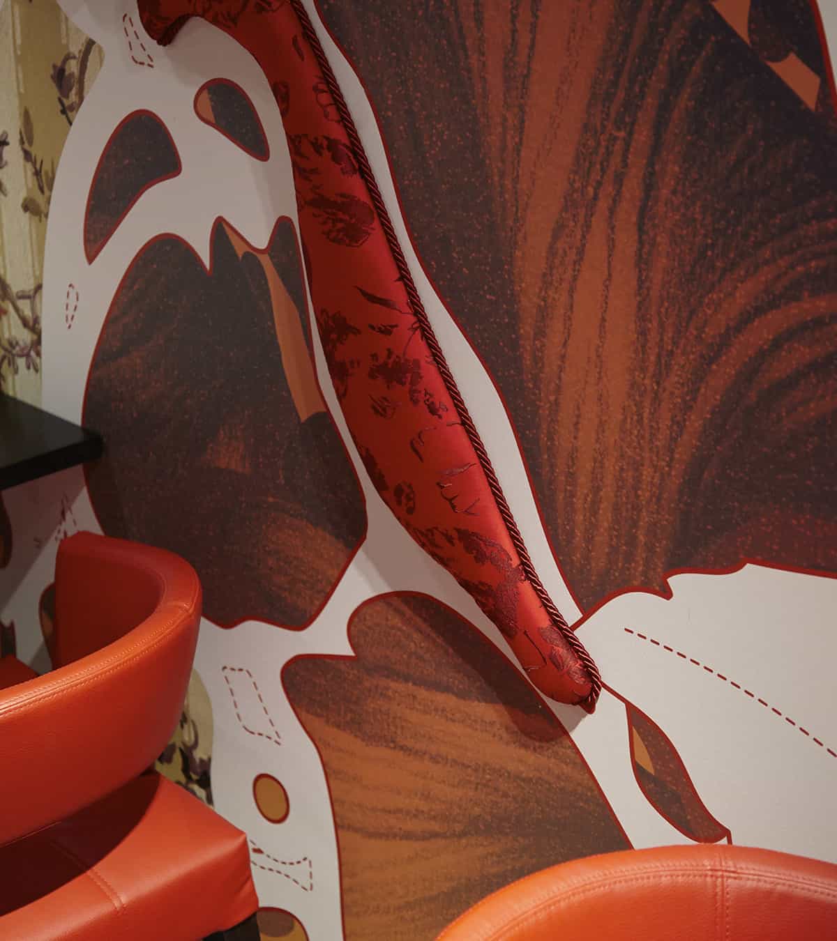
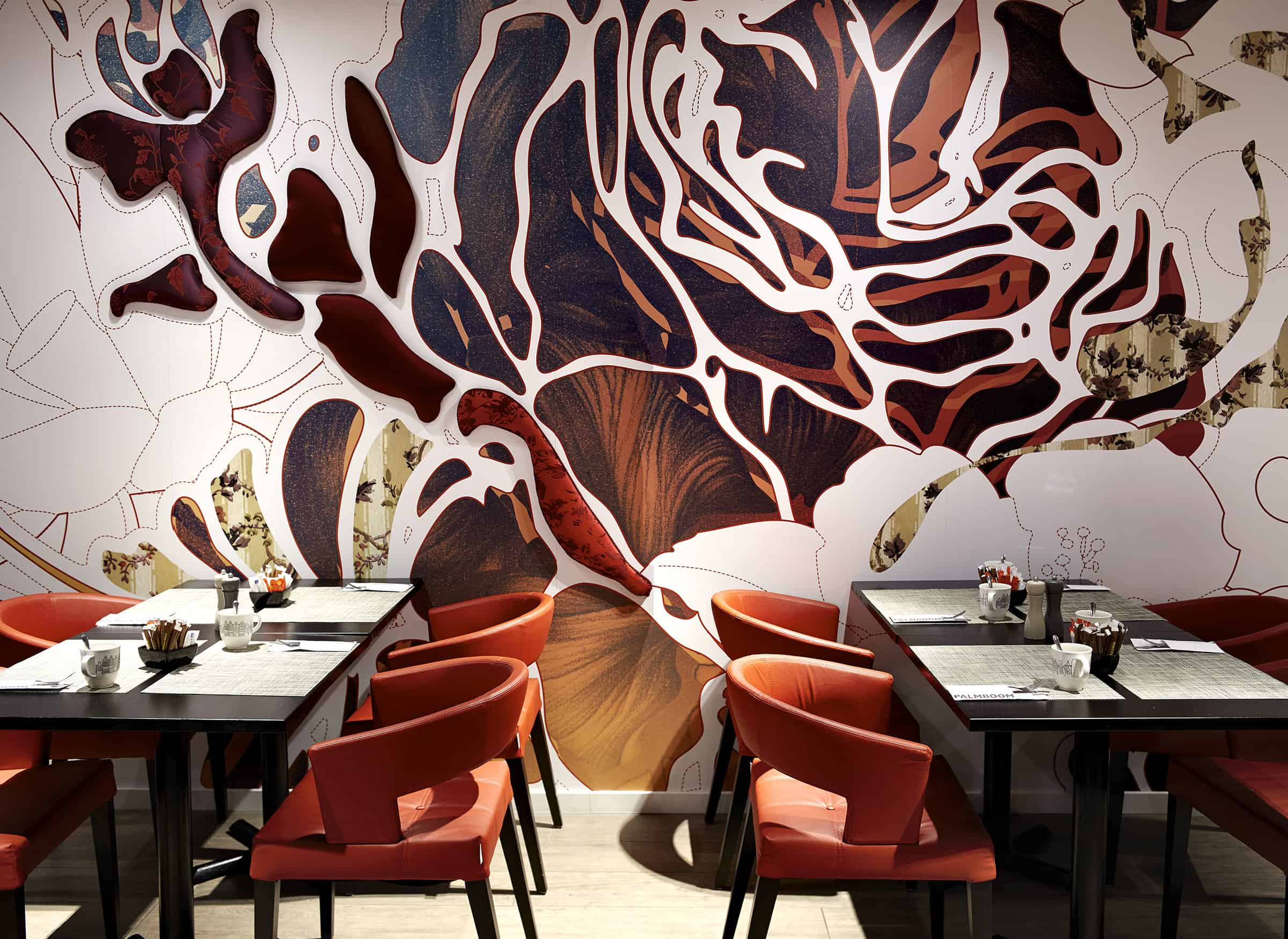
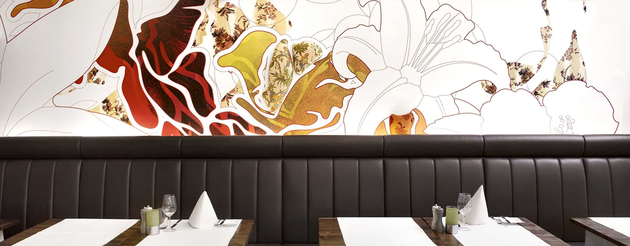
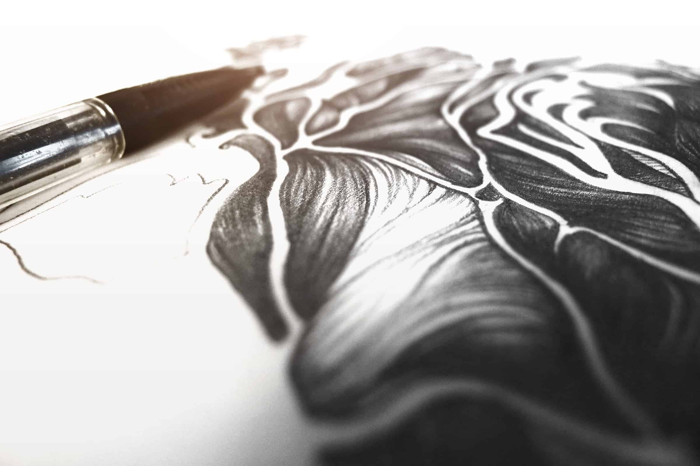
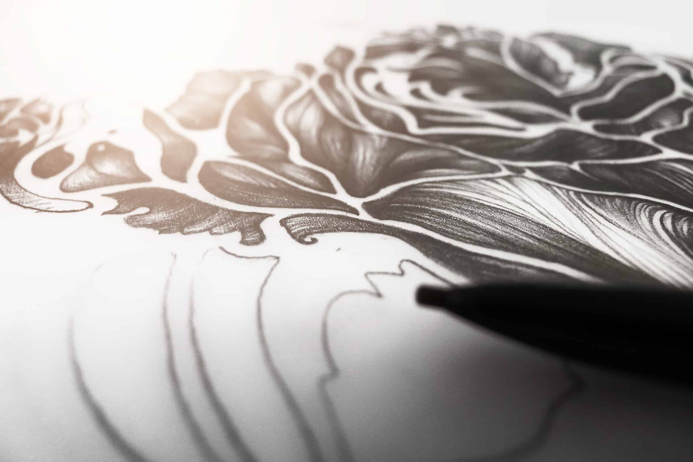
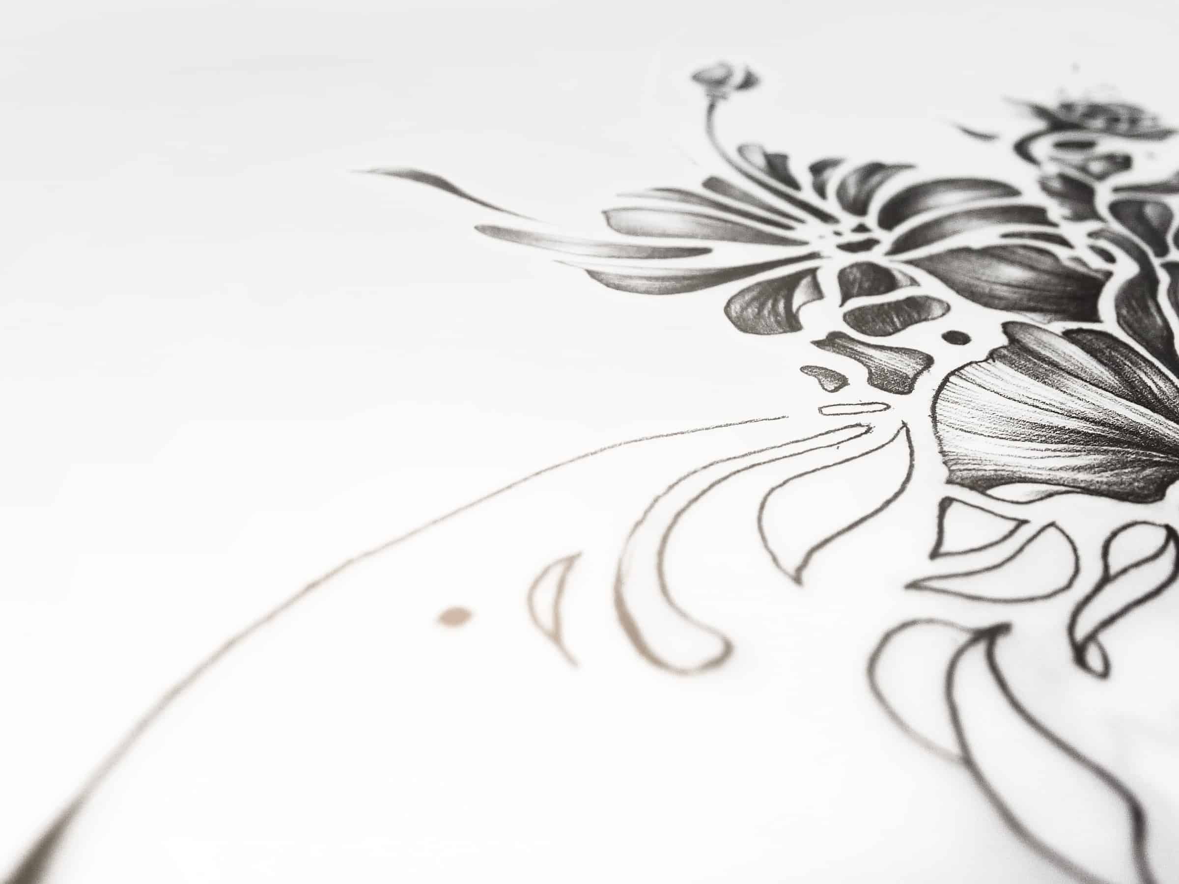
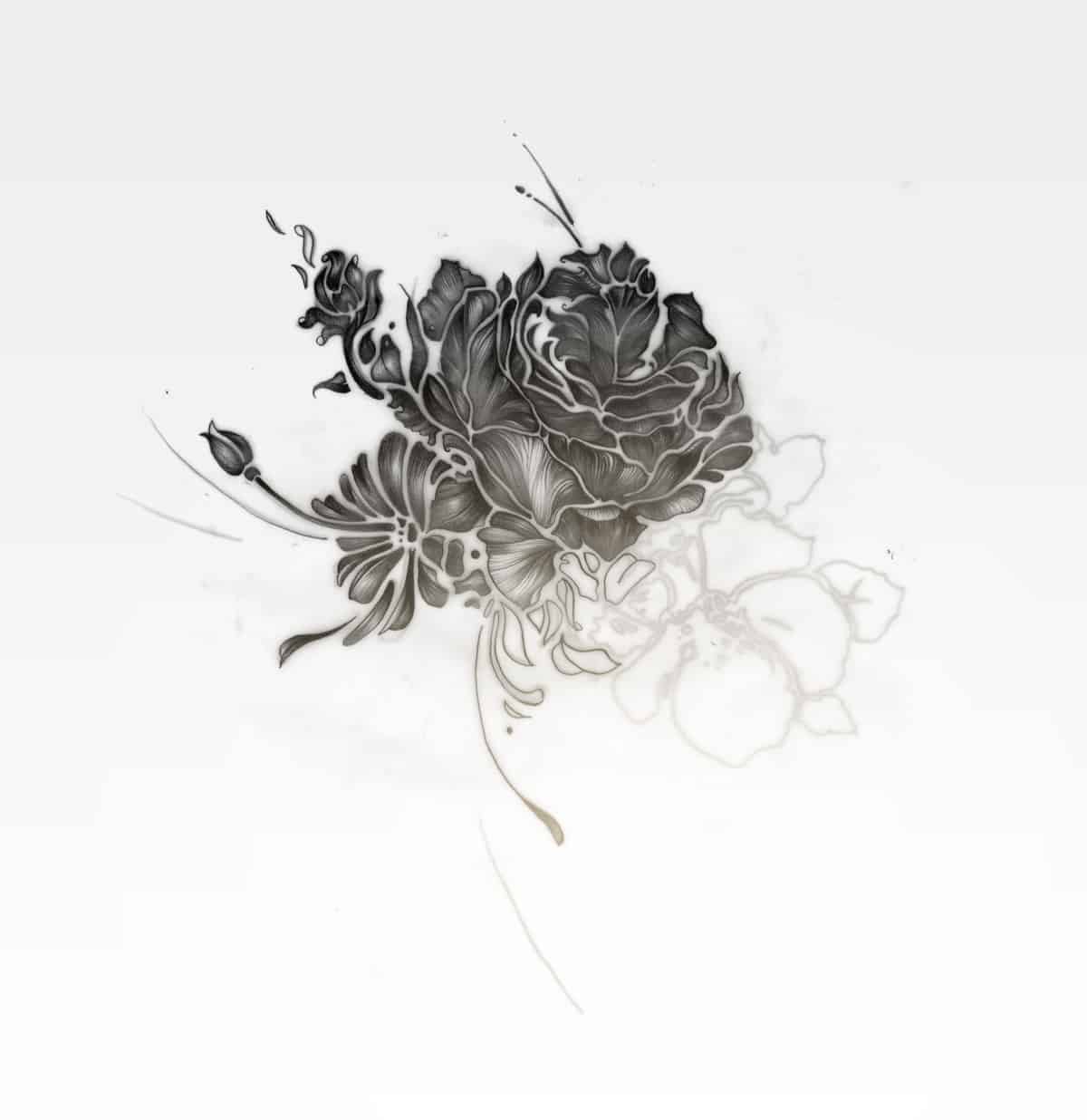
Silk was the main concept for the restaurant, and to build up reference with the city of Amsterdam itself we focused on floral elements, with warm, typical Dutch orange tints, fluid contours and organic illustrations for a silky look & feel. An extra rich and tactile touch was provided by upholstering some of the shapes with vintage, classy fabrics and patterns, done by Studio Stelt.
-Fre Lemmens
No distinctive style defines me, because there’s no real focus on a specific skill or style. However through the years, some methods and signatures have started to stand out. In order to carry out an identity, story or concept, I always try to purify and filter that message as much as possible, often resulting in a clear, no nonsense tone of voice. Constantly striving to develop a personalized and custom made end product, I put a lot of effort in detail and refinement, resulting in hand drawn logo marks, custom typefaces, icons, illustrations and more.
-Fre Lemmens
Besides creating beautiful artwork, the meaning and idea behind the work is still the main reason for a specific form or execution. Try to see every project as a challenge to explore something new, a learning curve for yourself, both conceptual and technical. In doing so, you will end up with something unique. The main thing is: try to find an approach, a style or method that keeps you and your audience excited. And most of all: have fun!
-Fre Lemmens
About Fre Lemmens
Fre Lemmens graduated from the Academy of Fine Arts of Antwerp in 2003, and been exploring and practicing the field in the widest possible range. With more than a decade of experience in graphic design, illustration, branding and much more, he's still obsessed and in love with the game. His main focus is on illustration, logo and type design, both for printed and digital applications. Always available for work, eager to learn and in for a challenge. See more of his works on Behance or his website.