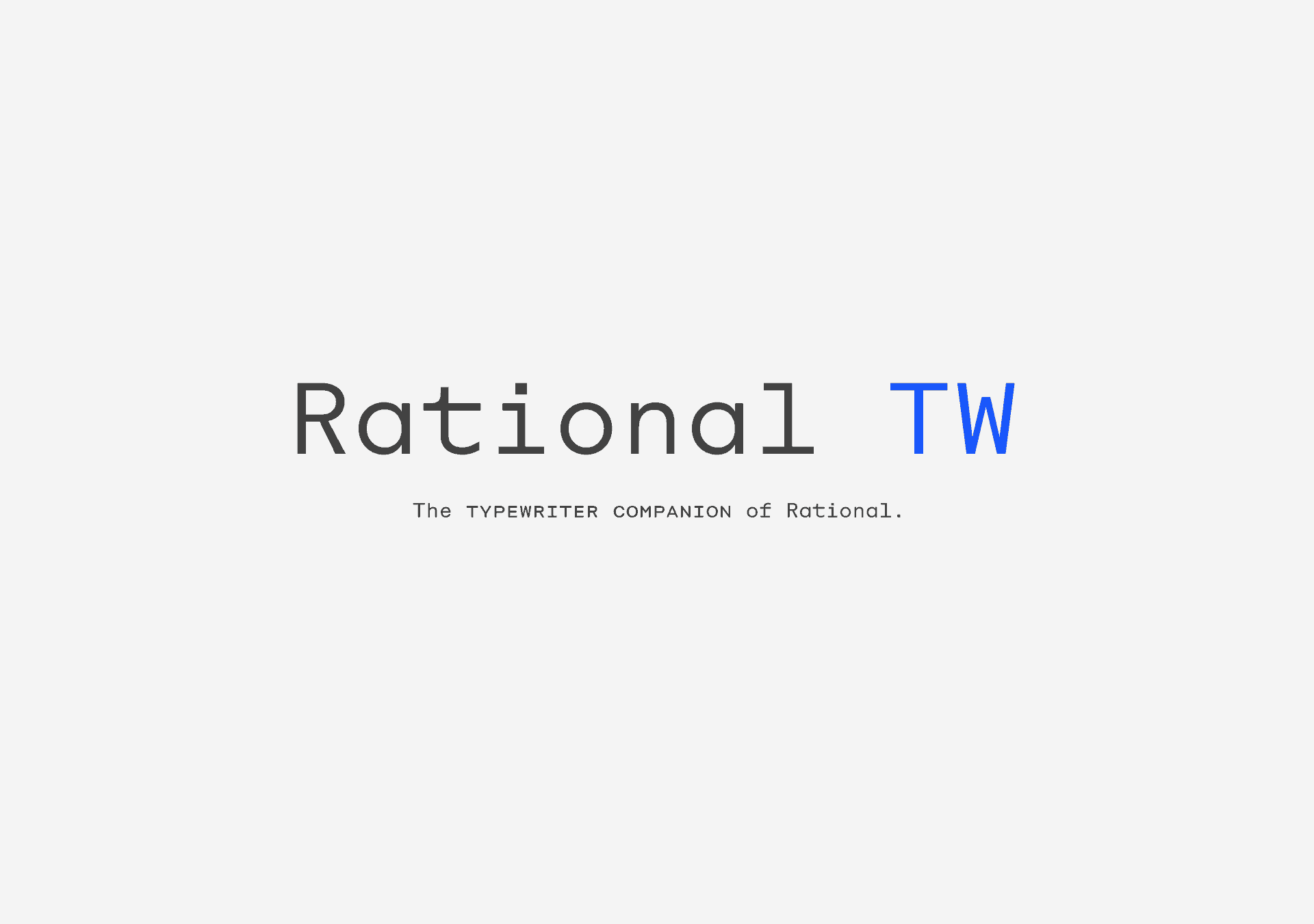
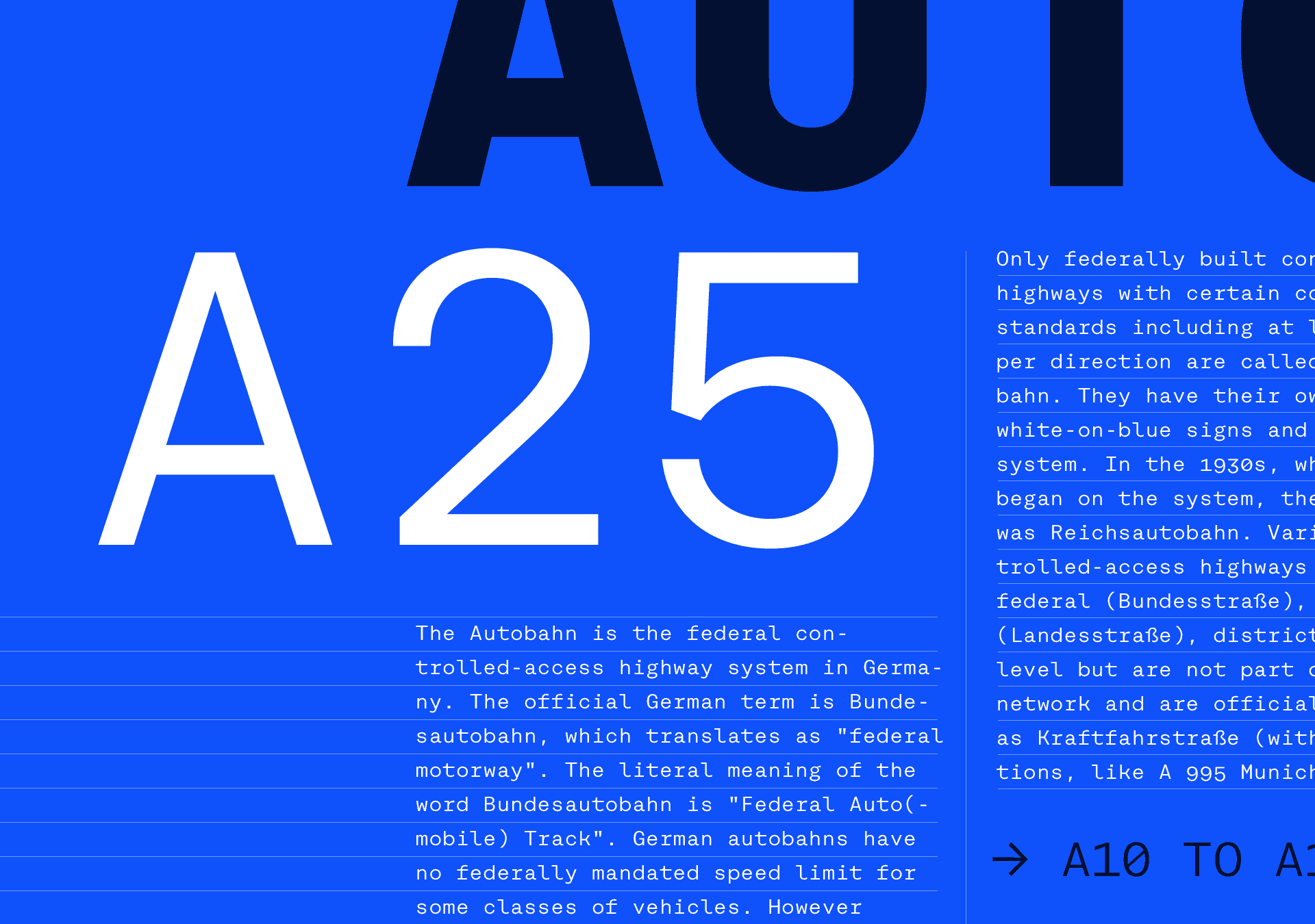
Rational TW Font Family
Rational TW is the typewriter addition to the Rational family. It is a monospaced font building on the same principles as its proportional, neogrotesque brother, such as maximum legibility and flexibility while combining swiss and american gothic elements with a modern aesthetic.
Since monospaced fonts still enjoy a great popularity among graphic designers, Rational TW was the consequent next step for the Rational family. Due to the monospaced environment, some of its letter shapes like 'r', 'm', 'f', 'i' and 'w' have been slightly adapted but kept the same in appearance.
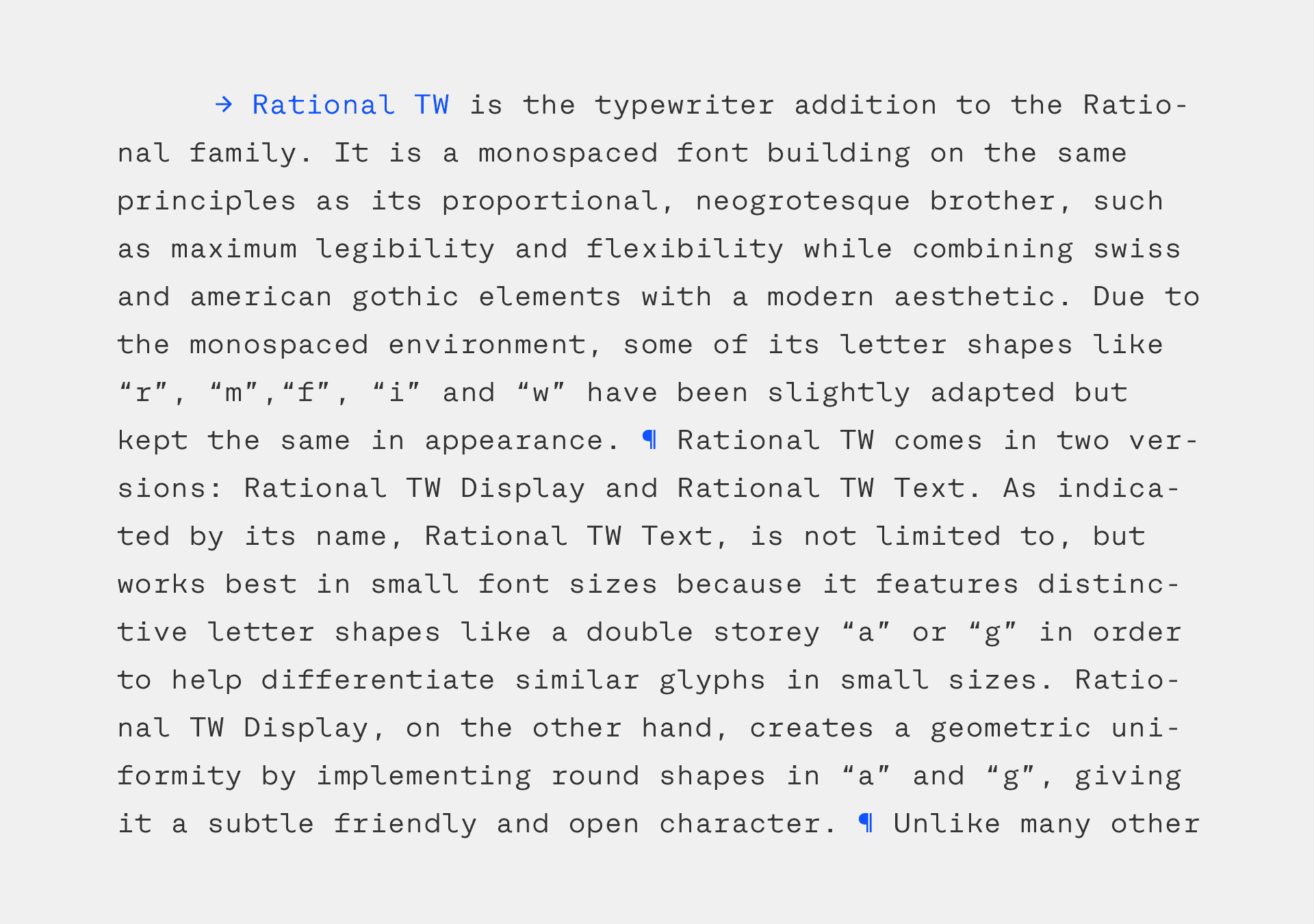
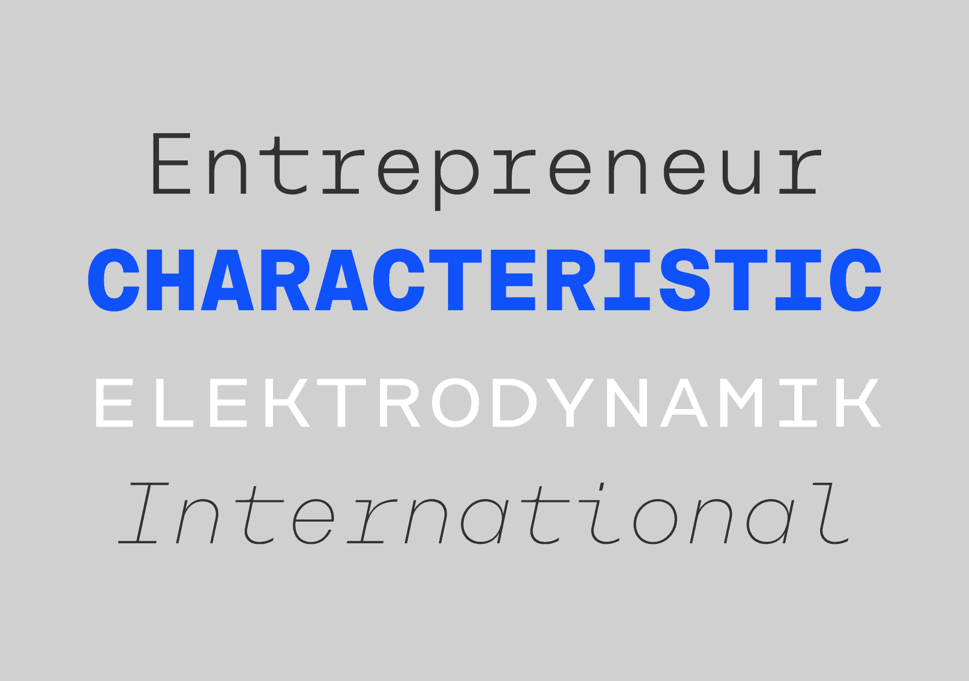
Rational TW was entirely created in Glyphs and is shipped in two version: Rational TW Display and Rational TW Text. As indicated by its name, Rational TW Text is not limited to, but works best in small font sizes because it features distinctive letter shapes like a double storey 'a' or 'g' in order to help differentiate similar glyphs in small sizes. Rational TW Display, on the other hand, creates a geometric uniformity by implementing round shapes in 'a' and 'g', giving it a subtle friendly and open character.
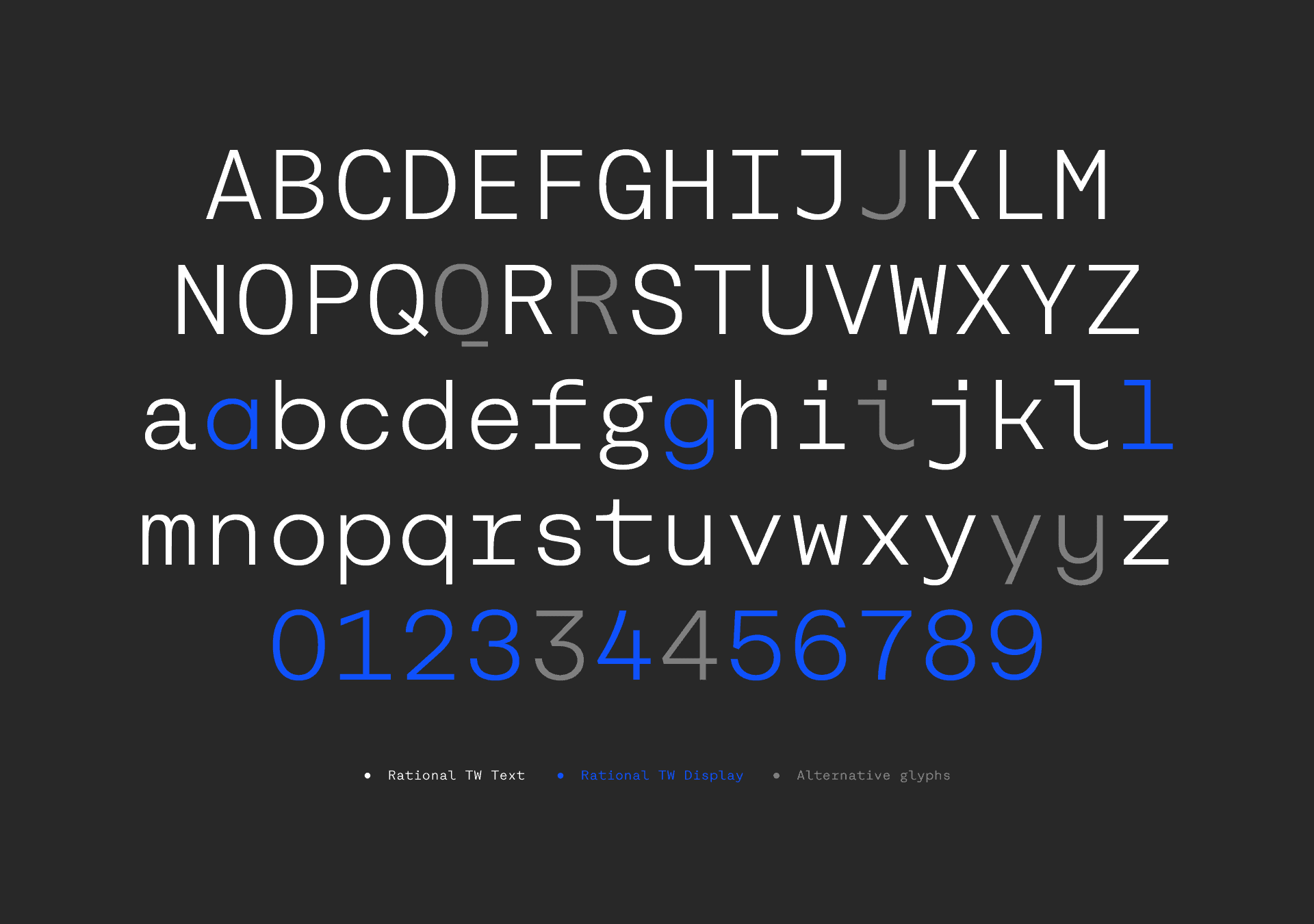
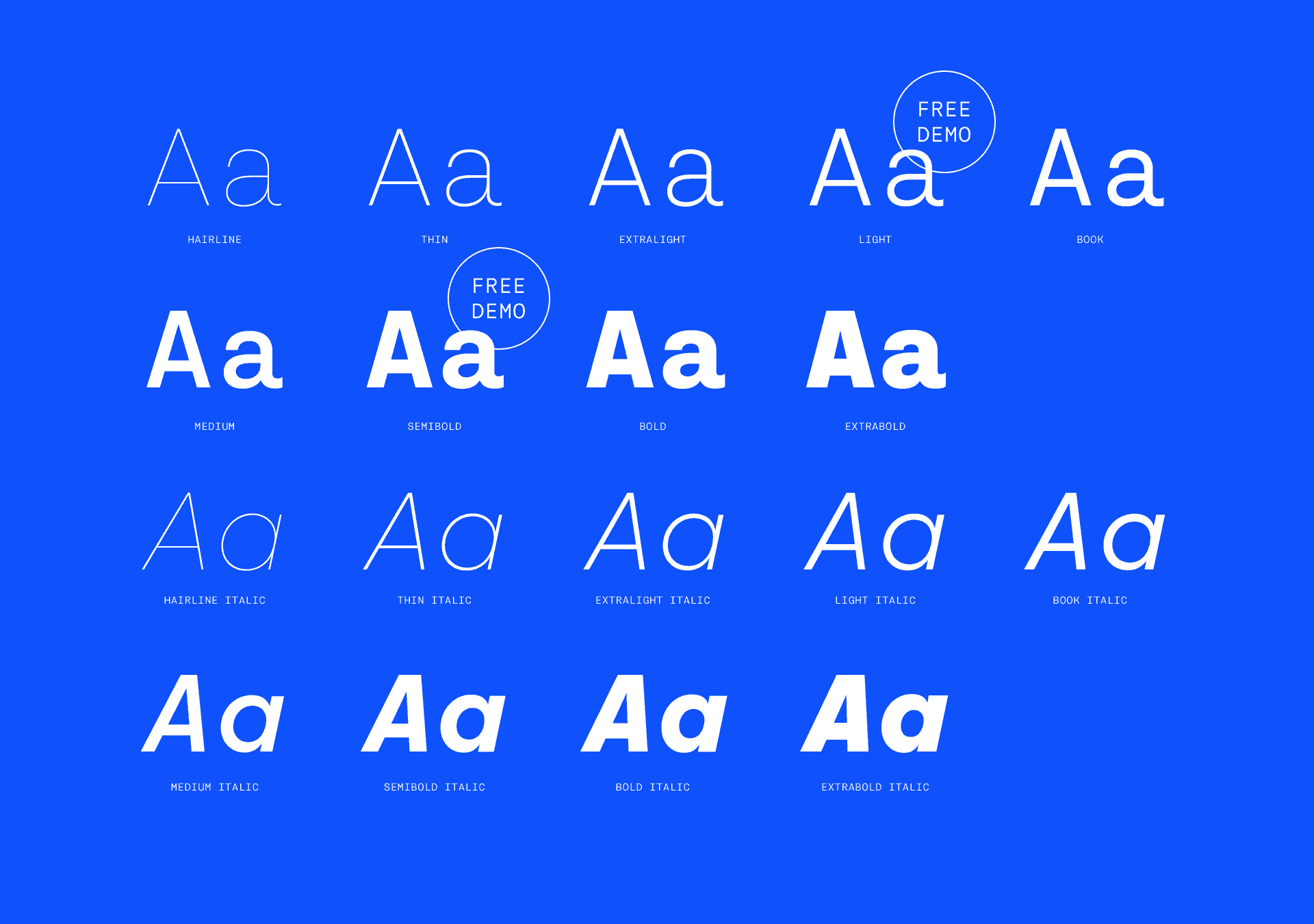
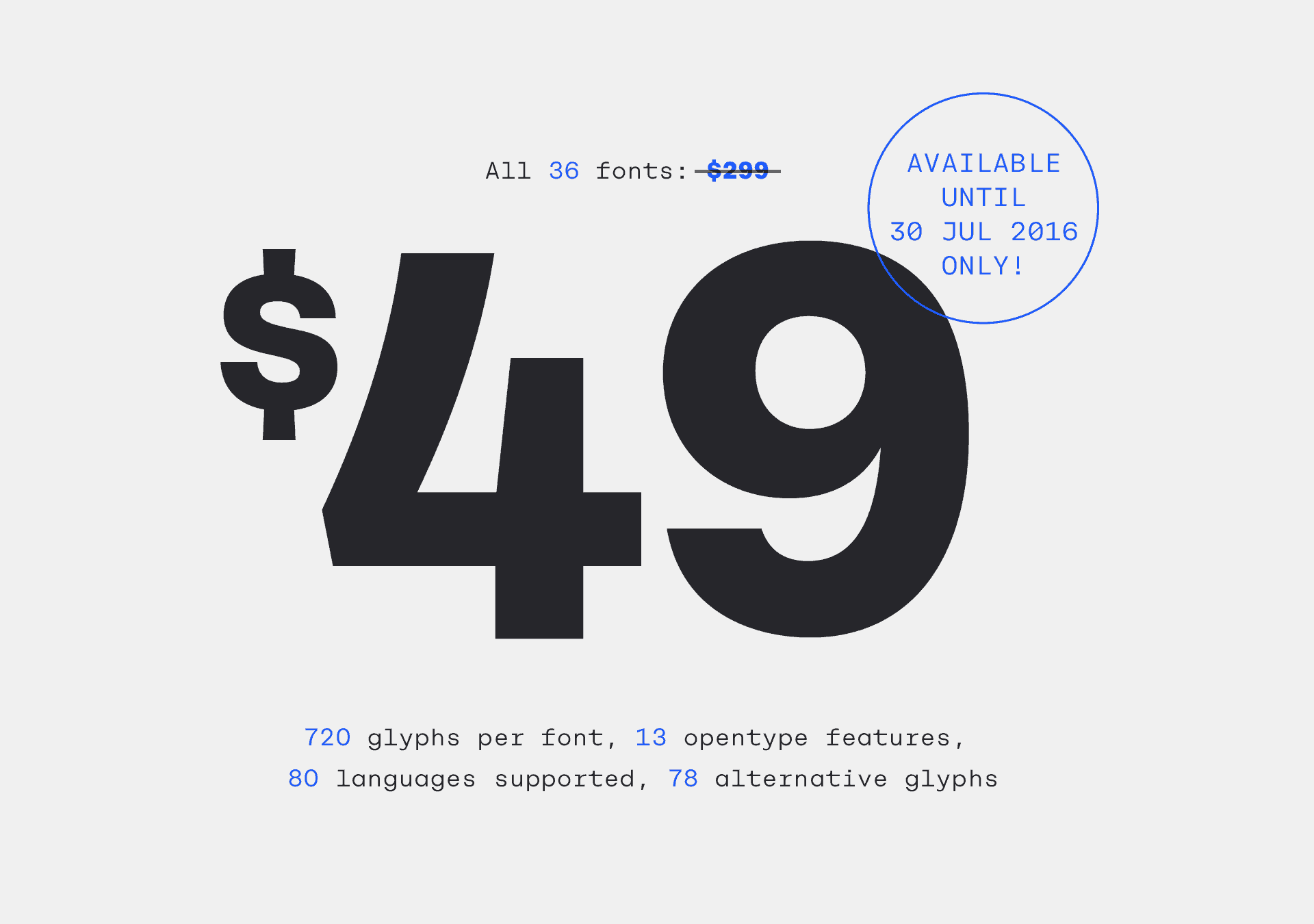
Since this was my first monospaced font design, I've learned a lot about balancing black and white shapes within a consistent space of 660 units, no matter if Hairline, ExtraBold or italic. Having in mind that the family has a large amount of opentype features like small caps, alternative glyphs, case sensitive shapes, and many more, which adds up to 720 glyphs per font, this was quite a task.
Rational TW comes with a time limited introductory offer at myfonts. It's 49 USD for all 36 weights (normal price 299 USD). http://www.myfonts.com/fonts/rene-bieder/rational-tw/
Sweet typeface! I like the roundness on the t, r, etc.