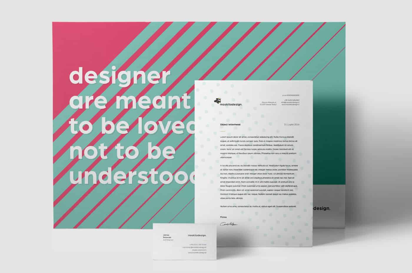
Rebranding moskitodesign.

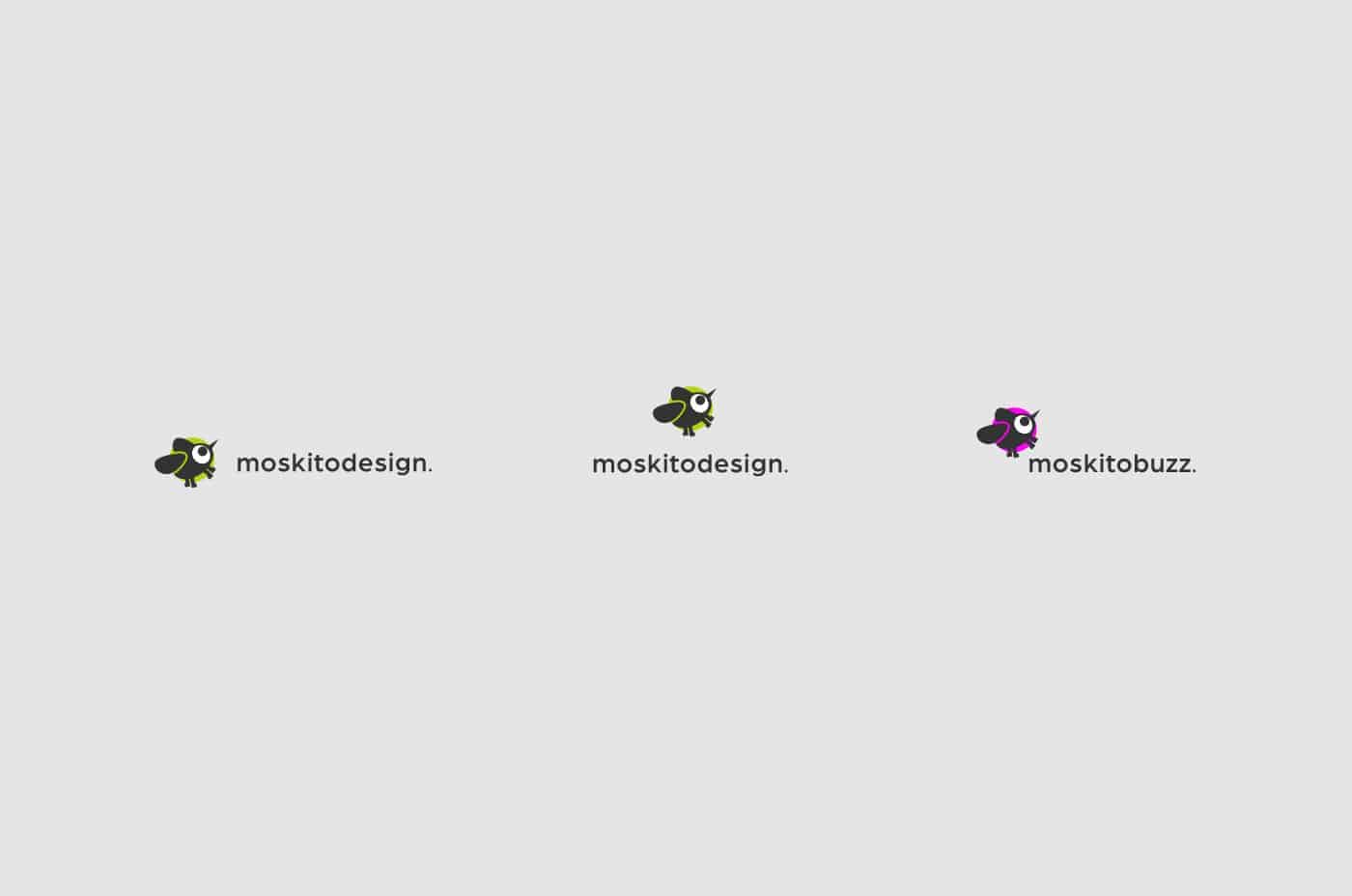
The project is the rebranding of moskitodesign. The restyling comes from the need to put more attention on the craft side of this job: the customization of projects and the attention to detail. The aim is to develop graphical solutions that include the idea of craftsmanship to boost the image of a company that operates in the digital age.
The idea is to put togheter the idea of craftsmanship and the digital in only one solution!
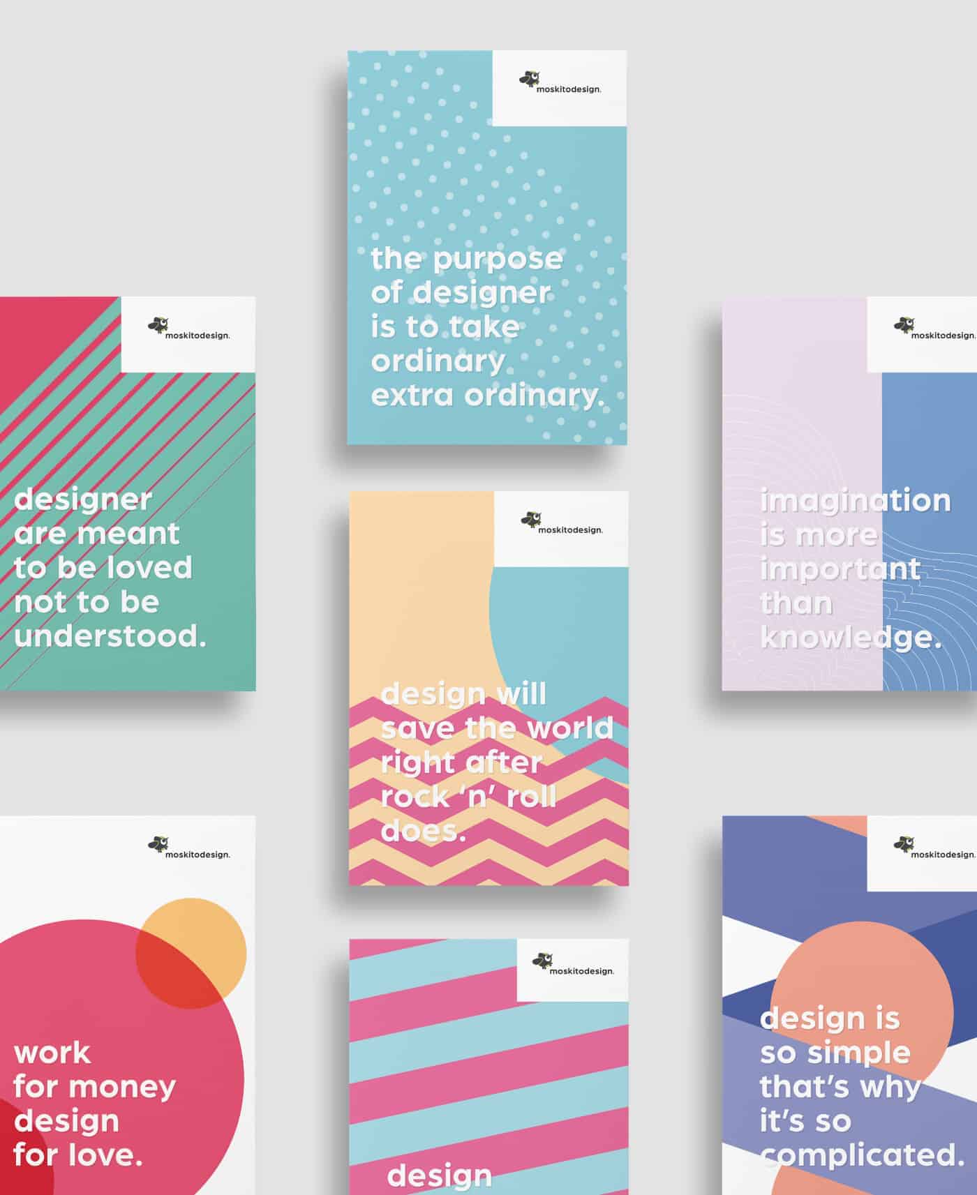
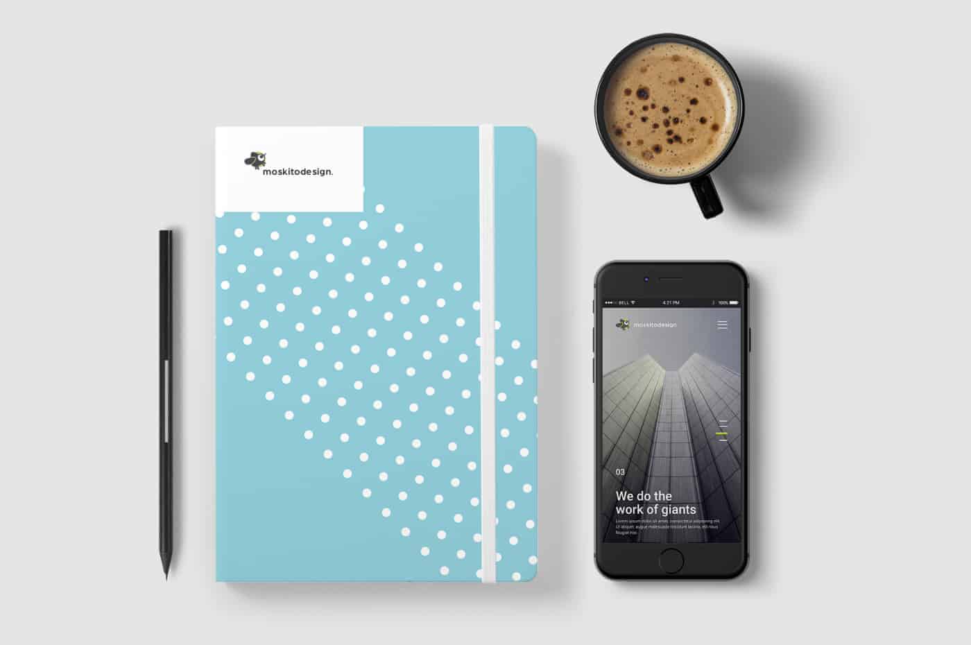
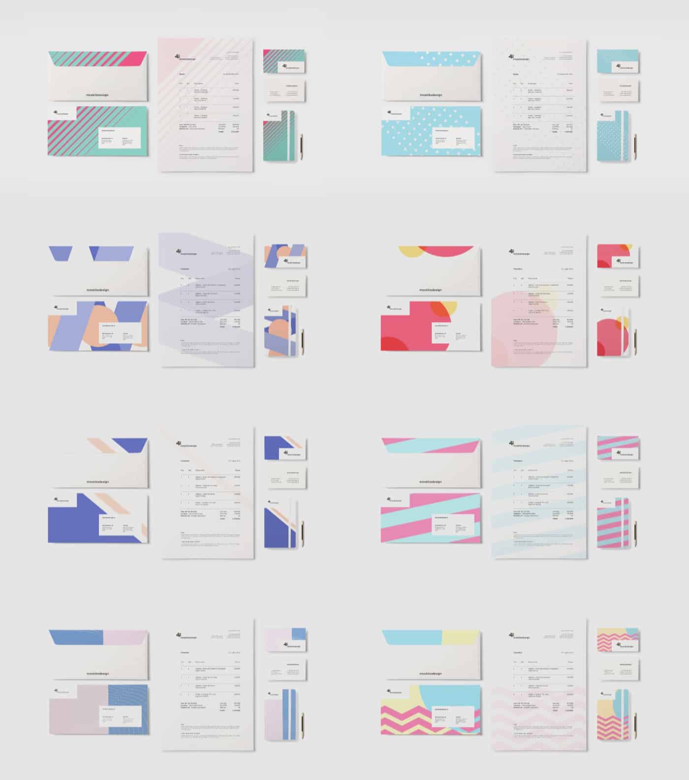
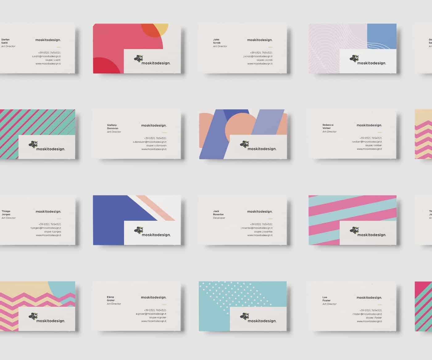
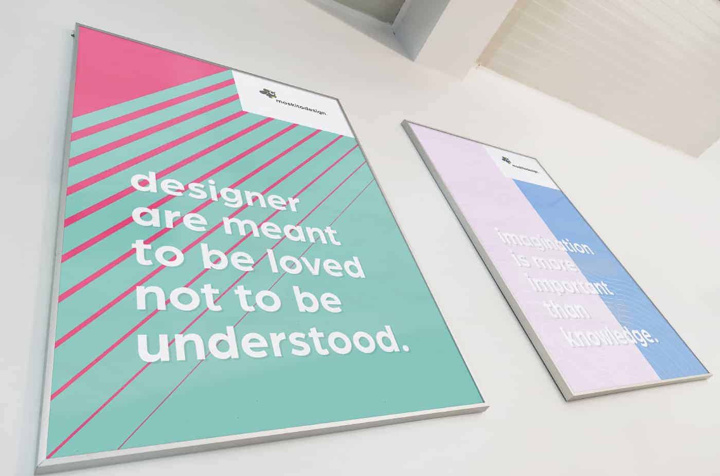
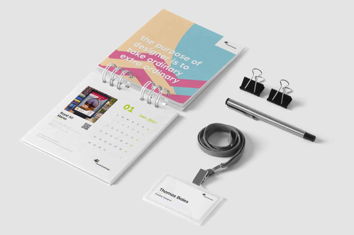
So I decided to mix 8 different pattern with a texture that references something handmade! In this way I could get together the digital side ( pattern ) and the craft side ( the textures ).
I decided to create eight different patterns to give to the customer the chance to feel free to choose his Moskito's business card which then he could bring home with him and to give him the opportunity to identify himself in the moskito project!
I principally used Adobe Illustrator to realize all the work done for this restyling.
I started from some sketches on the paper as regards the restyling of the logo and then I passed to the software to achieve it, I also did the same thing for the creation of patterns. The first thing I focused on was the logo, so modernize it and make it as clean as possible . Then I switched to the creation of the pattern, and after a long - very long - selection process I choosed the final palette of the 8 patterns!
This project has taught me to see in a different way the design of a corporate, it taught me how to take different decisions on a single project, it taught me to use many colors and different concepts together in the same project. It taught me that it's not important to focus on the stereotype of the classic business card or letterhead, but it's important to follow their own ideas.
If they want to see the entire project, they can go on the project page on my Behance profile!
Here the link: https://www.behance.net/gallery/42471563/Brand-Web-moskitodesign