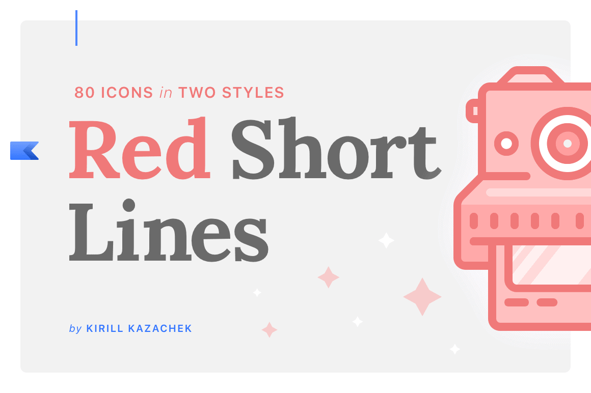
Red Short Lines

Red Short Lines – it is small icons set created in four categories: finance, office, car parts and photography. Thanks to the rhythm of short lines, symbols come out so crisply and stylish. It adds a distinctive and memorable look to the whole series.
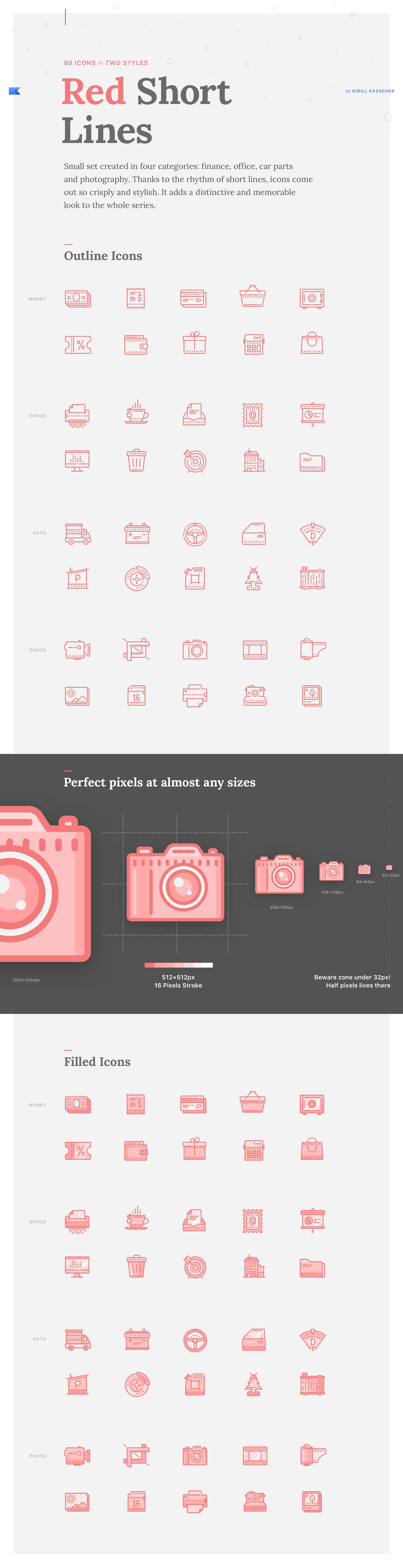
The idea was in the air all the time. I want to create icons that contain noticeable style elements. In that case, it was a row of short lines. Then I start experimenting with the color palette and find out that red tones for filled icons look really awesome.


At first, I've tried to draw it in Affinity Designer, but unfortunately, the app has some issues with stroke expanding mechanism. So I redrew all icons in traditional Adobe Illustrator. Also, I used Sketch for presentation design and Adobe After Effects for simple animation.


Working on that project I learned, that simple icons set can evolve into the complete product. Red Sort Lines not so much time hung in my portfolio, but Creative Market had handpicked the project. And I want to know what DesignIdea readers think about my icons ?
You can see this and other my works on Behance page https://www.behance.net/kazachek
Great project once again! It looks really cool :)